README.md
In Nuniemsis/Siane: Explore the Spanish INE Data using this Geographic Tool
Siane
This is an R package to plot maps based on CartoSiane, the official Spanis maps provided by the Instituto Geográfico Nacional (IGN). These maps are compatible with the Spanish Instituto Nacional de Estadística (INE) georreferenced data; this makes it simple to combine geographical and statistical data to produce maps.
This document explains how to install the package, how to download the base maps, and, finally, how to produce a number of simple statistical maps.
Package installation
To install the package, you need to download Siane maps first.
Obtain Siane maps
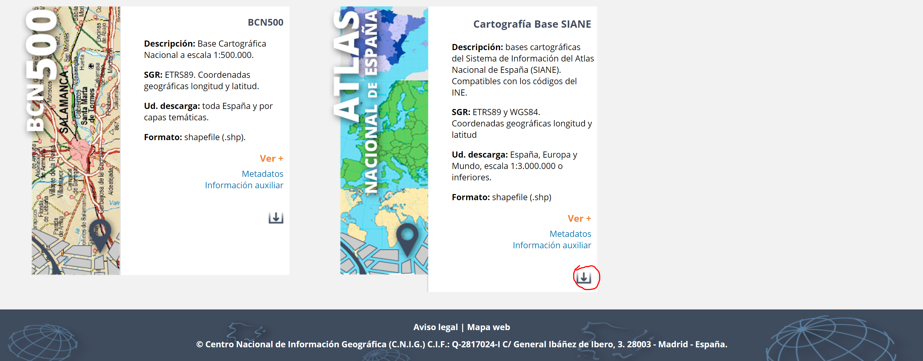
The package does not include the map layers. These need to be downloaded from the IGN first from this website.
You need to scroll down to the bottom of the page and click in the highlighted button:
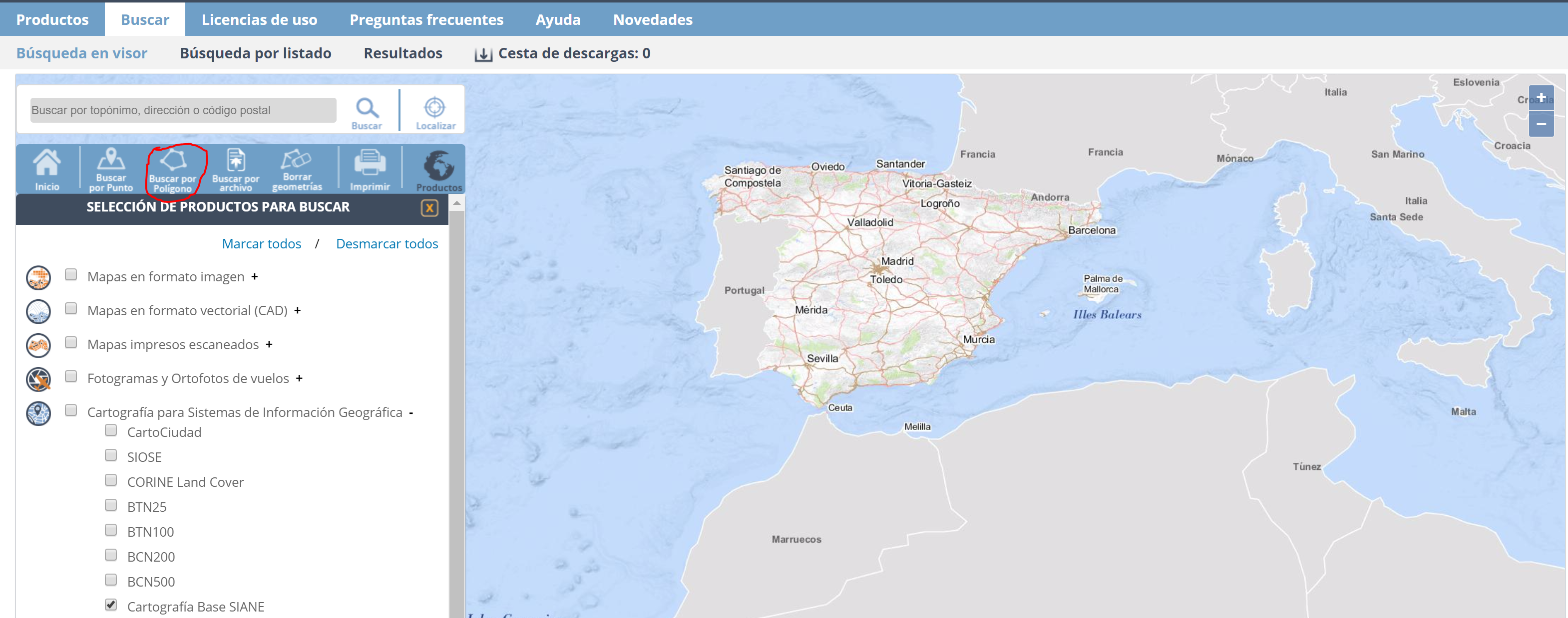
You will get into in a new page where you will have to click on "Buscar por polígono"
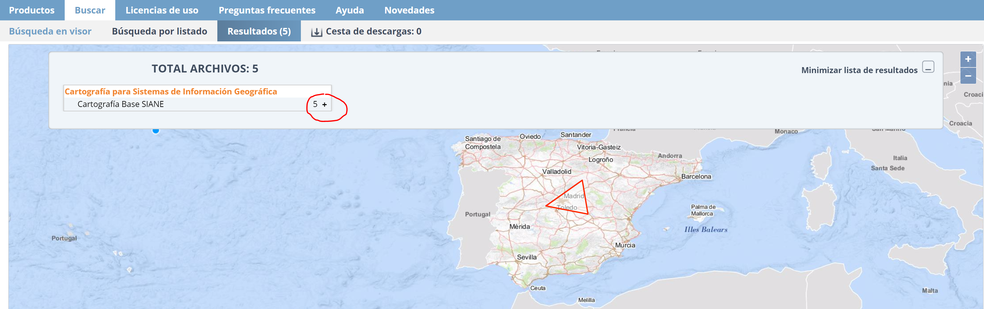
Once you get here, draw a triangle in the surface of the map. It just has to be a closed polygon. A simple triangle will do it.
Then, you need to unlist all the products by clicking on the "+" button.
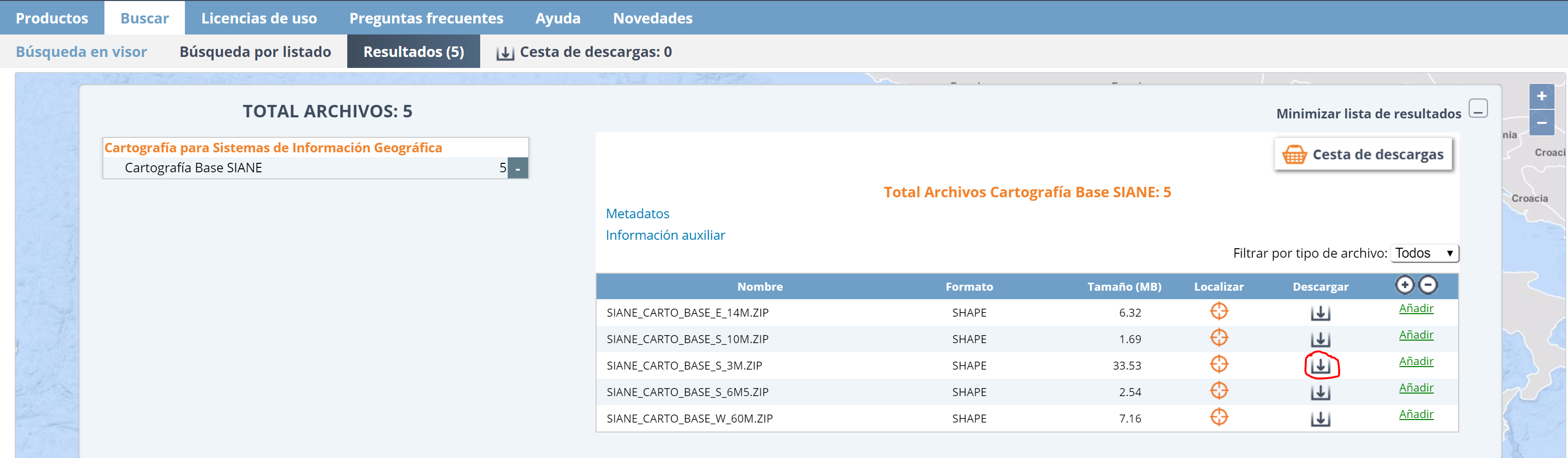
You will need to download the SIANE_CARTO_BASE_S_3M and SIANE_CARTO_BASE_S_6M5 maps.
You need to unzip the folders in the same directory. Siane should have access to both folders in order to plot the maps. For instance, my folders (SIANE_CARTO_BASE_S_3M and SIANE_CARTO_BASE_S_6M5) are stored at /Users/nunoc/Desktop/siane. You shouldnt' rename neither the files nor the directories.
Install the package
To install, the package, all you need to do is:
library(devtools)
install_github("rOpenSpain/Siane")
library(Siane)
Then you can use it in your session:
library(Siane)
However, the package is not usable until you register the maps, i.e., you indicate where to find them.
Register and test the package
To register the maps, you need to indicate the full path to the directory storing the SIANE_CARTO_BASE_S_3M and SIANE_CARTO_BASE_S_6M5 folders. In my case:
obj <- register_siane("/Users/Nuniemsis/Desktop/siane/")
Then you can select the map,
shp <- siane_map(obj = obj, level = "Municipios", canarias = TRUE, peninsula = "close")
and plot it:
raster::plot(shp)
Map options
This section describes some of the parameters to select the map features.
year: Maps change over time and Siane keeps a historic version of them. You can select the year corresponding to the base map. This is particularly useful for municipalities.canarias: It indicates whether we want to plot the Canary islands. level: It is the administrative level. For this set of maps there are three: Municipios, Provincias and Comunidades. scale: The scale of the maps. The default scale for municipalities is 1:3000000 scale = "3m". For provinces and regions the default scale is 1:6500000 scale = "6m". peninsula: It's the relative position of the Canarias island to the peninsula in case you want it to be shifted closer to it.
shp <- siane_map(obj, level = "Municipios", canarias = TRUE, peninsula = "close")
plot(shp)
Plotting INE data
One of the advantages of Siane maps is that their entities are indexed using official INE codes. This facilitates the creation of maps representing statistical variables. This section illustrates the procedure. In particular, we will plot the population of the municipalities of La Rioja.
Data download
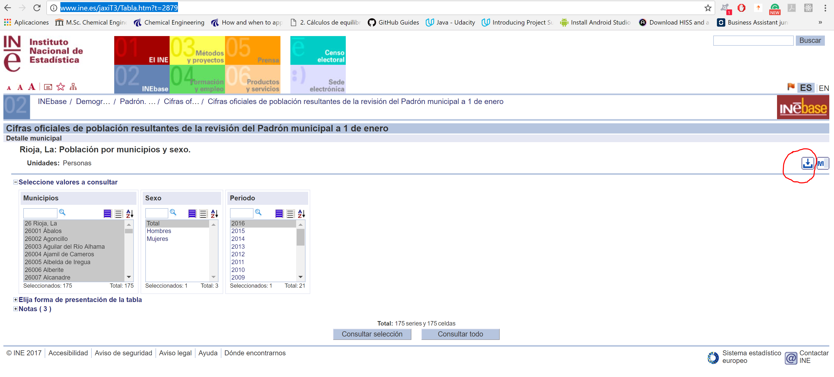
To download the data from the INE, you need to click on the button on the right side of the webpage and choose the Pc-Axis format.
You will need the pxR package to read this file.
library(pxR)
library(RColorBrewer)

ine_path <- "/Users/nunoc/Downloads/2879.px"
df <- as.data.frame(read.px(ine_path))

names(df) # List the column names  of the data frame
Of course, you will have to provide the path where you have downloaded the 2879.px file.
Data preparation
First we need to understand the data frame. It has the following columns:
Periodo is the time column in year's format. value is a column with the numeric value of the population. Sexo is the sex of that population. Municipios is a character array with the municipality name and the municipality code
In this dataset there is only one value per territory.
Split the Municipios column to get the municipality's codes. We are storing the codes in the column codes. This column is really important in order to plot the polygons with the correct colours.
We create a single column in the data frame with those codes.
df$codes <- sapply(df$Municipios, function(x) strsplit(as.character(x), split = " ")[[1]][1])
df$Periodo <- as.numeric(as.character(df$Periodo))
Plotting polygons by colour intensity requires one unique value per territory. Therefore, we have to filter the data frame. Keep this Golden rule: One value per territory. In this example I want to plot the total population in the year 2016.
df <- df[df$Sex == "Total" & df$Periodo == 2016, ]
Next, we need to include our population data into the map object, shp
by <- "codes"
value <- "value"
level <- "Municipios"

shp_merged <- siane_merge(shp = shp, df = df, by = by, level = level, value = value)
Then, we can plot the map with the plot function. The RColorBrewer package provides lots of colour scales. We can use this colour scales to visualize data over the map. The following function displays all the colour scales from that package. In case we want to plot the population of certain municipalities in a province, we must use a sequential pallete.
pallete_colour <- "OrRd" # Scale of oranges and reds
Let's say that n is the number of colour intervals.
n <- 5
The brewer.pal function builds a pallete with n intervals and the pallete_colour colour.
values_ine <- shp_merged@data[[value]] # Values we want to plot are stored in the shape@data data frame
colors <- brewer.pal(n, pallete_colour) # A pallete from RColorBrewer
The style is the distribution of colour within a numerical range. The classIntervals function generates numerical intervals. The upper and lower limits of these intervals are named breaks.
style <- "quantile"
brks <- classIntervals(values_ine, n = n, style = style)
my_pallete <- brks$brks # my_pallete is a vector of breaks
Match each number with its corresponding interval to be able to decide its colour.
col <- colors[findInterval(values_ine, my_pallete,
                           all.inside=TRUE)] # Setting the final colors
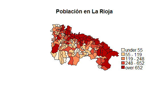
Plot the map and set title and legends.
raster::plot(shp_merged,col = col) # Plot the map
title_plot <- "Población total por municipios en La Rioja"

title(main = title_plot)
legend(legend = leglabs(round(my_pallete)), fill = colors,x = "bottomright")
The resulting map is:
Other examples
Let's try with a different dataset. This dataset has the spanish population for all the provinces.You can find the link in the README.MD file as well. Now we are going to go deeper in some options.
ine_path <- "/Users/nunoc/Downloads/2852.px"
df <- as.data.frame(read.px(ine_path))
names(df) # List the column names  of the data frame
Data preparation
The same steps as before.
df[[by]] <- sapply(df$Provincias,
                   function(x) strsplit(x = as.character(x), split = " ")[[1]][1])
df$Periodo <- as.numeric(as.character(df$Periodo))
year <- 2016 # year of the maps

df <- df[df$Sex == "Total" & df$Periodo == year,]
The options now will be slightly different:level <- "Provincias". Remember that first we have to create the shapefile. We can't use the previous shapefile provided that the level has changed. These maps are provincial maps.
level <- "Provincias"
canarias <- FALSE
scale <- "6m" # "3m" also accepted
Read the map
shp <- siane_map(obj = obj, canarias = canarias, year = year, level = level, scale = scale)
Map options
The values are in the values column and the codes are in the codes column.
value <- "value"
by <- "codes"
shp_merged <- siane_merge(shp = shp, df = df, by = by, value = value)
Plot the map.
```{r, fig.width = 7, fig.height = 7, eval = FALSE}
pallete_colour <- "BuPu"
n <- 7
style <- "kmeans"
values_ine <- shp_merged@data[[value]] # Values we want to plot are stored in the shape@data data frame
colors <- brewer.pal(n, pallete_colour) # A pallete from RColorBrewer
brks <- classIntervals(values_ine, n = n, style = style)
my_pallete <- brks$brks
col <- colors[findInterval(values_ine, my_pallete,
all.inside=TRUE)] # Setting the final colors
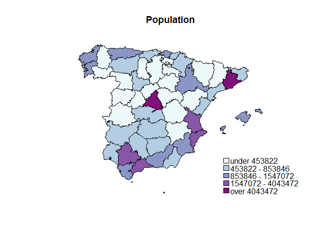
raster::plot(shp_merged,col = col) # Plot the map
title_plot <- "Población de España a nivel de provincias"
title(main = title_plot)
legend(legend = leglabs(round(my_pallete)), fill = colors,x = "bottomright")
```
This produces the map:
Nuniemsis/Siane documentation built on May 21, 2019, 2:20 p.m.
R Package Documentation
Browse R Packages
We want your feedback!
Note that we can't provide technical support on individual packages. You should contact the package authors for that.
Siane
This is an R package to plot maps based on CartoSiane, the official Spanis maps provided by the Instituto Geográfico Nacional (IGN). These maps are compatible with the Spanish Instituto Nacional de Estadística (INE) georreferenced data; this makes it simple to combine geographical and statistical data to produce maps.
This document explains how to install the package, how to download the base maps, and, finally, how to produce a number of simple statistical maps.
Package installation
To install the package, you need to download Siane maps first.
Obtain Siane maps
The package does not include the map layers. These need to be downloaded from the IGN first from this website.
You need to scroll down to the bottom of the page and click in the highlighted button:
You will get into in a new page where you will have to click on "Buscar por polígono"
Once you get here, draw a triangle in the surface of the map. It just has to be a closed polygon. A simple triangle will do it. Then, you need to unlist all the products by clicking on the "+" button.
You will need to download the SIANE_CARTO_BASE_S_3M and SIANE_CARTO_BASE_S_6M5 maps.
You need to unzip the folders in the same directory. Siane should have access to both folders in order to plot the maps. For instance, my folders (SIANE_CARTO_BASE_S_3M and SIANE_CARTO_BASE_S_6M5) are stored at /Users/nunoc/Desktop/siane. You shouldnt' rename neither the files nor the directories.
Install the package
To install, the package, all you need to do is:
library(devtools)
install_github("rOpenSpain/Siane")
library(Siane)
Then you can use it in your session:
library(Siane)
However, the package is not usable until you register the maps, i.e., you indicate where to find them.
Register and test the package
To register the maps, you need to indicate the full path to the directory storing the SIANE_CARTO_BASE_S_3M and SIANE_CARTO_BASE_S_6M5 folders. In my case:
obj <- register_siane("/Users/Nuniemsis/Desktop/siane/")
Then you can select the map,
shp <- siane_map(obj = obj, level = "Municipios", canarias = TRUE, peninsula = "close")
and plot it:
raster::plot(shp)
Map options
This section describes some of the parameters to select the map features.
year: Maps change over time and Siane keeps a historic version of them. You can select the year corresponding to the base map. This is particularly useful for municipalities.canarias: It indicates whether we want to plot the Canary islands.level: It is the administrative level. For this set of maps there are three:Municipios,ProvinciasandComunidades.scale: The scale of the maps. The default scale for municipalities is 1:3000000scale = "3m". For provinces and regions the default scale is 1:6500000scale = "6m".peninsula: It's the relative position of the Canarias island to the peninsula in case you want it to be shifted closer to it.
shp <- siane_map(obj, level = "Municipios", canarias = TRUE, peninsula = "close")
plot(shp)
Plotting INE data
One of the advantages of Siane maps is that their entities are indexed using official INE codes. This facilitates the creation of maps representing statistical variables. This section illustrates the procedure. In particular, we will plot the population of the municipalities of La Rioja.
Data download
To download the data from the INE, you need to click on the button on the right side of the webpage and choose the Pc-Axis format.
You will need the pxR package to read this file.
library(pxR)
library(RColorBrewer)
ine_path <- "/Users/nunoc/Downloads/2879.px"
df <- as.data.frame(read.px(ine_path))
names(df) # List the column names of the data frame
Of course, you will have to provide the path where you have downloaded the 2879.px file.
Data preparation
First we need to understand the data frame. It has the following columns:
Periodois the time column in year's format.valueis a column with the numeric value of the population.Sexois the sex of that population.Municipiosis a character array with the municipality name and the municipality code
In this dataset there is only one value per territory.
Split the Municipios column to get the municipality's codes. We are storing the codes in the column codes. This column is really important in order to plot the polygons with the correct colours.
We create a single column in the data frame with those codes.
df$codes <- sapply(df$Municipios, function(x) strsplit(as.character(x), split = " ")[[1]][1])
df$Periodo <- as.numeric(as.character(df$Periodo))
Plotting polygons by colour intensity requires one unique value per territory. Therefore, we have to filter the data frame. Keep this Golden rule: One value per territory. In this example I want to plot the total population in the year 2016.
df <- df[df$Sex == "Total" & df$Periodo == 2016, ]
Next, we need to include our population data into the map object, shp
by <- "codes"
value <- "value"
level <- "Municipios"
shp_merged <- siane_merge(shp = shp, df = df, by = by, level = level, value = value)
Then, we can plot the map with the plot function. The RColorBrewer package provides lots of colour scales. We can use this colour scales to visualize data over the map. The following function displays all the colour scales from that package. In case we want to plot the population of certain municipalities in a province, we must use a sequential pallete.
pallete_colour <- "OrRd" # Scale of oranges and reds
Let's say that n is the number of colour intervals.
n <- 5
The brewer.pal function builds a pallete with n intervals and the pallete_colour colour.
values_ine <- shp_merged@data[[value]] # Values we want to plot are stored in the shape@data data frame
colors <- brewer.pal(n, pallete_colour) # A pallete from RColorBrewer
The style is the distribution of colour within a numerical range. The classIntervals function generates numerical intervals. The upper and lower limits of these intervals are named breaks.
style <- "quantile"
brks <- classIntervals(values_ine, n = n, style = style)
my_pallete <- brks$brks # my_pallete is a vector of breaks
Match each number with its corresponding interval to be able to decide its colour.
col <- colors[findInterval(values_ine, my_pallete,
all.inside=TRUE)] # Setting the final colors
Plot the map and set title and legends.
raster::plot(shp_merged,col = col) # Plot the map
title_plot <- "Población total por municipios en La Rioja"
title(main = title_plot)
legend(legend = leglabs(round(my_pallete)), fill = colors,x = "bottomright")
The resulting map is:
Other examples
Let's try with a different dataset. This dataset has the spanish population for all the provinces.You can find the link in the README.MD file as well. Now we are going to go deeper in some options.
ine_path <- "/Users/nunoc/Downloads/2852.px"
df <- as.data.frame(read.px(ine_path))
names(df) # List the column names of the data frame
Data preparation
The same steps as before.
df[[by]] <- sapply(df$Provincias,
function(x) strsplit(x = as.character(x), split = " ")[[1]][1])
df$Periodo <- as.numeric(as.character(df$Periodo))
year <- 2016 # year of the maps
df <- df[df$Sex == "Total" & df$Periodo == year,]
The options now will be slightly different:level <- "Provincias". Remember that first we have to create the shapefile. We can't use the previous shapefile provided that the level has changed. These maps are provincial maps.
level <- "Provincias"
canarias <- FALSE
scale <- "6m" # "3m" also accepted
Read the map
shp <- siane_map(obj = obj, canarias = canarias, year = year, level = level, scale = scale)
Map options
The values are in the values column and the codes are in the codes column.
value <- "value"
by <- "codes"
shp_merged <- siane_merge(shp = shp, df = df, by = by, value = value)
Plot the map.
```{r, fig.width = 7, fig.height = 7, eval = FALSE} pallete_colour <- "BuPu" n <- 7 style <- "kmeans"
values_ine <- shp_merged@data[[value]] # Values we want to plot are stored in the shape@data data frame colors <- brewer.pal(n, pallete_colour) # A pallete from RColorBrewer
brks <- classIntervals(values_ine, n = n, style = style) my_pallete <- brks$brks
col <- colors[findInterval(values_ine, my_pallete, all.inside=TRUE)] # Setting the final colors
raster::plot(shp_merged,col = col) # Plot the map
title_plot <- "Población de España a nivel de provincias"
title(main = title_plot) legend(legend = leglabs(round(my_pallete)), fill = colors,x = "bottomright") ```
This produces the map:
R Package Documentation
Browse R Packages
We want your feedback!
Note that we can't provide technical support on individual packages. You should contact the package authors for that.
Embedding an R snippet on your website
Add the following code to your website.
For more information on customizing the embed code, read Embedding Snippets.