inst/examples/tutorial.md
In cboettig/earlywarning: Detection of Early Warning Signals for Catastrophic Bifurcations
We will need the following libraries to run this example. If you don't have them, they can be installed from CRAN using the install.packages function.
## Loading required package: bibtex
library(ggplot2)
library(reshape2)
library(multicore)
library(devtools)
We will be using custom functions provided in the R package Boettiger, (2012) that accompanies Boettiger & Hastings, (2012), which can be installed directly from the development repository on GitHub:
install_github("earlywarning", "cboettig")
library(earlywarning)
We begin by loading the ibm_critical data provided by Drake & Griffen, (2010). We plot the raw data to take a look at it.
data("ibms")
plot(ibm_critical, type="b")

Fit both models to the original data, record the observed likelihood ratio of the original data
A <- stability_model(ibm_critical, "OU")
B <- stability_model(ibm_critical, "LSN")
observed <- -2 * (logLik(A) - logLik(B))
Perform the bootstrapped model comparison on the parallel cluster.
runtime <- system.time(
reps <- mclapply(1:200, function(i) compare(A, B)))
Which took 4176.78 seconds to run for the example shown here.
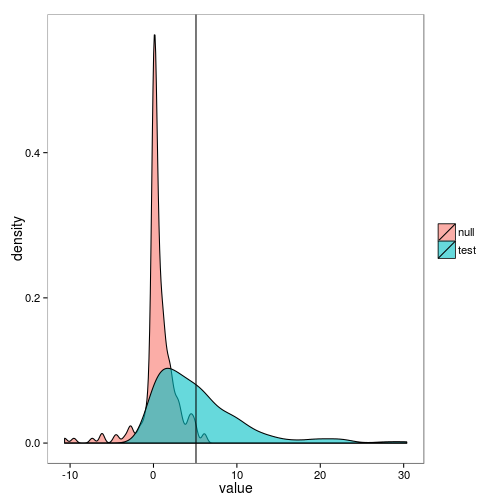
A helper function extracts the likelihood ratios under each of the pairwise comparisons (The null distribution: -2 times the log likelihood of data fit under A that had been simulated under A, minus the log likelihood of fits under A simulated under B; and the test distribution: fit under B when simulated under A, minus the loglikehood of being fit under B, simulated under B) as a data frame. we show the top of the data frame as output below.
lr <- lik_ratios(reps)
head(lr)
##   simulation rep     value
## 1       null   1  0.001659
## 2       test   1  2.255139
## 3       null   2  1.892615
## 4       test   2  9.804084
## 5       null   3  4.795269
## 6       test   3 22.696982
We use this data to generate the overlapping distributions shown in Boettiger & Hastings, (2012),
ggplot(lr) + geom_density(aes(value, fill=simulation), alpha=0.6) + geom_vline(aes(xintercept=observed))
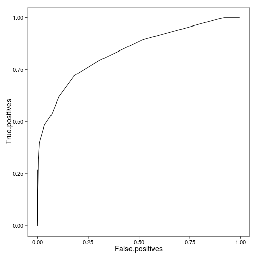
A second helper function generates the ROC curve from the likelihood ratio data, providing an alternative way to visualize this overlap:
roc <- roc_data(lr)
ggplot(roc) + geom_line(aes(False.positives, True.positives))
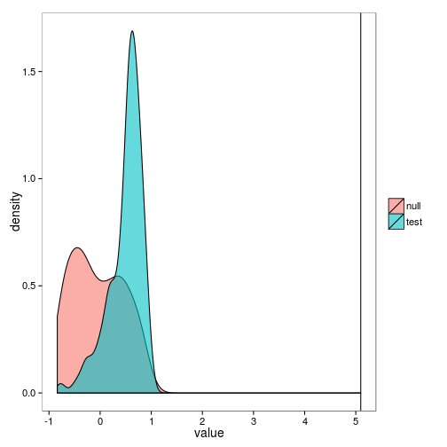
ROC curves are particularly useful in comparing the power of a variety of approaches. For instance, we can compare the performance of the likelihood-based signal shown above to the traditional approach of using a correlation coefficient to detect the increase in some summary statistic such as variance or autocorrelation. To obtain replicates, we will still simulate under the null (OU) and test (LSN) models estimated above, but instead of computing the likelihood of these data, we will estimate the commonly used rank correlation coefficient, Kendall's tau, to quantify the increase in variance, autcorrelation, and skew observed in a moving window over the data.
var <- bootstrap_trend(ibm_critical, window_var, method="kendall", rep=200)
acor <- bootstrap_trend(ibm_critical, window_autocorr, method="kendall", rep=200)
skew <- bootstrap_trend(ibm_critical, window_skew, method="kendall", rep=200)
These data are formatted like the likeihood ratio data above, only that the statistic is now Kendall's tau.
ggplot(var) + geom_density(aes(value, fill=simulation), alpha=0.6) + geom_vline(aes(xintercept=observed))
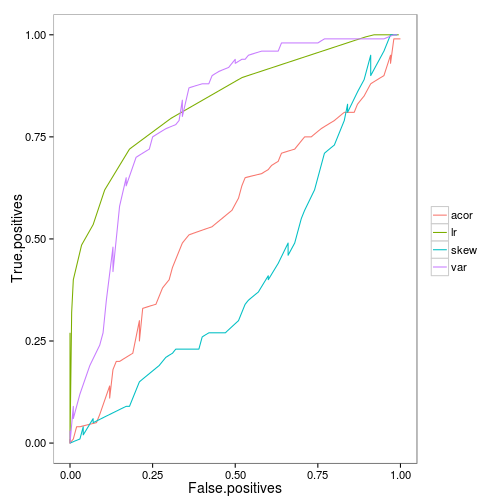
We can combine the data for the ROC curves of each indicator to compare:
indicators <- melt(list(var = roc_data(var), acor = roc_data(acor), skew = roc_data(skew), lr = roc), id = c("Threshold", "False.positives", "True.positives"))
ggplot(indicators) + geom_line(aes(False.positives, True.positives, color=L1))
cboettig/earlywarning documentation built on May 13, 2019, 2:07 p.m.
R Package Documentation
Browse R Packages
We want your feedback!
Note that we can't provide technical support on individual packages. You should contact the package authors for that.
We will need the following libraries to run this example. If you don't have them, they can be installed from CRAN using the install.packages function.
## Loading required package: bibtex
library(ggplot2)
library(reshape2)
library(multicore)
library(devtools)
We will be using custom functions provided in the R package Boettiger, (2012) that accompanies Boettiger & Hastings, (2012), which can be installed directly from the development repository on GitHub:
install_github("earlywarning", "cboettig")
library(earlywarning)
We begin by loading the ibm_critical data provided by Drake & Griffen, (2010). We plot the raw data to take a look at it.
data("ibms")
plot(ibm_critical, type="b")
Fit both models to the original data, record the observed likelihood ratio of the original data
A <- stability_model(ibm_critical, "OU")
B <- stability_model(ibm_critical, "LSN")
observed <- -2 * (logLik(A) - logLik(B))
Perform the bootstrapped model comparison on the parallel cluster.
runtime <- system.time(
reps <- mclapply(1:200, function(i) compare(A, B)))
Which took 4176.78 seconds to run for the example shown here.
A helper function extracts the likelihood ratios under each of the pairwise comparisons (The null distribution: -2 times the log likelihood of data fit under A that had been simulated under A, minus the log likelihood of fits under A simulated under B; and the test distribution: fit under B when simulated under A, minus the loglikehood of being fit under B, simulated under B) as a data frame. we show the top of the data frame as output below.
lr <- lik_ratios(reps)
head(lr)
## simulation rep value
## 1 null 1 0.001659
## 2 test 1 2.255139
## 3 null 2 1.892615
## 4 test 2 9.804084
## 5 null 3 4.795269
## 6 test 3 22.696982
We use this data to generate the overlapping distributions shown in Boettiger & Hastings, (2012),
ggplot(lr) + geom_density(aes(value, fill=simulation), alpha=0.6) + geom_vline(aes(xintercept=observed))
A second helper function generates the ROC curve from the likelihood ratio data, providing an alternative way to visualize this overlap:
roc <- roc_data(lr)
ggplot(roc) + geom_line(aes(False.positives, True.positives))
ROC curves are particularly useful in comparing the power of a variety of approaches. For instance, we can compare the performance of the likelihood-based signal shown above to the traditional approach of using a correlation coefficient to detect the increase in some summary statistic such as variance or autocorrelation. To obtain replicates, we will still simulate under the null (OU) and test (LSN) models estimated above, but instead of computing the likelihood of these data, we will estimate the commonly used rank correlation coefficient, Kendall's tau, to quantify the increase in variance, autcorrelation, and skew observed in a moving window over the data.
var <- bootstrap_trend(ibm_critical, window_var, method="kendall", rep=200)
acor <- bootstrap_trend(ibm_critical, window_autocorr, method="kendall", rep=200)
skew <- bootstrap_trend(ibm_critical, window_skew, method="kendall", rep=200)
These data are formatted like the likeihood ratio data above, only that the statistic is now Kendall's tau.
ggplot(var) + geom_density(aes(value, fill=simulation), alpha=0.6) + geom_vline(aes(xintercept=observed))
We can combine the data for the ROC curves of each indicator to compare:
indicators <- melt(list(var = roc_data(var), acor = roc_data(acor), skew = roc_data(skew), lr = roc), id = c("Threshold", "False.positives", "True.positives"))
ggplot(indicators) + geom_line(aes(False.positives, True.positives, color=L1))
R Package Documentation
Browse R Packages
We want your feedback!
Note that we can't provide technical support on individual packages. You should contact the package authors for that.
Embedding an R snippet on your website
Add the following code to your website.
For more information on customizing the embed code, read Embedding Snippets.