README.md
In maczokni/selfquant: This package is for creating a quantified self tracker using google sheets, and for pulling, displaying, and archiving the data collected with it.
selfquant
NOTE: We're still working on updating this package frequently, so please make sure you have the most recent version installed by using
devtools::install_github('maczokni/selfquant')
This is a package for getting data from our quantified self template on google sheets, to keep track of your weekly performance in various categories. The game is primarily designed to keep you engaged and feeling rewarded for building good habits.
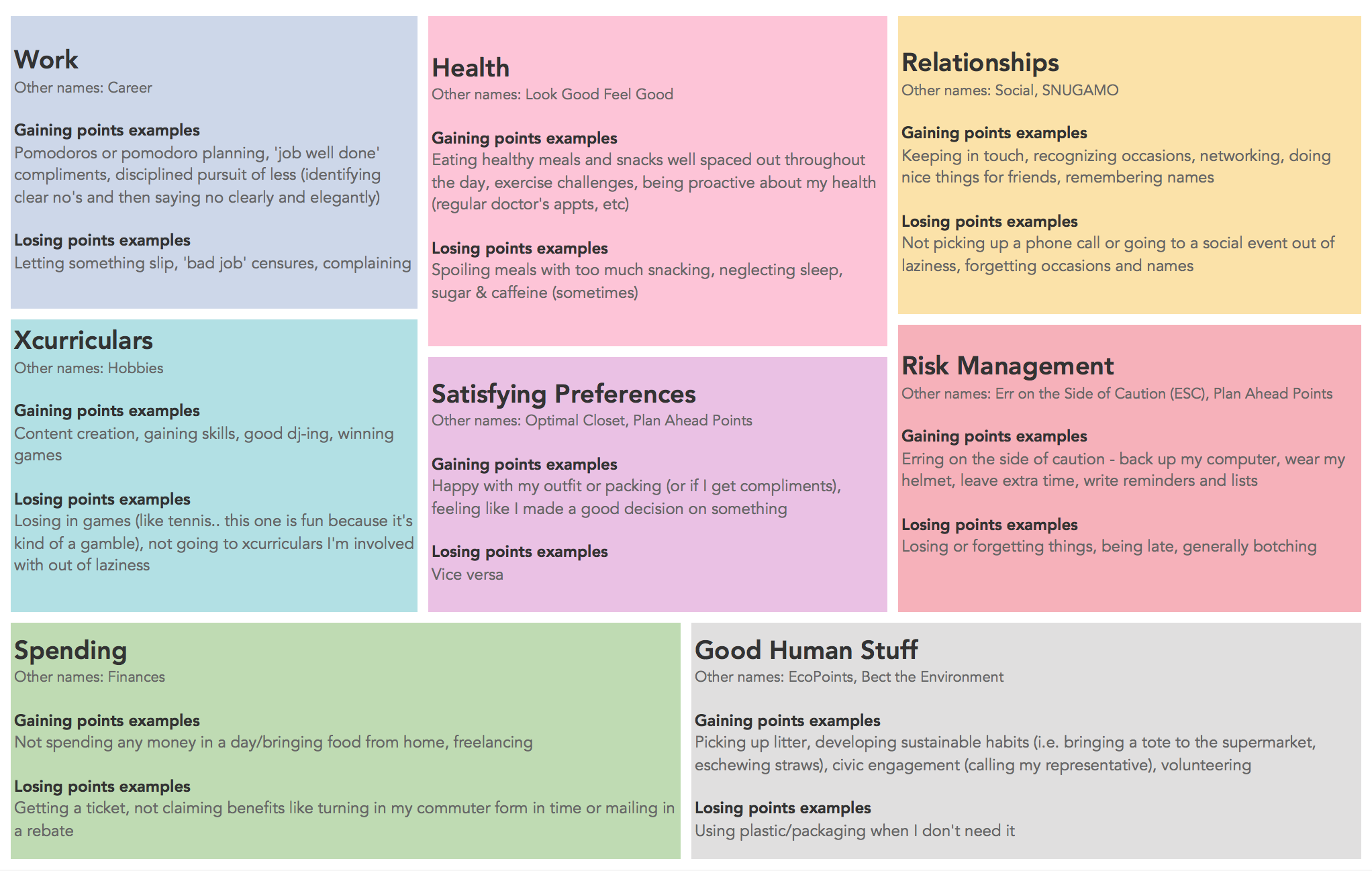
These categories include:
To get started:
1 - Download these packages:
- This project uses:
- google sheets, so you will need the googlesheets package.
- dplyr
- tidyr
- ggplot2
- plotly
- ohicore # devtools::install_github(‘ohi-science/ohicore’)
2 - Get authorisation to your sheets:
- To give access to your sheets, you have to (after intalling google sheets) run the following command (from the googlesheets package) in R:
- (my_sheets <- gs_ls())
- This will open a window where you have to click "Yes" to some permissions.
Then you can use the functions in this package to get your weekly stats, visualise them in a report/ dashboard/ whatever out output is, and archive your points.
Example workflow
You can create a template for recording points (both plus and minus points) about the 9 specified metrics by using the createSqTemplate function:
createSqTemplate()
It will create a sheet called Self Quant with a worksheet in it called Template.

You can now fill this out for the next 4 weeks. Every time you do something good in a particular area, for example you go above and beyond at work, you update the relevant cell by adding a point. On the other hand, if you do something bad, like miss a deadline, you would add a point to the negative column. As humans, we're often fluctuating between congratulating ourselves and being frustrated at ourselves. Tracking allows you to capture the experience as a data point and move on.
To make this truly work, the most important (and most lucrative) system you'll need to add into your life is a Weekly Review. See more here.
Once you have completed this for 4 weeks, you can read in your data, for some fun plotting.
You do this using the getQuant function. So if you have this sheet in your google sheets:
https://docs.google.com/spreadsheets/d/1ulmrOuD2_jCYJ4TxTVcNZCPqUVR5wxx6DoXW_uz-6lk/edit?usp=sharing
You can read this in with:
sq_data <- getQuant(title="Self Quant", workSheet = "Template")
Now you have the dataframe of your points, and some additional summary columns. These are the net scores for each week (good scores - bad scores) and the good to bad ratio (good scores/ bad scores).
So now you can plot your results. You can look at variation in your net scores over the past 4 weeks by using the plotWeek function:
plotWeek(sq_summary = sq_data)

You can also look at the net score of good to bad points. This function looks at variation in your good to bad net score for each metric over the last 4 weeks. Each petal of the flower represents one of the metrics. The score in the middle represents the total good to bad net score across all metrics. If it is greater than 0, then overall you have more good, and if it's smaller than 0, you have more bad. You create this withthe flowerPlot function:
plotFlower(sq_summary = sq_data)

Metrics that are empty are those where your score is zero or lower.
Generating a report
You can generate monthly reports from your data, by using our template. To load this, simply create a new rmarkdown document, select 'from templates' and find the selfquant report template:

This will load a rmarkdown doc with some instructions in there. You might get an error when knitting that tells you something like: oauth listener() needs an interactive environment rmarkdown. In this case, just run the bit of code highlighted in the markdown to create an oauth token. Once that exists your report should compile fine.
maczokni/selfquant documentation built on May 30, 2019, 9:54 p.m.
R Package Documentation
Browse R Packages
We want your feedback!
Note that we can't provide technical support on individual packages. You should contact the package authors for that.
selfquant
NOTE: We're still working on updating this package frequently, so please make sure you have the most recent version installed by using devtools::install_github('maczokni/selfquant')
This is a package for getting data from our quantified self template on google sheets, to keep track of your weekly performance in various categories. The game is primarily designed to keep you engaged and feeling rewarded for building good habits.
These categories include:
To get started:
1 - Download these packages: - This project uses: - google sheets, so you will need the googlesheets package. - dplyr - tidyr - ggplot2 - plotly - ohicore # devtools::install_github(‘ohi-science/ohicore’)
2 - Get authorisation to your sheets:
- To give access to your sheets, you have to (after intalling google sheets) run the following command (from the googlesheets package) in R:
- (my_sheets <- gs_ls())
- This will open a window where you have to click "Yes" to some permissions.
Then you can use the functions in this package to get your weekly stats, visualise them in a report/ dashboard/ whatever out output is, and archive your points.
Example workflow
You can create a template for recording points (both plus and minus points) about the 9 specified metrics by using the createSqTemplate function:
createSqTemplate()
It will create a sheet called Self Quant with a worksheet in it called Template.
You can now fill this out for the next 4 weeks. Every time you do something good in a particular area, for example you go above and beyond at work, you update the relevant cell by adding a point. On the other hand, if you do something bad, like miss a deadline, you would add a point to the negative column. As humans, we're often fluctuating between congratulating ourselves and being frustrated at ourselves. Tracking allows you to capture the experience as a data point and move on.
To make this truly work, the most important (and most lucrative) system you'll need to add into your life is a Weekly Review. See more here.
Once you have completed this for 4 weeks, you can read in your data, for some fun plotting.
You do this using the getQuant function. So if you have this sheet in your google sheets: https://docs.google.com/spreadsheets/d/1ulmrOuD2_jCYJ4TxTVcNZCPqUVR5wxx6DoXW_uz-6lk/edit?usp=sharing You can read this in with:
sq_data <- getQuant(title="Self Quant", workSheet = "Template")
Now you have the dataframe of your points, and some additional summary columns. These are the net scores for each week (good scores - bad scores) and the good to bad ratio (good scores/ bad scores).
So now you can plot your results. You can look at variation in your net scores over the past 4 weeks by using the plotWeek function:
plotWeek(sq_summary = sq_data)
You can also look at the net score of good to bad points. This function looks at variation in your good to bad net score for each metric over the last 4 weeks. Each petal of the flower represents one of the metrics. The score in the middle represents the total good to bad net score across all metrics. If it is greater than 0, then overall you have more good, and if it's smaller than 0, you have more bad. You create this withthe flowerPlot function:
plotFlower(sq_summary = sq_data)
Metrics that are empty are those where your score is zero or lower.
Generating a report
You can generate monthly reports from your data, by using our template. To load this, simply create a new rmarkdown document, select 'from templates' and find the selfquant report template:
This will load a rmarkdown doc with some instructions in there. You might get an error when knitting that tells you something like: oauth listener() needs an interactive environment rmarkdown. In this case, just run the bit of code highlighted in the markdown to create an oauth token. Once that exists your report should compile fine.
R Package Documentation
Browse R Packages
We want your feedback!
Note that we can't provide technical support on individual packages. You should contact the package authors for that.
Embedding an R snippet on your website
Add the following code to your website.
For more information on customizing the embed code, read Embedding Snippets.