In radiant-rstats/radiant.data: Data Menu for Radiant: Business Analytics using R and Shiny
Visualize data
Filter data
Use the Filter data box to select (or omit) specific sets of rows from the data. See the help file for Data > View for details.
Plot-type
Select the plot type you want. For example, with the diamonds data loaded select Distribution and all (X) variables (use CTRL-a or CMD-a). This will create a histogram for all numeric variables and a bar-plot for all categorical variables in the data set. Density plots can only be used with numeric variables. Scatter plots are used to visualize the relationship between two variables. Select one or more variables to plot on the Y-axis and one or more variables to plot on the X-axis. If one of the variables is categorical (i.e., a {factor}) it should be specified as an X-variable. Information about additional variables can be added through the Color or Size dropdown. Line plots are similar to scatter plots but they connect-the-dots and are particularly useful for time-series data. Surface plots are similar to Heat maps and require 3 input variables: X, Y, and Fill. Bar plots are used to show the relationship between a categorical (or integer) variable (X) and the (mean) value of a numeric variable (Y). Box-plots are also used when we have a numeric Y-variable and a categorical X-variable. They are more informative than bar charts but also require a bit more effort to evaluate.
Note that when a categorical variable (factor) is selected as the Y-variable in a Bar chart it will be converted to a numeric variable if required for the selected function. If the factor levels are numeric these will be used in all calculations. Since the mean, standard deviation, etc. are not relevant for non-binary categorical variables, these will be converted to 0-1 (binary) variables where the first level is coded as 1 and all other levels as 0. For example, if we select color from the diamonds data as the Y-variable, and mean as the function to apply, then each bar will represent the proportion of observations with the value D.
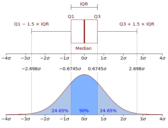
Box plots
The upper and lower "hinges" of the box correspond to the first and third quartiles (the 25th and 75th percentiles) in the data. The middle hinge is the median value of the data. The upper whisker extends from the upper hinge (i.e., the top of the box) to the highest value in the data that is within 1.5 x IQR of the upper hinge. IQR is the inter-quartile range, or distance, between the 25th and 75th percentile. The lower whisker extends from the lower hinge to the lowest value in the data within 1.5 x IQR of the lower hinge. Data beyond the end of the whiskers could be outliers and are plotted as points (as suggested by Tukey).
In sum:
1. The lower whisker extends from Q1 to max(min(data), Q1 - 1.5 x IQR)
2. The upper whisker extends from Q3 to min(max(data), Q3 + 1.5 x IQR)
where Q1 is the 25th percentile and Q3 is the 75th percentile. You may have to read the two bullets above a few times before it sinks in. The plot below should help to explain the structure of the box plot.
Sub-plots and heat-maps
Facet row and Facet column can be used to split the data into different groups and create separate plots for each group.
If you select a scatter or line plot a Color drop-down will be shown. Selecting a Color variable will create a type of heat-map where the colors are linked to the values of the Color variable. Selecting a categorical variable from the Color dropdown for a line plot will split the data into groups and will show a line of a different color for each group.
Line, loess, and jitter
To add a linear or non-linear regression line to a scatter plot check the Line and/or Loess boxes. If your data take on a limited number of values, Jitter can be useful to get a better feel for where most of the data points are located. Jitter-ing simply adds a small random value to each data point so they do not overlap completely in the plot(s).
Axis scale
The relationship between variables depicted in a scatter plot may be non-linear. There are numerous transformations we might apply to the data so this relationship becomes (approximately) linear (see Data > Transform) and easier to estimate using, for example, Model > Estimate > Linear regression (OLS). Perhaps the most common data transformation applied to business data is the (natural) logarithm. To see if log transformation(s) may be appropriate for your data check the Log X and/or Log Y boxes (e.g., for a scatter or bar plot).
By default the scale of the Y-axis is the same across sub-plots when using Facet row. To allow the Y-axis to be specific to each sub-plot click the Scale-y check-box.
Flip axes
To switch the variables on the X- and Y-axis check the Flip box.
Plot height and width
To make plots bigger or smaller adjust the values in the height and width boxes on the bottom left of the screen.
Keep plots
The best way to keep/store plots is to generate a visualize command by clicking the report () icon on the bottom left of your screen or by pressing ALT-enter on your keyboard. Alternatively, click the icon on the top right of your screen to save a png-file to disk.
Customizing plots in Report > Rmd
To customize a plot first generate the visualize command by clicking the report () icon on the bottom left of your screen or by pressing ALT-enter on your keyboard. The example below illustrates how to customize a command in the Report > Rmd tab. Notice that custom is set to TRUE.
visualize(diamonds, yvar = "price", xvar = "carat", type = "scatter", custom = TRUE) +
  labs(
    title = "A scatterplot",
    y = "Price in $",
    x = "Carats"
  )
The default resolution for plots is 144 dots per inch (dpi). You can change this setting up or down in Report > Rmd. For example, the code-chunk header below ensures the plot will be 7" wide, 3.5" tall, with a resolution of 600 dpi.
```r
If you have the svglite package installed, the code-chunk header below will produce graphs in high quality svg format.
```r
Some common customization commands:
- Add a title:
+ labs(title = "my title")
- Add a sub-title:
+ labs(subtitle = "my sub-title")
- Add a caption below figure:
+ labs(caption = "Based on data from ...")
- Change label:
+ labs(x = "my X-axis label") or + labs(y = "my Y-axis label")
- Remove all legends:
+ theme(legend.position = "none")
- Change legend title:
+ labs(color = "New legend title") or + labs(fill = "New legend title")
- Rotate tick labels:
+ theme(axis.text.x = element_text(angle = 90, hjust = 1))
- Set plot limits:
+ ylim(5000, 8000) or + xlim("VS1","VS2")
- Remove size legend:
+ scale_size(guide = "none")
- Change size range:
+ scale_size(range=c(1,6))
- Draw a horizontal line:
+ geom_hline(yintercept = 0.1)
- Draw a vertical line:
+ geom_vline(xintercept = 8)
- Scale the y-axis as a percentage:
+ scale_y_continuous(labels = scales::percent)
- Scale the y-axis in millions:
+ scale_y_continuous(labels = scales::unit_format(unit = "M", scale = 1e-6))
- Display y-axis in \$'s:
+ scale_y_continuous(labels = scales::dollar_format())
- Use
, as a thousand separator for the y-axis: + scale_y_continuous(labels = scales::comma)
For more on how to customize plots for communication see http://r4ds.had.co.nz/graphics-for-communication.html.
See also the ggplot2 documentation site https://ggplot2.tidyverse.org.
Suppose we create a set of three bar charts in Data > Visualize using the Diamond data. To add a title above the group of plots and impose a one-column layout we could use patchwork as follows:
library(patchwork)
plot_list <- visualize(
  diamonds,
  xvar = c("clarity", "cut", "color"),
  yvar = "price",
  type = "bar",
  custom = TRUE
)
wrap_plots(plot_list, ncol = 1) + plot_annotation(title = "Three bar plots")
See the patchwork documentation site for additional information on how to customize groups of plots.
Making plots interactive in Report > Rmd
It is possible to transform (most) plots generated in Radiant into interactive graphics using the plotly library. After setting custom = TRUE you can use the ggplotly function to convert a single plot. See example below:
visualize(diamonds, xvar = "price", custom = TRUE) %>%
  ggplotly() %>%
  render()
If more than one plot is created, you can use the subplot function from the plotly package. Provide a value for the nrows argument to setup the plot layout grid. In the example below four plots are created. Because nrow = 2 the plots will be displayed in a 2 X 2 grid.
visualize(diamonds, xvar = c("carat", "clarity", "cut", "color"), custom = TRUE) %>%
  subplot(nrows = 2) %>%
  render()
For additional information on the plotly library see the links below:
- Getting started: https://plot.ly/r/getting-started/
- Reference: https://plot.ly/r/reference/
- Book: https://cpsievert.github.io/plotly_book
- Code: https://github.com/ropensci/plotly
R-functions
For an overview of related R-functions used by Radiant to visualize data see Data > Visualize
radiant-rstats/radiant.data documentation built on Jan. 19, 2024, 12:21 p.m.
R Package Documentation
Browse R Packages
We want your feedback!
Note that we can't provide technical support on individual packages. You should contact the package authors for that.
Visualize data
Filter data
Use the Filter data box to select (or omit) specific sets of rows from the data. See the help file for Data > View for details.
Plot-type
Select the plot type you want. For example, with the diamonds data loaded select Distribution and all (X) variables (use CTRL-a or CMD-a). This will create a histogram for all numeric variables and a bar-plot for all categorical variables in the data set. Density plots can only be used with numeric variables. Scatter plots are used to visualize the relationship between two variables. Select one or more variables to plot on the Y-axis and one or more variables to plot on the X-axis. If one of the variables is categorical (i.e., a {factor}) it should be specified as an X-variable. Information about additional variables can be added through the Color or Size dropdown. Line plots are similar to scatter plots but they connect-the-dots and are particularly useful for time-series data. Surface plots are similar to Heat maps and require 3 input variables: X, Y, and Fill. Bar plots are used to show the relationship between a categorical (or integer) variable (X) and the (mean) value of a numeric variable (Y). Box-plots are also used when we have a numeric Y-variable and a categorical X-variable. They are more informative than bar charts but also require a bit more effort to evaluate.
Note that when a categorical variable (
factor) is selected as theY-variablein a Bar chart it will be converted to a numeric variable if required for the selected function. If the factor levels are numeric these will be used in all calculations. Since the mean, standard deviation, etc. are not relevant for non-binary categorical variables, these will be converted to 0-1 (binary) variables where the first level is coded as 1 and all other levels as 0. For example, if we selectcolorfrom thediamondsdata as the Y-variable, andmeanas the function to apply, then each bar will represent the proportion of observations with the valueD.
Box plots
The upper and lower "hinges" of the box correspond to the first and third quartiles (the 25th and 75th percentiles) in the data. The middle hinge is the median value of the data. The upper whisker extends from the upper hinge (i.e., the top of the box) to the highest value in the data that is within 1.5 x IQR of the upper hinge. IQR is the inter-quartile range, or distance, between the 25th and 75th percentile. The lower whisker extends from the lower hinge to the lowest value in the data within 1.5 x IQR of the lower hinge. Data beyond the end of the whiskers could be outliers and are plotted as points (as suggested by Tukey).
In sum: 1. The lower whisker extends from Q1 to max(min(data), Q1 - 1.5 x IQR) 2. The upper whisker extends from Q3 to min(max(data), Q3 + 1.5 x IQR)
where Q1 is the 25th percentile and Q3 is the 75th percentile. You may have to read the two bullets above a few times before it sinks in. The plot below should help to explain the structure of the box plot.
Sub-plots and heat-maps
Facet row and Facet column can be used to split the data into different groups and create separate plots for each group.
If you select a scatter or line plot a Color drop-down will be shown. Selecting a Color variable will create a type of heat-map where the colors are linked to the values of the Color variable. Selecting a categorical variable from the Color dropdown for a line plot will split the data into groups and will show a line of a different color for each group.
Line, loess, and jitter
To add a linear or non-linear regression line to a scatter plot check the Line and/or Loess boxes. If your data take on a limited number of values, Jitter can be useful to get a better feel for where most of the data points are located. Jitter-ing simply adds a small random value to each data point so they do not overlap completely in the plot(s).
Axis scale
The relationship between variables depicted in a scatter plot may be non-linear. There are numerous transformations we might apply to the data so this relationship becomes (approximately) linear (see Data > Transform) and easier to estimate using, for example, Model > Estimate > Linear regression (OLS). Perhaps the most common data transformation applied to business data is the (natural) logarithm. To see if log transformation(s) may be appropriate for your data check the Log X and/or Log Y boxes (e.g., for a scatter or bar plot).
By default the scale of the Y-axis is the same across sub-plots when using Facet row. To allow the Y-axis to be specific to each sub-plot click the Scale-y check-box.
Flip axes
To switch the variables on the X- and Y-axis check the Flip box.
Plot height and width
To make plots bigger or smaller adjust the values in the height and width boxes on the bottom left of the screen.
Keep plots
The best way to keep/store plots is to generate a visualize command by clicking the report () icon on the bottom left of your screen or by pressing ALT-enter on your keyboard. Alternatively, click the icon on the top right of your screen to save a png-file to disk.
Customizing plots in Report > Rmd
To customize a plot first generate the visualize command by clicking the report () icon on the bottom left of your screen or by pressing ALT-enter on your keyboard. The example below illustrates how to customize a command in the Report > Rmd tab. Notice that custom is set to TRUE.
visualize(diamonds, yvar = "price", xvar = "carat", type = "scatter", custom = TRUE) + labs( title = "A scatterplot", y = "Price in $", x = "Carats" )
The default resolution for plots is 144 dots per inch (dpi). You can change this setting up or down in Report > Rmd. For example, the code-chunk header below ensures the plot will be 7" wide, 3.5" tall, with a resolution of 600 dpi.
```r
If you have the svglite package installed, the code-chunk header below will produce graphs in high quality svg format.
```r
Some common customization commands:
- Add a title:
+ labs(title = "my title") - Add a sub-title:
+ labs(subtitle = "my sub-title") - Add a caption below figure:
+ labs(caption = "Based on data from ...") - Change label:
+ labs(x = "my X-axis label")or+ labs(y = "my Y-axis label") - Remove all legends:
+ theme(legend.position = "none") - Change legend title:
+ labs(color = "New legend title")or+ labs(fill = "New legend title") - Rotate tick labels:
+ theme(axis.text.x = element_text(angle = 90, hjust = 1)) - Set plot limits:
+ ylim(5000, 8000)or+ xlim("VS1","VS2") - Remove size legend:
+ scale_size(guide = "none") - Change size range:
+ scale_size(range=c(1,6)) - Draw a horizontal line:
+ geom_hline(yintercept = 0.1) - Draw a vertical line:
+ geom_vline(xintercept = 8) - Scale the y-axis as a percentage:
+ scale_y_continuous(labels = scales::percent) - Scale the y-axis in millions:
+ scale_y_continuous(labels = scales::unit_format(unit = "M", scale = 1e-6)) - Display y-axis in \$'s:
+ scale_y_continuous(labels = scales::dollar_format()) - Use
,as a thousand separator for the y-axis:+ scale_y_continuous(labels = scales::comma)
For more on how to customize plots for communication see http://r4ds.had.co.nz/graphics-for-communication.html.
See also the ggplot2 documentation site https://ggplot2.tidyverse.org.
Suppose we create a set of three bar charts in Data > Visualize using the Diamond data. To add a title above the group of plots and impose a one-column layout we could use patchwork as follows:
library(patchwork) plot_list <- visualize( diamonds, xvar = c("clarity", "cut", "color"), yvar = "price", type = "bar", custom = TRUE ) wrap_plots(plot_list, ncol = 1) + plot_annotation(title = "Three bar plots")
See the patchwork documentation site for additional information on how to customize groups of plots.
Making plots interactive in Report > Rmd
It is possible to transform (most) plots generated in Radiant into interactive graphics using the plotly library. After setting custom = TRUE you can use the ggplotly function to convert a single plot. See example below:
visualize(diamonds, xvar = "price", custom = TRUE) %>% ggplotly() %>% render()
If more than one plot is created, you can use the subplot function from the plotly package. Provide a value for the nrows argument to setup the plot layout grid. In the example below four plots are created. Because nrow = 2 the plots will be displayed in a 2 X 2 grid.
visualize(diamonds, xvar = c("carat", "clarity", "cut", "color"), custom = TRUE) %>% subplot(nrows = 2) %>% render()
For additional information on the plotly library see the links below:
- Getting started: https://plot.ly/r/getting-started/
- Reference: https://plot.ly/r/reference/
- Book: https://cpsievert.github.io/plotly_book
- Code: https://github.com/ropensci/plotly
R-functions
For an overview of related R-functions used by Radiant to visualize data see Data > Visualize
R Package Documentation
Browse R Packages
We want your feedback!
Note that we can't provide technical support on individual packages. You should contact the package authors for that.
Embedding an R snippet on your website
Add the following code to your website.
For more information on customizing the embed code, read Embedding Snippets.