In Athanasiamo/swc.tidyverse: Introduction to Tidyverse
library(learnr)
library(gradethis)

knitr::opts_chunk$set(
  echo = FALSE,
  exercise.warn_invisible = FALSE
)

# enable code checking
tutorial_options(
  exercise.checker = grade_learnr,
  exercise.lines = 8,
  exercise.reveal_solution = TRUE
)
Introduction to the excercise tool
This is a tutorial page, made specifically for this course using the learnr package.
Here there are exercises you can work through to help you understand the topics we have covered.
Each exercise is in a small R-console within the tutorial.
These function as any R console, and you can interact with is as any R-session.
The R consoles have all of the tidyverse and the penguins dataset preloaded for you.
You can try that below, just to get acquainted with it.
For instance, try looking at the penguins dataset by typing penguins, or taking the mean of any column by typing mean(penguins$flipper_length_mm)
# Type in any command you like, and press "run".
# continue to the next section when you like
Challenge 1
1a
How does body mass change over time? What do you observe? Note that many points are plotted on top of each other. This is called "overplotting".
Make a scatter plot of the penguins data set with bill length on the x-axis and bill depth on the y.
ggplot(data = __) +
  geom_point(
    mapping = aes(x = __, y = __)
  )
ggplot(data = penguins) +
  geom_point(
    mapping = aes(x = year,
                  y = bill_length_mm)
  )
grade_code(
  correct = random_praise(),
  incorrect = random_encouragement()
)
The name of the data object is `penguins`
If you forgot the column names, try looking at the data by typing the
data object name `penguing` in the console and select "run".
1b
Try a different geom_ function called geom_jitter. It will spread the points apart a little bit using random noise.
ggplot(data = penguins) +
  geom___(mapping = aes(x = year,
                        y = __bill_length_mm))
ggplot(data = penguins) +
  geom_jitter(mapping = aes(x = year,
                            y = __bill_length_mm))
grade_code(
  correct = random_praise(),
  incorrect = random_encouragement()
)
The geom's name is `geom_jitter`
1c
See if you can visualize body mass by island. Which island tends to have higher body mass (notice the density of the points along the y-axis)? Lowest body mass? Which island has highest spread in body mass values? How about lowest spread?
ggplot(data = penguins) +
  geom_jitter(mapping = aes(x = __,
                            y = __bill_length_mm))
ggplot(data = penguins) +
  geom_jitter(mapping = aes(x = island,
                            y = __bill_length_mm))
grade_code(
  correct = random_praise(),
  incorrect = random_encouragement()
)
Try using `island` on the x axis.
Challenge 2
2a
What will happen if you switch the mappings of island and year in the previous example? Is the graph still useful? Why? Try mapping year to colour.
ggplot(data = penguins) +
  geom_jitter(
    mapping = aes(x = __,
                  y = __,
                  colour = __)
  )
ggplot(data = penguins) +
  geom_jitter(
    mapping = aes(x = bill_length_mm,
                  y = year,
                  colour = year)
  )
grade_code(
  correct = random_praise(),
  incorrect = random_encouragement()
)
Try using bill_length_mm on the x-axis and year on the y-axis.
Try adding year to colour
2b
What if you map colour aesthetic to species? What has changed? How is year different from species? What is the limitation of the colour aesthetic, when used to visualize different types of data?
ggplot(data = penguins) +
  geom_jitter(
    mapping = aes(x = bill_length_mm,
                  y = year,
                  colour = __)
  )
ggplot(data = penguins) +
  geom_jitter(
    mapping = aes(x = island,
                  y = bill_length_mm,
                  colour = species)
  )
grade_code(
  correct = random_praise(),
  incorrect = random_encouragement()
)
Try using `speces` for colour.
2c
Can you add a little colour to our initial graph of body mass by bill length? colour the points by island.
ggplot(data = penguins) +
  geom_jitter(
    mapping = aes(x = __,
                  y = __,
                  colour =__)
  )
ggplot(data = penguins) +
  geom_jitter(
    mapping = aes(x = body_mass_g,
                  y = bill_length_mm,
                  colour = island)
  )
grade_code(
  correct = random_praise(),
  incorrect = random_encouragement()
)
x = body_mass_g,
y = bill_length_mm,
colour = island
2d
How about using colour gradient to illustrate change over time?
ggplot(data = penguins) +
  geom_jitter(
    mapping = aes(x = body_mass_g,
                  y = bill_length_mm,
                  colour =__)
  )
ggplot(data = penguins) +
  geom_jitter(
    mapping = aes(x = body_mass_g,
                  y = bill_length_mm,
                  colour = year)
  )
grade_code(
  correct = random_praise(),
  incorrect = random_encouragement()
)
Try adding year to colour
Challenge 3
Blow your mind by visualizing five(!) dimensions in the same graph. Modify the previous example mapping year to colour and shape to island.
ggplot(data = penguins) +
  geom_point(
    mapping = aes(x = body_mass_g,
                  y = bill_length_mm,
                  colour = year,
                  __ = __,
                  __ = __)
  )
ggplot(data = penguins) +
  geom_point(
    mapping = aes(x = body_mass_g,
                  y = bill_length_mm,
                  colour = year,
                  shape = island,
                  size = bill_depth_mm)
  )
grade_code(
  correct = random_praise(),
  incorrect = random_encouragement()
)
Try adding island to shape
Try adding bill_depth_mm to size
Challenge 4
4a
Try mapping colour aesthetic to island and then to year. What do you notice? What might be the reason for different treatment of these variables by ggplot?
ggplot(data = penguins) +
  geom_point(
    mapping = aes(x = body_mass_g,
                  y = bill_length_mm,
                  colour = __)
  )
ggplot(data = penguins) +
  geom_point(
    mapping = aes(x = body_mass_g,
                  y = bill_length_mm,
                  colour = year)
  )
grade_code(
  correct = random_praise(),
  incorrect = random_encouragement()
)
Try adding island to colour, and then do the same for year.
4b
Change the transparency of the data points by year.
ggplot(data = penguins) +
  geom_point(
    mapping = aes(x = body_mass_g,
                  y = bill_length_mm,
                  alpha = __)
  )
ggplot(data = penguins) +
  geom_point(
    mapping = aes(x = body_mass_g,
                  y = bill_length_mm,
                  alpha = year)
  )
grade_code(
  correct = random_praise(),
  incorrect = random_encouragement()
)
Try adding year to alpha
4c
Move the transparency outside the aes() and set it to 0.7. What can be the benefit of each one of these methods?
ggplot(data = penguins) +
  geom_point(
    mapping = aes(x = body_mass_g,
                  y = bill_length_mm),
    __ = __)
ggplot(data = penguins) +
  geom_point(
    mapping = aes(x = body_mass_g,
                  y = bill_length_mm),
    alpha = 0.7)
grade_code(
  correct = random_praise(),
  incorrect = random_encouragement()
)
Try setting `alpha = 0.7` outside the `aes()`
4d
Run the below code, and see what is produces. Then, move the colour argument, with 'blue' in quotations, into the aes and see what happens. Did you expect that?
ggplot(data = penguins) +
  geom_point(
    mapping = aes(x = body_mass_g,
                  y = bill_length_mm),
    colour = "blue")
ggplot(data = penguins) +
  geom_point(
    mapping = aes(x = body_mass_g,
                  y = bill_length_mm,
                  colour = "blue")
    )
grade_code(
  correct = random_praise(),
  incorrect = random_encouragement()
)
move `colour = "blue"`, into the `aes()`
ggplot(data = penguins) +
  geom_point(
    mapping = aes(x = body_mass_g,
                  y = bill_length_mm,
                  colour = "blue")
    )
Solution
When an argument is placed inside an aes and remains quoted, like "red" here, ggplot is interpreting as a variable named "blue" and not the colour blue!
Challenge 5
5a
Modify the graph to force R to create single regression line for all data points. Keep the points coloured by island.
ggplot(data = penguins,
       mapping = aes(x = bill_depth_mm,
                     y = bill_length_mm,
                     colour = species)) +
  geom_point(mapping = aes(),
             alpha = 0.5) +
  geom_smooth(method = "lm")
ggplot(data = penguins,
       mapping = aes(x = bill_depth_mm,
                     y = bill_length_mm)) +
  geom_point(mapping = aes(colour = species),
             alpha = 0.5) +
  geom_smooth(method = "lm")
grade_code(
  correct = random_praise(),
  incorrect = random_encouragement()
)
Try moving `colour = island` into `geom_point()` `aes()`.
Solution
In the graph above, each geom inherited all three mappings: x, y and colour. If we want only single linear model to be built, we would need to limit the effect of colour aesthetic to only geom_point() function, by moving it from the "parent" function to the layer where we want it to apply. Note, though, that because we want the colour to be still mapped to the island variable, it needs to be wrapped into aes() function and supplied to mapping argument.
5b
Add a regression line to the plot that plots one line for each species, while also plotting one across all species. Make sure it is plotted below the one for all species. Make the regression line across all black.
ggplot(data = penguins,
       mapping = aes(x = bill_depth_mm,
                     y = bill_length_mm)) +
  geom_point(mapping = aes(colour = species),
             alpha = 0.5) +
  geom_smooth(method = "lm")
ggplot(data = penguins,
       mapping = aes(x = bill_depth_mm,
                     y = bill_length_mm)) +
  geom_point(mapping = aes(colour = species),
             alpha = 0.5) +
  geom_smooth(method = "lm", aes(colour = species)) +
  geom_smooth(method = "lm", colour = "black")
grade_code(
  correct = random_praise(),
  incorrect = random_encouragement()
)
Try moving `colour = island` into `geom_point()` `aes()`.
Solution
In the graph above, each geom inherited all three mappings: x, y and colour. If we want only single linear model to be built, we would need to limit the effect of colour aesthetic to only geom_point() function, by moving it from the "parent" function to the layer where we want it to apply. Note, though, that because we want the colour to be still mapped to the island variable, it needs to be wrapped into aes() function and supplied to mapping argument.
Challenge 6
6a
Make a boxplot of body mass by year. When was interquartile range of body mass the smallest?
ggplot(penguins) +
  geom___(
    mapping = aes(y = body_mass_g,
                  x = __)
  )
ggplot(penguins) +
  geom_boxplot(
    mapping = aes(y = body_mass_g,
                  x = year,
                  group = year)
  )
grade_code(
  correct = random_praise(),
  incorrect = random_encouragement()
)
You may need to do something with the `year` variable to force it to be categorical.
Try adding `year` to `group`
6b
Make a histogram of body_mass_g. What is the shape of the distribution? Try setting bin to 50. Why is the bin parameter important for interpretation of the histogram?
ggplot(penguins) +
  geom___(
    mapping = aes(x = body_mass_g)
  )
ggplot(penguins) +
  geom_histogram(
    mapping = aes(x = body_mass_g),
    bins = 50
  )
grade_code(
  correct = random_praise(),
  incorrect = random_encouragement()
)
Try setting bin to 50
6c
Build a density function. How would you compare density functions of different islands?
ggplot(penguins) +
  geom___(
    mapping = aes(x = body_mass_g)
  )
ggplot(penguins) +
  geom_density(
    mapping = aes(x = body_mass_g,
                  colour = island)
  )
grade_code(
  correct = random_praise(),
  incorrect = random_encouragement()
)
Try geom_density
Try using island to the colour argument
6d
Based on graph produced using geom_density2d() function of log bill length vs body mass, how many clusters of data points can you identify? What if you look at it by island?
ggplot(penguins) +
  geom___(
    mapping = aes(x = body_mass_g,
                  y = bill_length_mm,
                  colour = __)
  )
ggplot(penguins) +
  geom_density2d(
    mapping = aes(x = body_mass_g,
                  y = bill_length_mm,
                  colour = island)
  )
grade_code(
  correct = random_praise(),
  incorrect = random_encouragement()
)
Try geom_density2
Challenge 7
7a
Try faceting by year, keeping the linear smoother. Is there any change in slope of the linear trend over the years?
ggplot(data = penguins,
       mapping = aes(x = body_mass_g,
                     y = bill_length_mm)
) +
  geom_point() +
  geom_smooth(method = "lm") +
  __(~ __)
ggplot(data = penguins,
       mapping = aes(x = body_mass_g,
                     y = bill_length_mm)
) +
  geom_point() +
  geom_smooth(method = "lm") +
  facet_wrap(~ year)
grade_code(
  correct = random_praise(),
  incorrect = random_encouragement()
)
Try using the facet_wrap function
7b
What if you look at linear models per island?
ggplot(data = penguins,
       mapping = aes(x = body_mass_g,
                     y = bill_length_mm)
) +
  geom_point() +
  geom_smooth(method = "lm") +
  __( ~ __)
ggplot(data = penguins,
       mapping = aes(x = body_mass_g,
                     y = bill_length_mm)
) +
  geom_point() +
  geom_smooth(method = "lm") +
  facet_wrap( ~ island)
grade_code(
  correct = random_praise(),
  incorrect = random_encouragement()
)
Try using the facet_wrap function
Challenge 8
8a
Make a boxplot of body mass by year. What happens if you add factor() around year? What do you need to change in the scale_fill function to make it work?
ggplot(penguins) +
  geom_boxplot(
    mapping = aes(y = body_mass_g,
                  x = year,
                  fill = year)
  ) +
  scale_fill___()
ggplot(penguins) +
  geom_boxplot(
    mapping = aes(y = body_mass_g,
                  x = factor(year),
                  fill = factor(year))
  ) +
  scale_fill_viridis_d()
grade_code(
  correct = random_praise(),
  incorrect = random_encouragement()
)
try changing `year` to `factor(year)`
When year is a factor, we now need a colour palette that is "discrete" and not "continuous".
Try using `scale_fill_viridis_d()`.
8b
Make a histogram of body_mass_g? What is the shape of the distribution? Why is bin parameter important for interpretation of the histogram?
ggplot(penguins) +
  geom_boxplot(
    mapping = aes(y = body_mass_g,
                  x = year,
                  fill = year)
  ) +
  scale_fill___()
ggplot(penguins) +
  geom_point(mapping = aes(x = body_mass_g,
                           y = bill_length_mm,
                           colour = body_mass_g)) +
  scale_colour_viridis_c()
grade_code(
  correct = random_praise(),
  incorrect = random_encouragement()
)
try changing `year` to `factor(year)`
When year is a factor, we now need a colour palette that is "discrete" and not "continuous".
Try using `scale_fill_viridis_d()`.
8c
Build a density2d plot How would you compare density functions of different islands? Change the colour palette to brewer "Dark2".
ggplot(penguins)+
  geom_density2d(
    aes(x = body_mass_g,
        y = bill_length_mm)
  )
ggplot(penguins)+
  geom_density2d(
    aes(x = body_mass_g,
        y = bill_length_mm,
        colour = island)
  ) +
  scale_colour_brewer(palette = "Dark2")
grade_code(
  correct = random_praise(),
  incorrect = random_encouragement()
)
Try adding island to colour in the density aes.
Add `scale_colour_brewer(palette = "Dark2")` to alter the palette.
Challenge 9
9a: Create a plot and alter the theme. Try the dark theme, for instance!
ggplot(penguins) +
  geom_boxplot(
    mapping = aes(y = body_mass_g,
                  x = factor(year),
                  fill = factor(year))
  )
ggplot(penguins) +
  geom_boxplot(
    mapping = aes(y = body_mass_g,
                  x = factor(year),
                  fill = factor(year))
  ) +
  theme_dark()
grade_code(
  correct = random_praise(),
  incorrect = random_encouragement()
)
Try adding `theme_dark()` at the end
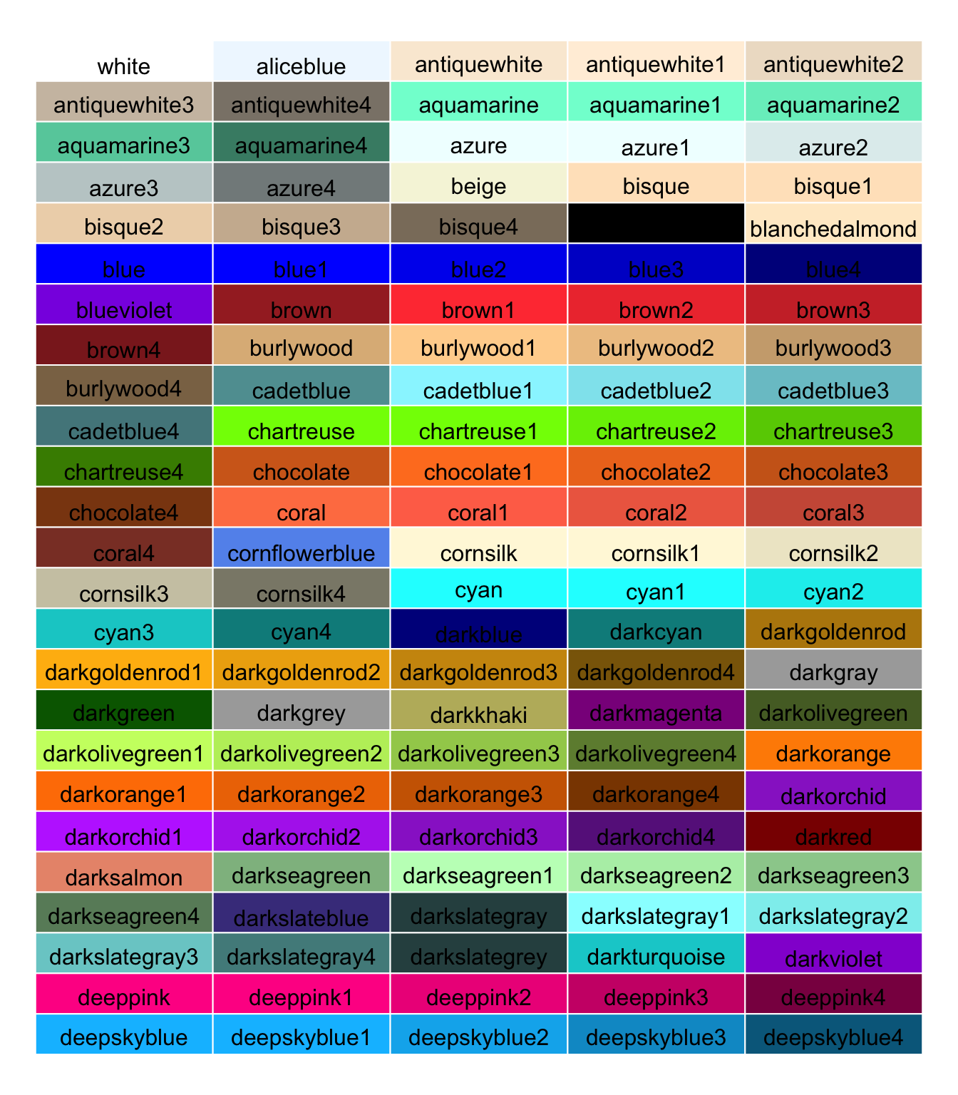
9b: Edit the theme and make the plot as ugly as you can! Use both the theme and scales for the colours to find the most horrible combinations!
You can find colour names in r at this link
ggplot(penguins) +
  geom_boxplot(
    mapping = aes(y = body_mass_g,
                  x = factor(year),
                  fill = factor(year))
  ) +
  theme_dark() +
  theme(
    legend.background = element_rect(fill = "_"),
    plot.background = element_rect(fill = "_"),
    panel.grid = element_line(colour = "_"),
    panel.background = element_rect(fill = "_")
  )
There are lots of R users on twitter that love seeing these horrible plots.
Share your monster with the twitter world, if you want in on the R-fun on twitter.
Make sure to use the #Rstats and #uiocarpentry hashtags, and also tag @swcarpentry.
Quiz
quiz(
  question("When you want to fix a ggplot aesthetic to a single value, you do this by...",
           answer("'mapping' values using the `aes()` function"),
           answer("adapting extra plot appearence through themes and scales"),
           answer("'setting' values outside the `aes()` function", correct = TRUE),
           allow_retry = TRUE
  ),

  question("When you want to make a ggplot aesthetic to a vary based on columns in the data set, you do this by...",
           answer("'mapping' values using the `aes()` function", correct = TRUE),
           answer("adapting extra plot appearence through themes and scales"),
           answer("'setting' values outside the `aes()` function"),
           allow_retry = TRUE
  ),

  question("When you want to alter  the 'look' of a ggplot, you do this by...",
           answer("'mapping' values using the `aes()` function"),
           answer("adapting extra plot appearence through themes and scales", correct = TRUE),
           answer("'setting' values outside the `aes()` function"),
           allow_retry = TRUE)
)
Athanasiamo/swc.tidyverse documentation built on Dec. 17, 2021, 9:48 a.m.
R Package Documentation
Browse R Packages
We want your feedback!
Note that we can't provide technical support on individual packages. You should contact the package authors for that.
library(learnr) library(gradethis) knitr::opts_chunk$set( echo = FALSE, exercise.warn_invisible = FALSE ) # enable code checking tutorial_options( exercise.checker = grade_learnr, exercise.lines = 8, exercise.reveal_solution = TRUE )
Introduction to the excercise tool
This is a tutorial page, made specifically for this course using the learnr package. Here there are exercises you can work through to help you understand the topics we have covered. Each exercise is in a small R-console within the tutorial. These function as any R console, and you can interact with is as any R-session. The R consoles have all of the tidyverse and the penguins dataset preloaded for you.
You can try that below, just to get acquainted with it.
For instance, try looking at the penguins dataset by typing penguins, or taking the mean of any column by typing mean(penguins$flipper_length_mm)
# Type in any command you like, and press "run". # continue to the next section when you like
Challenge 1
1a
How does body mass change over time? What do you observe? Note that many points are plotted on top of each other. This is called "overplotting".
Make a scatter plot of the penguins data set with bill length on the x-axis and bill depth on the y.
ggplot(data = __) + geom_point( mapping = aes(x = __, y = __) )
ggplot(data = penguins) + geom_point( mapping = aes(x = year, y = bill_length_mm) )
grade_code( correct = random_praise(), incorrect = random_encouragement() )
The name of the data object is `penguins`
If you forgot the column names, try looking at the data by typing the
data object name `penguing` in the console and select "run".
1b
Try a different
geom_function calledgeom_jitter. It will spread the points apart a little bit using random noise.
ggplot(data = penguins) + geom___(mapping = aes(x = year, y = __bill_length_mm))
ggplot(data = penguins) + geom_jitter(mapping = aes(x = year, y = __bill_length_mm))
grade_code( correct = random_praise(), incorrect = random_encouragement() )
The geom's name is `geom_jitter`
1c
See if you can visualize body mass by island. Which island tends to have higher body mass (notice the density of the points along the y-axis)? Lowest body mass? Which island has highest spread in body mass values? How about lowest spread?
ggplot(data = penguins) + geom_jitter(mapping = aes(x = __, y = __bill_length_mm))
ggplot(data = penguins) + geom_jitter(mapping = aes(x = island, y = __bill_length_mm))
grade_code( correct = random_praise(), incorrect = random_encouragement() )
Try using `island` on the x axis.
Challenge 2
2a
What will happen if you switch the mappings of
islandandyearin the previous example? Is the graph still useful? Why? Try mapping year to colour.
ggplot(data = penguins) + geom_jitter( mapping = aes(x = __, y = __, colour = __) )
ggplot(data = penguins) + geom_jitter( mapping = aes(x = bill_length_mm, y = year, colour = year) )
grade_code( correct = random_praise(), incorrect = random_encouragement() )
Try using bill_length_mm on the x-axis and year on the y-axis.
Try adding year to colour
2b
What if you map
colouraesthetic tospecies? What has changed? How isyeardifferent fromspecies? What is the limitation of thecolouraesthetic, when used to visualize different types of data?
ggplot(data = penguins) + geom_jitter( mapping = aes(x = bill_length_mm, y = year, colour = __) )
ggplot(data = penguins) + geom_jitter( mapping = aes(x = island, y = bill_length_mm, colour = species) )
grade_code( correct = random_praise(), incorrect = random_encouragement() )
Try using `speces` for colour.
2c
Can you add a little colour to our initial graph of body mass by bill length? colour the points by island.
ggplot(data = penguins) + geom_jitter( mapping = aes(x = __, y = __, colour =__) )
ggplot(data = penguins) + geom_jitter( mapping = aes(x = body_mass_g, y = bill_length_mm, colour = island) )
grade_code( correct = random_praise(), incorrect = random_encouragement() )
x = body_mass_g, y = bill_length_mm, colour = island
2d
How about using colour gradient to illustrate change over time?
ggplot(data = penguins) + geom_jitter( mapping = aes(x = body_mass_g, y = bill_length_mm, colour =__) )
ggplot(data = penguins) + geom_jitter( mapping = aes(x = body_mass_g, y = bill_length_mm, colour = year) )
grade_code( correct = random_praise(), incorrect = random_encouragement() )
Try adding year to colour
Challenge 3
Blow your mind by visualizing five(!) dimensions in the same graph. Modify the previous example mapping year to colour and shape to island.
ggplot(data = penguins) + geom_point( mapping = aes(x = body_mass_g, y = bill_length_mm, colour = year, __ = __, __ = __) )
ggplot(data = penguins) + geom_point( mapping = aes(x = body_mass_g, y = bill_length_mm, colour = year, shape = island, size = bill_depth_mm) )
grade_code( correct = random_praise(), incorrect = random_encouragement() )
Try adding island to shape
Try adding bill_depth_mm to size
Challenge 4
4a
Try mapping
colouraesthetic toislandand then toyear. What do you notice? What might be the reason for different treatment of these variables byggplot?
ggplot(data = penguins) + geom_point( mapping = aes(x = body_mass_g, y = bill_length_mm, colour = __) )
ggplot(data = penguins) + geom_point( mapping = aes(x = body_mass_g, y = bill_length_mm, colour = year) )
grade_code( correct = random_praise(), incorrect = random_encouragement() )
Try adding island to colour, and then do the same for year.
4b
Change the transparency of the data points by year.
ggplot(data = penguins) + geom_point( mapping = aes(x = body_mass_g, y = bill_length_mm, alpha = __) )
ggplot(data = penguins) + geom_point( mapping = aes(x = body_mass_g, y = bill_length_mm, alpha = year) )
grade_code( correct = random_praise(), incorrect = random_encouragement() )
Try adding year to alpha
4c
Move the transparency outside the
aes()and set it to0.7. What can be the benefit of each one of these methods?
ggplot(data = penguins) + geom_point( mapping = aes(x = body_mass_g, y = bill_length_mm), __ = __)
ggplot(data = penguins) + geom_point( mapping = aes(x = body_mass_g, y = bill_length_mm), alpha = 0.7)
grade_code( correct = random_praise(), incorrect = random_encouragement() )
Try setting `alpha = 0.7` outside the `aes()`
4d
Run the below code, and see what is produces. Then, move the colour argument, with 'blue' in quotations, into the aes and see what happens. Did you expect that?
ggplot(data = penguins) + geom_point( mapping = aes(x = body_mass_g, y = bill_length_mm), colour = "blue")
ggplot(data = penguins) + geom_point( mapping = aes(x = body_mass_g, y = bill_length_mm, colour = "blue") )
grade_code( correct = random_praise(), incorrect = random_encouragement() )
move `colour = "blue"`, into the `aes()`
ggplot(data = penguins) + geom_point( mapping = aes(x = body_mass_g, y = bill_length_mm, colour = "blue") )
Solution
When an argument is placed inside an aes and remains quoted, like "red" here, ggplot is interpreting as a variable named "blue" and not the colour blue!
Challenge 5
5a
Modify the graph to force R to create single regression line for all data points. Keep the points coloured by island.
ggplot(data = penguins, mapping = aes(x = bill_depth_mm, y = bill_length_mm, colour = species)) + geom_point(mapping = aes(), alpha = 0.5) + geom_smooth(method = "lm")
ggplot(data = penguins, mapping = aes(x = bill_depth_mm, y = bill_length_mm)) + geom_point(mapping = aes(colour = species), alpha = 0.5) + geom_smooth(method = "lm")
grade_code( correct = random_praise(), incorrect = random_encouragement() )
Try moving `colour = island` into `geom_point()` `aes()`.
Solution
In the graph above, each geom inherited all three mappings: x, y and colour. If we want only single linear model to be built, we would need to limit the effect of colour aesthetic to only geom_point() function, by moving it from the "parent" function to the layer where we want it to apply. Note, though, that because we want the colour to be still mapped to the island variable, it needs to be wrapped into aes() function and supplied to mapping argument.
5b
Add a regression line to the plot that plots one line for each species, while also plotting one across all species. Make sure it is plotted below the one for all species. Make the regression line across all black.
ggplot(data = penguins, mapping = aes(x = bill_depth_mm, y = bill_length_mm)) + geom_point(mapping = aes(colour = species), alpha = 0.5) + geom_smooth(method = "lm")
ggplot(data = penguins, mapping = aes(x = bill_depth_mm, y = bill_length_mm)) + geom_point(mapping = aes(colour = species), alpha = 0.5) + geom_smooth(method = "lm", aes(colour = species)) + geom_smooth(method = "lm", colour = "black")
grade_code( correct = random_praise(), incorrect = random_encouragement() )
Try moving `colour = island` into `geom_point()` `aes()`.
Solution
In the graph above, each geom inherited all three mappings: x, y and colour. If we want only single linear model to be built, we would need to limit the effect of colour aesthetic to only geom_point() function, by moving it from the "parent" function to the layer where we want it to apply. Note, though, that because we want the colour to be still mapped to the island variable, it needs to be wrapped into aes() function and supplied to mapping argument.
Challenge 6
6a
Make a boxplot of body mass by year. When was interquartile range of body mass the smallest?
ggplot(penguins) + geom___( mapping = aes(y = body_mass_g, x = __) )
ggplot(penguins) + geom_boxplot( mapping = aes(y = body_mass_g, x = year, group = year) )
grade_code( correct = random_praise(), incorrect = random_encouragement() )
You may need to do something with the `year` variable to force it to be categorical.
Try adding `year` to `group`
6b
Make a histogram of
body_mass_g. What is the shape of the distribution? Try setting bin to 50. Why is the bin parameter important for interpretation of the histogram?
ggplot(penguins) + geom___( mapping = aes(x = body_mass_g) )
ggplot(penguins) + geom_histogram( mapping = aes(x = body_mass_g), bins = 50 )
grade_code( correct = random_praise(), incorrect = random_encouragement() )
Try setting bin to 50
6c
Build a density function. How would you compare density functions of different islands?
ggplot(penguins) + geom___( mapping = aes(x = body_mass_g) )
ggplot(penguins) + geom_density( mapping = aes(x = body_mass_g, colour = island) )
grade_code( correct = random_praise(), incorrect = random_encouragement() )
Try geom_density
Try using island to the colour argument
6d
Based on graph produced using
geom_density2d()function of log bill length vs body mass, how many clusters of data points can you identify? What if you look at it by island?
ggplot(penguins) + geom___( mapping = aes(x = body_mass_g, y = bill_length_mm, colour = __) )
ggplot(penguins) + geom_density2d( mapping = aes(x = body_mass_g, y = bill_length_mm, colour = island) )
grade_code( correct = random_praise(), incorrect = random_encouragement() )
Try geom_density2
Challenge 7
7a
Try faceting by year, keeping the linear smoother. Is there any change in slope of the linear trend over the years?
ggplot(data = penguins, mapping = aes(x = body_mass_g, y = bill_length_mm) ) + geom_point() + geom_smooth(method = "lm") + __(~ __)
ggplot(data = penguins, mapping = aes(x = body_mass_g, y = bill_length_mm) ) + geom_point() + geom_smooth(method = "lm") + facet_wrap(~ year)
grade_code( correct = random_praise(), incorrect = random_encouragement() )
Try using the facet_wrap function
7b
What if you look at linear models per island?
ggplot(data = penguins, mapping = aes(x = body_mass_g, y = bill_length_mm) ) + geom_point() + geom_smooth(method = "lm") + __( ~ __)
ggplot(data = penguins, mapping = aes(x = body_mass_g, y = bill_length_mm) ) + geom_point() + geom_smooth(method = "lm") + facet_wrap( ~ island)
grade_code( correct = random_praise(), incorrect = random_encouragement() )
Try using the facet_wrap function
Challenge 8
8a
Make a boxplot of body mass by year. What happens if you add
factor()around year? What do you need to change in the scale_fill function to make it work?
ggplot(penguins) + geom_boxplot( mapping = aes(y = body_mass_g, x = year, fill = year) ) + scale_fill___()
ggplot(penguins) + geom_boxplot( mapping = aes(y = body_mass_g, x = factor(year), fill = factor(year)) ) + scale_fill_viridis_d()
grade_code( correct = random_praise(), incorrect = random_encouragement() )
try changing `year` to `factor(year)`
When year is a factor, we now need a colour palette that is "discrete" and not "continuous". Try using `scale_fill_viridis_d()`.
8b
Make a histogram of
body_mass_g? What is the shape of the distribution? Why is bin parameter important for interpretation of the histogram?
ggplot(penguins) + geom_boxplot( mapping = aes(y = body_mass_g, x = year, fill = year) ) + scale_fill___()
ggplot(penguins) + geom_point(mapping = aes(x = body_mass_g, y = bill_length_mm, colour = body_mass_g)) + scale_colour_viridis_c()
grade_code( correct = random_praise(), incorrect = random_encouragement() )
try changing `year` to `factor(year)`
When year is a factor, we now need a colour palette that is "discrete" and not "continuous". Try using `scale_fill_viridis_d()`.
8c
Build a density2d plot How would you compare density functions of different islands? Change the colour palette to brewer "Dark2".
ggplot(penguins)+ geom_density2d( aes(x = body_mass_g, y = bill_length_mm) )
ggplot(penguins)+ geom_density2d( aes(x = body_mass_g, y = bill_length_mm, colour = island) ) + scale_colour_brewer(palette = "Dark2")
grade_code( correct = random_praise(), incorrect = random_encouragement() )
Try adding island to colour in the density aes.
Add `scale_colour_brewer(palette = "Dark2")` to alter the palette.
Challenge 9
9a: Create a plot and alter the theme. Try the dark theme, for instance!
ggplot(penguins) + geom_boxplot( mapping = aes(y = body_mass_g, x = factor(year), fill = factor(year)) )
ggplot(penguins) + geom_boxplot( mapping = aes(y = body_mass_g, x = factor(year), fill = factor(year)) ) + theme_dark()
grade_code( correct = random_praise(), incorrect = random_encouragement() )
Try adding `theme_dark()` at the end
9b: Edit the theme and make the plot as ugly as you can! Use both the theme and scales for the colours to find the most horrible combinations! You can find colour names in r at this link
ggplot(penguins) + geom_boxplot( mapping = aes(y = body_mass_g, x = factor(year), fill = factor(year)) ) + theme_dark() + theme( legend.background = element_rect(fill = "_"), plot.background = element_rect(fill = "_"), panel.grid = element_line(colour = "_"), panel.background = element_rect(fill = "_") )
There are lots of R users on twitter that love seeing these horrible plots. Share your monster with the twitter world, if you want in on the R-fun on twitter. Make sure to use the #Rstats and #uiocarpentry hashtags, and also tag @swcarpentry.
Quiz
quiz( question("When you want to fix a ggplot aesthetic to a single value, you do this by...", answer("'mapping' values using the `aes()` function"), answer("adapting extra plot appearence through themes and scales"), answer("'setting' values outside the `aes()` function", correct = TRUE), allow_retry = TRUE ), question("When you want to make a ggplot aesthetic to a vary based on columns in the data set, you do this by...", answer("'mapping' values using the `aes()` function", correct = TRUE), answer("adapting extra plot appearence through themes and scales"), answer("'setting' values outside the `aes()` function"), allow_retry = TRUE ), question("When you want to alter the 'look' of a ggplot, you do this by...", answer("'mapping' values using the `aes()` function"), answer("adapting extra plot appearence through themes and scales", correct = TRUE), answer("'setting' values outside the `aes()` function"), allow_retry = TRUE) )
R Package Documentation
Browse R Packages
We want your feedback!
Note that we can't provide technical support on individual packages. You should contact the package authors for that.
Embedding an R snippet on your website
Add the following code to your website.
For more information on customizing the embed code, read Embedding Snippets.