vignette/ggallupVignette.md
In BillPetti/ggallup: This package loads custom ggplot themes and palettes that make creating graphs in R consistent with Gallup brand standards easier.
title: "ggallup Vignette"
author: "Bill Petti"
date: "December 2016"
output: html_document
Introduction
This package contains a custom ggplot2 theme that aligns with Gallup's general brand standards, as well as a custom palette that includes current colors that also align to Gallup's standards.
It includes three objects and two functions that are loaded when the package is loaded:
ggallup: A function to format ggplot2 objectsggallup_md: A function to format ggplot2 objects for use in rmarkdown documentstheme_gallup: A custom ggplot2 themetheme_gallup_md: The same custom theme as theme_gallup, but it has been tweaked to work better when producing rmarkdown documentsgallup_palette: A custom palette that has the current Gallup brand colors included
To see how they work, let's load some sample survey data and place each respondent into one of three groups:
```{r, warning=FALSE, message=FALSE}
sample_data <- read.csv("https://raw.githubusercontent.com/BillPetti/R-Crash-Course/master/survey_sample_data.csv")
head(sample_data)
set.seed(42)
sample_data$group <- sample(1:3, 116, replace = TRUE)
with(sample_data, table(group))
Now, let's load `ggplot2` and the `ggallup` packages:

```{r, warning=FALSE, message=FALSE}
require(ggplot2)
require(devtools)
install_github("BillPetti/ggallup", force = TRUE)
require(ggallup)
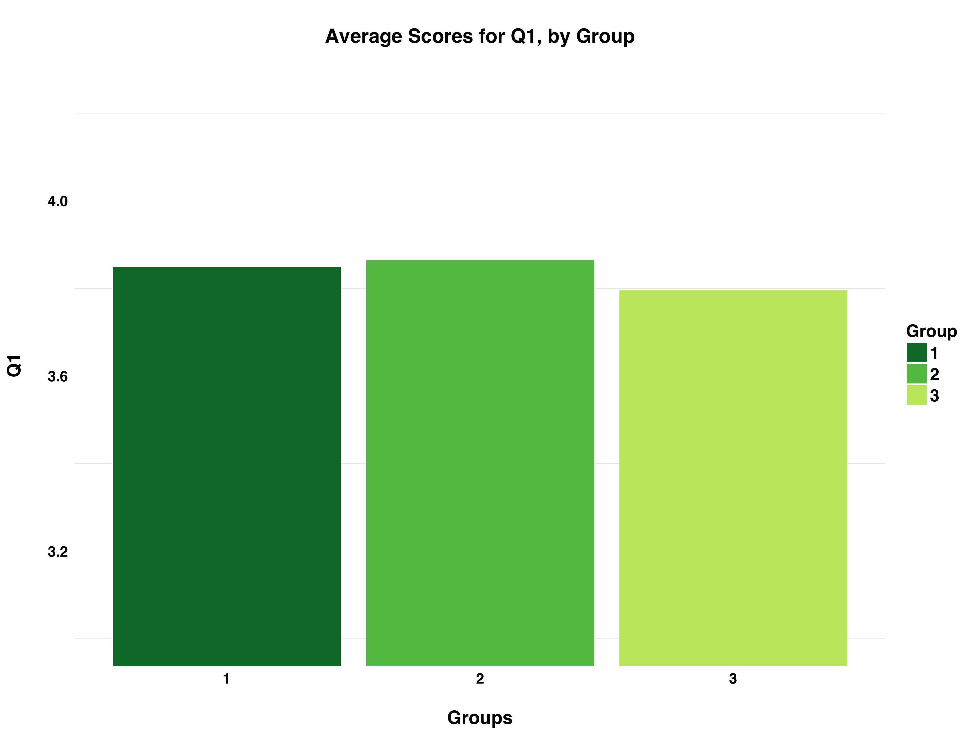
Here is what a bar chart of average scores for Q1 per group looks like:
``````{r, warning=FALSE, message=FALSE}
require(tidyverse)
sample_data_mean <- sample_data %>%
gather(question, value, -resp, -group) %>%
group_by(question, group) %>%
summarise_each(funs(mean(., na.rm = TRUE)), mean = value) %>%
spread(question, mean)
q1_plot <- ggplot(sample_data_mean, aes(factor(group), Q1)) +
geom_bar(aes(fill = factor(group)), stat = "identity") +
ggtitle("\nAverage Scores for Q1, by Group\n") +
xlab("\nGroups\n") +
ylab("Q1\n") +
coord_cartesian(ylim = c(3,4.25))
q1_plot

The plot colors each data based on the number of PAs in a given player's season.
If we pass our saved plot object to the `ggallup` function it will reformat the plot accordingly:
``````{r, warning=FALSE, message=FALSE}
q1_plot_gallup <- ggallup(q1_plot)
q1_plot_gallup

The plot is still using ggplot2's standard color scale. What if we wanted those colors to be compliant with Gallup standards? For that we can use the gallup_palette object. If we call the object we can see the hexadecimal codes for the colors:
``````{r, warning=FALSE, message=FALSE}
gallup_palette
[1] "#007934" "#61C250" "#C3E76F" "#A0A19E" "#7D7F7E" "#404545"
The palette includes our three greens as well as three greys. Let's color code each bar based on the group it represents using `scale_fill_manual` and specifying `gallup_palette` in the `values` argument:

``````{r, warning=FALSE, message=FALSE}
q1_plot_gallup_palette <- ggallup(q1_plot +
    scale_fill_manual(values = gallup_palette, "Group"))

q1_plot_gallup_palette
Here is another example:
forecast <- data_frame(Date = c("2015-1", "2015-2", "2015-3", "2015-4", "2016-1", "2016-2", "2016-3", "2016-4", "2017-1", "2017-2", "2017-3", "2017-4", "2018-1", "2018-2"), Sales = c(123657, 138786, 135784, 170495, 134050, 145450, 110090, 156504, 123580, 144678, 139087, 167098, 132456, 147564))

forecast_melt <- forecast %>%
  gather(key = key, value = 'Sales in Millions', -Date)

forecast_melt <- forecast_melt %>%
  mutate(group = c("Actuals", "Actuals", "Actuals", "Actuals",
                   "Actuals", "Actuals", "Actuals", "Actuals",
                   "Forecast", "Forecast", "Forecast", "Forecast",
                   "Forecast", "Forecast"))

forecast_plot <- ggallup(forecast_melt %>%
  ggplot(aes(x = Date, y = `Sales in Millions`, group = 1)) +
  geom_point(aes(color = group)) +
  geom_line(linetype = "dashed", color = "#61C250") +
  geom_line(data = filter(forecast_melt, group == "Actuals"), aes(color = group)) +
  xlab("\nQuarter") +
  ylab("\nSales in Millions\n") +
  ggtitle("\nExample: Actual & Forecasted Sales (MM)\n") +
  scale_y_continuous(labels = scales::comma) +
  scale_color_manual(values = gallup_palette, ""))

forecast_plot
BillPetti/ggallup documentation built on May 5, 2019, 3:46 p.m.
R Package Documentation
Browse R Packages
We want your feedback!
Note that we can't provide technical support on individual packages. You should contact the package authors for that.
title: "ggallup Vignette" author: "Bill Petti" date: "December 2016" output: html_document
Introduction
This package contains a custom ggplot2 theme that aligns with Gallup's general brand standards, as well as a custom palette that includes current colors that also align to Gallup's standards.
It includes three objects and two functions that are loaded when the package is loaded:
ggallup: A function to formatggplot2objectsggallup_md: A function to formatggplot2objects for use inrmarkdowndocumentstheme_gallup: A custom ggplot2 themetheme_gallup_md: The same custom theme astheme_gallup, but it has been tweaked to work better when producingrmarkdowndocumentsgallup_palette: A custom palette that has the current Gallup brand colors included
To see how they work, let's load some sample survey data and place each respondent into one of three groups:
```{r, warning=FALSE, message=FALSE} sample_data <- read.csv("https://raw.githubusercontent.com/BillPetti/R-Crash-Course/master/survey_sample_data.csv") head(sample_data) set.seed(42) sample_data$group <- sample(1:3, 116, replace = TRUE) with(sample_data, table(group))
Now, let's load `ggplot2` and the `ggallup` packages:
```{r, warning=FALSE, message=FALSE}
require(ggplot2)
require(devtools)
install_github("BillPetti/ggallup", force = TRUE)
require(ggallup)
Here is what a bar chart of average scores for Q1 per group looks like:
``````{r, warning=FALSE, message=FALSE} require(tidyverse)
sample_data_mean <- sample_data %>% gather(question, value, -resp, -group) %>% group_by(question, group) %>% summarise_each(funs(mean(., na.rm = TRUE)), mean = value) %>% spread(question, mean)
q1_plot <- ggplot(sample_data_mean, aes(factor(group), Q1)) + geom_bar(aes(fill = factor(group)), stat = "identity") + ggtitle("\nAverage Scores for Q1, by Group\n") + xlab("\nGroups\n") + ylab("Q1\n") + coord_cartesian(ylim = c(3,4.25))
q1_plot

The plot colors each data based on the number of PAs in a given player's season.
If we pass our saved plot object to the `ggallup` function it will reformat the plot accordingly:
``````{r, warning=FALSE, message=FALSE}
q1_plot_gallup <- ggallup(q1_plot)
q1_plot_gallup
The plot is still using ggplot2's standard color scale. What if we wanted those colors to be compliant with Gallup standards? For that we can use the gallup_palette object. If we call the object we can see the hexadecimal codes for the colors:
``````{r, warning=FALSE, message=FALSE} gallup_palette [1] "#007934" "#61C250" "#C3E76F" "#A0A19E" "#7D7F7E" "#404545"
The palette includes our three greens as well as three greys. Let's color code each bar based on the group it represents using `scale_fill_manual` and specifying `gallup_palette` in the `values` argument:
``````{r, warning=FALSE, message=FALSE}
q1_plot_gallup_palette <- ggallup(q1_plot +
scale_fill_manual(values = gallup_palette, "Group"))
q1_plot_gallup_palette
Here is another example:
forecast <- data_frame(Date = c("2015-1", "2015-2", "2015-3", "2015-4", "2016-1", "2016-2", "2016-3", "2016-4", "2017-1", "2017-2", "2017-3", "2017-4", "2018-1", "2018-2"), Sales = c(123657, 138786, 135784, 170495, 134050, 145450, 110090, 156504, 123580, 144678, 139087, 167098, 132456, 147564))
forecast_melt <- forecast %>%
gather(key = key, value = 'Sales in Millions', -Date)
forecast_melt <- forecast_melt %>%
mutate(group = c("Actuals", "Actuals", "Actuals", "Actuals",
"Actuals", "Actuals", "Actuals", "Actuals",
"Forecast", "Forecast", "Forecast", "Forecast",
"Forecast", "Forecast"))
forecast_plot <- ggallup(forecast_melt %>%
ggplot(aes(x = Date, y = `Sales in Millions`, group = 1)) +
geom_point(aes(color = group)) +
geom_line(linetype = "dashed", color = "#61C250") +
geom_line(data = filter(forecast_melt, group == "Actuals"), aes(color = group)) +
xlab("\nQuarter") +
ylab("\nSales in Millions\n") +
ggtitle("\nExample: Actual & Forecasted Sales (MM)\n") +
scale_y_continuous(labels = scales::comma) +
scale_color_manual(values = gallup_palette, ""))
forecast_plot
R Package Documentation
Browse R Packages
We want your feedback!
Note that we can't provide technical support on individual packages. You should contact the package authors for that.
Embedding an R snippet on your website
Add the following code to your website.
For more information on customizing the embed code, read Embedding Snippets.