In Edouard-Legoupil/unhcrdatapackage: UNHCR Population Statistics Database with Chart Library and Factsheet Template
options(htmltools.dir.version = FALSE)
knitr::opts_chunk$set(
  warning = FALSE,
  message = FALSE,
  fig.showtext = TRUE
)
library(tidyverse)
library(unhcrthemes)
library(fontawesome)
library(unhcrdatapackage)
background-position: 50% 25%
class: center, bottom, inverse
“Numbers have an important story to tell. They rely on YOU to give them a voice!”
-- Stephen Few
What is data story telling?
.pull-left[
Data literacy describes the ability to read, analyze, and argue with data.
Data storytelling is the art of presenting data with a contextual narrative.
An understandable story line allows to put data insights into context in order to inspire action and to influence the targeted audience.
What makes a story is a "cause and effect" relationship!
]
.pull-right[
 ]
]
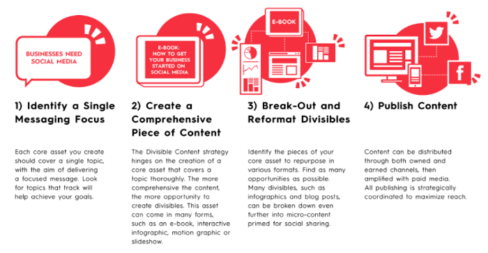
Pairing assumptions with evidences
First start from an assumption and then to identify a graph that can be associated to it.
This will give the foundation for potential data stories!
A story usually address a broad research question and matches one of the narrative frames below:
-
Shed light on a previously unexplored topic - For instance an assumption on the main origin of refugees and asylum seekers in a specific country
-
Introduce an interesting angle - For instance an assumption on existing refugee case processing capacity
-
Provide useful suggestions to solve a problem - For instance an assumption on availability of Solutions available to refugee
-
Disprove an hypothesis / debunk a widely held belief - For instance an assumption on the reality of a "Refugee Burden"
Do not start from scratch!
.pull-left[
Rather than starting from raw data and excel, using the chart library from {UnhcrDataPackage} allows you to:
-
Benefit from an initial data exploration - for instance consult the Factsheets for the Americas, which means practically "Save time & pain to get a first version of your charts!"
-
Ensure to use the correct style in line with Brand Recommendations using {unhcrthemes}, meaning using consistent color, font, elements...
-
Have you process documented and fully reproducible by using the datajournalism lingua franca
]
.pull-right[
 ]
]
How to do that?
From a simple default chart, chart crafting can be done by:
-
adjusting the message in the title,
-
highlighting specific parts of the data or
-
adding annotation to ease interpretation or provide more contextual background
-
including additional background information
An example
We will not demonstrate this through an example: The history of refugee arrival in the United States.
This story has been actually explored in this blog post: Exploring U.S. Refugee Data, which came with another series of Refugee Data Stories
The Example for inspiration is presented in the next slide. You will notice that the data source is not the UNHCR Global Population Statistic Database... This is probably because {UnhcrDataPackage} was not yet available when the chart was created :)
class: hide-logo
background-image: url(https://pbs.twimg.com/media/Ezqj6eRWUAcq63v?format=png&name=4096x4096)
background-size: cover
background-position: center 25%
# admissions75 <- tidytemplate::load_it("data/admissions75.Rdata")
# # year_lab <- paste0("'", stringi::stri_sub(1975:2018, -2 , -1))
# year_lab <- seq(1977, 2017, 4)
# year_dat <- tibble(fiscal_year = c(seq(1976, 2016, 4)),
#                    label = c("Carter I", "Reagan I", "Reagan II",
#                              "H.W. Bush I", "Clinton I", "Clinton II", "Bush I",
#                              "Bush II", "Obama I", "Obama II", "Trump I"))
# n_refugee_2018 <- admissions75 %>%
#   filter(fiscal_year == 2018) %>%
#   summarize(n = sum(n)) %>%
#   .$n
# n_refugee_2002 <- admissions75 %>%
#   filter(fiscal_year == 2002) %>%
#   summarize(n = sum(n)) %>%
#   .$n
# n_refugee_1992 <- admissions75 %>%
#   filter(fiscal_year == 1992) %>%
#   summarize(n = sum(n)) %>%
#   .$n
# n_refugee_1980 <- admissions75 %>%
#   filter(fiscal_year == 1980) %>%
#   summarize(n = sum(n)) %>%
#   .$n
# n_refugee_1975 <- admissions75 %>%
#   filter(fiscal_year == 1975) %>%
#   summarize(n = sum(n)) %>%
#   .$n
# admissions75 %>%
#   summarize(n = sum(n)) %>%
#   .$n
# admissions75 %>%
#   mutate(region = case_when(
#     region == "Former\rSoviet\rUnion" ~ "(Former) Soviet Union",
#     region == "Latin America\rCaribbean" ~ "Latin America/Caribbean",
#     region == "Near East\rSouth Asia" ~ "Near East/South Asia",
#     region == "PSI" ~ "Private Sector Initiative",
#     T ~ region
#   )) %>%
#   ggplot(aes(fiscal_year, n))  +
#   geom_vline(data = year_dat, aes(xintercept = fiscal_year + 1), alpha = 0.35) +
#   geom_label(data = year_dat, aes(x = fiscal_year + 1, y = 220000, label = label),
#             angle = 0, color = "black") +
#   geom_area(aes(fill = region), alpha = 0.9) +
#   geom_hline(yintercept = n_refugee_2018,
#              linetype = "dashed", color = "black", alpha = 0.85) +
#   annotate("label", x = 1978, y = 115000,
#            fill = "lightgrey", alpha = 0.85, label.size = NA,
#            label = "End of\n Vietnam War") +
#   annotate("label", x = 1984, y = 185000,
#            fill = "lightgrey", alpha = 0.85, label.size = NA,
#            label = "Refugee Act of 1980") +
#   annotate("label", x = 1997, y = 150000,
#            fill = "lightgrey", alpha = 0.85, label.size = NA,
#            label = "Fall of Soviet Union") +
#   annotate("label", x = 2000, y = 105000,
#            fill = "lightgrey", alpha = 0.85, label.size = NA,
#            label = "Drop after 9/11") +
#   annotate("label", x = 2015, y = 110000,
#            fill = "lightgrey", alpha = 0.85, label.size = NA,
#            label = "Number of Refugees in 2018\n lowest since 1977") +
#   theme_minimal() +
#   scale_y_continuous(labels = scales::comma) +
#   scale_fill_manual("Region", values = qualitative) +
#   geom_curve(aes(x = 1977, y = 125000, xend = 1975, yend = n_refugee_1975),
#   arrow = arrow(length = unit(0.03, "npc")), curvature = 0.2) +
#   geom_curve(aes(x = 1982, y = 190000, xend = 1980, yend = n_refugee_1980),
#   arrow = arrow(length = unit(0.03, "npc")), curvature = 0.2) +
#   geom_curve(aes(x = 1994, y = 150000, xend = 1992, yend = n_refugee_1992),
#   arrow = arrow(length = unit(0.03, "npc")), curvature = 0.2) +
#   geom_curve(aes(x = 2000, y = 100000, xend = 2002, yend = n_refugee_2002),
#   arrow = arrow(length = unit(0.03, "npc")), curvature = -0.3) +
#   geom_curve(aes(x = 2016, y = 100000, xend = 2018, yend = n_refugee_2018),
#   arrow = arrow(length = unit(0.03, "npc")), curvature = -0.2) +
#   theme(plot.title = element_text(size = 13, face = "bold"),
#     # plot.subtitle = element_text(size = 11, face = "bold"),
#     plot.caption = element_text(size = 10, face = "italic", hjust = 1),
#     legend.key.width = unit(3, "line"),
#     legend.position = "bottom") +
#   scale_x_continuous(breaks = year_lab, labels = year_lab,
#                      minor_breaks = seq(1975, 2018, 1)) +
#   labs(x = "", y = "Number of Refugees\n",
#        title = "Refugees arriving in the United States of America by Year (1975 - 2018)\n",
#        caption = "\nData: State Department, Office of Admissions - Refugee Processing Center. Total Number of Accepted Refugees since 1975: 3.340.709; Visualization: @favstats")
# ggsave(filename = "images/refugee75.png", height = 7, width = 13)
???
https://github.com/favstats/usa_refugee_data/blob/5c0c042784a7c3118f71294622660492b784e760/refugee_analysis.Rmd#L930:L1025
1. Adjust the message
.pull-left[
First we identify what chart from the library could match that question.
The default chart from the library would then be plot_ctr_origin_history
p <- unhcrdatapackkage::plot_ctr_origin_history(
     year = 2022,
     lag = 30,
     country_asylum_iso3c = "USA",
     pop_type = c("ASY"),
     otherprop = .024)

p
]
.pull-right[
p <- plot_ctr_origin_history(year = 2022,
                        lag = 30,
                        country_asylum_iso3c = "USA",
                          pop_type = c("ASY"),
                        otherprop = .024)
p
]
1. Adjust the message
.pull-left[
Now we can start getting an idea of a key story to tell..
For instance, we can see that quite a number of refugees are actually not coming from countries affected by a conflict. This match the narrative frame around a widely held belief: "all refugees are fleeing war"
and change both the title and the subtitle
p <- p +
labs(title = "Not only Conflicts fuels
              demand for Asylum",

     subtitle = "Arrival in the US
                 since 2000")
]
.pull-right[
p <- p +
    labs(title = "Not only Conflicts fuel demand for Asylum",
         subtitle = "Arrival in the US since 2000")

p
]
2. Highlight specific parts
We need to focus the audience attention on a specific part of the chart
To do that we can highlight the specific part of the chart that match our message
See tutorial here_
3. Add annotations
.pull-left[
To ease interpretation or provide more contextual background through annotation
See tutorial here
p <- p +
  annotate("label", x = 2000, y = 105000,
           fill = "lightgrey", alpha = 0.85,
           label.size = NA,
           label = "Drop after 9/11") +
  annotate("label", x = 2015, y = 110000,
           fill = "lightgrey", alpha = 0.85,
           label.size = NA,
     label = "Number of Refugees in 2018\n
              lowest since 1977")
]
.pull-right[
p <- p +
  annotate("label", x = 2000, y = 105000,
           fill = "lightgrey", alpha = 0.85, label.size = NA,
           label = "Drop after 9/11") +
  annotate("label", x = 2015, y = 110000,
           fill = "lightgrey", alpha = 0.85, label.size = NA,
           label = "Number of Refugees in 2018\n lowest since 1977")
p
]
4. Include Background information
.pull-left[
For instance an additional layers to include the political context
year_lab <- seq(1977, 2022, 4)
year_dat <- tibble(
 fiscal_year = c(seq(2000, 2022, 4)),
 label = c("Bush I", "Bush II", "Obama I",
        "Obama II", "Trump", "Biden"))
p <- p +
  geom_vline(data = year_dat,
             aes(xintercept = fiscal_year ),
             alpha = 0.35) +
  geom_label(data = year_dat,
             aes(x = fiscal_year + 1,
                  y = 1000000,
                 label = label),
            angle = 0, color = "black")
]
.pull-right[
year_lab <- seq(1977, 2022, 4)
year_dat <- tibble(fiscal_year = c(seq(2000, 2022, 4)),
                   label = c( "Bush I",
                             "Bush II", "Obama I", "Obama II", "Trump", "Biden"))
p <- p +
  geom_vline(data = year_dat,
             aes(xintercept = fiscal_year ),
             alpha = 0.35) +
  geom_label(data = year_dat,
             aes(x = fiscal_year + 1,
                  y = 1000000,
                 label = label),
            angle = 0, color = "black")
p
]
Design for the web
.pull-left[
Less is more:
-
Only retain content in relation with your message! Fewer numbers can give greater insight if they are the right numbers. Less precision can lead to more confidence. The percentage values can almost appear to be too precise, while "two-thirds of…" shows the focus on what the majority did or didn’t do.
-
Peer Review the chart legibility - the 10 seconds test - display your charts to someone for 10 seconds and then ask the person to share back what he understood
-
Output based on screen - mobile or desktop - change frame to square - increase size font if you want to share on social media
Check the recommendation from the Economist Data Journalism team
]
.pull-right[

]
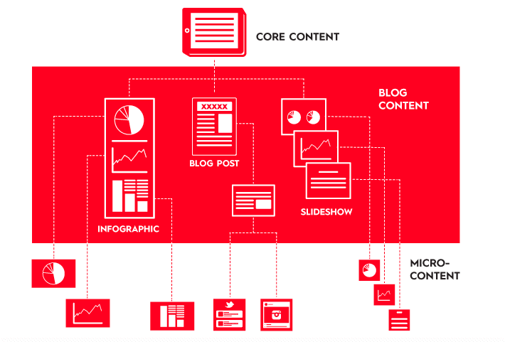
Use Divisible Content Strategy
.pull-left[
An approach to content creation where you use a single asset to create multiple pieces. For example, you might break an a long report into a few articles, an infographic, social microcontent, or even a video.
Check the blog post from Column Five Media
]
.pull-right[
]
???
Nowadays, the average consumer attention span is less than 10 sec. Long reports are therefore less likely to draw large audience. “Divisible Content Strategy” consists in breaking a traditional report into a few articles, an infographic, social microcontent, or even a motion graphic video. For instance, if an article includes 5 different charts, each chart can be posted it as a visual tweet implying that the same content can be promoted through different angles.
Generate More Content With Less Work
.pull-left[
The chart library is therefore designed to speed up the creation of microcontent that can be then re-embedded wherever needed:
-
Social Media
-
Donor Presentation
-
Talking points
-
Situation Analysis or Protection Monitoring Reports
With this approach, the effort spent on polishing content can benefit a series of product
]
.pull-right[
 ]
]
Product Template
When packing up your story - you can not only use the chart as a single image but also embed it into products
You can install the unhcrdown package from Github to benefit from a series of template:
remotes::install_github("vidonne/unhcrdown")
.pull-left[
For the Web:
* unhcrdown::html_slides generates simple online presentation template, actually demonstrated through this document
unhcrdown::html_page converts to UNHCR branded HTML website
For PDF:
* unhcrdown::paged_report & unhcrdown::paged_simple creates formatted paginated reports
]
.pull-right[
For Office
-
unhcrdown::pptx_slides converts to UNHCR branded PowerPoint presentation
-
unhcrdown::docx_simple converts to UNHCR branded Word document
]
???
Main resources:
- R Markdown documentation
- unhcrthemes package
- UNHCR Data Visualization Platform
class: inverse, center, middle
Summary take away
-
Read the graphs to identify patterns or insights
-
Analyse them by linking them to broader question and to the specific context
-
Develop an argument that can be illustrated with the data
-
Put that argument into a narrative frame
-
Design for the web with re-usability in mind
-
Share for the data blog - https://www.unhcr.org/blogs/category/notable-chart/
Edouard-Legoupil/unhcrdatapackage documentation built on Nov. 6, 2023, 6:10 p.m.
R Package Documentation
Browse R Packages
We want your feedback!
Note that we can't provide technical support on individual packages. You should contact the package authors for that.
options(htmltools.dir.version = FALSE) knitr::opts_chunk$set( warning = FALSE, message = FALSE, fig.showtext = TRUE ) library(tidyverse) library(unhcrthemes) library(fontawesome) library(unhcrdatapackage)
background-position: 50% 25% class: center, bottom, inverse
“Numbers have an important story to tell. They rely on YOU to give them a voice!”
-- Stephen Few
What is data story telling?
.pull-left[
Data literacy describes the ability to read, analyze, and argue with data.
Data storytelling is the art of presenting data with a contextual narrative.
An understandable story line allows to put data insights into context in order to inspire action and to influence the targeted audience.
What makes a story is a "cause and effect" relationship!
]
.pull-right[
]
Pairing assumptions with evidences
First start from an assumption and then to identify a graph that can be associated to it.
This will give the foundation for potential data stories!
A story usually address a broad research question and matches one of the narrative frames below:
-
Shed light on a previously unexplored topic - For instance an assumption on the main origin of refugees and asylum seekers in a specific country
-
Introduce an interesting angle - For instance an assumption on existing refugee case processing capacity
-
Provide useful suggestions to solve a problem - For instance an assumption on availability of Solutions available to refugee
-
Disprove an hypothesis / debunk a widely held belief - For instance an assumption on the reality of a "Refugee Burden"
Do not start from scratch!
.pull-left[
Rather than starting from raw data and excel, using the chart library from {UnhcrDataPackage} allows you to:
-
Benefit from an initial data exploration - for instance consult the Factsheets for the Americas, which means practically "Save time & pain to get a first version of your charts!"
-
Ensure to use the correct style in line with Brand Recommendations using
{unhcrthemes}, meaning using consistent color, font, elements... -
Have you process documented and fully reproducible by using the datajournalism lingua franca
]
.pull-right[
]
How to do that?
From a simple default chart, chart crafting can be done by:
-
adjusting the message in the title,
-
highlighting specific parts of the data or
-
adding annotation to ease interpretation or provide more contextual background
-
including additional background information
An example
We will not demonstrate this through an example: The history of refugee arrival in the United States.
This story has been actually explored in this blog post: Exploring U.S. Refugee Data, which came with another series of Refugee Data Stories
The Example for inspiration is presented in the next slide. You will notice that the data source is not the UNHCR Global Population Statistic Database... This is probably because {UnhcrDataPackage} was not yet available when the chart was created :)
class: hide-logo background-image: url(https://pbs.twimg.com/media/Ezqj6eRWUAcq63v?format=png&name=4096x4096) background-size: cover background-position: center 25%
# admissions75 <- tidytemplate::load_it("data/admissions75.Rdata") # # year_lab <- paste0("'", stringi::stri_sub(1975:2018, -2 , -1)) # year_lab <- seq(1977, 2017, 4) # year_dat <- tibble(fiscal_year = c(seq(1976, 2016, 4)), # label = c("Carter I", "Reagan I", "Reagan II", # "H.W. Bush I", "Clinton I", "Clinton II", "Bush I", # "Bush II", "Obama I", "Obama II", "Trump I")) # n_refugee_2018 <- admissions75 %>% # filter(fiscal_year == 2018) %>% # summarize(n = sum(n)) %>% # .$n # n_refugee_2002 <- admissions75 %>% # filter(fiscal_year == 2002) %>% # summarize(n = sum(n)) %>% # .$n # n_refugee_1992 <- admissions75 %>% # filter(fiscal_year == 1992) %>% # summarize(n = sum(n)) %>% # .$n # n_refugee_1980 <- admissions75 %>% # filter(fiscal_year == 1980) %>% # summarize(n = sum(n)) %>% # .$n # n_refugee_1975 <- admissions75 %>% # filter(fiscal_year == 1975) %>% # summarize(n = sum(n)) %>% # .$n # admissions75 %>% # summarize(n = sum(n)) %>% # .$n # admissions75 %>% # mutate(region = case_when( # region == "Former\rSoviet\rUnion" ~ "(Former) Soviet Union", # region == "Latin America\rCaribbean" ~ "Latin America/Caribbean", # region == "Near East\rSouth Asia" ~ "Near East/South Asia", # region == "PSI" ~ "Private Sector Initiative", # T ~ region # )) %>% # ggplot(aes(fiscal_year, n)) + # geom_vline(data = year_dat, aes(xintercept = fiscal_year + 1), alpha = 0.35) + # geom_label(data = year_dat, aes(x = fiscal_year + 1, y = 220000, label = label), # angle = 0, color = "black") + # geom_area(aes(fill = region), alpha = 0.9) + # geom_hline(yintercept = n_refugee_2018, # linetype = "dashed", color = "black", alpha = 0.85) + # annotate("label", x = 1978, y = 115000, # fill = "lightgrey", alpha = 0.85, label.size = NA, # label = "End of\n Vietnam War") + # annotate("label", x = 1984, y = 185000, # fill = "lightgrey", alpha = 0.85, label.size = NA, # label = "Refugee Act of 1980") + # annotate("label", x = 1997, y = 150000, # fill = "lightgrey", alpha = 0.85, label.size = NA, # label = "Fall of Soviet Union") + # annotate("label", x = 2000, y = 105000, # fill = "lightgrey", alpha = 0.85, label.size = NA, # label = "Drop after 9/11") + # annotate("label", x = 2015, y = 110000, # fill = "lightgrey", alpha = 0.85, label.size = NA, # label = "Number of Refugees in 2018\n lowest since 1977") + # theme_minimal() + # scale_y_continuous(labels = scales::comma) + # scale_fill_manual("Region", values = qualitative) + # geom_curve(aes(x = 1977, y = 125000, xend = 1975, yend = n_refugee_1975), # arrow = arrow(length = unit(0.03, "npc")), curvature = 0.2) + # geom_curve(aes(x = 1982, y = 190000, xend = 1980, yend = n_refugee_1980), # arrow = arrow(length = unit(0.03, "npc")), curvature = 0.2) + # geom_curve(aes(x = 1994, y = 150000, xend = 1992, yend = n_refugee_1992), # arrow = arrow(length = unit(0.03, "npc")), curvature = 0.2) + # geom_curve(aes(x = 2000, y = 100000, xend = 2002, yend = n_refugee_2002), # arrow = arrow(length = unit(0.03, "npc")), curvature = -0.3) + # geom_curve(aes(x = 2016, y = 100000, xend = 2018, yend = n_refugee_2018), # arrow = arrow(length = unit(0.03, "npc")), curvature = -0.2) + # theme(plot.title = element_text(size = 13, face = "bold"), # # plot.subtitle = element_text(size = 11, face = "bold"), # plot.caption = element_text(size = 10, face = "italic", hjust = 1), # legend.key.width = unit(3, "line"), # legend.position = "bottom") + # scale_x_continuous(breaks = year_lab, labels = year_lab, # minor_breaks = seq(1975, 2018, 1)) + # labs(x = "", y = "Number of Refugees\n", # title = "Refugees arriving in the United States of America by Year (1975 - 2018)\n", # caption = "\nData: State Department, Office of Admissions - Refugee Processing Center. Total Number of Accepted Refugees since 1975: 3.340.709; Visualization: @favstats") # ggsave(filename = "images/refugee75.png", height = 7, width = 13)
??? https://github.com/favstats/usa_refugee_data/blob/5c0c042784a7c3118f71294622660492b784e760/refugee_analysis.Rmd#L930:L1025
1. Adjust the message
.pull-left[ First we identify what chart from the library could match that question. The default chart from the library would then be plot_ctr_origin_history
p <- unhcrdatapackkage::plot_ctr_origin_history( year = 2022, lag = 30, country_asylum_iso3c = "USA", pop_type = c("ASY"), otherprop = .024) p
]
.pull-right[
p <- plot_ctr_origin_history(year = 2022, lag = 30, country_asylum_iso3c = "USA", pop_type = c("ASY"), otherprop = .024) p
]
1. Adjust the message
.pull-left[
Now we can start getting an idea of a key story to tell..
For instance, we can see that quite a number of refugees are actually not coming from countries affected by a conflict. This match the narrative frame around a widely held belief: "all refugees are fleeing war"
and change both the title and the subtitle
p <- p + labs(title = "Not only Conflicts fuels demand for Asylum", subtitle = "Arrival in the US since 2000")
]
.pull-right[
p <- p + labs(title = "Not only Conflicts fuel demand for Asylum", subtitle = "Arrival in the US since 2000") p
]
2. Highlight specific parts
We need to focus the audience attention on a specific part of the chart
To do that we can highlight the specific part of the chart that match our message
See tutorial here_
3. Add annotations
.pull-left[
To ease interpretation or provide more contextual background through annotation
See tutorial here
p <- p + annotate("label", x = 2000, y = 105000, fill = "lightgrey", alpha = 0.85, label.size = NA, label = "Drop after 9/11") + annotate("label", x = 2015, y = 110000, fill = "lightgrey", alpha = 0.85, label.size = NA, label = "Number of Refugees in 2018\n lowest since 1977")
]
.pull-right[
p <- p + annotate("label", x = 2000, y = 105000, fill = "lightgrey", alpha = 0.85, label.size = NA, label = "Drop after 9/11") + annotate("label", x = 2015, y = 110000, fill = "lightgrey", alpha = 0.85, label.size = NA, label = "Number of Refugees in 2018\n lowest since 1977") p
]
4. Include Background information
.pull-left[
For instance an additional layers to include the political context
year_lab <- seq(1977, 2022, 4) year_dat <- tibble( fiscal_year = c(seq(2000, 2022, 4)), label = c("Bush I", "Bush II", "Obama I", "Obama II", "Trump", "Biden")) p <- p + geom_vline(data = year_dat, aes(xintercept = fiscal_year ), alpha = 0.35) + geom_label(data = year_dat, aes(x = fiscal_year + 1, y = 1000000, label = label), angle = 0, color = "black")
]
.pull-right[
year_lab <- seq(1977, 2022, 4) year_dat <- tibble(fiscal_year = c(seq(2000, 2022, 4)), label = c( "Bush I", "Bush II", "Obama I", "Obama II", "Trump", "Biden")) p <- p + geom_vline(data = year_dat, aes(xintercept = fiscal_year ), alpha = 0.35) + geom_label(data = year_dat, aes(x = fiscal_year + 1, y = 1000000, label = label), angle = 0, color = "black") p
]
Design for the web
.pull-left[
Less is more:
-
Only retain content in relation with your message! Fewer numbers can give greater insight if they are the right numbers. Less precision can lead to more confidence. The percentage values can almost appear to be too precise, while "two-thirds of…" shows the focus on what the majority did or didn’t do.
-
Peer Review the chart legibility - the 10 seconds test - display your charts to someone for 10 seconds and then ask the person to share back what he understood
-
Output based on screen - mobile or desktop - change frame to square - increase size font if you want to share on social media
Check the recommendation from the Economist Data Journalism team ]
.pull-right[
]
Use Divisible Content Strategy
.pull-left[ An approach to content creation where you use a single asset to create multiple pieces. For example, you might break an a long report into a few articles, an infographic, social microcontent, or even a video.
Check the blog post from Column Five Media ]
.pull-right[
]
???
Nowadays, the average consumer attention span is less than 10 sec. Long reports are therefore less likely to draw large audience. “Divisible Content Strategy” consists in breaking a traditional report into a few articles, an infographic, social microcontent, or even a motion graphic video. For instance, if an article includes 5 different charts, each chart can be posted it as a visual tweet implying that the same content can be promoted through different angles.
Generate More Content With Less Work
.pull-left[
The chart library is therefore designed to speed up the creation of microcontent that can be then re-embedded wherever needed:
-
Social Media
-
Donor Presentation
-
Talking points
-
Situation Analysis or Protection Monitoring Reports
With this approach, the effort spent on polishing content can benefit a series of product
]
.pull-right[
]
Product Template
When packing up your story - you can not only use the chart as a single image but also embed it into products
You can install the unhcrdown package from Github to benefit from a series of template:
remotes::install_github("vidonne/unhcrdown")
.pull-left[
For the Web:
* unhcrdown::html_slides generates simple online presentation template, actually demonstrated through this document
unhcrdown::html_pageconverts to UNHCR branded HTML website
For PDF:
* unhcrdown::paged_report & unhcrdown::paged_simple creates formatted paginated reports
]
.pull-right[ For Office
-
unhcrdown::pptx_slidesconverts to UNHCR branded PowerPoint presentation -
unhcrdown::docx_simpleconverts to UNHCR branded Word document
]
???
Main resources:
- R Markdown documentation
- unhcrthemes package
- UNHCR Data Visualization Platform
class: inverse, center, middle
Summary take away
-
Read the graphs to identify patterns or insights
-
Analyse them by linking them to broader question and to the specific context
-
Develop an argument that can be illustrated with the data
-
Put that argument into a narrative frame
-
Design for the web with re-usability in mind
-
Share for the data blog - https://www.unhcr.org/blogs/category/notable-chart/
R Package Documentation
Browse R Packages
We want your feedback!
Note that we can't provide technical support on individual packages. You should contact the package authors for that.
Embedding an R snippet on your website
Add the following code to your website.
For more information on customizing the embed code, read Embedding Snippets.