In Edouard-Legoupil/unhcrdatapackage: UNHCR Population Statistics Database with Chart Library and Factsheet Template
knitr::opts_chunk$set(
  collapse = TRUE,
  comment = "#>"
)
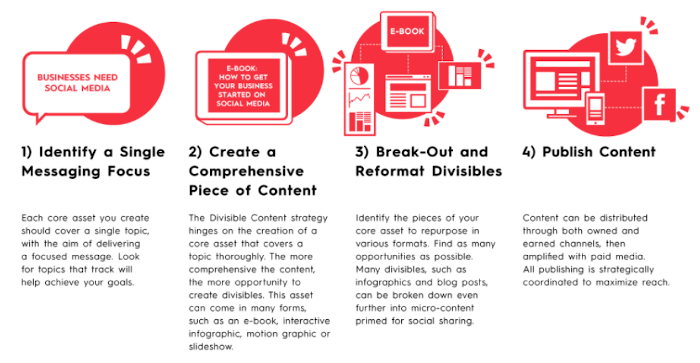
Divisible Content Strategy Gives You More Content With Less Work
As explained in this blog post from Column Five Media, a divisible content strategy is an approach to content creation where you use a single asset to create multiple pieces. For example, you might break an e-book into a few articles, an infographic, social microcontent, or even a brand video.
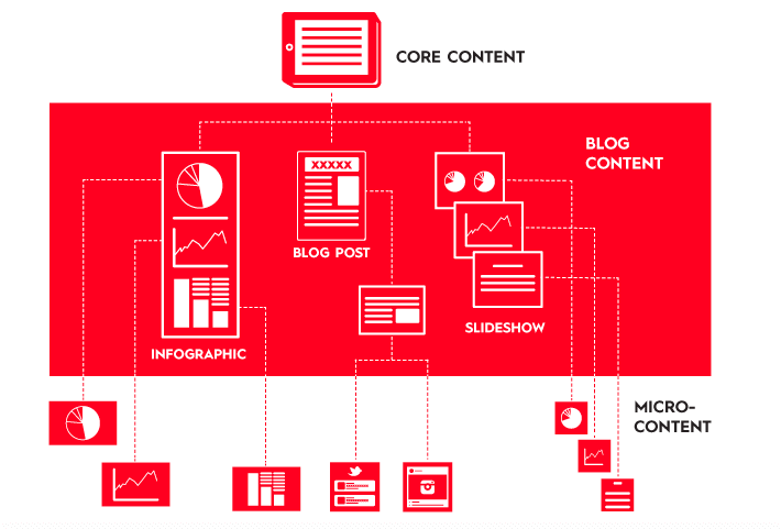
The chart library is therefore designed to speed up the creation of microcontent that can be then re-embedded wherever needed:
-
Social Media
-
Donor Presentation
-
Talking points
-
Situation Analysis or Protection Monitoring Reports
With this approach, the effort spent on polishing content can benefit a series of product -
More Content With Less Work!
Do not waste time with charts creation, focus on the message and on the story
Impactful charts with are characterized by their story telling ability. Using the default plots from the package, the chart effectiveness can be improved by:
-
Changing charts existing default title and subtitle to replace it with a key message or call to Action
-
Annotating the chart to provide interpretation hint around the context: See tutorial here
-
Highlighting specific parts in the chart to reinforce the main message and ease legibility: See tutorial here_
-
Adding background information
How to get started: Start building your country or regional/situational factsheet now
If you just want to explore the package, you can for instance create an account on Rstudio Cloud
First install the package
remotes::install_github("vidonne/unhcrdesign")
remotes::install_github("vidonne/unhcrthemes")
remotes::install_github("vidonne/unhcrdown")
remotes::install_github("edouard-legoupil/unhcrdatapackage")
Report Template
Then just create a new markdown file using one of the template included in the package - this can be either a powepoint or an html/PDF.
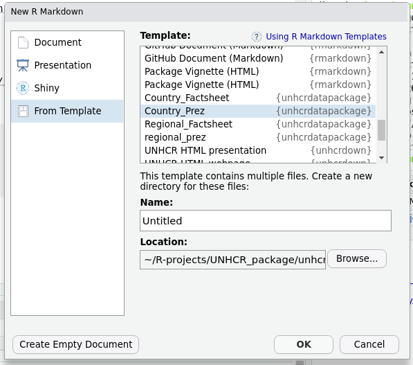
In an RMD report, the top part of the file, the header is called YAML.
A YAML header contains YAML arguments, such as “title”, “author”, and “output”, demarcated by three dashes (—) on either end.
From here you can adjust the notebook parameters for your country for instance and then knit your report.
Adjust charts within the template
Each of the notebook chunk includes one plotting function
plot_ctr_population_type_abs(year = params$year,
                    country_asylum_iso3c = params$country,
                    top_n_countries = 9,
                    pop_type = "REF"
                    )
Note that if you want to change the title to an existing chart just add: labs with a new title
plot_ctr_population_type_abs(year = params$year,
                    country_asylum_iso3c = params$country,
                    top_n_countries = 9,
                    pop_type = "REF"
                    ) +
  labs(title = paste0("Refugees: Main Countries of origin | ", params$year))
In case you use the PowerPoint template, you will need to append 2 instructions so that the output becomes an editable obejct within the resuting powerpoint.
-> p
dml(ggobj = p, fonts = list(serif = 'Lato'))
plot_ctr_population_type_abs(year = params$year,
                    country_asylum_iso3c = params$country,
                    top_n_countries = 9,
                    pop_type = "REF"
                    ) +
  labs(title = paste0("Refugees: Main Countries of origin | ", params$year)) -> p
dml(ggobj = p, fonts = list(serif = 'Lato'))
Edouard-Legoupil/unhcrdatapackage documentation built on Nov. 6, 2023, 6:10 p.m.
R Package Documentation
Browse R Packages
We want your feedback!
Note that we can't provide technical support on individual packages. You should contact the package authors for that.
knitr::opts_chunk$set( collapse = TRUE, comment = "#>" )
Divisible Content Strategy Gives You More Content With Less Work
As explained in this blog post from Column Five Media, a divisible content strategy is an approach to content creation where you use a single asset to create multiple pieces. For example, you might break an e-book into a few articles, an infographic, social microcontent, or even a brand video.
The chart library is therefore designed to speed up the creation of microcontent that can be then re-embedded wherever needed:
-
Social Media
-
Donor Presentation
-
Talking points
-
Situation Analysis or Protection Monitoring Reports
With this approach, the effort spent on polishing content can benefit a series of product -
More Content With Less Work!
Do not waste time with charts creation, focus on the message and on the story
Impactful charts with are characterized by their story telling ability. Using the default plots from the package, the chart effectiveness can be improved by:
-
Changing charts existing default title and subtitle to replace it with a key message or call to Action
-
Annotating the chart to provide interpretation hint around the context: See tutorial here
-
Highlighting specific parts in the chart to reinforce the main message and ease legibility: See tutorial here_
-
Adding background information
How to get started: Start building your country or regional/situational factsheet now
If you just want to explore the package, you can for instance create an account on Rstudio Cloud
First install the package
remotes::install_github("vidonne/unhcrdesign") remotes::install_github("vidonne/unhcrthemes") remotes::install_github("vidonne/unhcrdown") remotes::install_github("edouard-legoupil/unhcrdatapackage")
Report Template
Then just create a new markdown file using one of the template included in the package - this can be either a powepoint or an html/PDF.
In an RMD report, the top part of the file, the header is called YAML.
A YAML header contains YAML arguments, such as “title”, “author”, and “output”, demarcated by three dashes (—) on either end.
From here you can adjust the notebook parameters for your country for instance and then knit your report.
Adjust charts within the template
Each of the notebook chunk includes one plotting function
plot_ctr_population_type_abs(year = params$year, country_asylum_iso3c = params$country, top_n_countries = 9, pop_type = "REF" )
Note that if you want to change the title to an existing chart just add: labs with a new title
plot_ctr_population_type_abs(year = params$year, country_asylum_iso3c = params$country, top_n_countries = 9, pop_type = "REF" ) + labs(title = paste0("Refugees: Main Countries of origin | ", params$year))
In case you use the PowerPoint template, you will need to append 2 instructions so that the output becomes an editable obejct within the resuting powerpoint.
-> p
dml(ggobj = p, fonts = list(serif = 'Lato'))
plot_ctr_population_type_abs(year = params$year, country_asylum_iso3c = params$country, top_n_countries = 9, pop_type = "REF" ) + labs(title = paste0("Refugees: Main Countries of origin | ", params$year)) -> p dml(ggobj = p, fonts = list(serif = 'Lato'))
R Package Documentation
Browse R Packages
We want your feedback!
Note that we can't provide technical support on individual packages. You should contact the package authors for that.
Embedding an R snippet on your website
Add the following code to your website.
For more information on customizing the embed code, read Embedding Snippets.