In NWCEd/NWCEd: National Water Census Education Demo
knitr::opts_chunk$set(echo = TRUE)
library(NWCEd)
library(ggplot2)
library(iterators)
library(foreach)
Introduction
Water managers, hydrologists, and engineers are responsible for making decisions that not only impact people today, but future generations to come. These decisions could include how large to design a culvert for a stream, what legislature should be implemented regarding water use, how to properly plan for population growth for a city based on available water resources, and so on. These decisions are difficult to make, especially when the decisions impacting the future must be made according to the available data of today. To help in making these decisions, hydrologic models have been created to predict the size of hydrologic events, flooding, and to project the status of water budgets. The purpose of this lab is to introduce a probability density model commonly known as the Log-Pearson Type III distribution model. This lab will walk through the steps of how to model National Water Census Data Portal (NWC-DP) data using both Microsoft Excel and the Lp3 function found in the NWCEd package in R.
Important Questions to Ask Yourself
- What information does a frequency distribution curve communicate?
- What ways are frequency distribution curves helpful?
- How do I generate a frequency distribution curve from raw data?
Useful Terms and Acronyms
Term | Definition
---------------------|--------------------------------------------------------------------------------------
Log-Pearson Type III | A statistical method where hydrologic data is fixed to a probability distribution curve
Water Year | Describes a 12 month period beginning October 1st and ending the last day in September
PivotTable | A tool which allows for the organization of data in a spreadsheet
Exercise 1
Step 1
In this exercise we will learn how to download a .csv file containing precipitation time series data from the National Water Cenus Data-Portal (NWC-DP) and generate a Log-Pearson Type III distribution model for the selected data. For information regarding the theory behind the Log-Pearson Type III distribution model, please read information put out by the USGS, the University of Western Ontario, and the Water Resources Research journal.
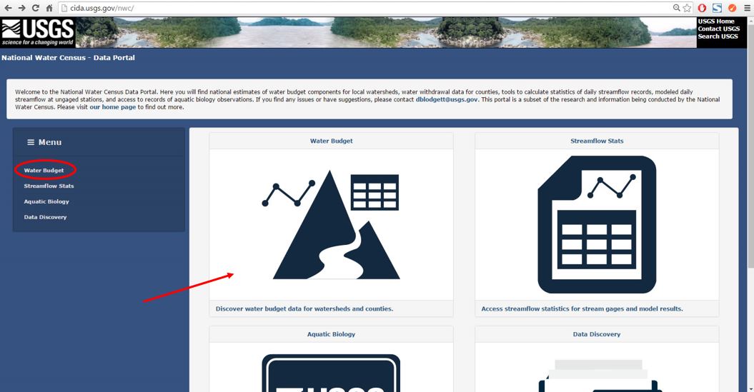
To begin, log on to the NWC-DP using the following URL: https://cida.usgs.gov/nwc/. The home page is shown in Figure 1 below. Click on the tab titled, "Water Budget" in the Menu ribbon on the left of the page or anywhere in the large Water Budget icon to access the Water Budget tool. For more instruction on how to navigate through the NWC-DP and its features, please review Lab 1 and Lab 2.
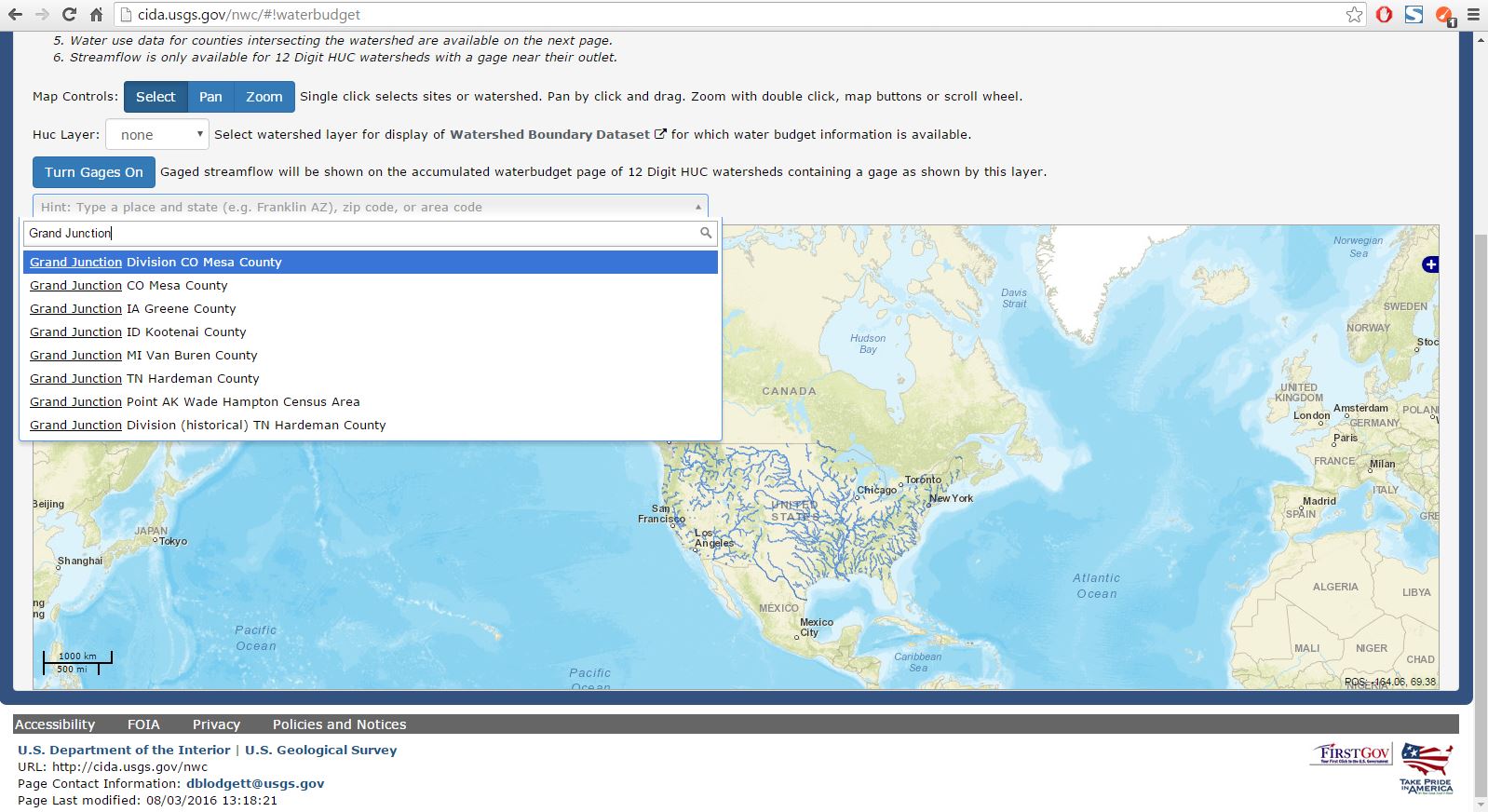
After clicking on the Water Budget icon, a new screen will load which displays an interactive map. For this exercise we want to download data associated with the HUC that encompasses Orchard Mesa, Colorado. This HUC is located just south of Grand Junction, Colorado. In the search bar, type "Grand Junction" and click on the first suggestion that appears under the search bar as shown in Figure 2 below.
The map will zoom in to the general region where we can more easily see the HUC we want to select. Under the HUC Layer dropdown box, select the 12 Digit layer (see Figure 3 and Figure 4 below). Select the HUC that encompasses Orchard Mesa, Colorado as indicated by the red arrow in Figure 4.


Once the new page has loaded, verify that the HUC you selected is the intended HUC you wanted to select. Next, click on the **`Download Precipitation`** button to download a .csv file of the precipitationd data associated with the HUC as shown in Figure 5 below.

Step 2
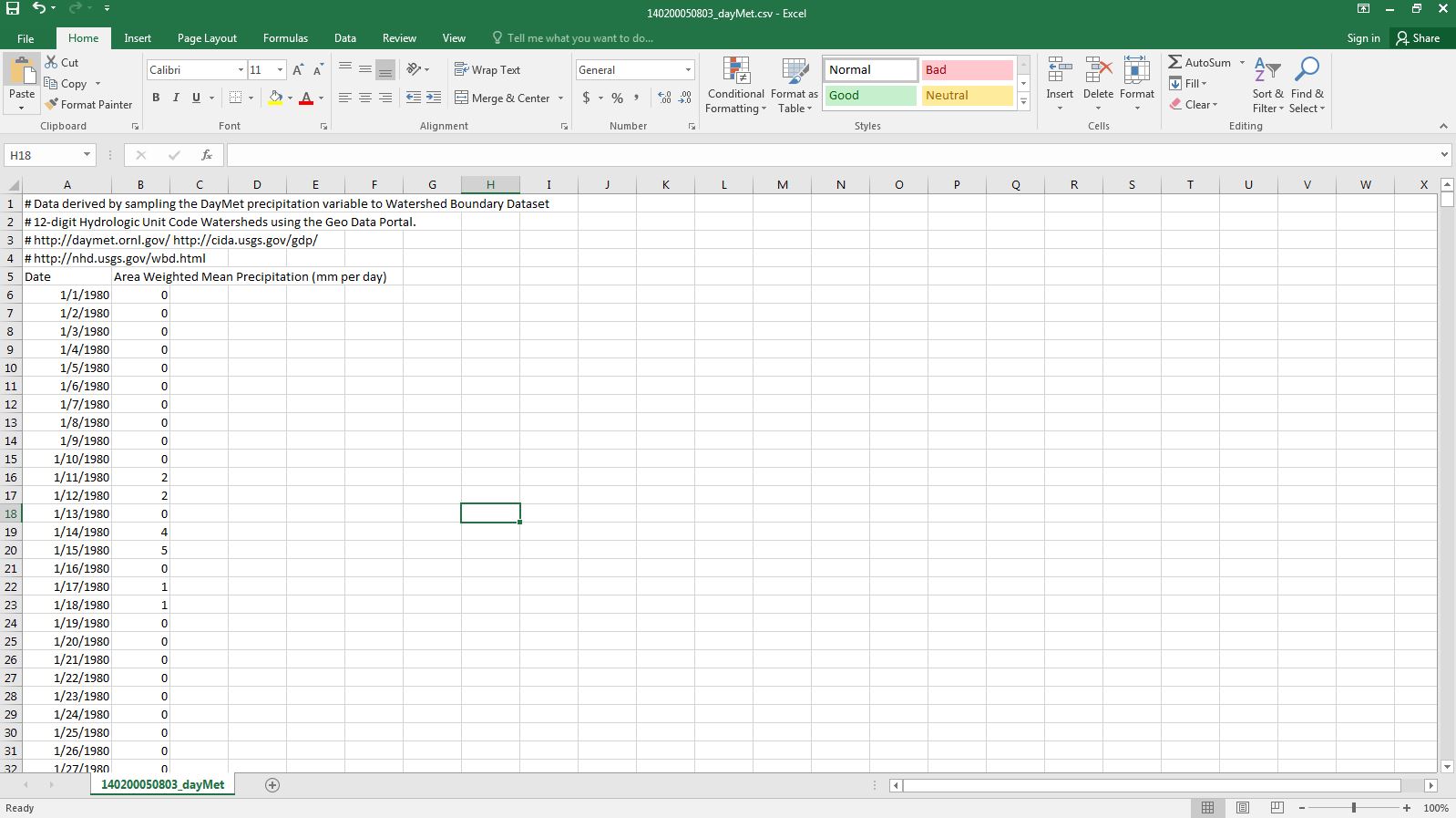
Once the file has been downloaded, open it in Microsoft Excel. Please note that while these steps are to be carried out in Microsoft Excel, similar open source software such as Google Sheets can run the steps with slight adjustments. Once the file has been downloaded and opened in Excel, the spreadsheet should look similar to that displayed in Figure 6 below.
The first thing we need to do is prepare the spreadsheet for the analysis. We are needing to compile and separate the data based on their respective water years. To do this, add a column in between column A and column B. This can be done simply by selecting cell B6. Then while holding down the control and shift buttons, press the down arrow key. Once the cells are selected, right click and select insert with the Shift cells right option selected. Click OK. The column of area weighted mean precipitation values shifts to the right.
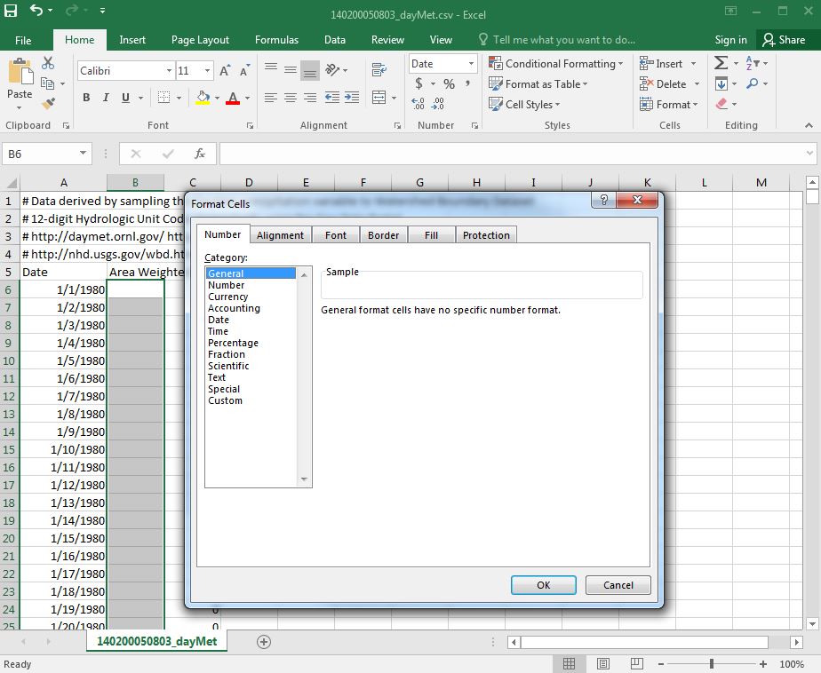
Next, select the empty cell B6. Select all the empty cells in between the given dates and data values using the same steps given previously. When all the empty cells have been selected, right click and select Format Cells. A popup window appears as shown in Figure 7. With the Number tab selected, click on General in the Category box. Doing this will allow us to use a custom formula to convert the dates in column A to water year dates in the empty column B.
Now that the empty column B has been prepared, we are ready to convert the dates listed in column A into water years. In the empty cell B6, enter the following statement:
$$=IF(MONTH(A6)<=9,YEAR(A6),1+YEAR(A6))$$
This statement checks the month of the year in the A column to see if it is in the current water year. If it is, the year is extracted from the cell in column A and inserted into the empty adjacent cell in column B. If the month is greater than 9, then 1 is added to the current year to match the correct water year date. Once the formula has been entered into B6, double click in the bottom-right corner of the cell to populate the proceeding cells in column B.
Scroll down column B to verify that the year is updating every October. Once the water years have been assigned correctly to the corresponding precipitation values, we are ready to sort our data.
#### Step 3
We are now ready to begin the analysis. As a check, make sure your spreadsheet looks like the one depicted in Figure 8 below. Please note the addition of the **"WtrYr"** table header. Make sure there are no empty columns in between the water year column and the precipitation value column.

We will now begin using a pivot table in Excel to help us quickly run the Log-Pearson Type III distribution for our data. The methods shown in this lab correspond to Microsoft Excel 2016. These steps can also be performed in previous versions. In your spreadsheet, select the **WtrYr** and **Area Weighted Mean Precipitation** columns including the headers as shown in Figure 9. Under the **`Insert`** tab, click on **PivotTable** button in the upper left-hand corner of the screen. A **Create PivotTable** popup window will then display on the screen. Select **New Worksheet**. Doing this will open the pivot table in a new sheet.

After clicking **`OK`** a new sheet will open up as shown in Figure 10. On the right of the sheet is the **PivotTable Fields** ribbon. Clicking anywhere in the sheet outside of the **PivotTable** box will hide the pivot table ribbon. clicking anywhere inside the PivotTable box will show the ribbon again.

In the PivotTable Fields ribbon, hover the cursor over the **`WtrYr`** words. Click on the **WtrYr** and drag it into the **ROWS** box below. If done successfully, the **`WtrYr`** box will update with a check mark. A column will appear in the sheet with the rows in the column populated with the water years we obtained previously. Hover the cursor over the **`Area Weighted Mean Precipitation`** words under the **`WtrYr`** box. Click and drag it into the **VALUES** box in the lower right-hand corner of the screen. The corresponding box will update with a check mark as before, and a new column is added to the sheet containing all the precipitation values.

In the **VALUES** box, click on the **`Count of Area`** drop down menu. Click on the **Value Field Settings** option. A **Value Field Settings** popup window is displayed as shown in Figure 12. Select the **Max** option under the **`Summarize Values By`** tab. Then click **`OK`**.

Now that the max values for each water year have been calculated, copy and paste the values table you just created to the right in the same sheet. This new table should not be a pivottable. Make sure to only paste the values. This next part will not work in the pivottable. Select the **Max of Area Weighted Mean Precipitation** column, right click, and sort from largest to smallest. Make sure to expand the selection. _Note that the pivot table generated a grand total value at the bottom of the column that needs to be deleted before sorting._ Create a new column titled **Rank**. Rank the max precipitation column from 1 to 36 as shown in Figure 13 below.

Once the max precipitation values have been ranked, create a new column. Title the column **Log(MaxPrecip)**. Use the Excel formula **log(E4)** and copy it down the column as shown in Figure 14 below. From there, calculate the average of the max precipitation values and the max of the average of the log of the precipitation values. To find the averages, use the Excel formula **=AVERAGE(E4:E39)** with the respective column range as the argument. Figure 15 shows the averages for the max precipitation and log of max precipitation columns.


Create a new column to the right of the **Log(MaxPrecip)** column titled **(Log(MaxPrecip)-avg(Log(MaxPrecip))^2** . Use the formula from the column title to populate the column. _Don't forget the absolute reference to the avg(log(MaxPrecip)) when copying the formula down the column_. Create another column to the right of the previous column titled **(Log(MaxPrecip)-avg(Log(MaxPrecip))^3** . Using the formula in the title, populate the cells in the respective column. Next, create another column titled **Tr** for the return period. Use the Excel formula ((n+1)/m) to populate the column where n is the number of observations in the Max of Area column and m is the respective rank. In this example, n = 36. Next, create another column titled **Exceedence Probability**. Populate this column by using the Excel formula (1/Tr). Figure 16 below shows the additional columns made. Using the Excel formula Sum(), find the sum for the **(Log(MaxPrecip)-avg(Log(MaxPrecip))^2** and **(Log(MaxPrecip)-avg(Log(MaxPrecip))^3** columns as shown in Figure 17 below.


#### Step 4
With our spreadsheet completed, we are ready to calculate the **variance**, **standard deviation**, and **skew coefficient**. The formula to calculate the variance is provided below:
$$\frac{\sum_{i}^{n}(Log(MaxPrecip)-avg(Log(MaxPrecip))^2}{n-1}$$
The standard deviation is equal to the square root of the variance. The formula is displayed below.
$$\sigma log(MaxPrecip) = \sqrt{variance}$$
The skew coefficient can be calculated using the following formula:
$$\frac{n*\sum_{i}^{n}(Log(MaxPrecip)-avg(Log(MaxPrecip))^3}{(n-1)(n-2)(\sigma log(MaxPrecip)^3}$$
Calculate the variance, standard deviation, and skew coefficient in your Excel spreadsheet using the formulas given. For this example, the variance, standard deviation, and skew coefficient were found to be 0.016, 0.127, and -0.408, respectively.
We now need to create our final table in the spreadsheet. Create three columns with titles as **Return Period**, **k**, and **MaxPrecip**. The **Return Period** column needs to be populated with the following values: 1.01, 2, 5, 10, 25, 50, 100, 200. To find the k values, we need to turn to a **Frequency Factors** table. Click [here](http://insaat.erciyes.edu.tr/mcobaner/MIY%5CPearson_tablosu.pdf) to view the table. You'll notice that the skew coefficients range from -3 to 3 and the column headers range in percent change from 99% to 0.5%. To use the table, look up the row with the coefficient that corresponds to the one calculated. From there move across the table to the right on the same row and pull to obtain frequency factors for each of the recurrence intervals. In our case, the calculated skew coefficient is -0.408. We can use linear interpolation to obtain the frequency factor values which correspond to the calculated skew coefficient. These values are shown in Figure 18 below.

Finally, we are ready to calculate the **MaxPrecip** column. The formula to do this is given below:
$$log(MaxPrecip) = avg(log(MaxPrecip))+[k(Tr,Cs)]*\sigma log(MaxPrecip)$$
With the formula, populate the **MaxPrecip** column. _Hint: Remember that Log base 10 is undone by 10^_. With the last column filled in, the table should look similar to the table shown in Figure 19 below.

Create a scatter plot with smooth lines and markers of the return period and max precipitation. Now right click on the x-axis and select **Format Axis**. Under the Format Axis ribbon on the right, click in the **Logarithmic scale** box. This will change the scale on the plot to a logarithmic scale. Feel free to add minor gridlines to plot. The two plots are shown below. How do they compare? What differences do you see? How can the logarithmic scale help to estimate values between known return periods?


Exercise 2
Step 1
Now that we have learned the steps in applying the Log-Pearson Type III distribution to a dataset in Excel, we are ready to learn the Log-Pearson Type III function in the NWCEd R package. These steps assume that R has been installed along with the required packages which include iterators, foreach, NWCEd, and ggplot2. The first step is to download the desired dataset from the NWC-DP. This can be done by using the getNWCData function in the NWCEd package. Below is a block of code that walks through how this is to be done.
# Uses the getNWCData function to pull down hydrologic datasets for specified HUC ID
variable_name<-getNWCData(huc = "160202030505", local = FALSE)
Once the data is downloaded and stored in a variable of your choice, we are ready to use the Log-Pearson Type III function. The function name is Lp3. It has two arguments: variable name with stored data and dataset type ("prcp" or "streamflow"). The function will read the data from the user-named variable, run through the Log-Pearson Type III method and returns a frequency curve. Below is the code which can be copied and pasted in the R console.
Lp3(variable_name, "prcp")
Try It Yourself
Problem 1
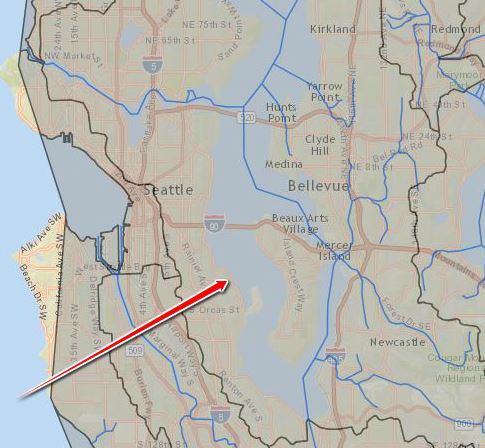
Using the steps outlined previously in this exercise, use Microsoft Excel or similar open source software to plot a frequency curve for precipitation data associated with the 12-Digit HUC which encompasses the majority of the Seattle, Washington and Bellevue, Washington areas (see Hint).
Problem 2
Plot a Log-Pearson Type III model to the same precipitation dataset from Problem 1 in R. Use the the getNWCData function to pull down the data. Use the Lp3 function to produce the plot.
Problem 3
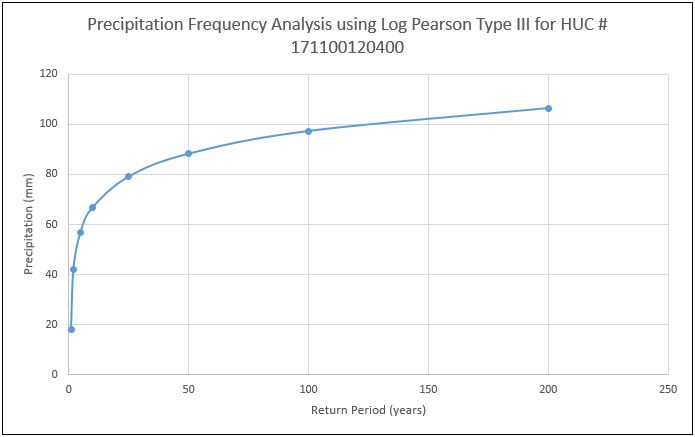
You have been asked to design a culvert to be installed in Cane Creek located in Cordova, Alabama. The city has a standard that requres the culvert be designed for the 100 year storm event. The site is located in a 12-Digit HUC with an ID of 031501070601. Produce a short report for the city engineer which includes the flow for a 100 year event. Include a plot of the frequency curve.
NWCEd/NWCEd documentation built on May 7, 2019, 6:04 p.m.
knitr::opts_chunk$set(echo = TRUE) library(NWCEd) library(ggplot2) library(iterators) library(foreach)
Introduction
Water managers, hydrologists, and engineers are responsible for making decisions that not only impact people today, but future generations to come. These decisions could include how large to design a culvert for a stream, what legislature should be implemented regarding water use, how to properly plan for population growth for a city based on available water resources, and so on. These decisions are difficult to make, especially when the decisions impacting the future must be made according to the available data of today. To help in making these decisions, hydrologic models have been created to predict the size of hydrologic events, flooding, and to project the status of water budgets. The purpose of this lab is to introduce a probability density model commonly known as the Log-Pearson Type III distribution model. This lab will walk through the steps of how to model National Water Census Data Portal (NWC-DP) data using both Microsoft Excel and the Lp3 function found in the NWCEd package in R.
Important Questions to Ask Yourself
- What information does a frequency distribution curve communicate?
- What ways are frequency distribution curves helpful?
- How do I generate a frequency distribution curve from raw data?
Useful Terms and Acronyms
Term | Definition ---------------------|-------------------------------------------------------------------------------------- Log-Pearson Type III | A statistical method where hydrologic data is fixed to a probability distribution curve Water Year | Describes a 12 month period beginning October 1st and ending the last day in September PivotTable | A tool which allows for the organization of data in a spreadsheet
Exercise 1
Step 1
In this exercise we will learn how to download a .csv file containing precipitation time series data from the National Water Cenus Data-Portal (NWC-DP) and generate a Log-Pearson Type III distribution model for the selected data. For information regarding the theory behind the Log-Pearson Type III distribution model, please read information put out by the USGS, the University of Western Ontario, and the Water Resources Research journal.
To begin, log on to the NWC-DP using the following URL: https://cida.usgs.gov/nwc/. The home page is shown in Figure 1 below. Click on the tab titled, "Water Budget" in the Menu ribbon on the left of the page or anywhere in the large Water Budget icon to access the Water Budget tool. For more instruction on how to navigate through the NWC-DP and its features, please review Lab 1 and Lab 2.
To begin, log on to the NWC-DP using the following URL: https://cida.usgs.gov/nwc/. The home page is shown in Figure 1 below. Click on the tab titled, "Water Budget" in the Menu ribbon on the left of the page or anywhere in the large Water Budget icon to access the Water Budget tool. For more instruction on how to navigate through the NWC-DP and its features, please review Lab 1 and Lab 2.
After clicking on the Water Budget icon, a new screen will load which displays an interactive map. For this exercise we want to download data associated with the HUC that encompasses Orchard Mesa, Colorado. This HUC is located just south of Grand Junction, Colorado. In the search bar, type "Grand Junction" and click on the first suggestion that appears under the search bar as shown in Figure 2 below.
The map will zoom in to the general region where we can more easily see the HUC we want to select. Under the HUC Layer dropdown box, select the 12 Digit layer (see Figure 3 and Figure 4 below). Select the HUC that encompasses Orchard Mesa, Colorado as indicated by the red arrow in Figure 4.


Once the new page has loaded, verify that the HUC you selected is the intended HUC you wanted to select. Next, click on the **`Download Precipitation`** button to download a .csv file of the precipitationd data associated with the HUC as shown in Figure 5 below.

Step 2
Once the file has been downloaded, open it in Microsoft Excel. Please note that while these steps are to be carried out in Microsoft Excel, similar open source software such as Google Sheets can run the steps with slight adjustments. Once the file has been downloaded and opened in Excel, the spreadsheet should look similar to that displayed in Figure 6 below.
The first thing we need to do is prepare the spreadsheet for the analysis. We are needing to compile and separate the data based on their respective water years. To do this, add a column in between column A and column B. This can be done simply by selecting cell B6. Then while holding down the control and shift buttons, press the down arrow key. Once the cells are selected, right click and select insert with the Shift cells right option selected. Click OK. The column of area weighted mean precipitation values shifts to the right.
Next, select the empty cell B6. Select all the empty cells in between the given dates and data values using the same steps given previously. When all the empty cells have been selected, right click and select
Format Cells. A popup window appears as shown in Figure 7. With the Number tab selected, click on General in the Category box. Doing this will allow us to use a custom formula to convert the dates in column A to water year dates in the empty column B.
Now that the empty column B has been prepared, we are ready to convert the dates listed in column A into water years. In the empty cell B6, enter the following statement:
$$=IF(MONTH(A6)<=9,YEAR(A6),1+YEAR(A6))$$
This statement checks the month of the year in the A column to see if it is in the current water year. If it is, the year is extracted from the cell in column A and inserted into the empty adjacent cell in column B. If the month is greater than 9, then 1 is added to the current year to match the correct water year date. Once the formula has been entered into B6, double click in the bottom-right corner of the cell to populate the proceeding cells in column B.
Scroll down column B to verify that the year is updating every October. Once the water years have been assigned correctly to the corresponding precipitation values, we are ready to sort our data.
#### Step 3 We are now ready to begin the analysis. As a check, make sure your spreadsheet looks like the one depicted in Figure 8 below. Please note the addition of the **"WtrYr"** table header. Make sure there are no empty columns in between the water year column and the precipitation value column.

We will now begin using a pivot table in Excel to help us quickly run the Log-Pearson Type III distribution for our data. The methods shown in this lab correspond to Microsoft Excel 2016. These steps can also be performed in previous versions. In your spreadsheet, select the **WtrYr** and **Area Weighted Mean Precipitation** columns including the headers as shown in Figure 9. Under the **`Insert`** tab, click on **PivotTable** button in the upper left-hand corner of the screen. A **Create PivotTable** popup window will then display on the screen. Select **New Worksheet**. Doing this will open the pivot table in a new sheet.

After clicking **`OK`** a new sheet will open up as shown in Figure 10. On the right of the sheet is the **PivotTable Fields** ribbon. Clicking anywhere in the sheet outside of the **PivotTable** box will hide the pivot table ribbon. clicking anywhere inside the PivotTable box will show the ribbon again.

In the PivotTable Fields ribbon, hover the cursor over the **`WtrYr`** words. Click on the **WtrYr** and drag it into the **ROWS** box below. If done successfully, the **`WtrYr`** box will update with a check mark. A column will appear in the sheet with the rows in the column populated with the water years we obtained previously. Hover the cursor over the **`Area Weighted Mean Precipitation`** words under the **`WtrYr`** box. Click and drag it into the **VALUES** box in the lower right-hand corner of the screen. The corresponding box will update with a check mark as before, and a new column is added to the sheet containing all the precipitation values.

In the **VALUES** box, click on the **`Count of Area`** drop down menu. Click on the **Value Field Settings** option. A **Value Field Settings** popup window is displayed as shown in Figure 12. Select the **Max** option under the **`Summarize Values By`** tab. Then click **`OK`**.

Now that the max values for each water year have been calculated, copy and paste the values table you just created to the right in the same sheet. This new table should not be a pivottable. Make sure to only paste the values. This next part will not work in the pivottable. Select the **Max of Area Weighted Mean Precipitation** column, right click, and sort from largest to smallest. Make sure to expand the selection. _Note that the pivot table generated a grand total value at the bottom of the column that needs to be deleted before sorting._ Create a new column titled **Rank**. Rank the max precipitation column from 1 to 36 as shown in Figure 13 below.

Once the max precipitation values have been ranked, create a new column. Title the column **Log(MaxPrecip)**. Use the Excel formula **log(E4)** and copy it down the column as shown in Figure 14 below. From there, calculate the average of the max precipitation values and the max of the average of the log of the precipitation values. To find the averages, use the Excel formula **=AVERAGE(E4:E39)** with the respective column range as the argument. Figure 15 shows the averages for the max precipitation and log of max precipitation columns.


Create a new column to the right of the **Log(MaxPrecip)** column titled **(Log(MaxPrecip)-avg(Log(MaxPrecip))^2** . Use the formula from the column title to populate the column. _Don't forget the absolute reference to the avg(log(MaxPrecip)) when copying the formula down the column_. Create another column to the right of the previous column titled **(Log(MaxPrecip)-avg(Log(MaxPrecip))^3** . Using the formula in the title, populate the cells in the respective column. Next, create another column titled **Tr** for the return period. Use the Excel formula ((n+1)/m) to populate the column where n is the number of observations in the Max of Area column and m is the respective rank. In this example, n = 36. Next, create another column titled **Exceedence Probability**. Populate this column by using the Excel formula (1/Tr). Figure 16 below shows the additional columns made. Using the Excel formula Sum(), find the sum for the **(Log(MaxPrecip)-avg(Log(MaxPrecip))^2** and **(Log(MaxPrecip)-avg(Log(MaxPrecip))^3** columns as shown in Figure 17 below.


#### Step 4
With our spreadsheet completed, we are ready to calculate the **variance**, **standard deviation**, and **skew coefficient**. The formula to calculate the variance is provided below:
$$\frac{\sum_{i}^{n}(Log(MaxPrecip)-avg(Log(MaxPrecip))^2}{n-1}$$
The standard deviation is equal to the square root of the variance. The formula is displayed below. $$\sigma log(MaxPrecip) = \sqrt{variance}$$
The skew coefficient can be calculated using the following formula: $$\frac{n*\sum_{i}^{n}(Log(MaxPrecip)-avg(Log(MaxPrecip))^3}{(n-1)(n-2)(\sigma log(MaxPrecip)^3}$$
Calculate the variance, standard deviation, and skew coefficient in your Excel spreadsheet using the formulas given. For this example, the variance, standard deviation, and skew coefficient were found to be 0.016, 0.127, and -0.408, respectively.
We now need to create our final table in the spreadsheet. Create three columns with titles as **Return Period**, **k**, and **MaxPrecip**. The **Return Period** column needs to be populated with the following values: 1.01, 2, 5, 10, 25, 50, 100, 200. To find the k values, we need to turn to a **Frequency Factors** table. Click [here](http://insaat.erciyes.edu.tr/mcobaner/MIY%5CPearson_tablosu.pdf) to view the table. You'll notice that the skew coefficients range from -3 to 3 and the column headers range in percent change from 99% to 0.5%. To use the table, look up the row with the coefficient that corresponds to the one calculated. From there move across the table to the right on the same row and pull to obtain frequency factors for each of the recurrence intervals. In our case, the calculated skew coefficient is -0.408. We can use linear interpolation to obtain the frequency factor values which correspond to the calculated skew coefficient. These values are shown in Figure 18 below.

Finally, we are ready to calculate the **MaxPrecip** column. The formula to do this is given below:
$$log(MaxPrecip) = avg(log(MaxPrecip))+[k(Tr,Cs)]*\sigma log(MaxPrecip)$$
With the formula, populate the **MaxPrecip** column. _Hint: Remember that Log base 10 is undone by 10^_. With the last column filled in, the table should look similar to the table shown in Figure 19 below.
With the formula, populate the **MaxPrecip** column. _Hint: Remember that Log base 10 is undone by 10^_. With the last column filled in, the table should look similar to the table shown in Figure 19 below.

Create a scatter plot with smooth lines and markers of the return period and max precipitation. Now right click on the x-axis and select **Format Axis**. Under the Format Axis ribbon on the right, click in the **Logarithmic scale** box. This will change the scale on the plot to a logarithmic scale. Feel free to add minor gridlines to plot. The two plots are shown below. How do they compare? What differences do you see? How can the logarithmic scale help to estimate values between known return periods?


Exercise 2
Step 1
Now that we have learned the steps in applying the Log-Pearson Type III distribution to a dataset in Excel, we are ready to learn the Log-Pearson Type III function in the NWCEd R package. These steps assume that R has been installed along with the required packages which include iterators, foreach, NWCEd, and ggplot2. The first step is to download the desired dataset from the NWC-DP. This can be done by using the getNWCData function in the NWCEd package. Below is a block of code that walks through how this is to be done.
# Uses the getNWCData function to pull down hydrologic datasets for specified HUC ID variable_name<-getNWCData(huc = "160202030505", local = FALSE)
Once the data is downloaded and stored in a variable of your choice, we are ready to use the Log-Pearson Type III function. The function name is Lp3. It has two arguments: variable name with stored data and dataset type ("prcp" or "streamflow"). The function will read the data from the user-named variable, run through the Log-Pearson Type III method and returns a frequency curve. Below is the code which can be copied and pasted in the R console.
Lp3(variable_name, "prcp")
Try It Yourself
Problem 1
Using the steps outlined previously in this exercise, use Microsoft Excel or similar open source software to plot a frequency curve for precipitation data associated with the 12-Digit HUC which encompasses the majority of the Seattle, Washington and Bellevue, Washington areas (see Hint).
Problem 2
Plot a Log-Pearson Type III model to the same precipitation dataset from Problem 1 in R. Use the the getNWCData function to pull down the data. Use the Lp3 function to produce the plot.
Problem 3
You have been asked to design a culvert to be installed in Cane Creek located in Cordova, Alabama. The city has a standard that requres the culvert be designed for the 100 year storm event. The site is located in a 12-Digit HUC with an ID of 031501070601. Produce a short report for the city engineer which includes the flow for a 100 year event. Include a plot of the frequency curve.
