In TiagoOlivoto/pliman: Tools for Plant Image Analysis
knitr::opts_chunk$set(
  collapse = TRUE,
  comment = "#>",
  rmarkdown.html_vignette.check_title = FALSE
)
Getting started
Single images
library(pliman)
# set the path directory
path_soy <- "https://raw.githubusercontent.com/TiagoOlivoto/images/master/pliman"
# import images
img <- image_import("leaf.jpg", path = path_soy)
healthy <- image_import("healthy.jpg", path = path_soy)
symptoms <- image_import("sympt.jpg", path = path_soy)
background <- image_import("back.jpg", path = path_soy)
image_combine(img, healthy, symptoms, background, ncol = 4)
Image palettes
Sample palettes can be created by manually sampling small areas of representative images and producing a composite image that represents each of the desired classes (background, healthy, and symptomatic tissues). Another approach is to use the image_palette() function to generate sample color palettes.
pals <- image_palette(img, npal = 8)
image_combine(pals$palette_list)
# to extract the color palettes, use the object
plot(pals$palette_list[[1]])
# default settings
res <-
  measure_disease(img = img,
                  img_healthy = healthy,
                  img_symptoms = symptoms,
                  img_background = background)
res$severity
Alternatively, users can create a mask instead of displaying the original image.
# create a personalized mask
res2 <-
  measure_disease(img = img,
                  img_healthy = healthy,
                  img_symptoms = symptoms,
                  img_background = background,
                  show_original = FALSE, # create a mask
                  show_contour = FALSE, # hide the contour line
                  col_background = "white", # default
                  col_lesions = "red", # default
                  col_leaf = "green") # default


res2$severity
Variations in image palettes
The results may vary depending on how the palettes are chosen and are subjective due to the researcher's experience. In the following example, I present a second variation in the color palettes, where only the necrotic area is assumed to be the diseased tissue. Therefore, the symptomatic area will be smaller than in the previous example.
# import images
healthy2 <- image_import("healthy2.jpg", path = path_soy)
symptoms2 <- image_import("sympt2.jpg", path = path_soy)
background2 <- image_import("back2.jpg", path = path_soy)
image_combine(healthy2, symptoms2, background2, ncol = 3)

res3 <-
  measure_disease(img = img,
                  img_healthy = healthy2,
                  img_symptoms = symptoms2,
                  img_background = background2)
res3$severity
Lesion features
res4 <-
  measure_disease(img = img,
                  img_healthy = healthy,
                  img_symptoms = symptoms,
                  img_background = background,
                  show_features = TRUE,
                  marker = "area")
res4$shape
res4$statistics
Interactive disease measurements
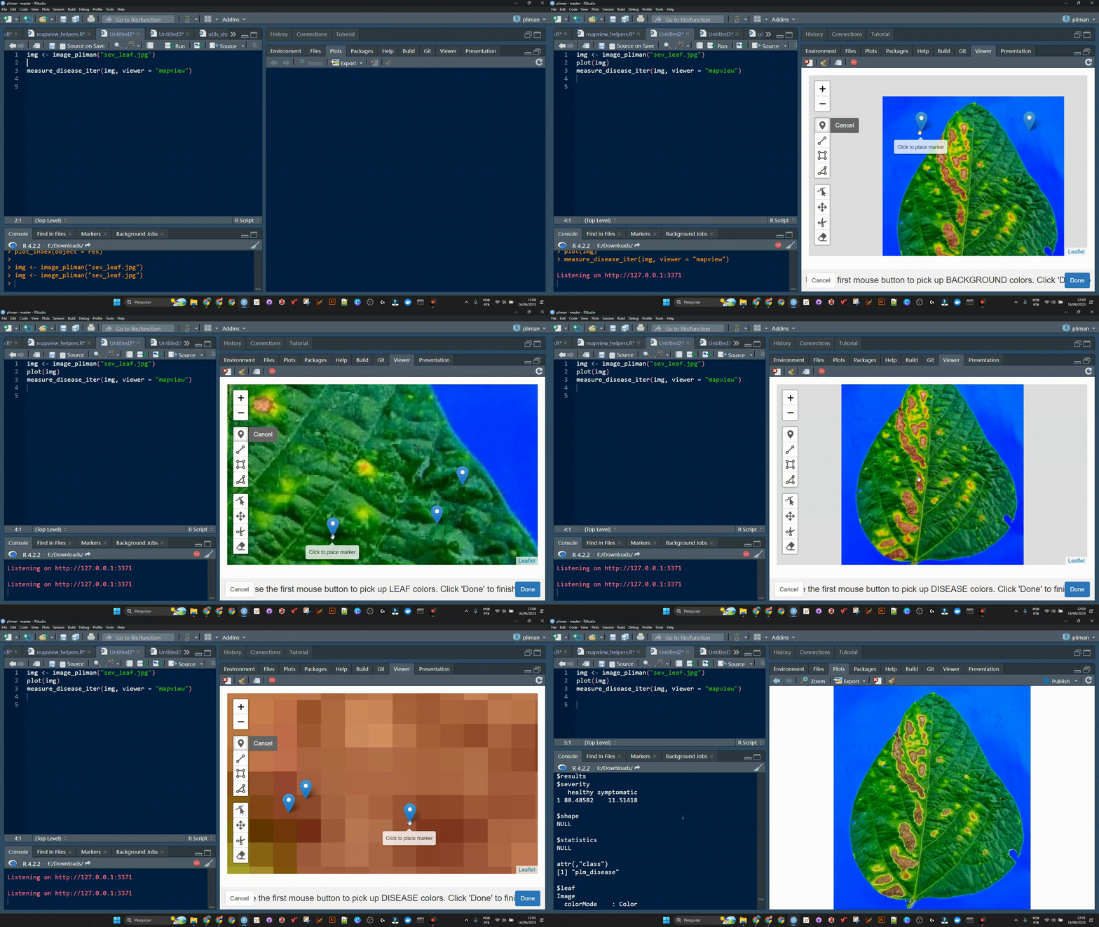
An alternative approach to measuring disease percentage is available through the measure_disease_iter() function. This function offers an interactive interface that empowers users to manually select sample colors directly from the image. By doing so, it provides a highly customizable analysis method.
One advantage of using measure_disease_iter() is the ability to utilize the "mapview" viewer, which enhances the analysis process by offering zoom-in options. This feature allows users to closely examine specific areas of the image, enabling detailed inspection and accurate disease measurement.
img <- image_pliman("sev_leaf.jpg", plot = TRUE)
measure_disease_iter(img, viewer = "mapview")

A little bit more!
{=html}
<script src="https://kit.fontawesome.com/1f72d6921a.js" crossorigin="anonymous"></script>
At this link you will find more examples on how to use {pliman} to analyze plant images. Source code and images can be downloaded here. You can also find a talk (Portuguese language) about {pliman} here. Lights, camera, {pliman}!
TiagoOlivoto/pliman documentation built on Sept. 14, 2024, 2:24 a.m.
knitr::opts_chunk$set( collapse = TRUE, comment = "#>", rmarkdown.html_vignette.check_title = FALSE )
Getting started
Single images
library(pliman) # set the path directory path_soy <- "https://raw.githubusercontent.com/TiagoOlivoto/images/master/pliman" # import images img <- image_import("leaf.jpg", path = path_soy) healthy <- image_import("healthy.jpg", path = path_soy) symptoms <- image_import("sympt.jpg", path = path_soy) background <- image_import("back.jpg", path = path_soy) image_combine(img, healthy, symptoms, background, ncol = 4)
Image palettes
Sample palettes can be created by manually sampling small areas of representative images and producing a composite image that represents each of the desired classes (background, healthy, and symptomatic tissues). Another approach is to use the image_palette() function to generate sample color palettes.
pals <- image_palette(img, npal = 8) image_combine(pals$palette_list) # to extract the color palettes, use the object plot(pals$palette_list[[1]])
# default settings res <- measure_disease(img = img, img_healthy = healthy, img_symptoms = symptoms, img_background = background) res$severity
Alternatively, users can create a mask instead of displaying the original image.
# create a personalized mask res2 <- measure_disease(img = img, img_healthy = healthy, img_symptoms = symptoms, img_background = background, show_original = FALSE, # create a mask show_contour = FALSE, # hide the contour line col_background = "white", # default col_lesions = "red", # default col_leaf = "green") # default res2$severity
Variations in image palettes
The results may vary depending on how the palettes are chosen and are subjective due to the researcher's experience. In the following example, I present a second variation in the color palettes, where only the necrotic area is assumed to be the diseased tissue. Therefore, the symptomatic area will be smaller than in the previous example.
# import images healthy2 <- image_import("healthy2.jpg", path = path_soy) symptoms2 <- image_import("sympt2.jpg", path = path_soy) background2 <- image_import("back2.jpg", path = path_soy) image_combine(healthy2, symptoms2, background2, ncol = 3) res3 <- measure_disease(img = img, img_healthy = healthy2, img_symptoms = symptoms2, img_background = background2) res3$severity
Lesion features
res4 <- measure_disease(img = img, img_healthy = healthy, img_symptoms = symptoms, img_background = background, show_features = TRUE, marker = "area") res4$shape res4$statistics
Interactive disease measurements
An alternative approach to measuring disease percentage is available through the measure_disease_iter() function. This function offers an interactive interface that empowers users to manually select sample colors directly from the image. By doing so, it provides a highly customizable analysis method.
One advantage of using measure_disease_iter() is the ability to utilize the "mapview" viewer, which enhances the analysis process by offering zoom-in options. This feature allows users to closely examine specific areas of the image, enabling detailed inspection and accurate disease measurement.
img <- image_pliman("sev_leaf.jpg", plot = TRUE) measure_disease_iter(img, viewer = "mapview")

A little bit more!
{=html}
<script src="https://kit.fontawesome.com/1f72d6921a.js" crossorigin="anonymous"></script>
At this link you will find more examples on how to use {pliman} to analyze plant images. Source code and images can be downloaded here. You can also find a talk (Portuguese language) about {pliman} here. Lights, camera, {pliman}!
Add the following code to your website.
For more information on customizing the embed code, read Embedding Snippets.
