In VincentGuyader/tutor: Deploy shiny_prerendered Rmds
library(learnr)
library(tidyverse)
library(babynames)

checker <- function(label, user_code, check_code, envir_result, evaluate_result, ...) {
  list(message = check_code, correct = TRUE, location = "append")
}
tutorial_options(exercise.timelimit = 20, exercise.checker = checker)
knitr::opts_chunk$set(echo = FALSE)
cases <- tribble(
  ~Country, ~"2011", ~"2012", ~"2013",
      "FR",    7000,    6900,    7000,
      "DE",    5800,    6000,    6200,
      "US",   15000,   14000,   13000
)

cases2 <- tribble(
  ~city, ~country,  ~continent,     ~"2011", ~"2012", ~"2013",
  "Paris",    "FR", "Europe",           7000,    6900,    7000,
  "Berlin",   "DE", "Europe",           5800,    6000,    6200,
  "Chicago",  "US", "North America",   15000,   14000,   13000
)

pollution <- tribble(
       ~city, ~size, ~amount,
  "New York", "large",      23,
  "New York", "small",      14,
    "London", "large",      22,
    "London", "small",      16,
   "Beijing", "large",     121,
   "Beijing", "small",     121
)
names_to_keep <- babynames |> group_by(year) |> top_n(50,prop) |> pull(name) |> unique() |> append(c("Garrett","Sea","Khaleesi","Anemone","Acura", "Lexus", "Yugo"))
babynames <- babynames |> filter(name %in% names_to_keep)
# distinct(name) |> sample_n(100)
Welcome
The tools that you learned in the previous Primers work best when your data is organized in a specific way. This format is known as tidy data and it appears throughout the tidyverse. You will spend a lot of time as a data scientist wrangling your data into a useable format, so it is important to learn how to do this fast.
This tutorial will teach you how to recognize tidy data, as well as how to reshape untidy data into a tidy format. In it, you will learn the core data wrangling functions for the tidyverse:
pivot_longer() - which reshapes wide data into long data, and pivot_wider() - which reshapes long data into wide data
We'll come back to this later, but remember that data is said to be in a 'long format' if the same observation appears several times. Like here:
knitr::include_graphics("www/images/long.png")
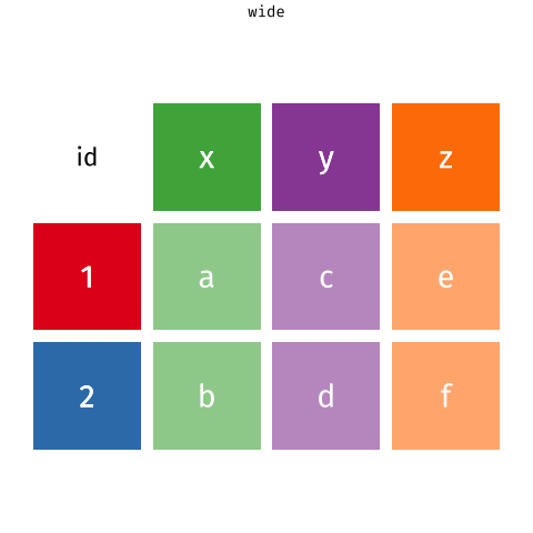
On the contrary, data are said to be 'in a wide format' if the same observation appears only once. Like here:
knitr::include_graphics("www/images/wide.png")
This tutorial uses the core tidyverse packages{target="_blank}, including {ggplot2}, {dplyr}, and {tidyr}, as well as the babynames package. All of these packages have been pre-installed and pre-loaded for your convenience.
Click the Next Topic button to begin.
Tidy Data
Variables, values, and observations
In Exploratory Data Analysis, we proposed three definitions that are useful for data science:
-
A variable is a quantity, quality, or property that you can measure.
-
A value is the state of a variable when you measure it. The value of a variable may change from measurement to measurement.
-
An observation is a set of measurements that are made under similar conditions (you usually make all of the measurements in an observation at the same time and on the same object). An observation will contain several values, each associated with a different variable. I'll sometimes refer to an observation as a case or data point.
These definitions are tied to the concept of tidy data. To see how, let's apply the definitions to some real data.
Quiz 1 - What are the variables?
table1
question("What are the variables in the data set above. Check all that apply.",
         answer("country", correct = TRUE),
         answer("year", correct = TRUE),
         answer("cases", correct = TRUE),
         answer("population", correct = TRUE),
         answer("count"),
         answer("type"),
         allow_retry = TRUE,
         correct = "Good Job! The data set contains four variables measured on six observations: country, year, cases, and population."
)
Quiz 2 - What are the variables?
Now consider this data set. Does it contain the same variables?
table2
question("Does the data above contain the variables **country**, **year**, **cases**, and **population**?",
         answer("Yes", correct = TRUE, message = "If you look closely, you will see that this is the same data set as before, but organized in a new way."),
         answer("No", message = "Don't be mislead by the two new column names: a variable and a column name are not necessarily the same thing."),
         allow_retry = TRUE
)
The shapes of data
These data sets reveal something important: you can reorganize the same set of variables, values, and observations in many different ways.
It's not hard to do. If you run the code chunks below, you can see the same data displayed in three more ways.
table3
table4a; table4b
table5
Tidy data
Data can come in a variety of formats, but one format is easier to use in R than the others. This format is known as tidy data. A data set is tidy if:
- Each variable is in its own column
- Each observation is in its own row
- Each value is in its own cell (this follows from #1 and #2)
Among our tables above, only table1 is tidy.
table1
Extracting variables
To see why tidy data is easier to use, consider a basic task. Each code chunk below extracts the values of the cases variable as a vector and computes the mean of the variable. One uses a tidy table, table1:
table1 |>
  summarise(mean_cases = mean(cases))
The other uses an untidy table, table2:
table2 |>
  slice(c(1, 3, 5, 7, 9, 11)) |>
  summarise(mean_count = mean(count))
Which line of code is easier to write? Which line could you write if you've only looked at the first row of the data?
Reusing code
Not only is the code for table1 easier to write, it is easier to reuse. To see what I mean, modify the code chunks below to compute the mean of the population variable for each table.
First with table1:
table1 |>
  summarise(mean_cases = mean(cases))
table1 |>
  summarise(mean_population = mean(population))
Then with table2:
table2 |>
  slice(c(1, 3, 5, 7, 9, 11)) |>
  summarise(mean_count = mean(count))
table2 |>
  slice(c(2, 4, 6, 8, 10, 12)) |>
  summarise(mean_count = mean(count))
Again table1 is easier to work with; you only need to change the name of the variable that you wish to extract. Code like this is easier to generalize to new data sets (if they are tidy) and easier to automate with a function.
Let's look at one more advantage.
Calculations
Suppose you would like to compute the ratios of cases to population for each country and each year. To do this, you need to ensure that the correct value of cases is paired with the correct value of population when you do the calculation.
Again, this is hard to do with untidy table2:
table2 |> slice(c(1, 3, 5, 7, 9, 11)) |> select(count) / table2 |> slice(c(2, 4, 6, 8, 10, 12)) |> select(count)
But it is easy to do with tidy table1. Give it a try below:
table1 |> select(cases) / table1 |> select(population)
These small differences may seem petty, but they add up over the course of a data analysis, stealing time and inviting mistakes.
Tidy data and R
The tidy data format works so well for R because it aligns the structure of your data with the mechanics of R:
-
R stores each data frame as a list of column vectors, which makes it easy to extract a column from a data frame as a vector. Tidy data places each variable in its own column vector, which makes it easy to extract all of the values of a variable to compute a summary statistic, or to use the variable in a computation.
-
R computes many functions and operations in a vectorized fashion, matching the first values of each vector of input to compute the first result, matching the second values of each input to compute the second result, and so on. Tidy data ensures that R will always match values with other values from the same operation whenever vector inputs are drawn from the same table.
knitr::include_graphics("www/images/vectorized.png")
As a result, most functions in R---and every function in the tidyverse---will expect your data to be organized into a tidy format. (You may have noticed above that we could use dplyr functions to work on table1, but not on table2).
Recap
"Data comes in many formats, but R prefers just one: tidy data."
--- Garrett Grolemund
A data set is tidy if:
- Each variable is in its own column
- Each observation is in its own row
- Each value is in its own cell (this follows from #1 and #2)
Now that you know what tidy data is, what can you do about untidy data?
In the following sections, you will learn about the functions:
-
pivot_longer() - reshapes wide data into long data by gathering columns, and
-
pivot_wider() - reshapes long data into wide data by expanding columns.
We'll come back to this later, but here's an overview of how these two functions work:
 {target="_blank}
Gathering columns
Untidy data
"Tidy data sets are all alike; but every messy data set is messy in its own way."
--- Hadley Wickham
How you tidy an untidy data set will depend on the initial configuration of the data. For example, consider the cases data set below.
cases
Quiz 3 - What are the variables?
question("What are the variables in cases?",
         answer("Country, 2011, 2012, and 2013", message = "Good try, but does this seem likely? Is 7000 an instance of some property named 2011?"),
         answer("Country, year, and some unknown quantity (n, count, number of cases, etc.)", correct = TRUE),
         answer("FR, DE, and US", message = "These seem like abbreviated country names, not the names of three properties whose values could vary across observations."),
         allow_retry = TRUE
)
A tidy version of
 {target="_blank}
pivot_longer()
You can use the pivot_longer() function in the {tidyr} package to convert wide data to long data. Notice that pivot_longer() returns a tidy copy of the dataset, but does not alter the original dataset. If you wish to use this copy later, you'll need to save it somewhere.
cases |>
  pivot_longer(cols = c(2, 3, 4),
               names_to = "year",
               values_to = "n")
Let's take a closer look at the pivot_longer() syntax.
pivot_longer() syntax
Here's the same call written without the pipe operator, which makes the syntax easier to see.
pivot_longer(cases, cols = c(2, 3, 4),
             names_to = "year",
             values_to = "n")
To use pivot_longer(), pass it as an argument the name of a dataset to be restructured followed by the cols argument which indicates which columns to use to construct the new columns (as numbers). Here, pivot_longer() will use the second, third and fourth columns. pivot_longer() will remove these columns from the result, but their contents will appear in the new columns. Any unspecified columns will remain in the dataset, and their contents will be repeated as often as necessary to duplicate each relationship in the original disordered dataset.
We also need to pass to pivot_longer() the two new column names to use. Each name must be a string enclosed in quotes:
To use pivot_longer(), pass it the name of a data set to reshape followed by two new column names to use. Each name should be a character string surrounded by quotes:
names_to : string that will become the name of the new column that will contain the old column names.values_to : string that will become the name of the new column containing the old values contained in the cells.
Exercise 1 - Ordering table4a
Now that you have seen pivot_longer() in action, try using it to order table4a:
table4a
The result should contain three columns: country, year, and cases. Start by modifying the code below.
cases |>
  pivot_longer(cols = c(2, 3, 4),
               names_to = "year",
               values_to = "n")
table4a |>
  pivot_longer(cols = c(2, 3),
               names_to = "year",
               values_to = "cases")
"Well done!"
Specifying columns
So far we've used numbers to describe which columns to reshape with pivot_longer(), but this isn't necessary. pivot_longer() also recognizes column names as well as all of the select() helpers that you learned about in Isolating Data with dplyr. So for example, these expressions would all do the same thing:
table4a |>
  pivot_longer(cols = c(2, 3),
               names_to = "year",
               values_to = "cases")

table4a |>
  pivot_longer(cols = c(`1999`, `2000`),
               names_to = "year",
               values_to = "cases")

table4a |>
  pivot_longer(cols = -country,
               names_to = "year",
               values_to = "cases")

table4a |>
  pivot_longer(cols = one_of(c("1999", "2000")),
               names_to = "year",
               values_to = "cases")
Notice that 1999 and 2000 are numbers. When you directly call column names that are numbers, you need to surround the names with backticks (otherwise pivot_longer() would think you mean the 1999th and 2000th columns). Use ?select_helpers to open a help page that lists the select helpers.
Exercise 2 - Tidy table4b
Use pivot_longer() and the - helper to tidy table4b into a dataset with three columns: country, year, and population.
table4b
table4b |>
  pivot_longer(cols = -country,
               names_to = "year",
               values_to = "population")
"Good job! Together the tidy versions of table4a and table4b repeat the information in table1. In Join Data Sets you will learn how to combine them back into a single data set."
Converting output
If you looked closely at your results in the previous exercises, you may have noticed something odd: the new year column contains character vectors. You can tell because R displays <chr> beneath the column name.
You can ask R to convert each new column to an appropriate data type by using the names_transform argument to the pivot_longer() call. This argument must be set to names_transform = list(year = as.integer). R will transform the contents of the year column into integers. Try it in the code above!
table4b |>
  pivot_longer(cols = -country,
               names_to = "year",
               values_to = "population")
table4b |>
  pivot_longer(cols = -country,
               names_to = "year",
               values_to = "population",
               names_transform = list(year = as.integer))
"Good Job! Now <int> appears under the year column, which means that R has stored the years as integers instead of character strings. Integers are one of R's two numeric data types, along with doubles."
The flexibility of pivot_longer()
cases, table4a, and table4b are all rectangular tables:
- each row corresponds to the value of a variable, and
- each column corresponds to the value of a variable
Rectangular tables are a simple form of wide data. But you will also encounter more complicated examples of wide data. For example, it is common for researchers to place one subject per row. In this case, you might see several columns of identifying information followed by a set of columns that list repeated measurements of the same variable. cases2 emulates such a data set.
cases2
To tidy this data, you would want to keep the first three columns as they are. Can you tidy this data with pivot_longer()? Yes, an you already know how. Think about the problem and then tidy cases2 into a data set with five columns: city, country, continent, year, and cases.
cases2 |>
  pivot_longer(cols = c(4, 5, 6),
               names_to = "year",
               values_to = "cases")
"Great job! Now let's look at how to tidy another common type of untidy data."
Spreading columns
Narrow data
The pollution dataset below displays the amount of small and large particulate in the air of three cities. It illustrates another common type of untidy data. Narrow data uses a literal key column and a literal value column to store multiple variables. Can you tell here which is which?
pollution
Quiz 4 - Which is the key column?
pollution
question("Which column in pollution contains key names (i.e. variable names)?",
         answer("city"),
         answer("size", correct = TRUE, message = "Two properties are being measured in this data: 1) the amount of small particulate in the air, and 2) the amount of large particulate"),
         answer("amount"),
         allow_retry = TRUE
)
Quiz 5 - Which is the value column?
pollution
question("Which column in pollution contains the values associated with the key names?",
         answer("city"),
         answer("size"),
         answer("amount", correct = TRUE, message = "What do these numbers represent? You can only tell when you match them with the variable names large (for large particulate) and small (for small particulate)."),
         allow_retry = TRUE
)
A tidy version of pollution
{target="_blank}
pivot_wider()
You can "expand" the variable names on their own set of columns with the pivot_wider() function in the {tidyr} package. To use pivot_wider(), pass it the name of a a data set to spread (provided here by the |> pipe). Then tell pivot_wider() which column contains the variable names and which column contains the values associated with those variables.
pollution |>
  pivot_wider(names_from = size,
              values_from = amount)
pivot_wider() will give each unique value in the names_from column its own column. The name of the value will become the name of the column. pivot_wider() will then redistribute the values in the values_from column across the new columns in a way that preserves each relationship in the original dataset.
Exercise 3 - Tidy table2
Use pivot_wider() to tidy table2 into a dataset with four columns: country, year, cases, and population. In short, convert table2 to look like table1.
table2
table2 |>
  pivot_wider(names_from = type,
              values_from = count)
"Good job! You now posses two complementary tools for reshaping the layout of data. By iterating between pivot_longer() and pivot_wider() you can rearrange the values of any data set into many different configurations."
To quote or not to quote
You may notice that both pivot_longer() and pivot_wider() take names_ et values_. And, in each case the arguments are set to column names. But in the pivot_longer() you must surround the names with quotes and in the pivot_wider() case you do not. Why is this?
table4b |>
  pivot_longer(cols = -country,
               names_to = "year",
               values_to = "population")

pollution |>
  pivot_wider(names_from = size,
              values_from = amount)
Don't let the difference trip you up. Instead think about what the quotes mean.
- In R, any sequence of characters surrounded by quotes is a character string, which is a piece of data in and of itself.
- Likewise, any sequence of characters not surrounded by quotes is the name of an object, which is a symbol that contains or points to a piece of data. Whenever R evaluates an object name, it searches for the object to find the data that it contains. If the object does not exist somewhere, R will return an error.
In our pivot_longer() code above, "year" and "population" refer to two columns that do not yet exist. If R tried to look for objects named year and population it wouldn't find them (at least not in the table4b dataset). When we use pivot_longer() we are passing R two values (character strings) to use as the name of future columns that will appear in the result.
In our pivot_wider() code, names_from and values_from point to two columns that do exist in the pollution dataset: size and amount. When we use pivot_wider(), we are telling R to find these objects (columns) in the dataset and to use their contents to create the result. Since they exist, we do not need to surround them in quotation marks.
In practice, whether or not you need to use quotation marks will depend on how the author of your function wrote the function (For example, pivot_wider() will still work if you do include quotation marks). However, you can use the intuition above as a guide for how to use functions in the tidyverse.
Boys and girls in babynames
Let's apply pivot_wider() to a real world inquiry. The plot below visualizes an aspect of the babynames data set from the babynames package. (See Work with Data for an introduction to the babynames data set.)
babynames |>
  group_by(year, sex) |>
  summarise(n = sum(n)) |>
  ggplot() +
    aes(x = year, y = n, color = sex) +
    geom_line()
The ratio of girls to boys in babynames is not constant across time. We can explore this phenomenon further by recreating the data in the plot.
Review - Make the data
babynames |>
  group_by(year, sex) |>
  summarise(total = sum(n)) |>
  ggplot() +
    aes(x = year, y = total, color = sex) +
    geom_line()
To make the data displayed in the plot above, I first grouped babynames by year and sex. Then I computed a summary for each group: total, which is equal to the sum of n for each group.
Use {dplyr} functions to recreate this process in the chunk below.
babynames |>
  group_by(year, sex) |>
  summarise(total = sum(n))
"Good job! Now that we have the data, let's recreate the plot."
Review - Make the plot
babynames |>
  group_by(year, sex) |>
  summarise(total = sum(n)) |>
  ggplot() +
    aes(x = year, y = total, color = sex) +
    geom_line()
Use the data below to make the plot above, which was built with {ggplot2} functions.
babynames |>
  group_by(year, sex) |>
  summarise(total = sum(n))
babynames |>
  group_by(year, sex) |>
  summarise(total = sum(n)) |>
  ggplot() +
    aes(x = year, y = total, color = sex) +
    geom_line()
"Good job! You can see that the data shows that less boys than girls were born for the years prior to 1936, and less girls than boys for the years after 1936."
A better way to look at the data
A better way to explore this phenomena would be to directly plot a ratio of boys to girls over time. To make such a plot, you would need to compute the ratio of boys to girls for each year from 1880 to 2015:
$$\text{ratio male} = \frac{\text{total male}}{\text{total female}}$$
But how can we plot this data? Our current iteration of babynames places the total number of boys and girls for each year in the same column, which makes it hard to use both totals in the same calculation.
babynames |>
  group_by(year, sex) |>
  summarise(total = sum(n))
A goal
It would be easier to calculate the ratio of boys to girls if we could reshape our data to place the total number of boys born per year in one column and the total number of girls born per year in another:
babynames |>
  group_by(year, sex) |>
  summarise(total = sum(n)) |>
  pivot_wider(names_from = sex,
              values_from = total)
Then we could compute the ratio by piping our data into a call like mutate(ratio = M / F).
Exercise 4 - Make the plot
Add to the code below to:
- Reshape the layout to place the total number of boys per year in one column and the total number of girls born per year in a second column.
- Compute the ratio of boys to girls.
- Plot the ratio of boys to girls over time.
babynames |>
  group_by(year, sex) |>
  summarise(total = sum(n))
babynames |>
  group_by(year, sex) |>
  summarise(total = sum(n)) |>
  pivot_wider(names_from = sex,
              values_from = total) |>
  mutate(ratio = M / F) |>
  ggplot() +
    aes(x = year, y = ratio) +
    geom_line()
"Good job!"
Interesting
Our results reveal a conspicuous oddity, that is easier to interpret if we turn the ratio into a percentage.
babynames |>
  group_by(year, sex) |>
  summarise(total = sum(n)) |>
  pivot_wider(names_from = sex,
              values_from = total) |>
  mutate(percent_male = M / (M + F) * 100, ratio = M / F) |>
  ggplot(aes(year, percent_male)) + geom_line()
The percent of recorded male births is unusually low between 1880 and 1936. What is happening? One insight is that the data comes from the United States Social Security office, which was only created in 1936. As a result, we can expect the data prior to 1936 to display a survivorship bias.
Recap
Your data will be easier to work with in R if you reshape it into a tidy layout at the start of your analysis. Data is tidy if:
- Each variable is in its own column
- Each observation is in its own row
- Each value is in its own cell
You can use pivot_longer() and pivot_wider(), or some iterative sequence of the two, to reshape your data into any possible configuration that:
- Retains all of the values in your original data set, and
- Retains all of the relationships between values in your original data set.
In particular, you can use these functions to recast your data into a tidy layout.
Food for thought
It is not always clear whether or not a data set is tidy. For example, the version of babynames that was tidy when we wanted to plot total children by year, was no longer tidy when we wanted to compute the ratio of male to female children.
The ambiguity comes from the definition of tidy data. Tidiness depends on the variables in your data set. But what is a variable depends on what you are trying to do.
To identify the variables that you need to work with, describe what you want to do with an equation. Each variable in the equation should correspond to a variable in your data.
So in our first case, we wanted to make a plot with the following mappings (e.g. equations)
$$x = year$$
$$y = total$$
$$color = sex$$
To do this, we needed a data set that placed $year$, $total$, and $sex$ each in their own columns.
In our second case we wanted to compute $ratio$, where
$$\text{ratio} = \frac{\text{male}}{\text{female}}$$
This formula has three variables: $ratio\ \ male$, $total\ \ male$, and $total\ \ female$. To create the first variable, we required a data set that isolated the second and third variables ($total\ \ male$ and $total\ \ female$) in their own columns.
VincentGuyader/tutor documentation built on June 6, 2024, 12:35 p.m.
R Package Documentation
Browse R Packages
We want your feedback!
Note that we can't provide technical support on individual packages. You should contact the package authors for that.
library(learnr) library(tidyverse) library(babynames) checker <- function(label, user_code, check_code, envir_result, evaluate_result, ...) { list(message = check_code, correct = TRUE, location = "append") } tutorial_options(exercise.timelimit = 20, exercise.checker = checker) knitr::opts_chunk$set(echo = FALSE)
cases <- tribble( ~Country, ~"2011", ~"2012", ~"2013", "FR", 7000, 6900, 7000, "DE", 5800, 6000, 6200, "US", 15000, 14000, 13000 ) cases2 <- tribble( ~city, ~country, ~continent, ~"2011", ~"2012", ~"2013", "Paris", "FR", "Europe", 7000, 6900, 7000, "Berlin", "DE", "Europe", 5800, 6000, 6200, "Chicago", "US", "North America", 15000, 14000, 13000 ) pollution <- tribble( ~city, ~size, ~amount, "New York", "large", 23, "New York", "small", 14, "London", "large", 22, "London", "small", 16, "Beijing", "large", 121, "Beijing", "small", 121 )
names_to_keep <- babynames |> group_by(year) |> top_n(50,prop) |> pull(name) |> unique() |> append(c("Garrett","Sea","Khaleesi","Anemone","Acura", "Lexus", "Yugo")) babynames <- babynames |> filter(name %in% names_to_keep) # distinct(name) |> sample_n(100)
Welcome
The tools that you learned in the previous Primers work best when your data is organized in a specific way. This format is known as tidy data and it appears throughout the tidyverse. You will spend a lot of time as a data scientist wrangling your data into a useable format, so it is important to learn how to do this fast.
This tutorial will teach you how to recognize tidy data, as well as how to reshape untidy data into a tidy format. In it, you will learn the core data wrangling functions for the tidyverse:
pivot_longer()- which reshapes wide data into long data, andpivot_wider()- which reshapes long data into wide data
We'll come back to this later, but remember that data is said to be in a 'long format' if the same observation appears several times. Like here:
knitr::include_graphics("www/images/long.png")
On the contrary, data are said to be 'in a wide format' if the same observation appears only once. Like here:
knitr::include_graphics("www/images/wide.png")
This tutorial uses the core tidyverse packages{target="_blank}, including {ggplot2}, {dplyr}, and {tidyr}, as well as the babynames package. All of these packages have been pre-installed and pre-loaded for your convenience.
Click the Next Topic button to begin.
Tidy Data
Variables, values, and observations
In Exploratory Data Analysis, we proposed three definitions that are useful for data science:
-
A variable is a quantity, quality, or property that you can measure.
-
A value is the state of a variable when you measure it. The value of a variable may change from measurement to measurement.
-
An observation is a set of measurements that are made under similar conditions (you usually make all of the measurements in an observation at the same time and on the same object). An observation will contain several values, each associated with a different variable. I'll sometimes refer to an observation as a case or data point.
These definitions are tied to the concept of tidy data. To see how, let's apply the definitions to some real data.
Quiz 1 - What are the variables?
table1
question("What are the variables in the data set above. Check all that apply.", answer("country", correct = TRUE), answer("year", correct = TRUE), answer("cases", correct = TRUE), answer("population", correct = TRUE), answer("count"), answer("type"), allow_retry = TRUE, correct = "Good Job! The data set contains four variables measured on six observations: country, year, cases, and population." )
Quiz 2 - What are the variables?
Now consider this data set. Does it contain the same variables?
table2
question("Does the data above contain the variables **country**, **year**, **cases**, and **population**?", answer("Yes", correct = TRUE, message = "If you look closely, you will see that this is the same data set as before, but organized in a new way."), answer("No", message = "Don't be mislead by the two new column names: a variable and a column name are not necessarily the same thing."), allow_retry = TRUE )
The shapes of data
These data sets reveal something important: you can reorganize the same set of variables, values, and observations in many different ways.
It's not hard to do. If you run the code chunks below, you can see the same data displayed in three more ways.
table3
table4a; table4b
table5
Tidy data
Data can come in a variety of formats, but one format is easier to use in R than the others. This format is known as tidy data. A data set is tidy if:
- Each variable is in its own column
- Each observation is in its own row
- Each value is in its own cell (this follows from #1 and #2)
Among our tables above, only table1 is tidy.
table1
Extracting variables
To see why tidy data is easier to use, consider a basic task. Each code chunk below extracts the values of the cases variable as a vector and computes the mean of the variable. One uses a tidy table, table1:
table1 |> summarise(mean_cases = mean(cases))
The other uses an untidy table, table2:
table2 |> slice(c(1, 3, 5, 7, 9, 11)) |> summarise(mean_count = mean(count))
Which line of code is easier to write? Which line could you write if you've only looked at the first row of the data?
Reusing code
Not only is the code for table1 easier to write, it is easier to reuse. To see what I mean, modify the code chunks below to compute the mean of the population variable for each table.
First with table1:
table1 |> summarise(mean_cases = mean(cases))
table1 |> summarise(mean_population = mean(population))
Then with table2:
table2 |> slice(c(1, 3, 5, 7, 9, 11)) |> summarise(mean_count = mean(count))
table2 |> slice(c(2, 4, 6, 8, 10, 12)) |> summarise(mean_count = mean(count))
Again table1 is easier to work with; you only need to change the name of the variable that you wish to extract. Code like this is easier to generalize to new data sets (if they are tidy) and easier to automate with a function.
Let's look at one more advantage.
Calculations
Suppose you would like to compute the ratios of cases to population for each country and each year. To do this, you need to ensure that the correct value of cases is paired with the correct value of population when you do the calculation.
Again, this is hard to do with untidy table2:
table2 |> slice(c(1, 3, 5, 7, 9, 11)) |> select(count) / table2 |> slice(c(2, 4, 6, 8, 10, 12)) |> select(count)
But it is easy to do with tidy table1. Give it a try below:
table1 |> select(cases) / table1 |> select(population)
These small differences may seem petty, but they add up over the course of a data analysis, stealing time and inviting mistakes.
Tidy data and R
The tidy data format works so well for R because it aligns the structure of your data with the mechanics of R:
-
R stores each data frame as a list of column vectors, which makes it easy to extract a column from a data frame as a vector. Tidy data places each variable in its own column vector, which makes it easy to extract all of the values of a variable to compute a summary statistic, or to use the variable in a computation.
-
R computes many functions and operations in a vectorized fashion, matching the first values of each vector of input to compute the first result, matching the second values of each input to compute the second result, and so on. Tidy data ensures that R will always match values with other values from the same operation whenever vector inputs are drawn from the same table.
knitr::include_graphics("www/images/vectorized.png")
As a result, most functions in R---and every function in the tidyverse---will expect your data to be organized into a tidy format. (You may have noticed above that we could use dplyr functions to work on table1, but not on table2).
Recap
"Data comes in many formats, but R prefers just one: tidy data." --- Garrett Grolemund
A data set is tidy if:
- Each variable is in its own column
- Each observation is in its own row
- Each value is in its own cell (this follows from #1 and #2)
Now that you know what tidy data is, what can you do about untidy data?
In the following sections, you will learn about the functions:
-
pivot_longer()- reshapes wide data into long data by gathering columns, and -
pivot_wider()- reshapes long data into wide data by expanding columns.
We'll come back to this later, but here's an overview of how these two functions work:
{target="_blank}
Gathering columns
Untidy data
"Tidy data sets are all alike; but every messy data set is messy in its own way." --- Hadley Wickham
How you tidy an untidy data set will depend on the initial configuration of the data. For example, consider the cases data set below.
cases
Quiz 3 - What are the variables?
question("What are the variables in cases?", answer("Country, 2011, 2012, and 2013", message = "Good try, but does this seem likely? Is 7000 an instance of some property named 2011?"), answer("Country, year, and some unknown quantity (n, count, number of cases, etc.)", correct = TRUE), answer("FR, DE, and US", message = "These seem like abbreviated country names, not the names of three properties whose values could vary across observations."), allow_retry = TRUE )
A tidy version of
{target="_blank}
pivot_longer()
You can use the pivot_longer() function in the {tidyr} package to convert wide data to long data. Notice that pivot_longer() returns a tidy copy of the dataset, but does not alter the original dataset. If you wish to use this copy later, you'll need to save it somewhere.
cases |> pivot_longer(cols = c(2, 3, 4), names_to = "year", values_to = "n")
Let's take a closer look at the pivot_longer() syntax.
pivot_longer() syntax
Here's the same call written without the pipe operator, which makes the syntax easier to see.
pivot_longer(cases, cols = c(2, 3, 4), names_to = "year", values_to = "n")
To use pivot_longer(), pass it as an argument the name of a dataset to be restructured followed by the cols argument which indicates which columns to use to construct the new columns (as numbers). Here, pivot_longer() will use the second, third and fourth columns. pivot_longer() will remove these columns from the result, but their contents will appear in the new columns. Any unspecified columns will remain in the dataset, and their contents will be repeated as often as necessary to duplicate each relationship in the original disordered dataset.
We also need to pass to pivot_longer() the two new column names to use. Each name must be a string enclosed in quotes:
To use pivot_longer(), pass it the name of a data set to reshape followed by two new column names to use. Each name should be a character string surrounded by quotes:
names_to: string that will become the name of the new column that will contain the old column names.values_to: string that will become the name of the new column containing the old values contained in the cells.
Exercise 1 - Ordering table4a
Now that you have seen pivot_longer() in action, try using it to order table4a:
table4a
The result should contain three columns: country, year, and cases. Start by modifying the code below.
cases |> pivot_longer(cols = c(2, 3, 4), names_to = "year", values_to = "n")
table4a |> pivot_longer(cols = c(2, 3), names_to = "year", values_to = "cases")
"Well done!"
Specifying columns
So far we've used numbers to describe which columns to reshape with pivot_longer(), but this isn't necessary. pivot_longer() also recognizes column names as well as all of the select() helpers that you learned about in Isolating Data with dplyr. So for example, these expressions would all do the same thing:
table4a |> pivot_longer(cols = c(2, 3), names_to = "year", values_to = "cases") table4a |> pivot_longer(cols = c(`1999`, `2000`), names_to = "year", values_to = "cases") table4a |> pivot_longer(cols = -country, names_to = "year", values_to = "cases") table4a |> pivot_longer(cols = one_of(c("1999", "2000")), names_to = "year", values_to = "cases")
Notice that 1999 and 2000 are numbers. When you directly call column names that are numbers, you need to surround the names with backticks (otherwise pivot_longer() would think you mean the 1999th and 2000th columns). Use ?select_helpers to open a help page that lists the select helpers.
Exercise 2 - Tidy table4b
Use pivot_longer() and the - helper to tidy table4b into a dataset with three columns: country, year, and population.
table4b
table4b |> pivot_longer(cols = -country, names_to = "year", values_to = "population")
"Good job! Together the tidy versions of table4a and table4b repeat the information in table1. In Join Data Sets you will learn how to combine them back into a single data set."
Converting output
If you looked closely at your results in the previous exercises, you may have noticed something odd: the new year column contains character vectors. You can tell because R displays <chr> beneath the column name.
You can ask R to convert each new column to an appropriate data type by using the names_transform argument to the pivot_longer() call. This argument must be set to names_transform = list(year = as.integer). R will transform the contents of the year column into integers. Try it in the code above!
table4b |> pivot_longer(cols = -country, names_to = "year", values_to = "population")
table4b |> pivot_longer(cols = -country, names_to = "year", values_to = "population", names_transform = list(year = as.integer))
"Good Job! Now <int> appears under the year column, which means that R has stored the years as integers instead of character strings. Integers are one of R's two numeric data types, along with doubles."
The flexibility of pivot_longer()
cases, table4a, and table4b are all rectangular tables:
- each row corresponds to the value of a variable, and
- each column corresponds to the value of a variable
Rectangular tables are a simple form of wide data. But you will also encounter more complicated examples of wide data. For example, it is common for researchers to place one subject per row. In this case, you might see several columns of identifying information followed by a set of columns that list repeated measurements of the same variable. cases2 emulates such a data set.
cases2
To tidy this data, you would want to keep the first three columns as they are. Can you tidy this data with pivot_longer()? Yes, an you already know how. Think about the problem and then tidy cases2 into a data set with five columns: city, country, continent, year, and cases.
cases2 |> pivot_longer(cols = c(4, 5, 6), names_to = "year", values_to = "cases")
"Great job! Now let's look at how to tidy another common type of untidy data."
Spreading columns
Narrow data
The pollution dataset below displays the amount of small and large particulate in the air of three cities. It illustrates another common type of untidy data. Narrow data uses a literal key column and a literal value column to store multiple variables. Can you tell here which is which?
pollution
Quiz 4 - Which is the key column?
pollution
question("Which column in pollution contains key names (i.e. variable names)?", answer("city"), answer("size", correct = TRUE, message = "Two properties are being measured in this data: 1) the amount of small particulate in the air, and 2) the amount of large particulate"), answer("amount"), allow_retry = TRUE )
Quiz 5 - Which is the value column?
pollution
question("Which column in pollution contains the values associated with the key names?", answer("city"), answer("size"), answer("amount", correct = TRUE, message = "What do these numbers represent? You can only tell when you match them with the variable names large (for large particulate) and small (for small particulate)."), allow_retry = TRUE )
A tidy version of pollution
{target="_blank}
pivot_wider()
You can "expand" the variable names on their own set of columns with the pivot_wider() function in the {tidyr} package. To use pivot_wider(), pass it the name of a a data set to spread (provided here by the |> pipe). Then tell pivot_wider() which column contains the variable names and which column contains the values associated with those variables.
pollution |> pivot_wider(names_from = size, values_from = amount)
pivot_wider() will give each unique value in the names_from column its own column. The name of the value will become the name of the column. pivot_wider() will then redistribute the values in the values_from column across the new columns in a way that preserves each relationship in the original dataset.
Exercise 3 - Tidy table2
Use pivot_wider() to tidy table2 into a dataset with four columns: country, year, cases, and population. In short, convert table2 to look like table1.
table2
table2 |> pivot_wider(names_from = type, values_from = count)
"Good job! You now posses two complementary tools for reshaping the layout of data. By iterating between pivot_longer() and pivot_wider() you can rearrange the values of any data set into many different configurations."
To quote or not to quote
You may notice that both pivot_longer() and pivot_wider() take names_ et values_. And, in each case the arguments are set to column names. But in the pivot_longer() you must surround the names with quotes and in the pivot_wider() case you do not. Why is this?
table4b |> pivot_longer(cols = -country, names_to = "year", values_to = "population") pollution |> pivot_wider(names_from = size, values_from = amount)
Don't let the difference trip you up. Instead think about what the quotes mean.
- In R, any sequence of characters surrounded by quotes is a character string, which is a piece of data in and of itself.
- Likewise, any sequence of characters not surrounded by quotes is the name of an object, which is a symbol that contains or points to a piece of data. Whenever R evaluates an object name, it searches for the object to find the data that it contains. If the object does not exist somewhere, R will return an error.
In our pivot_longer() code above, "year" and "population" refer to two columns that do not yet exist. If R tried to look for objects named year and population it wouldn't find them (at least not in the table4b dataset). When we use pivot_longer() we are passing R two values (character strings) to use as the name of future columns that will appear in the result.
In our pivot_wider() code, names_from and values_from point to two columns that do exist in the pollution dataset: size and amount. When we use pivot_wider(), we are telling R to find these objects (columns) in the dataset and to use their contents to create the result. Since they exist, we do not need to surround them in quotation marks.
In practice, whether or not you need to use quotation marks will depend on how the author of your function wrote the function (For example, pivot_wider() will still work if you do include quotation marks). However, you can use the intuition above as a guide for how to use functions in the tidyverse.
Boys and girls in babynames
Let's apply pivot_wider() to a real world inquiry. The plot below visualizes an aspect of the babynames data set from the babynames package. (See Work with Data for an introduction to the babynames data set.)
babynames |> group_by(year, sex) |> summarise(n = sum(n)) |> ggplot() + aes(x = year, y = n, color = sex) + geom_line()
The ratio of girls to boys in babynames is not constant across time. We can explore this phenomenon further by recreating the data in the plot.
Review - Make the data
babynames |> group_by(year, sex) |> summarise(total = sum(n)) |> ggplot() + aes(x = year, y = total, color = sex) + geom_line()
To make the data displayed in the plot above, I first grouped babynames by year and sex. Then I computed a summary for each group: total, which is equal to the sum of n for each group.
Use {dplyr} functions to recreate this process in the chunk below.
babynames |> group_by(year, sex) |> summarise(total = sum(n))
"Good job! Now that we have the data, let's recreate the plot."
Review - Make the plot
babynames |> group_by(year, sex) |> summarise(total = sum(n)) |> ggplot() + aes(x = year, y = total, color = sex) + geom_line()
Use the data below to make the plot above, which was built with {ggplot2} functions.
babynames |> group_by(year, sex) |> summarise(total = sum(n))
babynames |> group_by(year, sex) |> summarise(total = sum(n)) |> ggplot() + aes(x = year, y = total, color = sex) + geom_line()
"Good job! You can see that the data shows that less boys than girls were born for the years prior to 1936, and less girls than boys for the years after 1936."
A better way to look at the data
A better way to explore this phenomena would be to directly plot a ratio of boys to girls over time. To make such a plot, you would need to compute the ratio of boys to girls for each year from 1880 to 2015:
$$\text{ratio male} = \frac{\text{total male}}{\text{total female}}$$
But how can we plot this data? Our current iteration of babynames places the total number of boys and girls for each year in the same column, which makes it hard to use both totals in the same calculation.
babynames |> group_by(year, sex) |> summarise(total = sum(n))
A goal
It would be easier to calculate the ratio of boys to girls if we could reshape our data to place the total number of boys born per year in one column and the total number of girls born per year in another:
babynames |> group_by(year, sex) |> summarise(total = sum(n)) |> pivot_wider(names_from = sex, values_from = total)
Then we could compute the ratio by piping our data into a call like mutate(ratio = M / F).
Exercise 4 - Make the plot
Add to the code below to:
- Reshape the layout to place the total number of boys per year in one column and the total number of girls born per year in a second column.
- Compute the ratio of boys to girls.
- Plot the ratio of boys to girls over time.
babynames |> group_by(year, sex) |> summarise(total = sum(n))
babynames |> group_by(year, sex) |> summarise(total = sum(n)) |> pivot_wider(names_from = sex, values_from = total) |> mutate(ratio = M / F) |> ggplot() + aes(x = year, y = ratio) + geom_line()
"Good job!"
Interesting
Our results reveal a conspicuous oddity, that is easier to interpret if we turn the ratio into a percentage.
babynames |> group_by(year, sex) |> summarise(total = sum(n)) |> pivot_wider(names_from = sex, values_from = total) |> mutate(percent_male = M / (M + F) * 100, ratio = M / F) |> ggplot(aes(year, percent_male)) + geom_line()
The percent of recorded male births is unusually low between 1880 and 1936. What is happening? One insight is that the data comes from the United States Social Security office, which was only created in 1936. As a result, we can expect the data prior to 1936 to display a survivorship bias.
Recap
Your data will be easier to work with in R if you reshape it into a tidy layout at the start of your analysis. Data is tidy if:
- Each variable is in its own column
- Each observation is in its own row
- Each value is in its own cell
You can use pivot_longer() and pivot_wider(), or some iterative sequence of the two, to reshape your data into any possible configuration that:
- Retains all of the values in your original data set, and
- Retains all of the relationships between values in your original data set.
In particular, you can use these functions to recast your data into a tidy layout.
Food for thought
It is not always clear whether or not a data set is tidy. For example, the version of babynames that was tidy when we wanted to plot total children by year, was no longer tidy when we wanted to compute the ratio of male to female children.
The ambiguity comes from the definition of tidy data. Tidiness depends on the variables in your data set. But what is a variable depends on what you are trying to do.
To identify the variables that you need to work with, describe what you want to do with an equation. Each variable in the equation should correspond to a variable in your data.
So in our first case, we wanted to make a plot with the following mappings (e.g. equations)
$$x = year$$ $$y = total$$ $$color = sex$$
To do this, we needed a data set that placed $year$, $total$, and $sex$ each in their own columns.
In our second case we wanted to compute $ratio$, where
$$\text{ratio} = \frac{\text{male}}{\text{female}}$$ This formula has three variables: $ratio\ \ male$, $total\ \ male$, and $total\ \ female$. To create the first variable, we required a data set that isolated the second and third variables ($total\ \ male$ and $total\ \ female$) in their own columns.
R Package Documentation
Browse R Packages
We want your feedback!
Note that we can't provide technical support on individual packages. You should contact the package authors for that.
Embedding an R snippet on your website
Add the following code to your website.
For more information on customizing the embed code, read Embedding Snippets.