README.md
In aashidham/rpac: R package for performing labelled PCA (lPCA)
rpac
This is an R package for performing labelled PCA. Did you ever want to visualize high-dimensional data? If the data is unlabelled, the answer is simple: use PCA.
But what if you have labelled high-dimensional data? One of the first things you might want to do is check if it is classifiable at all. Labelled PCA shows whether a dataset is separable in the first place. If the dataset is not separable, no matter how fancy your machine learning tools are, you won't find much success in building a classifer.
The labelled PCA method computes a linear transformation of the data that maximizes the pairwise distance between points in different labelled classes of the data while maintaining the constraint that the transformed data are orthogonal to each other. By examining the labelled classes of the clusters that emerge in the transformed data, you can clearly see whether or not the dataset is seperable.
To install:
install.packages("devtools")
require(devtools)
install.packages("geigen")
require(geigen)
install_github("aashidham/rpac")
require(rpac)
Examples of use (code):
library(RCurl)
library(rpac)

X <- getURL("https://aashidham.github.io/rpac_assets/X_sample.csv")
X <- read.csv(textConnection(X))
X <- data.matrix(X)

Y <- getURL("https://aashidham.github.io/rpac_assets/Y_sample.csv")
Y <- read.csv(textConnection(Y))
Y <- data.matrix(Y)

#lPCA plot
plotlPCA(X,Y)

#compare to normal PCA plot
pca = prcomp(X)
plot(pca$x[,1],pca$x[,2],col=Y)
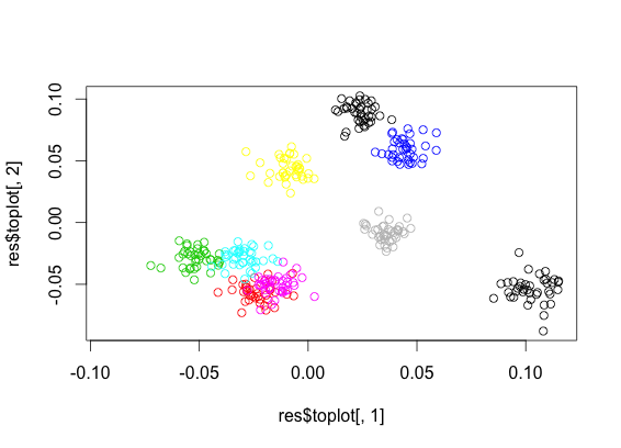
Output of the above. The first image is labelled PCA, the second is normal PCA. The colored clusters are easily observed in the first image, giving evidence that seperability is possible. The second image, on the other hand, does not make clear whether the data is seperable, since it is transforming the data to maximize pairwise distances regardless of class.

Details
There are two functions inside this package: lPCA and plotlPCA.
plotlPCA takes in X and Y and returns its best visualization of
the results. lPCA takes in X and Y and returns toplot and V, which
you can use for your own visualizations.
This package needs two inputs from you: X and Y.
X is a matrix of n rows of samples, and m columns of features of these samples. Y is n rows by 1 column of labels (say 1 for some group, 2 for another, etc.). X and Y should be numerical matrices without any NAs. It is really important that n > m for meaningful results.
Citations
Adapted from Koren, Y., & Carmel, L. (2003). Visualization of Labeled Data Using Linear Transformations. In Proceedings of the Ninth Annual IEEE Conference on Information Visualization (pp. 121–128). Washington, DC, USA: IEEE Computer Society.
Cited in Blood Journal (doi:10.1182), American College of Surgeons Clinical Congress (poster), Science Translational Medicine (doi: 10.1126/scitranslmed.aaa5993)
Sweeney, T. E., Shidham, A., Wong, H. R., & Khatri, P. (2015). A comprehensive time-course–based multicohort analysis of sepsis and sterile inflammation reveals a robust diagnostic gene set. Science Translational Medicine, 7(287), 287ra71.
Sweeney TE, Shidham A, Khatri P. “Gene expression can robustly separate infectious and non-infectious inflammation”. American College of Surgeons Clinical Congress, 2014.
aashidham/rpac documentation built on May 10, 2019, 8:05 a.m.
R Package Documentation
Browse R Packages
We want your feedback!
Note that we can't provide technical support on individual packages. You should contact the package authors for that.
rpac
This is an R package for performing labelled PCA. Did you ever want to visualize high-dimensional data? If the data is unlabelled, the answer is simple: use PCA.
But what if you have labelled high-dimensional data? One of the first things you might want to do is check if it is classifiable at all. Labelled PCA shows whether a dataset is separable in the first place. If the dataset is not separable, no matter how fancy your machine learning tools are, you won't find much success in building a classifer.
The labelled PCA method computes a linear transformation of the data that maximizes the pairwise distance between points in different labelled classes of the data while maintaining the constraint that the transformed data are orthogonal to each other. By examining the labelled classes of the clusters that emerge in the transformed data, you can clearly see whether or not the dataset is seperable.
To install:
install.packages("devtools")
require(devtools)
install.packages("geigen")
require(geigen)
install_github("aashidham/rpac")
require(rpac)
Examples of use (code):
library(RCurl)
library(rpac)
X <- getURL("https://aashidham.github.io/rpac_assets/X_sample.csv")
X <- read.csv(textConnection(X))
X <- data.matrix(X)
Y <- getURL("https://aashidham.github.io/rpac_assets/Y_sample.csv")
Y <- read.csv(textConnection(Y))
Y <- data.matrix(Y)
#lPCA plot
plotlPCA(X,Y)
#compare to normal PCA plot
pca = prcomp(X)
plot(pca$x[,1],pca$x[,2],col=Y)
Output of the above. The first image is labelled PCA, the second is normal PCA. The colored clusters are easily observed in the first image, giving evidence that seperability is possible. The second image, on the other hand, does not make clear whether the data is seperable, since it is transforming the data to maximize pairwise distances regardless of class.
Details
There are two functions inside this package: lPCA and plotlPCA.
plotlPCA takes in X and Y and returns its best visualization of the results. lPCA takes in X and Y and returns toplot and V, which you can use for your own visualizations.
This package needs two inputs from you: X and Y.
X is a matrix of n rows of samples, and m columns of features of these samples. Y is n rows by 1 column of labels (say 1 for some group, 2 for another, etc.). X and Y should be numerical matrices without any NAs. It is really important that n > m for meaningful results.
Citations
Adapted from Koren, Y., & Carmel, L. (2003). Visualization of Labeled Data Using Linear Transformations. In Proceedings of the Ninth Annual IEEE Conference on Information Visualization (pp. 121–128). Washington, DC, USA: IEEE Computer Society.
Cited in Blood Journal (doi:10.1182), American College of Surgeons Clinical Congress (poster), Science Translational Medicine (doi: 10.1126/scitranslmed.aaa5993)
Sweeney, T. E., Shidham, A., Wong, H. R., & Khatri, P. (2015). A comprehensive time-course–based multicohort analysis of sepsis and sterile inflammation reveals a robust diagnostic gene set. Science Translational Medicine, 7(287), 287ra71.
Sweeney TE, Shidham A, Khatri P. “Gene expression can robustly separate infectious and non-infectious inflammation”. American College of Surgeons Clinical Congress, 2014.
R Package Documentation
Browse R Packages
We want your feedback!
Note that we can't provide technical support on individual packages. You should contact the package authors for that.
Embedding an R snippet on your website
Add the following code to your website.
For more information on customizing the embed code, read Embedding Snippets.