LabellingBarplot.md
In cardiomoon/ggplotAssist: 'RStudio' Addin for Teaching and Learning 'ggplot2'
title: "Labelling Barplot with ggplotAssist(I)"
author: "Keon-Woong Moon"
date: "2017-11-13"
output: rmarkdown::html_vignette
vignette: >
%\VignetteIndexEntry{Labelling Barplot}
%\VignetteEngine{knitr::rmarkdown}
%\VignetteEncoding{UTF-8}
In this vignette, you will learn how to add labels to bar plots representing counts. Labelling bar plots representing values will be coverd in the next vignette. You can add labels using geom_text() function. If you want to add labels to the proportional bar plots, you have to make some manipulation of your data.

Bar plot representing count
Stacked bar plot
The default position of the geom_bar() function is stack and the default stat is count. You can make bar plot with geom_bar(stat="count"). This is identical with stat_count(geom="bar").
ggplot(mtcars,aes(x=factor(cyl),fill=factor(gear)))+geom_bar(stat="count")

ggplot(mtcars,aes(x=factor(cyl),fill=factor(gear)))+stat_count(geom="bar")

You can add labels to bar plot using geom_text(). You can add labels represneting counts with the following code. The geom_text() needs x,y and label.
ggplot(mtcars,aes(x=factor(cyl),fill=factor(gear)))+
    geom_bar()+
    geom_text(aes(label=..count..),stat="count",position=position_stack())

If you want to put the label in the middle of each bar, set the vjust argument of position_stack() function to 0.5.
ggplot(mtcars,aes(x=factor(cyl),fill=factor(gear)))+
    geom_bar()+
    geom_text(aes(label=..count..),stat="count",position=position_stack(0.5))

labelling stacked barplot with ggplotAssist
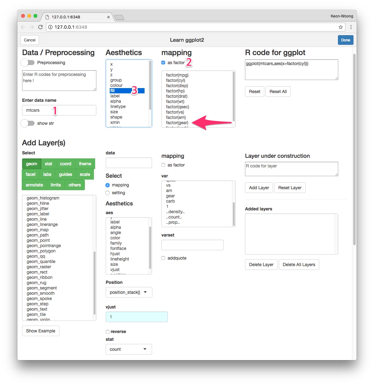
Mapping the variables
Launch ggplotAssist add-in. Check the data name(1). After select the as factor checkbox(2), select x and factor(cyl) to map the x-axis variable(not shown). Select fill(3) and factor(gear)(arrow) to map the fill variable.
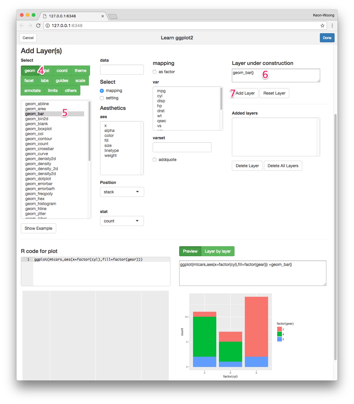
Add geom_bar() layer
Select geom button(4). Select geom_bar(5) among selections. Check the R code for the layer(6) and plot preview in the lower right corner. Press Add Layer button(7).
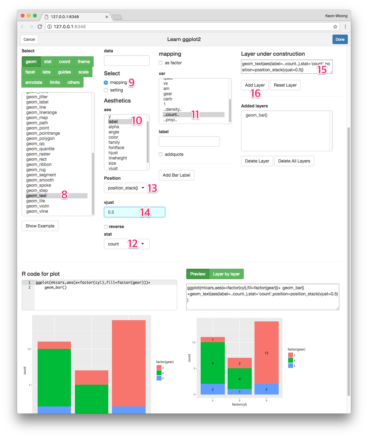
Add geom_text() layer - standard method
Select geom_text(8) among geoms. To map label, select mapping radioButton(9). Select label among aes(10) and select ..count.. among var(11). Select count as stat(12). Select position_stack() as position(13) and set vjust 0.5(14). Check the resultant R code for layer(15) and plot preview at lower right corner. Press Add Layer button(16).
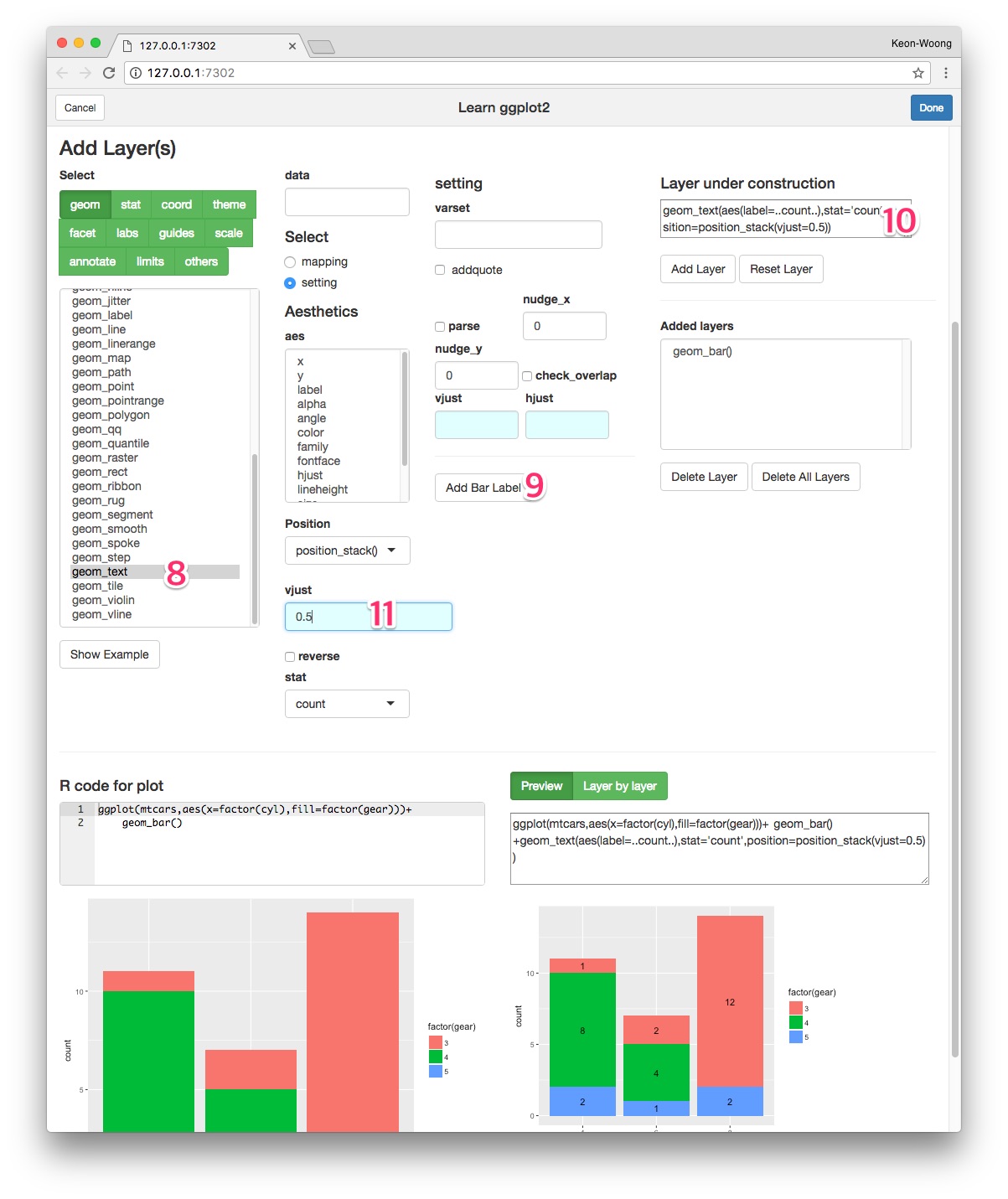
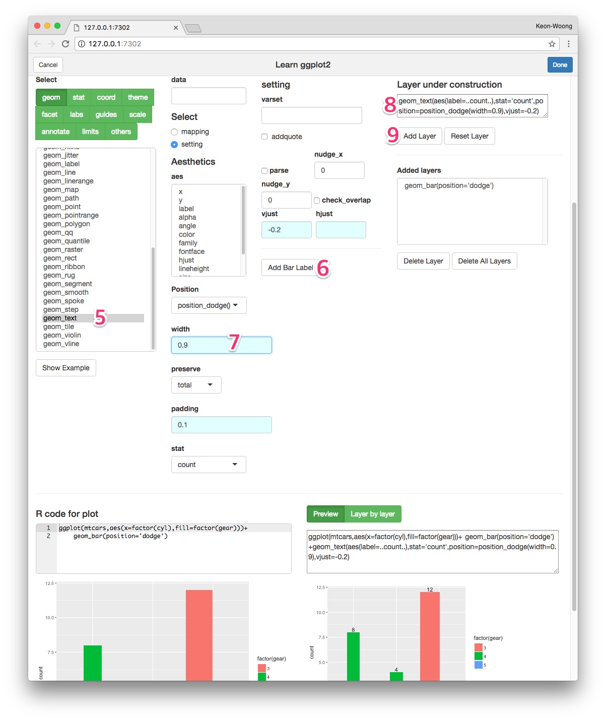
Add geom_text() layer - A shortcut
I have made a shortcut in the ggplotAssist app. After adding the geom_bar() layer, select geom_text(8) among geoms. Press Add Bar Label button(9). The R code for labelling bar plot is made(10). Adjust vjust argument(11).
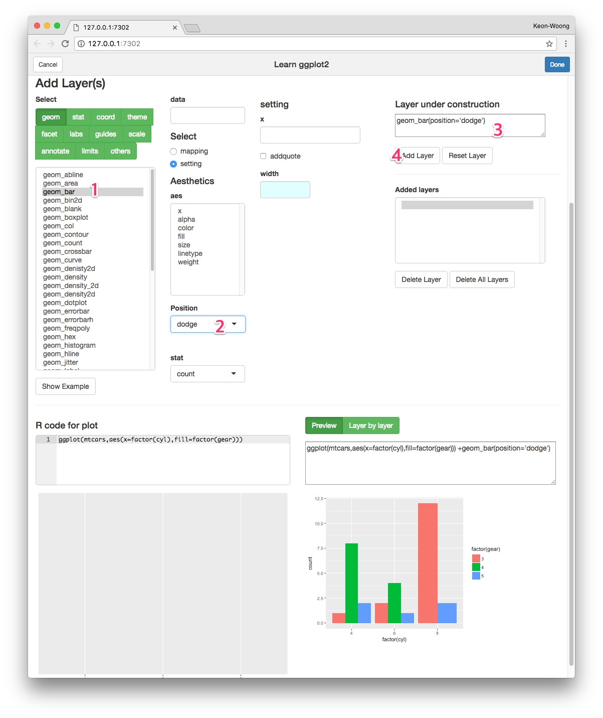
Grouped Bar plot
You can make a grouped bar plot by setting the position of geom_bar() to dodge.
ggplot(mtcars,aes(x=factor(cyl),fill=factor(gear)))+
    geom_bar(position="dodge")

You can label the bar plot with geom_text() function.
ggplot(mtcars,aes(x=factor(cyl),fill=factor(gear)))+
    geom_bar(position="dodge")+
    geom_text(aes(label=..count..),stat='count',position=position_dodge(0.9))

For fine adjustment of vertical position of label, you can adjust vjust argument of geom_text().
ggplot(mtcars,aes(x=factor(cyl),fill=factor(gear)))+
    geom_bar(position="dodge")+
    geom_text(aes(label=..count..),stat='count',position=position_dodge(0.9),vjust=-0.2)

labelling grouped barplot with ggplotAssist
Make a grouped barplot
After mapping the x-axis and fill variables, select geom_bar among geoms(1). Set the position dodge(2). You can see the R code for layer(3). Press Add Layer button(4).
Add label
Select geom_text(5) among geoms. Press Add Bar Label button(6). Set the width argument of position_dodge 0.9(7). You can see the R code for this layer(8). Press Add Layer button(9).
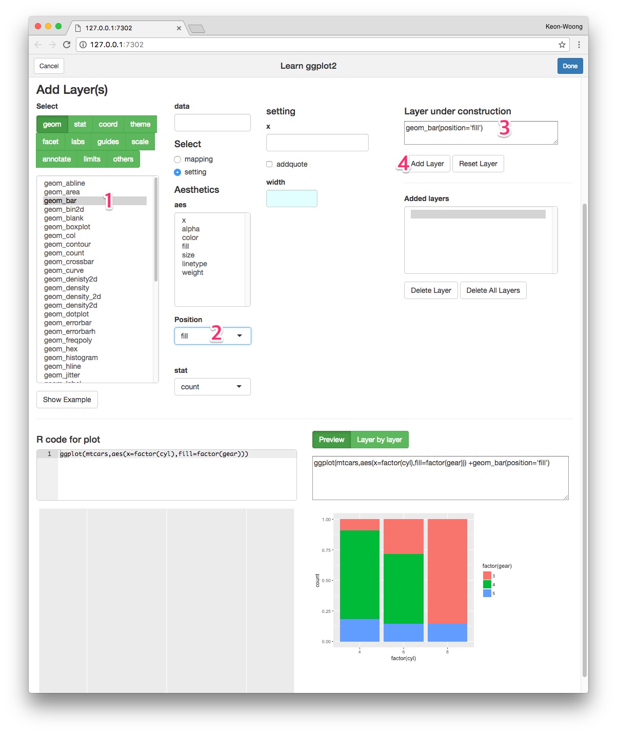
Proportional stacked bar plot
You can make a proportional atacked bar plot by setting the position of geom_bar() fill.
ggplot(mtcars,aes(x=factor(cyl),fill=factor(gear)))+
    geom_bar(position="fill")

You can label the bar plot with counts with geom_text() function.
ggplot(mtcars,aes(x=factor(cyl),fill=factor(gear)))+
    geom_bar(position="fill")+
    geom_text(aes(label=..count..),stat='count',position=position_fill(vjust=0.5))

You can to make labels with ratios instead of counts with the following code.
ggplot(mtcars,aes(x=factor(cyl),fill=factor(gear)))+
    geom_bar(position="fill")+
    geom_text(aes(label=scales::percent(..count../sum(..count..))),
              stat='count',position=position_fill(vjust=0.5))

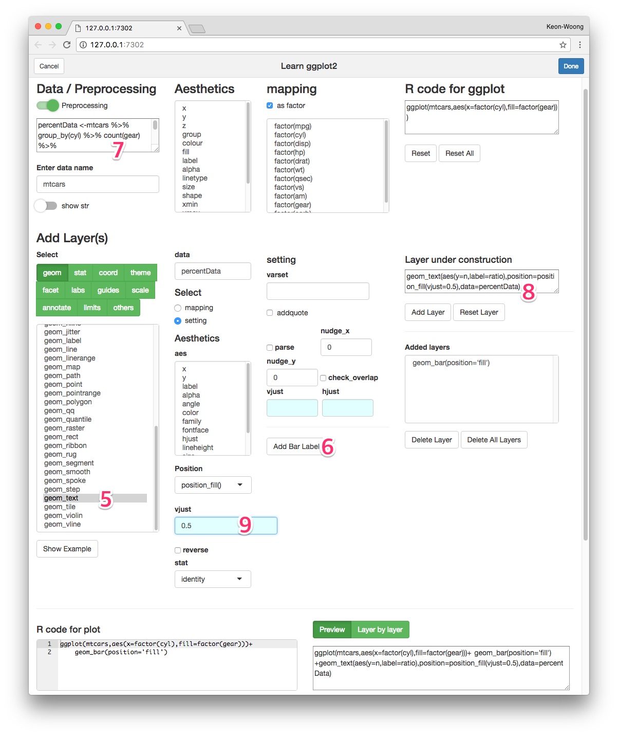
To add labels with columnwise ratios, the first thing to do is to make another data summarizing columnwise ratio.
percentData <- mtcars %>% group_by(cyl) %>% count(gear) %>%
    mutate(ratio=scales::percent(n/sum(n)))
percentData
# A tibble: 8 x 4
# Groups:   cyl [3]
    cyl  gear     n ratio
  <dbl> <dbl> <int> <chr>
1     4     3     1  9.1%
2     4     4     8 72.7%
3     4     5     2 18.2%
4     6     3     2 28.6%
5     6     4     4 57.1%
6     6     5     1 14.3%
7     8     3    12 85.7%
8     8     5     2 14.3%
With this data, make a label with geom_text() function.
ggplot(mtcars,aes(x=factor(cyl),fill=factor(gear)))+
    geom_bar(position="fill")+
    geom_text(data=percentData, aes(y=n,label=ratio),
              position=position_fill(vjust=0.5))

Labelling a proportional stacked barplot with ggplotAssist
Make a proportional stacked barplot
After mapping the x-axis and fill variables, select geom_bar among geoms(1). Set the position fill(2). You can see the R code for layer(3). Press Add Layer button(4).
Add label
Select geom_text(5) among geoms. Press Add Bar Label button(6). A new data summarizing columnwise ratio is made automatically and inserted as preprocessing(7). With this data, the R code for this layer is made(8). Set the vjust argument of position_fill() 0.5(9). Press Add Layer button and you can get the plot.
cardiomoon/ggplotAssist documentation built on May 28, 2019, 7:14 p.m.
R Package Documentation
Browse R Packages
We want your feedback!
Note that we can't provide technical support on individual packages. You should contact the package authors for that.
title: "Labelling Barplot with ggplotAssist(I)" author: "Keon-Woong Moon" date: "2017-11-13" output: rmarkdown::html_vignette vignette: > %\VignetteIndexEntry{Labelling Barplot} %\VignetteEngine{knitr::rmarkdown} %\VignetteEncoding{UTF-8}
In this vignette, you will learn how to add labels to bar plots representing counts. Labelling bar plots representing values will be coverd in the next vignette. You can add labels using geom_text() function. If you want to add labels to the proportional bar plots, you have to make some manipulation of your data.
Bar plot representing count
Stacked bar plot
The default position of the geom_bar() function is stack and the default stat is count. You can make bar plot with geom_bar(stat="count"). This is identical with stat_count(geom="bar").
ggplot(mtcars,aes(x=factor(cyl),fill=factor(gear)))+geom_bar(stat="count")
ggplot(mtcars,aes(x=factor(cyl),fill=factor(gear)))+stat_count(geom="bar")
You can add labels to bar plot using geom_text(). You can add labels represneting counts with the following code. The geom_text() needs x,y and label.
ggplot(mtcars,aes(x=factor(cyl),fill=factor(gear)))+
geom_bar()+
geom_text(aes(label=..count..),stat="count",position=position_stack())
If you want to put the label in the middle of each bar, set the vjust argument of position_stack() function to 0.5.
ggplot(mtcars,aes(x=factor(cyl),fill=factor(gear)))+
geom_bar()+
geom_text(aes(label=..count..),stat="count",position=position_stack(0.5))
labelling stacked barplot with ggplotAssist
Mapping the variables
Launch ggplotAssist add-in. Check the data name(1). After select the as factor checkbox(2), select x and factor(cyl) to map the x-axis variable(not shown). Select fill(3) and factor(gear)(arrow) to map the fill variable.
Add geom_bar() layer
Select geom button(4). Select geom_bar(5) among selections. Check the R code for the layer(6) and plot preview in the lower right corner. Press Add Layer button(7).
Add geom_text() layer - standard method
Select geom_text(8) among geoms. To map label, select mapping radioButton(9). Select label among aes(10) and select ..count.. among var(11). Select count as stat(12). Select position_stack() as position(13) and set vjust 0.5(14). Check the resultant R code for layer(15) and plot preview at lower right corner. Press Add Layer button(16).
Add geom_text() layer - A shortcut
I have made a shortcut in the ggplotAssist app. After adding the geom_bar() layer, select geom_text(8) among geoms. Press Add Bar Label button(9). The R code for labelling bar plot is made(10). Adjust vjust argument(11).
Grouped Bar plot
You can make a grouped bar plot by setting the position of geom_bar() to dodge.
ggplot(mtcars,aes(x=factor(cyl),fill=factor(gear)))+
geom_bar(position="dodge")
You can label the bar plot with geom_text() function.
ggplot(mtcars,aes(x=factor(cyl),fill=factor(gear)))+
geom_bar(position="dodge")+
geom_text(aes(label=..count..),stat='count',position=position_dodge(0.9))
For fine adjustment of vertical position of label, you can adjust vjust argument of geom_text().
ggplot(mtcars,aes(x=factor(cyl),fill=factor(gear)))+
geom_bar(position="dodge")+
geom_text(aes(label=..count..),stat='count',position=position_dodge(0.9),vjust=-0.2)
labelling grouped barplot with ggplotAssist
Make a grouped barplot
After mapping the x-axis and fill variables, select geom_bar among geoms(1). Set the position dodge(2). You can see the R code for layer(3). Press Add Layer button(4).
Add label
Select geom_text(5) among geoms. Press Add Bar Label button(6). Set the width argument of position_dodge 0.9(7). You can see the R code for this layer(8). Press Add Layer button(9).
Proportional stacked bar plot
You can make a proportional atacked bar plot by setting the position of geom_bar() fill.
ggplot(mtcars,aes(x=factor(cyl),fill=factor(gear)))+
geom_bar(position="fill")
You can label the bar plot with counts with geom_text() function.
ggplot(mtcars,aes(x=factor(cyl),fill=factor(gear)))+
geom_bar(position="fill")+
geom_text(aes(label=..count..),stat='count',position=position_fill(vjust=0.5))
You can to make labels with ratios instead of counts with the following code.
ggplot(mtcars,aes(x=factor(cyl),fill=factor(gear)))+
geom_bar(position="fill")+
geom_text(aes(label=scales::percent(..count../sum(..count..))),
stat='count',position=position_fill(vjust=0.5))
To add labels with columnwise ratios, the first thing to do is to make another data summarizing columnwise ratio.
percentData <- mtcars %>% group_by(cyl) %>% count(gear) %>%
mutate(ratio=scales::percent(n/sum(n)))
percentData
# A tibble: 8 x 4
# Groups: cyl [3]
cyl gear n ratio
<dbl> <dbl> <int> <chr>
1 4 3 1 9.1%
2 4 4 8 72.7%
3 4 5 2 18.2%
4 6 3 2 28.6%
5 6 4 4 57.1%
6 6 5 1 14.3%
7 8 3 12 85.7%
8 8 5 2 14.3%
With this data, make a label with geom_text() function.
ggplot(mtcars,aes(x=factor(cyl),fill=factor(gear)))+
geom_bar(position="fill")+
geom_text(data=percentData, aes(y=n,label=ratio),
position=position_fill(vjust=0.5))
Labelling a proportional stacked barplot with ggplotAssist
Make a proportional stacked barplot
After mapping the x-axis and fill variables, select geom_bar among geoms(1). Set the position fill(2). You can see the R code for layer(3). Press Add Layer button(4).
Add label
Select geom_text(5) among geoms. Press Add Bar Label button(6). A new data summarizing columnwise ratio is made automatically and inserted as preprocessing(7). With this data, the R code for this layer is made(8). Set the vjust argument of position_fill() 0.5(9). Press Add Layer button and you can get the plot.
R Package Documentation
Browse R Packages
We want your feedback!
Note that we can't provide technical support on individual packages. You should contact the package authors for that.
Embedding an R snippet on your website
Add the following code to your website.
For more information on customizing the embed code, read Embedding Snippets.