README.md
In codyschulz/earthquakeMap: Reads in, cleans, and visualizes NOAA earthquake data

README
Cody Schulz
February 26, 2018
earthquakeMap
earthquakeMap helps users visualize over 4,000 years of earthquake statistics in both time and space.
Installation
earthquakeMap can be installed using devtools:
library(devtools)
install_github("codyschulz/earthquakeMap")
library(earthquakeMap)
Setup
## Open packages
libs <- c("readr", "magrittr", "dplyr", "earthquakeMap", "ggplot2", "lubridate")
lapply(libs, require, character.only = TRUE)

## Open dataset
x <- earthquake_read() %>%

  ## Clean
  eq_clean_data() %>%

  ## Filter
  filter(COUNTRY %in% c("USA", "MEXICO") & year(date) >= 2000)

## Create a theme
my_theme <-   theme(
  axis.title.y = element_blank(),
  panel.background = element_blank(),
  legend.position="bottom",
  legend.key = element_blank(),
  axis.line.x = element_line()
)
Earthquake Plotting in Time
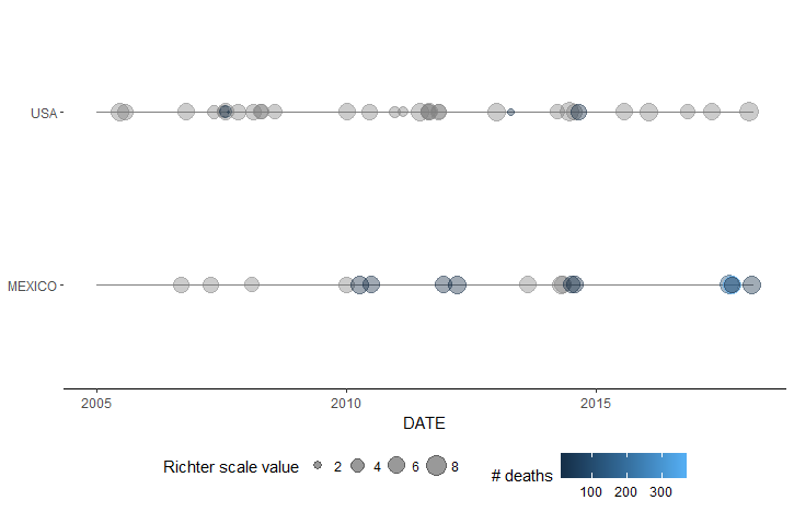
earthquakeMap's geom_timeline() function displays earthquakes on a timeline, with point size corresponding to magnitude and point color to the number of fatalities. Each country selected is given its own timeline. Below is a plot of all earthquakes in the US and Mexico since 2005.
plot0 <- ggplot() +
  geom_timeline(data = x, aes(
    x = date,
    xmin = as.Date("2005-01-01"),
    xmax = as.Date("2018-02-22"),
    colour = TOTAL_DEATHS,
    y = COUNTRY,
    size = EQ_PRIMARY
    )
  ) +
  scale_size_continuous(name = "Richter scale value") +
  scale_colour_continuous(name = "# deaths") +
  xlab("DATE") +
  my_theme
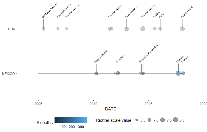
The geom_timeline_label function provides additional labeling and subsetting capabilities. Users can set a maximum number of earthquakes to plot per country using the n_max parameter (the function selects the highest magnitude earthquakes first). The output also provides location labels for many earthquakes. Below is a graph of the same set of earthquakes as the prior example, selecting only the 10 highest magnitude earthquakes.
plot1 <- ggplot() +
  geom_timeline_label(data = x, aes(
    x = date,
    xmin = as.Date("2005-01-01"),
    label = LOCATION_NAME,
    xmax = as.Date("2018-02-22"),
    colour = TOTAL_DEATHS,
    y = COUNTRY,
    size = EQ_PRIMARY
    ),
    n_max = 10
  ) +
  scale_x_date(expand = c(.15, .15)) +
  scale_size_continuous(name = "Richter scale value") +
  scale_colour_continuous(name = "# deaths") +
  xlab("DATE") +
  my_theme
Earthquake Plotting in Space
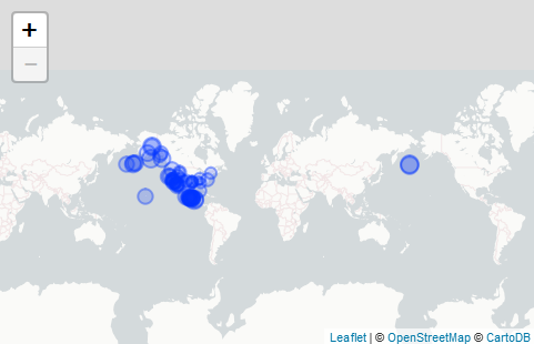
earthquakeMap's eq_map function shows earthquakes on an interactive map, with more information the earthquake provided when users click on the plotted point. Below is a sample screenshot map of the same data as the first plot.
x %>%
  ## Create a popup text label with the eq_create_label function
  mutate(popup_text = eq_create_label(.)) %>%

  ## Filter to the USA and Mexico
  filter(COUNTRY %in% c("MEXICO", "USA") & date >= as.Date("2000-01-01")) %>%

  ## Map
  eq_map(annot_col = "popup_text")
codyschulz/earthquakeMap documentation built on May 25, 2019, 4:20 p.m.
R Package Documentation
Browse R Packages
We want your feedback!
Note that we can't provide technical support on individual packages. You should contact the package authors for that.
README
Cody Schulz February 26, 2018
earthquakeMap
earthquakeMap helps users visualize over 4,000 years of earthquake statistics in both time and space.
Installation
earthquakeMap can be installed using devtools:
library(devtools)
install_github("codyschulz/earthquakeMap")
library(earthquakeMap)
Setup
## Open packages
libs <- c("readr", "magrittr", "dplyr", "earthquakeMap", "ggplot2", "lubridate")
lapply(libs, require, character.only = TRUE)
## Open dataset
x <- earthquake_read() %>%
## Clean
eq_clean_data() %>%
## Filter
filter(COUNTRY %in% c("USA", "MEXICO") & year(date) >= 2000)
## Create a theme
my_theme <- theme(
axis.title.y = element_blank(),
panel.background = element_blank(),
legend.position="bottom",
legend.key = element_blank(),
axis.line.x = element_line()
)
Earthquake Plotting in Time
earthquakeMap's geom_timeline() function displays earthquakes on a timeline, with point size corresponding to magnitude and point color to the number of fatalities. Each country selected is given its own timeline. Below is a plot of all earthquakes in the US and Mexico since 2005.
plot0 <- ggplot() +
geom_timeline(data = x, aes(
x = date,
xmin = as.Date("2005-01-01"),
xmax = as.Date("2018-02-22"),
colour = TOTAL_DEATHS,
y = COUNTRY,
size = EQ_PRIMARY
)
) +
scale_size_continuous(name = "Richter scale value") +
scale_colour_continuous(name = "# deaths") +
xlab("DATE") +
my_theme
The geom_timeline_label function provides additional labeling and subsetting capabilities. Users can set a maximum number of earthquakes to plot per country using the n_max parameter (the function selects the highest magnitude earthquakes first). The output also provides location labels for many earthquakes. Below is a graph of the same set of earthquakes as the prior example, selecting only the 10 highest magnitude earthquakes.
plot1 <- ggplot() +
geom_timeline_label(data = x, aes(
x = date,
xmin = as.Date("2005-01-01"),
label = LOCATION_NAME,
xmax = as.Date("2018-02-22"),
colour = TOTAL_DEATHS,
y = COUNTRY,
size = EQ_PRIMARY
),
n_max = 10
) +
scale_x_date(expand = c(.15, .15)) +
scale_size_continuous(name = "Richter scale value") +
scale_colour_continuous(name = "# deaths") +
xlab("DATE") +
my_theme
Earthquake Plotting in Space
earthquakeMap's eq_map function shows earthquakes on an interactive map, with more information the earthquake provided when users click on the plotted point. Below is a sample screenshot map of the same data as the first plot.
x %>%
## Create a popup text label with the eq_create_label function
mutate(popup_text = eq_create_label(.)) %>%
## Filter to the USA and Mexico
filter(COUNTRY %in% c("MEXICO", "USA") & date >= as.Date("2000-01-01")) %>%
## Map
eq_map(annot_col = "popup_text")
R Package Documentation
Browse R Packages
We want your feedback!
Note that we can't provide technical support on individual packages. You should contact the package authors for that.
Embedding an R snippet on your website
Add the following code to your website.
For more information on customizing the embed code, read Embedding Snippets.