README.md
In fairanalytics/CovidDashboard2021: An Amazing Shiny App
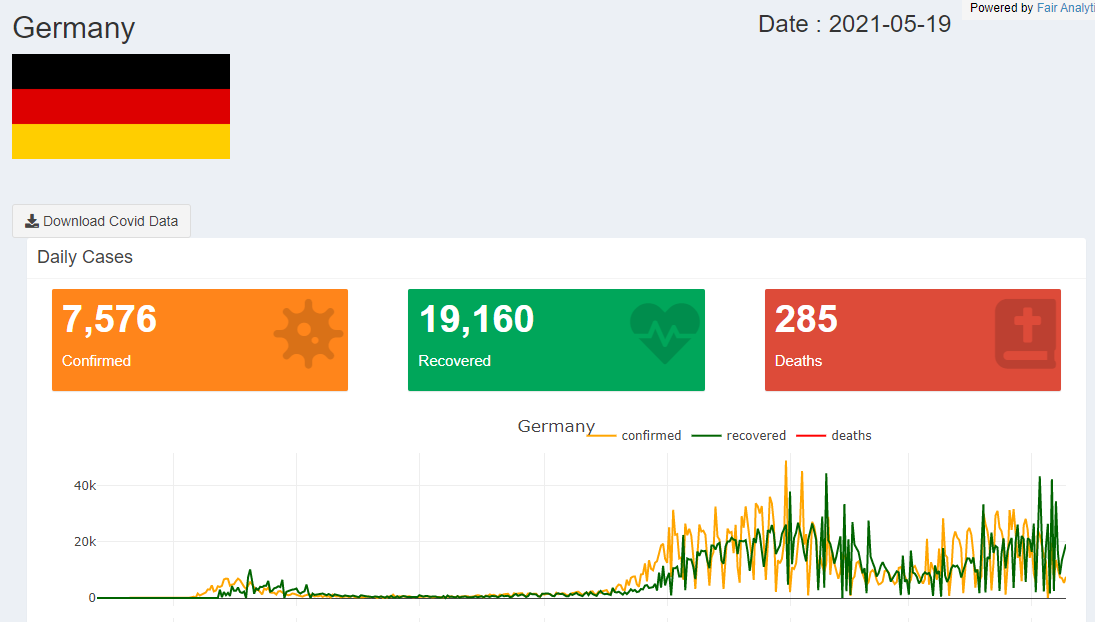
Covid Tracker Dashboard
It Consists of an interactive web-based application developped using R and Shiny .
It tracks daily covid situation developement including :
- New case
- Recovered
- Death
- Vaccination information
Motivation :
I track covid situtations on daily basis , sometimes even hourly .
And one day I thought, I am a data scientist and can have access live public data, why not providing a useful solution .
Data source :
The application relies fully on Johns Hopkins University Center for Systems Science and Engineering (JHU CCSE) data, available in the following link :
https://data.humdata.org/dataset/novel-coronavirus-2019-ncov-cases
Dashboard :
The dashboard diplays a bunch of infromation on a country level with a possibility to visualize on different aggretions .
Live Demo :
https://fair-analytics.shinyapps.io/covidfairanalytics/
what makes it happen :
Several packages were involved to make this project a real dashboard, below are the elements :
shiny/shindashboard/shindashboardPlus : without them the UI would look like a R file .
Tidyverse Family and purrr : my favourite packages to make every complex dataset look like "mtcars" .
* golem : as sexy as that you would not find, it enables to organize the dashboard as a software and package and gives it an entreprise framework.
Usage and Installation
In order to run the app in your local machine, follow the steps below :
- install.packages("remotes")
We need Dev version of shinydashboardPlus
- remotes::install_github("RinteRface/shinydashboardPlus")
Then simply install the Covid Dashboard as a package .
- remotes::install_github("fairanalytics/CovidDashboard2021")
Successfully installed ? run the following command line in your IDE :
- CovidFairAnalytics::run_app()
Issues :
If you encounter any issue for installation or running the dashboard itself , please report them here:
https://github.com/fairanalytics/CovidDashboard2021/issues
fairanalytics/CovidDashboard2021 documentation built on Dec. 20, 2021, 7:41 a.m.
R Package Documentation
Browse R Packages
We want your feedback!
Note that we can't provide technical support on individual packages. You should contact the package authors for that.
Covid Tracker Dashboard
It Consists of an interactive web-based application developped using R and Shiny .
It tracks daily covid situation developement including :
- New case
- Recovered
- Death
- Vaccination information
Motivation :
I track covid situtations on daily basis , sometimes even hourly . And one day I thought, I am a data scientist and can have access live public data, why not providing a useful solution .
Data source :
The application relies fully on Johns Hopkins University Center for Systems Science and Engineering (JHU CCSE) data, available in the following link : https://data.humdata.org/dataset/novel-coronavirus-2019-ncov-cases
Dashboard :
The dashboard diplays a bunch of infromation on a country level with a possibility to visualize on different aggretions .
Live Demo :
https://fair-analytics.shinyapps.io/covidfairanalytics/
what makes it happen :
Several packages were involved to make this project a real dashboard, below are the elements : shiny/shindashboard/shindashboardPlus : without them the UI would look like a R file . Tidyverse Family and purrr : my favourite packages to make every complex dataset look like "mtcars" . * golem : as sexy as that you would not find, it enables to organize the dashboard as a software and package and gives it an entreprise framework.
Usage and Installation
In order to run the app in your local machine, follow the steps below :
- install.packages("remotes") We need Dev version of shinydashboardPlus
- remotes::install_github("RinteRface/shinydashboardPlus")
Then simply install the Covid Dashboard as a package .
- remotes::install_github("fairanalytics/CovidDashboard2021")
Successfully installed ? run the following command line in your IDE :
- CovidFairAnalytics::run_app()
Issues :
If you encounter any issue for installation or running the dashboard itself , please report them here:
https://github.com/fairanalytics/CovidDashboard2021/issues
R Package Documentation
Browse R Packages
We want your feedback!
Note that we can't provide technical support on individual packages. You should contact the package authors for that.
Embedding an R snippet on your website
Add the following code to your website.
For more information on customizing the embed code, read Embedding Snippets.