In jrminter/statshelpR: Convenience functions for statistical analysis
knitr::opts_chunk$set(echo = TRUE, warning=FALSE)
suppressWarnings(suppressMessages(suppressPackageStartupMessages(library(tidyverse))))
Introduction
R and R-Studio provide a very powerful environment for statistical
analysis and visualization of data. R is a Open Source language
developed by statisticians for statistical analysis and visualization of
a wide range of data. It is both powerful and popular. Like any
software there is a learning curve. Happily, the #rstats community
on Twitter is very helpful. Examples are typically a Google search
away. The
Modern Dive
text by Chester Ismay and Albert Y. Kim is a helpful resource. So is
the free OpenIntro
textbook and their
playlist
of YouTube videos. They also have the instructions to use
TI calculators. There is also a github repository for the
OpenIntroLabs. Most of these were written by Andrew Bray and Mine Çetinkaya-Rundel.
Professor Ed Boone of Virginia Commonwealth University has a
YouTube playlist of
short videos
(typically 3-15 min) for his Statistics 321 class. The first 79 videos
are examples of common operations in R. This is a good place to
look for help on how to do something... Note that he shares data sets
on a Google Drive
here
.
You will enjoy enjoy yourself if you follow this great advice from
Kim Cressman:
Don't feel like you have to learn R, like you have to know
everything before you can do anything.
Just pick a thing you want to do, and learn how to do it.
It's easier to digest when you have a goal - learn the steps that
get you there.
Benefits of using R and RStudio
-
Cost: Both are freely available. R is Open Source. RStudio is available
in Open Source and commercial editions. Both programs run on Windows/Mac/Linux
operating systems.
-
Both are widely used both in universities and in large and small corporations.
-
The RStudio integrated development environment permits us to write
reproducible reports that use a technique called literate programming
made popular by Donald Knuth at Stanford University. We embed the
code chunks that do our computations in our reports (i.e. show our
work). The code is run when we generate the report and the results are
included in the report. No more cutting and pasting!!! This permits our
audience to see our work and run it on their own computers if they wish. This
both improves communication and reduces errors. We can also include
mathematical equations if needed, such as the formula for a
binomial distribution that we will use in Chapter 5.
$$f(x) = \dbinom{n}{x} \ p^x (1-p)^{(n-x)} \ where \ x=1,2,\ldots,n$$
A simple example is shown below where we compute the mean and standard
deviation of a series of test scores. (We will use the R package pander to
make nice looking output). Note the use of comments (preceded by #) to
explain our work.
# we need to tell R that we want to use the pander package for the table
library(pander)
# Our test scores... We create a list.
scores <- c(99, 97, 90, 87, 82, 82, 80, 80, 78, 77, 75, 73, 70,
            68, 65, 62, 60, 55, 45, 40)
# compute the mean and standard deviation
# these are both built-in functions because they are used frequently
avg <- mean(scores)
std <- sd(scores)
# make a list of results and round to 1 decimal place
ans <- round(c(avg, std), 1)
# add labels for a table
names(ans) <- c("mean", "std dev")
# print the table..
pander(ans)
- Help with Rmarkdown
Rmarkdown documents use a simplified markup language to format documents.
This results in plain text documents that are easily maintained under
version control. Version control helps us to not lose our work and lets
us recover from moments where we say, "I really wish I didn't do
that..."
You can find a good introductions to Rmarkdown
here. The last item
on the page is a helpful cheatsheet
that you can download for quick reference. After a bit of practice you will
remember the codes you use most of the time and will need the cheatsheet
less and less.
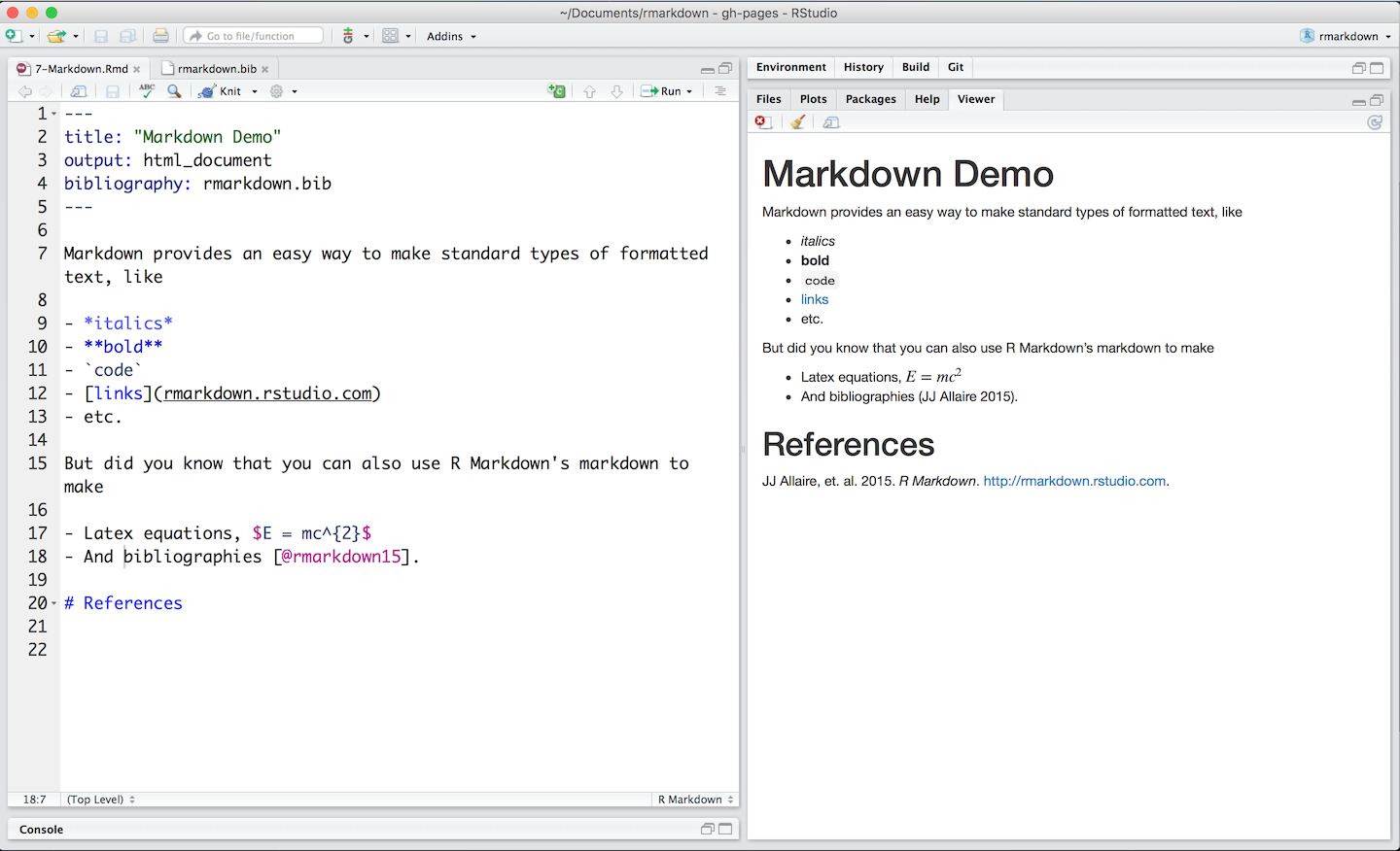
This image
from R-Studio is reproduced below to give you an idea of what it looks like.
I split the view into two pieces so it fit on the page better

Which is then rendered as

You can find help on writing mathematical equations on the
artofproblemsolving.com
website. This site was designed for advanced high school students. You
can find most of what you may need for statistics on
equplus.net. They have a
wide range of examples.
Our approach
Many instructors have concluded that the best way to start is by
learning to understand the objective of our analysis and our
data set. First we will learn how to get our data into R. Often
this will require us to transform a messy data set into a tidy
format that is easier to analyze and plot.
Next we want to plot our data to look for patterns. Finally, we will
apply the appropriate statistical algorithms to answer the question
that prompted our study. Finally, we will prepare a report that
summarizes our results. We will use Rmarkdown to write a report
that embeds our computations to make a report that can be
reproduced by someone else.
Where to get the software
Our intention is to install the software on the LCS computers. If you
have a computer at home, you can get the software and install it
on your own system. The software runs on Windows, Mac, and Linux. Your
teacher can give you some hints to help you with your system.
How to get help
Most of those who answer questions are volunteers. The likelihood of
getting a response increases when you show that you are being
considerate.
- Do a Google search first.
- Make your question specific. Explain what you have tried and what
did not work as you expected.
- Make a minimum reproducible example that works with a simple
data set that is easily available. Explain what did not work as
expected.
Data Visualization
"The simple graph has brought more information to the data analyst’s
mind than any other device."
— John Tukey
"You can observe a lot by just watching."
- Yogi Berra
An example: Automobile miles per gallon
The tidyverse package comes with a data set of mpg for different
types of automobiles.
summary(mpg)
We can visualize the relationship by plotting the data, plotting the
highway mileage (hwy) as a function of the engine displacement
(displ) for r nrow(mpg) automobile models.
plt <- ggplot(data = mpg) +
       geom_point(mapping = aes(x = displ, y = hwy))
print(plt)
We see that there is a lot of variability. We might want to know how
different types of cars behave. We can use color to help us.
plt <- ggplot(data = mpg) +
       geom_point(mapping = aes(x = displ, y = hwy, color = class))
print(plt)
This tells us much more. Note how subcompact cars perform much better
than SUVs as pickups. Data visualizations like this can help you buy
a car that better meets your needs.
jrminter/statshelpR documentation built on May 2, 2020, 12:08 a.m.
R Package Documentation
Browse R Packages
We want your feedback!
Note that we can't provide technical support on individual packages. You should contact the package authors for that.
knitr::opts_chunk$set(echo = TRUE, warning=FALSE) suppressWarnings(suppressMessages(suppressPackageStartupMessages(library(tidyverse))))
Introduction
R and R-Studio provide a very powerful environment for statistical
analysis and visualization of data. R is a Open Source language
developed by statisticians for statistical analysis and visualization of
a wide range of data. It is both powerful and popular. Like any
software there is a learning curve. Happily, the #rstats community
on Twitter is very helpful. Examples are typically a Google search
away. The
Modern Dive
text by Chester Ismay and Albert Y. Kim is a helpful resource. So is
the free OpenIntro
textbook and their
playlist
of YouTube videos. They also have the instructions to use
TI calculators. There is also a github repository for the
OpenIntroLabs. Most of these were written by Andrew Bray and Mine Çetinkaya-Rundel.
Professor Ed Boone of Virginia Commonwealth University has a YouTube playlist of short videos (typically 3-15 min) for his Statistics 321 class. The first 79 videos are examples of common operations in R. This is a good place to look for help on how to do something... Note that he shares data sets on a Google Drive here .
You will enjoy enjoy yourself if you follow this great advice from Kim Cressman:
Don't feel like you have to learn R, like you have to know everything before you can do anything.
Just pick a thing you want to do, and learn how to do it.
It's easier to digest when you have a goal - learn the steps that get you there.
Benefits of using R and RStudio
-
Cost: Both are freely available. R is Open Source. RStudio is available in Open Source and commercial editions. Both programs run on Windows/Mac/Linux operating systems.
-
Both are widely used both in universities and in large and small corporations.
-
The RStudio integrated development environment permits us to write reproducible reports that use a technique called literate programming made popular by Donald Knuth at Stanford University. We embed the code chunks that do our computations in our reports (i.e. show our work). The code is run when we generate the report and the results are included in the report. No more cutting and pasting!!! This permits our audience to see our work and run it on their own computers if they wish. This both improves communication and reduces errors. We can also include mathematical equations if needed, such as the formula for a binomial distribution that we will use in Chapter 5.
$$f(x) = \dbinom{n}{x} \ p^x (1-p)^{(n-x)} \ where \ x=1,2,\ldots,n$$
A simple example is shown below where we compute the mean and standard
deviation of a series of test scores. (We will use the R package pander to
make nice looking output). Note the use of comments (preceded by #) to
explain our work.
# we need to tell R that we want to use the pander package for the table library(pander) # Our test scores... We create a list. scores <- c(99, 97, 90, 87, 82, 82, 80, 80, 78, 77, 75, 73, 70, 68, 65, 62, 60, 55, 45, 40) # compute the mean and standard deviation # these are both built-in functions because they are used frequently avg <- mean(scores) std <- sd(scores) # make a list of results and round to 1 decimal place ans <- round(c(avg, std), 1) # add labels for a table names(ans) <- c("mean", "std dev") # print the table.. pander(ans)
- Help with Rmarkdown
Rmarkdown documents use a simplified markup language to format documents. This results in plain text documents that are easily maintained under version control. Version control helps us to not lose our work and lets us recover from moments where we say, "I really wish I didn't do that..."
You can find a good introductions to Rmarkdown here. The last item on the page is a helpful cheatsheet that you can download for quick reference. After a bit of practice you will remember the codes you use most of the time and will need the cheatsheet less and less.
This image from R-Studio is reproduced below to give you an idea of what it looks like. I split the view into two pieces so it fit on the page better
Which is then rendered as
You can find help on writing mathematical equations on the artofproblemsolving.com website. This site was designed for advanced high school students. You can find most of what you may need for statistics on equplus.net. They have a wide range of examples.
Our approach
Many instructors have concluded that the best way to start is by learning to understand the objective of our analysis and our data set. First we will learn how to get our data into R. Often this will require us to transform a messy data set into a tidy format that is easier to analyze and plot.
Next we want to plot our data to look for patterns. Finally, we will apply the appropriate statistical algorithms to answer the question that prompted our study. Finally, we will prepare a report that summarizes our results. We will use Rmarkdown to write a report that embeds our computations to make a report that can be reproduced by someone else.
Where to get the software
Our intention is to install the software on the LCS computers. If you have a computer at home, you can get the software and install it on your own system. The software runs on Windows, Mac, and Linux. Your teacher can give you some hints to help you with your system.
How to get help
Most of those who answer questions are volunteers. The likelihood of getting a response increases when you show that you are being considerate.
- Do a Google search first.
- Make your question specific. Explain what you have tried and what did not work as you expected.
- Make a minimum reproducible example that works with a simple data set that is easily available. Explain what did not work as expected.
Data Visualization
"The simple graph has brought more information to the data analyst’s mind than any other device."
— John Tukey"You can observe a lot by just watching."
- Yogi Berra
An example: Automobile miles per gallon
The tidyverse package comes with a data set of mpg for different
types of automobiles.
summary(mpg)
We can visualize the relationship by plotting the data, plotting the
highway mileage (hwy) as a function of the engine displacement
(displ) for r nrow(mpg) automobile models.
plt <- ggplot(data = mpg) + geom_point(mapping = aes(x = displ, y = hwy)) print(plt)
We see that there is a lot of variability. We might want to know how different types of cars behave. We can use color to help us.
plt <- ggplot(data = mpg) + geom_point(mapping = aes(x = displ, y = hwy, color = class)) print(plt)
This tells us much more. Note how subcompact cars perform much better than SUVs as pickups. Data visualizations like this can help you buy a car that better meets your needs.
R Package Documentation
Browse R Packages
We want your feedback!
Note that we can't provide technical support on individual packages. You should contact the package authors for that.
Embedding an R snippet on your website
Add the following code to your website.
For more information on customizing the embed code, read Embedding Snippets.