In jthomasmock/gtExtras: Extending 'gt' for Beautiful HTML Tables
knitr::opts_chunk$set(
  collapse = TRUE,
  comment = "#>"
)
Graphs vs Tables
Per Stephen Few in his book, Show Me the Numbers:
The difference between Tables and Graphs:
Tables: Display used to look up and compare individual values
Graphs: Display used to reveal relationships among whole sets of values and their overall shape
While we typically reach for our graphing tools whenever we want to tell a story with data, we are likely underutilizing tables. We can merge graphs and tables to often get the best of both worlds.
Get started
We can first load our libraries.
library(gt)
library(gtExtras)
library(dplyr, warn.conflicts =  FALSE)
library(ggplot2)
Sparklines
Per Wikipedia:
A sparkline is a very small line chart, typically drawn without axes or coordinates. It presents the general shape of the variation (typically over time) in some measurement, such as temperature or stock market price, in a simple and highly condensed way.

We can use gtExtras::gt_plt_sparkline() to add an inline sparkline very quickly. A necessary prep step is to first convert from a long data format to a summarized data format, where each row represents one "group" and the data column is now a vector of the values.
mtcars %>%
  head()
By using summarize(list_data = list(col_name)) we can create a list-column of ALL the data for that group.
car_summary <- mtcars %>%
  dplyr::group_by(cyl) %>%

  dplyr::summarize(
    mean = mean(mpg),
    sd = sd(mpg),
    # must end up with list of data for each row in the input dataframe
    mpg_data = list(mpg),
    .groups = "drop"
  )

car_summary
car_summary %>%
  arrange(desc(cyl)) %>%
  gt() %>%
  gtExtras::gt_plt_sparkline(mpg_data) %>%
  fmt_number(columns = mean:sd, decimals = 1)
Sparkline alternatives
You can also plot a density-plot or a histogram instead of just a line plot, note that we've switched to gt_plt_dist() since we're plotting a true distribution now.
car_summary %>%
  arrange(desc(cyl)) %>%
  gt() %>%
  gtExtras::gt_plt_dist(mpg_data, type = "density", line_color = "blue",
                         fill_color = "red") %>%
  fmt_number(columns = mean:sd, decimals = 1)
car_summary %>%
  arrange(desc(cyl)) %>%
  gt() %>%
  gtExtras::gt_plt_dist(mpg_data, type = "histogram", line_color = "purple",
                         fill_color = "green", bw = 4) %>%
  fmt_number(columns = mean:sd, decimals = 1)
Inline bars
You can also generate ggplot2 created bar plots inline. Note that keep_column allows you to keep the raw values and the plot inline.
mtcars %>%
  dplyr::select(cyl:wt, mpg) %>%
  head() %>%
  gt() %>%
  gt_plt_bar(column = mpg, keep_column = TRUE, width = 35)
Percent bars
Alternatively, you may prefer the HTML-generated bar plotsfrom gt_plt_bar_pct(). Note that the bars represent a percentage of max, so the largest value will indicate 100% of the row. You can pass raw values that are scaled to a 0-100% range, or pass values between 0 and 100 that represent an existing percent.
mtcars %>%
   head() %>%
   dplyr::select(cyl, mpg) %>%
   dplyr::mutate(mpg_pct_max = round(mpg/max(mpg) * 100, digits = 2),
                 mpg_scaled = mpg/max(mpg) * 100) %>%
   dplyr::mutate(mpg_unscaled = mpg) %>%
   gt() %>%
   gt_plt_bar_pct(column = mpg_scaled, scaled = TRUE) %>%
   gt_plt_bar_pct(column = mpg_unscaled, scaled = FALSE,
                  fill = "blue", background = "lightblue") %>%
   cols_align("center", contains("scale")) %>%
   cols_width(4 ~ px(125),
              5 ~ px(125))
Inline Win Loss plots
You can also generate really nice looking "Win Loss" plots, similar to the ones used by The Guardian for Soccer outcomes. The code to bring in the data via the {nflreadr} package is hidden in an expandable tab below.
Bring data in
library(dplyr)

games_df <- nflreadr::load_schedules() %>%
  filter(season == 2020, game_type == "REG") %>%
  select(game_id, team_home = home_team, team_away = away_team, result, week) %>%
  tidyr::pivot_longer(contains('team'), names_to = 'home_away', values_to = 'team', names_prefix = 'team_') %>%
  mutate(
    result = ifelse(home_away == 'home', result, -result),
    win = ifelse(result == 0 , 0.5, ifelse(result > 0, 1, 0))
  ) %>%
  select(week, team, win) %>%
  mutate(
    team = case_when(
      team == 'STL' ~ 'LA',
      team == 'OAK' ~ 'LV',
      team == 'SD' ~ 'LAC',
      T ~ team
    )
  )

team_df <- nflreadr::load_teams() %>%
  select(team_wordmark, team_abbr, team_conf, team_division)

joined_df <- games_df %>%
  group_by(team) %>%
  summarise(
    Wins = length(win[win==1]),
    Losses = length(win[win==0]),
    outcomes = list(win), .groups = "drop") %>%
  left_join(team_df, by = c("team" = "team_abbr")) %>%
  select(team_wordmark, team_conf, team_division, Wins:outcomes)

final_df <- joined_df %>%
  filter(team_conf == "AFC") %>%
  group_by(team_division) %>%
  arrange(desc(Wins)) %>%
  ungroup() %>%
  arrange(team_division) %>%
  select(-team_conf) %>%
  mutate(team_division = stringr::str_remove(team_division, "AFC |NFC ")) %>%
  mutate(
    team_division = factor(team_division,
      levels = c("North", "South", "East", "West")
      )
    ) %>%
  arrange(team_division)
final_df <- tibble::tribble(
                                                            ~team_wordmark, ~team_division, ~Wins, ~Losses,                                           ~outcomes,
  "https://github.com/nflverse/nflfastR-data/raw/master/wordmarks/PIT.png",        "North",   12L,      4L,   c(1, 1, 1, 1, 1, 1, 1, 1, 1, 1, 1, 0, 0, 0, 1, 0),
  "https://github.com/nflverse/nflfastR-data/raw/master/wordmarks/BAL.png",        "North",   11L,      5L,   c(1, 1, 0, 1, 1, 1, 0, 1, 0, 0, 0, 1, 1, 1, 1, 1),
  "https://github.com/nflverse/nflfastR-data/raw/master/wordmarks/CLE.png",        "North",   11L,      5L,   c(0, 1, 1, 1, 1, 0, 1, 0, 1, 1, 1, 1, 0, 1, 0, 1),
  "https://github.com/nflverse/nflfastR-data/raw/master/wordmarks/CIN.png",        "North",    4L,     11L, c(0, 0, 0.5, 1, 0, 0, 0, 1, 0, 0, 0, 0, 0, 1, 1, 0),
  "https://github.com/nflverse/nflfastR-data/raw/master/wordmarks/IND.png",        "South",   11L,      5L,   c(0, 1, 1, 1, 0, 1, 1, 0, 1, 1, 0, 1, 1, 1, 0, 1),
  "https://github.com/nflverse/nflfastR-data/raw/master/wordmarks/TEN.png",        "South",   11L,      5L,   c(1, 1, 1, 1, 1, 0, 0, 1, 0, 1, 1, 0, 1, 1, 0, 1),
  "https://github.com/nflverse/nflfastR-data/raw/master/wordmarks/HOU.png",        "South",    4L,     12L,   c(0, 0, 0, 0, 1, 0, 0, 1, 0, 1, 1, 0, 0, 0, 0, 0),
  "https://github.com/nflverse/nflfastR-data/raw/master/wordmarks/JAX.png",        "South",    1L,     15L,   c(1, 0, 0, 0, 0, 0, 0, 0, 0, 0, 0, 0, 0, 0, 0, 0),
  "https://github.com/nflverse/nflfastR-data/raw/master/wordmarks/BUF.png",         "East",   13L,      3L,   c(1, 1, 1, 1, 0, 0, 1, 1, 1, 0, 1, 1, 1, 1, 1, 1),
  "https://github.com/nflverse/nflfastR-data/raw/master/wordmarks/MIA.png",         "East",   10L,      6L,   c(0, 0, 1, 0, 1, 1, 1, 1, 1, 0, 1, 1, 0, 1, 1, 0),
   "https://github.com/nflverse/nflfastR-data/raw/master/wordmarks/NE.png",         "East",    7L,      9L,   c(1, 0, 1, 0, 0, 0, 0, 1, 1, 0, 1, 1, 0, 0, 0, 1),
  "https://github.com/nflverse/nflfastR-data/raw/master/wordmarks/NYJ.png",         "East",    2L,     14L,   c(0, 0, 0, 0, 0, 0, 0, 0, 0, 0, 0, 0, 0, 1, 1, 0),
   "https://github.com/nflverse/nflfastR-data/raw/master/wordmarks/KC.png",         "West",   14L,      2L,   c(1, 1, 1, 1, 0, 1, 1, 1, 1, 1, 1, 1, 1, 1, 1, 0),
   "https://github.com/nflverse/nflfastR-data/raw/master/wordmarks/LV.png",         "West",    8L,      8L,   c(1, 1, 0, 0, 1, 0, 1, 1, 1, 0, 0, 1, 0, 0, 0, 1),
  "https://github.com/nflverse/nflfastR-data/raw/master/wordmarks/LAC.png",         "West",    7L,      9L,   c(1, 0, 0, 0, 0, 1, 0, 0, 0, 1, 0, 0, 1, 1, 1, 1),
  "https://github.com/nflverse/nflfastR-data/raw/master/wordmarks/DEN.png",         "West",    5L,     11L,   c(0, 0, 0, 1, 1, 0, 1, 0, 0, 1, 0, 0, 1, 0, 0, 0)
  )
Note that we have a list-column of the outcomes for each team.
glimpse(final_df)
And now we can generate an example table!
final_df %>%
  gt(groupname_col = "team_division") %>%
  cols_label(team_wordmark = "") %>%
  cols_align("left", team_division) %>%
  gtExtras::gt_plt_winloss(outcomes, max_wins = 16, type = "pill") %>%
  gtExtras::gt_img_rows(columns = team_wordmark, height = 20) %>%
  gtExtras::gt_theme_538() %>%
  tab_header(
    title = gtExtras::add_text_img(
      "2020 Results by Division",
      url = "https://github.com/nflverse/nflfastR-data/raw/master/AFC.png",
      height = 30
    )
  ) %>%
  tab_options(data_row.padding = px(2))
Inline bar plots
We can also do inline bar plots, purely via HTML! You can customize the colors, and have the option to scale or use unscaled values.
gt_bar_plot_tab <- mtcars %>%
  head() %>%
  dplyr::select(cyl, mpg) %>%
  dplyr::mutate(
    mpg_pct_max = round(mpg / max(mpg) * 100, digits = 2),
    mpg_scaled = mpg / max(mpg) * 100
  ) %>%
  dplyr::mutate(mpg_unscaled = mpg) %>%
  gt() %>%
  gt_plt_bar_pct(column = mpg_scaled, scaled = TRUE) %>%
  gt_plt_bar_pct(column = mpg_unscaled, scaled = FALSE, fill = "blue", background = "lightblue") %>%
  cols_align("center", contains("scale")) %>%
  cols_width(
    4 ~ px(125),
    5 ~ px(125)
  )

gt_bar_plot_tab
Stacked Percent bar charts
We can create a horizontal stacked percent bar chart inline like so. The data can be prepped as seen in the expandable section below.
library(dplyr)
library(tidyr)
library(gt)

player_df <- tibble(
  player = c(
    "Evan Mobley",
    "Sandro Mamukelashvili",
    "Charles Bassey",
    "Luke Garza",
    "Moses Wright",
    "Neemias Queta",
    "Isaiah Jackson",
    "Day'Ron Sharpe"
  ),
  team = c(
    "USC", "Seton Hall", "Western Kentucky",
    "Iowa", "Georgia Tech", "Utah St", "Kentucky",
    "North Carolina"
  ),
  ht = c(
    "7'0\"",
    "6'10\"",
    "6'10\"",
    "6'11\"",
    "6'9\"",
    "7'1\"",
    "6'11\"",
    "6'10\""
  ),
  dk_pct_time = c(40, 48, 50, 50, 51, 55, 60, 66),
  dk_pps = c(1.62, 1.02, 1.54,1.33,1.46,1.37,1.33,1.18),
  tip_pct_time = c(26, 10, 19, 15, 25, 27, 15, 24),
  tip_pps = c(0.88, .97,1,1.05, .63, .85, .76, .84),
  jmp_pct_time = c(33, 42, 31, 35, 25, 18, 25, 10),
  jmp_pps = c(.91, .91, .78, 1.04, .86, .74, .71, .42)
) %>%
  left_join(
    tibble(
      player = c(
        "Evan Mobley",
        "Sandro Mamukelashvili",
        "Charles Bassey",
        "Luke Garza",
        "Moses Wright",
        "Neemias Queta",
        "Isaiah Jackson",
        "Day'Ron Sharpe"
      ) %>% rep(each = 3),
      shot_type = c("Dunks + Lays", "Hooks + Floats", "Jumpers") %>% rep(8)
    ) %>%
      mutate(
        shot_type = factor(shot_type, levels = c("Jumpers", "Hooks + Floats", "Dunks + Lays")),
        shot_mix = c(
          40, 26, 33,
          48, 10, 42,
          50, 19, 31,
          50, 15, 35,
          51, 25, 25,
          55, 27, 18,
          60, 15, 25,
          66, 24, 10
        )
      ),
    by = "player"
  )
basic_tb <- player_df %>%
  group_by(player) %>%
  summarize(dunks = shot_mix[1], list_data = list(shot_mix)) %>%
  arrange(dunks) %>%
  gt()
basic_tb %>%
  gt_plt_bar_stack(list_data, width = 65,
                   labels = c("DUNKS", "HOOKS/FLOATS", "JUMPERS"),
                   palette= c("#ff4343", "#bfbfbf", "#0a1c2b")) %>%
  gt_theme_538()
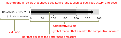
Bullet chart
There's also an option to create bullet charts which represent a core value and a target metric.
set.seed(37)

bullet_df <- tibble::rownames_to_column(mtcars) %>%
 dplyr::select(rowname, cyl:drat, mpg) %>%
 dplyr::group_by(cyl) %>%
 dplyr::mutate(target_col = mean(mpg)) %>%
 dplyr::slice_sample(n = 3) %>%
 dplyr::ungroup()

bullet_df %>%
 gt() %>%
 gt_plt_bullet(column = mpg, target = target_col, width = 45,
               palette = c("lightblue", "black"))
Note that for now, if you want to use any of the gt::fmt_ functions on your column of interest, you'll need to create a duplicate column ahead of time.
bullet_df %>%
  dplyr::mutate(plot_column = mpg) %>%
  gt() %>%
  gt_plt_bullet(column = plot_column, target = target_col, width = 45) %>%
  fmt_number(mpg, decimals = 1)
jthomasmock/gtExtras documentation built on April 6, 2024, 5:28 a.m.
R Package Documentation
Browse R Packages
We want your feedback!
Note that we can't provide technical support on individual packages. You should contact the package authors for that.
knitr::opts_chunk$set( collapse = TRUE, comment = "#>" )
Graphs vs Tables
Per Stephen Few in his book, Show Me the Numbers:
The difference between Tables and Graphs:
Tables: Display used to look up and compare individual values
Graphs: Display used to reveal relationships among whole sets of values and their overall shape
While we typically reach for our graphing tools whenever we want to tell a story with data, we are likely underutilizing tables. We can merge graphs and tables to often get the best of both worlds.
Get started
We can first load our libraries.
library(gt) library(gtExtras) library(dplyr, warn.conflicts = FALSE) library(ggplot2)
Sparklines
Per Wikipedia:
A sparkline is a very small line chart, typically drawn without axes or coordinates. It presents the general shape of the variation (typically over time) in some measurement, such as temperature or stock market price, in a simple and highly condensed way.
![]()
We can use gtExtras::gt_plt_sparkline() to add an inline sparkline very quickly. A necessary prep step is to first convert from a long data format to a summarized data format, where each row represents one "group" and the data column is now a vector of the values.
mtcars %>% head()
By using summarize(list_data = list(col_name)) we can create a list-column of ALL the data for that group.
car_summary <- mtcars %>% dplyr::group_by(cyl) %>% dplyr::summarize( mean = mean(mpg), sd = sd(mpg), # must end up with list of data for each row in the input dataframe mpg_data = list(mpg), .groups = "drop" ) car_summary
car_summary %>% arrange(desc(cyl)) %>% gt() %>% gtExtras::gt_plt_sparkline(mpg_data) %>% fmt_number(columns = mean:sd, decimals = 1)
Sparkline alternatives
You can also plot a density-plot or a histogram instead of just a line plot, note that we've switched to gt_plt_dist() since we're plotting a true distribution now.
car_summary %>% arrange(desc(cyl)) %>% gt() %>% gtExtras::gt_plt_dist(mpg_data, type = "density", line_color = "blue", fill_color = "red") %>% fmt_number(columns = mean:sd, decimals = 1)
car_summary %>% arrange(desc(cyl)) %>% gt() %>% gtExtras::gt_plt_dist(mpg_data, type = "histogram", line_color = "purple", fill_color = "green", bw = 4) %>% fmt_number(columns = mean:sd, decimals = 1)
Inline bars
You can also generate ggplot2 created bar plots inline. Note that keep_column allows you to keep the raw values and the plot inline.
mtcars %>% dplyr::select(cyl:wt, mpg) %>% head() %>% gt() %>% gt_plt_bar(column = mpg, keep_column = TRUE, width = 35)
Percent bars
Alternatively, you may prefer the HTML-generated bar plotsfrom gt_plt_bar_pct(). Note that the bars represent a percentage of max, so the largest value will indicate 100% of the row. You can pass raw values that are scaled to a 0-100% range, or pass values between 0 and 100 that represent an existing percent.
mtcars %>% head() %>% dplyr::select(cyl, mpg) %>% dplyr::mutate(mpg_pct_max = round(mpg/max(mpg) * 100, digits = 2), mpg_scaled = mpg/max(mpg) * 100) %>% dplyr::mutate(mpg_unscaled = mpg) %>% gt() %>% gt_plt_bar_pct(column = mpg_scaled, scaled = TRUE) %>% gt_plt_bar_pct(column = mpg_unscaled, scaled = FALSE, fill = "blue", background = "lightblue") %>% cols_align("center", contains("scale")) %>% cols_width(4 ~ px(125), 5 ~ px(125))
Inline Win Loss plots
You can also generate really nice looking "Win Loss" plots, similar to the ones used by The Guardian for Soccer outcomes. The code to bring in the data via the {nflreadr} package is hidden in an expandable tab below.
Bring data in
library(dplyr) games_df <- nflreadr::load_schedules() %>% filter(season == 2020, game_type == "REG") %>% select(game_id, team_home = home_team, team_away = away_team, result, week) %>% tidyr::pivot_longer(contains('team'), names_to = 'home_away', values_to = 'team', names_prefix = 'team_') %>% mutate( result = ifelse(home_away == 'home', result, -result), win = ifelse(result == 0 , 0.5, ifelse(result > 0, 1, 0)) ) %>% select(week, team, win) %>% mutate( team = case_when( team == 'STL' ~ 'LA', team == 'OAK' ~ 'LV', team == 'SD' ~ 'LAC', T ~ team ) ) team_df <- nflreadr::load_teams() %>% select(team_wordmark, team_abbr, team_conf, team_division) joined_df <- games_df %>% group_by(team) %>% summarise( Wins = length(win[win==1]), Losses = length(win[win==0]), outcomes = list(win), .groups = "drop") %>% left_join(team_df, by = c("team" = "team_abbr")) %>% select(team_wordmark, team_conf, team_division, Wins:outcomes) final_df <- joined_df %>% filter(team_conf == "AFC") %>% group_by(team_division) %>% arrange(desc(Wins)) %>% ungroup() %>% arrange(team_division) %>% select(-team_conf) %>% mutate(team_division = stringr::str_remove(team_division, "AFC |NFC ")) %>% mutate( team_division = factor(team_division, levels = c("North", "South", "East", "West") ) ) %>% arrange(team_division)
final_df <- tibble::tribble( ~team_wordmark, ~team_division, ~Wins, ~Losses, ~outcomes, "https://github.com/nflverse/nflfastR-data/raw/master/wordmarks/PIT.png", "North", 12L, 4L, c(1, 1, 1, 1, 1, 1, 1, 1, 1, 1, 1, 0, 0, 0, 1, 0), "https://github.com/nflverse/nflfastR-data/raw/master/wordmarks/BAL.png", "North", 11L, 5L, c(1, 1, 0, 1, 1, 1, 0, 1, 0, 0, 0, 1, 1, 1, 1, 1), "https://github.com/nflverse/nflfastR-data/raw/master/wordmarks/CLE.png", "North", 11L, 5L, c(0, 1, 1, 1, 1, 0, 1, 0, 1, 1, 1, 1, 0, 1, 0, 1), "https://github.com/nflverse/nflfastR-data/raw/master/wordmarks/CIN.png", "North", 4L, 11L, c(0, 0, 0.5, 1, 0, 0, 0, 1, 0, 0, 0, 0, 0, 1, 1, 0), "https://github.com/nflverse/nflfastR-data/raw/master/wordmarks/IND.png", "South", 11L, 5L, c(0, 1, 1, 1, 0, 1, 1, 0, 1, 1, 0, 1, 1, 1, 0, 1), "https://github.com/nflverse/nflfastR-data/raw/master/wordmarks/TEN.png", "South", 11L, 5L, c(1, 1, 1, 1, 1, 0, 0, 1, 0, 1, 1, 0, 1, 1, 0, 1), "https://github.com/nflverse/nflfastR-data/raw/master/wordmarks/HOU.png", "South", 4L, 12L, c(0, 0, 0, 0, 1, 0, 0, 1, 0, 1, 1, 0, 0, 0, 0, 0), "https://github.com/nflverse/nflfastR-data/raw/master/wordmarks/JAX.png", "South", 1L, 15L, c(1, 0, 0, 0, 0, 0, 0, 0, 0, 0, 0, 0, 0, 0, 0, 0), "https://github.com/nflverse/nflfastR-data/raw/master/wordmarks/BUF.png", "East", 13L, 3L, c(1, 1, 1, 1, 0, 0, 1, 1, 1, 0, 1, 1, 1, 1, 1, 1), "https://github.com/nflverse/nflfastR-data/raw/master/wordmarks/MIA.png", "East", 10L, 6L, c(0, 0, 1, 0, 1, 1, 1, 1, 1, 0, 1, 1, 0, 1, 1, 0), "https://github.com/nflverse/nflfastR-data/raw/master/wordmarks/NE.png", "East", 7L, 9L, c(1, 0, 1, 0, 0, 0, 0, 1, 1, 0, 1, 1, 0, 0, 0, 1), "https://github.com/nflverse/nflfastR-data/raw/master/wordmarks/NYJ.png", "East", 2L, 14L, c(0, 0, 0, 0, 0, 0, 0, 0, 0, 0, 0, 0, 0, 1, 1, 0), "https://github.com/nflverse/nflfastR-data/raw/master/wordmarks/KC.png", "West", 14L, 2L, c(1, 1, 1, 1, 0, 1, 1, 1, 1, 1, 1, 1, 1, 1, 1, 0), "https://github.com/nflverse/nflfastR-data/raw/master/wordmarks/LV.png", "West", 8L, 8L, c(1, 1, 0, 0, 1, 0, 1, 1, 1, 0, 0, 1, 0, 0, 0, 1), "https://github.com/nflverse/nflfastR-data/raw/master/wordmarks/LAC.png", "West", 7L, 9L, c(1, 0, 0, 0, 0, 1, 0, 0, 0, 1, 0, 0, 1, 1, 1, 1), "https://github.com/nflverse/nflfastR-data/raw/master/wordmarks/DEN.png", "West", 5L, 11L, c(0, 0, 0, 1, 1, 0, 1, 0, 0, 1, 0, 0, 1, 0, 0, 0) )
Note that we have a list-column of the outcomes for each team.
glimpse(final_df)
And now we can generate an example table!
final_df %>% gt(groupname_col = "team_division") %>% cols_label(team_wordmark = "") %>% cols_align("left", team_division) %>% gtExtras::gt_plt_winloss(outcomes, max_wins = 16, type = "pill") %>% gtExtras::gt_img_rows(columns = team_wordmark, height = 20) %>% gtExtras::gt_theme_538() %>% tab_header( title = gtExtras::add_text_img( "2020 Results by Division", url = "https://github.com/nflverse/nflfastR-data/raw/master/AFC.png", height = 30 ) ) %>% tab_options(data_row.padding = px(2))
Inline bar plots
We can also do inline bar plots, purely via HTML! You can customize the colors, and have the option to scale or use unscaled values.
gt_bar_plot_tab <- mtcars %>% head() %>% dplyr::select(cyl, mpg) %>% dplyr::mutate( mpg_pct_max = round(mpg / max(mpg) * 100, digits = 2), mpg_scaled = mpg / max(mpg) * 100 ) %>% dplyr::mutate(mpg_unscaled = mpg) %>% gt() %>% gt_plt_bar_pct(column = mpg_scaled, scaled = TRUE) %>% gt_plt_bar_pct(column = mpg_unscaled, scaled = FALSE, fill = "blue", background = "lightblue") %>% cols_align("center", contains("scale")) %>% cols_width( 4 ~ px(125), 5 ~ px(125) ) gt_bar_plot_tab
Stacked Percent bar charts
We can create a horizontal stacked percent bar chart inline like so. The data can be prepped as seen in the expandable section below.
library(dplyr) library(tidyr) library(gt) player_df <- tibble( player = c( "Evan Mobley", "Sandro Mamukelashvili", "Charles Bassey", "Luke Garza", "Moses Wright", "Neemias Queta", "Isaiah Jackson", "Day'Ron Sharpe" ), team = c( "USC", "Seton Hall", "Western Kentucky", "Iowa", "Georgia Tech", "Utah St", "Kentucky", "North Carolina" ), ht = c( "7'0\"", "6'10\"", "6'10\"", "6'11\"", "6'9\"", "7'1\"", "6'11\"", "6'10\"" ), dk_pct_time = c(40, 48, 50, 50, 51, 55, 60, 66), dk_pps = c(1.62, 1.02, 1.54,1.33,1.46,1.37,1.33,1.18), tip_pct_time = c(26, 10, 19, 15, 25, 27, 15, 24), tip_pps = c(0.88, .97,1,1.05, .63, .85, .76, .84), jmp_pct_time = c(33, 42, 31, 35, 25, 18, 25, 10), jmp_pps = c(.91, .91, .78, 1.04, .86, .74, .71, .42) ) %>% left_join( tibble( player = c( "Evan Mobley", "Sandro Mamukelashvili", "Charles Bassey", "Luke Garza", "Moses Wright", "Neemias Queta", "Isaiah Jackson", "Day'Ron Sharpe" ) %>% rep(each = 3), shot_type = c("Dunks + Lays", "Hooks + Floats", "Jumpers") %>% rep(8) ) %>% mutate( shot_type = factor(shot_type, levels = c("Jumpers", "Hooks + Floats", "Dunks + Lays")), shot_mix = c( 40, 26, 33, 48, 10, 42, 50, 19, 31, 50, 15, 35, 51, 25, 25, 55, 27, 18, 60, 15, 25, 66, 24, 10 ) ), by = "player" )
basic_tb <- player_df %>% group_by(player) %>% summarize(dunks = shot_mix[1], list_data = list(shot_mix)) %>% arrange(dunks) %>% gt()
basic_tb %>% gt_plt_bar_stack(list_data, width = 65, labels = c("DUNKS", "HOOKS/FLOATS", "JUMPERS"), palette= c("#ff4343", "#bfbfbf", "#0a1c2b")) %>% gt_theme_538()
Bullet chart
There's also an option to create bullet charts which represent a core value and a target metric.
set.seed(37) bullet_df <- tibble::rownames_to_column(mtcars) %>% dplyr::select(rowname, cyl:drat, mpg) %>% dplyr::group_by(cyl) %>% dplyr::mutate(target_col = mean(mpg)) %>% dplyr::slice_sample(n = 3) %>% dplyr::ungroup() bullet_df %>% gt() %>% gt_plt_bullet(column = mpg, target = target_col, width = 45, palette = c("lightblue", "black"))
Note that for now, if you want to use any of the gt::fmt_ functions on your column of interest, you'll need to create a duplicate column ahead of time.
bullet_df %>% dplyr::mutate(plot_column = mpg) %>% gt() %>% gt_plt_bullet(column = plot_column, target = target_col, width = 45) %>% fmt_number(mpg, decimals = 1)
R Package Documentation
Browse R Packages
We want your feedback!
Note that we can't provide technical support on individual packages. You should contact the package authors for that.
Embedding an R snippet on your website
Add the following code to your website.
For more information on customizing the embed code, read Embedding Snippets.