In pheymanss/chronicle: Grammar for Creating R Markdown Reports
library(chronicle)
# If you want this report to be reproducible, add all the libraries, data
# loading and preprocessing code into this chunk before knitting.
An R package for easy R Markdown reporting
install.packages('chronicle')
This R package aims to be an opinionated assistant, to whom
you can delegate the task of creating visually appealing and consistent R Markdown
reports.
A quick demo
The way you build the reports is by specifying the structure
of your report through the add_* family of functions, layering one below the
previous one.
library(chronicle)

demo_report <-
  add_text(text_title = "This is the output of a chronicle call",
           text = "Each element has been added through an `add_*` function.",
           title_level = 1) %>%
  add_table(table = head(iris),
            table_title = "A glimpse of the iris dataset",
            html_table_type = "kable",
            title_level = 1) %>%
  add_raincloud(dt = iris,
                value = "Sepal.Length",
                groups = "Species") %>%
  add_scatterplot(dt = iris,
                  x = "Petal.Width",
                  y = "Petal.Length",
                  groups = "Species")

render_report(report = demo_report,
              title = "A quick chronicle demo",
              filename = "quick_demo",
              keep_rmd = TRUE)
file.remove('quick_demo.Rmd')
           file.remove('quick_demo.html')
You can see
the output of this call, and
a full showcase of all the
elements supported by chronicle.
What happens behind these calls is that chronicle literally wirtes the content of
an R Markdown for you! You can see the content of the report by directly printing
it.
demo_report
The make_* family of functions
Every plot added with an add_* function will be built through its
correpsonding make_* function. These functions take care of the heavy lifting,
avoiding the cumbersome (albeit powerful) sintax of ggplot, plotly and other
html widgets. The parameters of the make_functions are simple and intuitive
specifications on how to make each plot, and they can be called independently
and used in any instance where a ggplot or an html widget would fit.
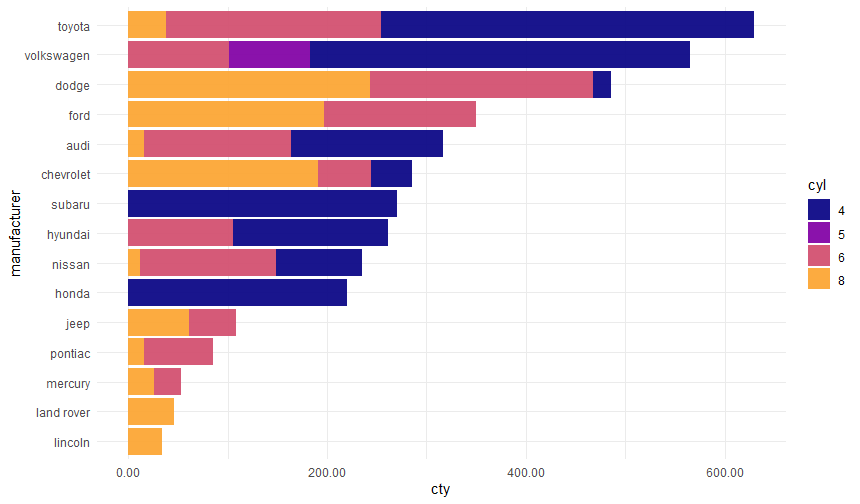
make_barplot(dt = ggplot2::mpg,
             value = 'cty',
             bars = 'manufacturer',
             break_bars_by = 'cyl',
             horizontal = TRUE,
             sort_by_value = TRUE,
             static = TRUE)
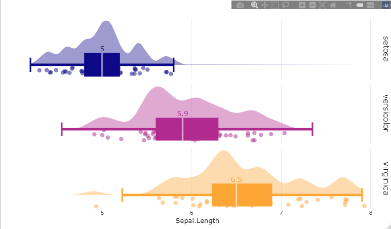
make_raincloud(dt = iris,
             value = 'Sepal.Length',
             groups = 'Species')
Rendering chronicle reports
Once the structure of the report has been defined, the rendering process is done
by render_report(). This uses rmarkdown::render() as a backend for rendering the
report, which gives chronicle the capability to render the reports with full
visibility to all objects in the global environment. This gives chronicle two of
big strengths:
-
You don't need to include nor run all your data processing code again for a
new report output. This means you can build several report recipes for different
audiences out of the same data processing, rendering all of them from the same global
environment.
-
It can render several output formats in a single call. For instance, it is
possible to render the same content as
ioslides
for a presentation, as tufte_html for handouts
and as rmdformats for a site upload.
Take our quick demo as an example, to render this as the three outputs
mentioned previously, you only need to add that vector to the output_format
parameter of render_report()
render_report(report = demo_report,
              output_format = c("ioslides", "tufte_html", "rmdformats"),
              filename = "quick_demo",
              title = "A quick chronicle demo",
              author = "You did this!",
              include_date = FALSE,
              fig_width = 8,
              fig_height = 6,
              plot_palette = c("#FC8D59", "#FFFFBF", "#99D594"),
              plot_palette_generator = "plasma",
              rmdformats_theme = "readthedown",
              keep_rmd = TRUE)
The render_report function allows the user to specify several
global parameters of the report, like fig_width, fig_height, plot_palette,
and plot_palette_generator. This last one specifies which palette from the
viridis
package will be used to complete insufficiently long palettes (or when the user
did not specify a palette at all.)
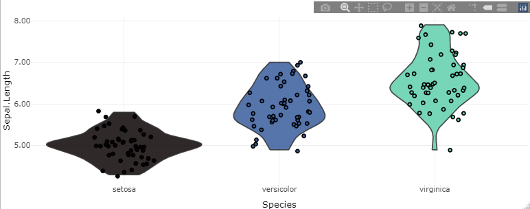
make_violin(dt = iris,
             value = 'Sepal.Length',
             groups = 'Species',
             plot_palette_generator = 'mako')
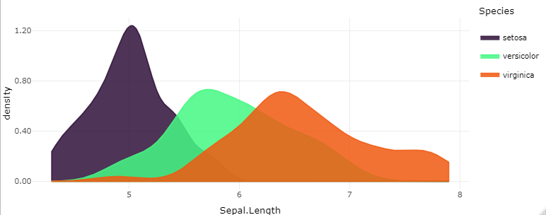
make_density(dt = iris,
             value = 'Sepal.Length',
             groups = 'Species',
             faceted = FALSE,
             plot_palette_generator = 'turbo')
The report_columns() function
chronicle also includes a function called report_columns(),
that will create an entire chronicle report for a single dataset. It includes a
comprehensive summary of the data through the skimr::skim() function, along with
one plot for each column present in the data: bar plots for categorical variables
and rain cloud plots for numerical variables. This gives you an immediate view of
a dataset with a single line of code!
report_columns(dt = palmerpenguins::penguins,
               by_column = 'species')
And you can see
the output of this call
Supported formats
As of version 0.2.5, chronicle can output both static and dynamic
outputs. Dynamic outputs refer to R Markdown formats that support html
widgets, hence the elements added will be dynamic plots (plotly,
dygraph, DT). For static outputs, these will roll back to ggplot and
static table prints. To avoid large file sizes, it will also roll back to static plots
if the table has over 10,000 rows.
Dynamic outputs (html)
- bookdown
- github_document (you are reading one right now!)
- html_document
- html_notebook
- ioslides
- prettydoc
- rmdformats (this is currently the default)
- slidy_presentation
- tufte_html
Static outputs
Additionally, {flexdashboard}
and {xaringan} technically compile,
but the layout is stiff in flexdashboard and altogether incorrect in xaringan,
so you might still use it if you don't mind manually correcting the separators.
Also, {rticles} support can technically
be added, but that would involve a plethora of additional parameters for the header,
and frankly, writing a journal article is not the intended use of the package
Supported report elements
I highly encourage
you to review the enitre
showcase, words are not
as adequate to describe each element. But for a quick glance, as of version 0.2.5
chronicle supports:
- Bar plots
- Box plots
- Code (optionally evaluated)
- Density plots
- Dygraphs
- Histograms
- Line plots
- Rain cloud plots
- Scatter plots
- Tables
- Texts
- Titles
- Violin plots
pheymanss/chronicle documentation built on Jan. 19, 2024, 6 a.m.
R Package Documentation
Browse R Packages
We want your feedback!
Note that we can't provide technical support on individual packages. You should contact the package authors for that.
library(chronicle) # If you want this report to be reproducible, add all the libraries, data # loading and preprocessing code into this chunk before knitting.
An R package for easy R Markdown reporting
install.packages('chronicle')
This R package aims to be an opinionated assistant, to whom you can delegate the task of creating visually appealing and consistent R Markdown reports.
A quick demo
The way you build the reports is by specifying the structure
of your report through the add_* family of functions, layering one below the
previous one.
library(chronicle) demo_report <- add_text(text_title = "This is the output of a chronicle call", text = "Each element has been added through an `add_*` function.", title_level = 1) %>% add_table(table = head(iris), table_title = "A glimpse of the iris dataset", html_table_type = "kable", title_level = 1) %>% add_raincloud(dt = iris, value = "Sepal.Length", groups = "Species") %>% add_scatterplot(dt = iris, x = "Petal.Width", y = "Petal.Length", groups = "Species") render_report(report = demo_report, title = "A quick chronicle demo", filename = "quick_demo", keep_rmd = TRUE)
file.remove('quick_demo.Rmd') file.remove('quick_demo.html')
You can see the output of this call, and a full showcase of all the elements supported by chronicle.
What happens behind these calls is that chronicle literally wirtes the content of an R Markdown for you! You can see the content of the report by directly printing it.
demo_report
The make_* family of functions
Every plot added with an add_* function will be built through its
correpsonding make_* function. These functions take care of the heavy lifting,
avoiding the cumbersome (albeit powerful) sintax of ggplot, plotly and other
html widgets. The parameters of the make_functions are simple and intuitive
specifications on how to make each plot, and they can be called independently
and used in any instance where a ggplot or an html widget would fit.
make_barplot(dt = ggplot2::mpg, value = 'cty', bars = 'manufacturer', break_bars_by = 'cyl', horizontal = TRUE, sort_by_value = TRUE, static = TRUE)
make_raincloud(dt = iris, value = 'Sepal.Length', groups = 'Species')
Rendering chronicle reports
Once the structure of the report has been defined, the rendering process is done
by render_report(). This uses rmarkdown::render() as a backend for rendering the
report, which gives chronicle the capability to render the reports with full
visibility to all objects in the global environment. This gives chronicle two of
big strengths:
-
You don't need to include nor run all your data processing code again for a new report output. This means you can build several report recipes for different audiences out of the same data processing, rendering all of them from the same global environment.
-
It can render several output formats in a single call. For instance, it is possible to render the same content as ioslides for a presentation, as tufte_html for handouts and as rmdformats for a site upload.
Take our quick demo as an example, to render this as the three outputs
mentioned previously, you only need to add that vector to the output_format
parameter of render_report()
render_report(report = demo_report, output_format = c("ioslides", "tufte_html", "rmdformats"), filename = "quick_demo", title = "A quick chronicle demo", author = "You did this!", include_date = FALSE, fig_width = 8, fig_height = 6, plot_palette = c("#FC8D59", "#FFFFBF", "#99D594"), plot_palette_generator = "plasma", rmdformats_theme = "readthedown", keep_rmd = TRUE)
The render_report function allows the user to specify several
global parameters of the report, like fig_width, fig_height, plot_palette,
and plot_palette_generator. This last one specifies which palette from the
viridis
package will be used to complete insufficiently long palettes (or when the user
did not specify a palette at all.)
make_violin(dt = iris, value = 'Sepal.Length', groups = 'Species', plot_palette_generator = 'mako')
make_density(dt = iris, value = 'Sepal.Length', groups = 'Species', faceted = FALSE, plot_palette_generator = 'turbo')
The report_columns() function
chronicle also includes a function called report_columns(),
that will create an entire chronicle report for a single dataset. It includes a
comprehensive summary of the data through the skimr::skim() function, along with
one plot for each column present in the data: bar plots for categorical variables
and rain cloud plots for numerical variables. This gives you an immediate view of
a dataset with a single line of code!
report_columns(dt = palmerpenguins::penguins, by_column = 'species')
And you can see the output of this call
Supported formats
As of version 0.2.5, chronicle can output both static and dynamic outputs. Dynamic outputs refer to R Markdown formats that support html widgets, hence the elements added will be dynamic plots (plotly, dygraph, DT). For static outputs, these will roll back to ggplot and static table prints. To avoid large file sizes, it will also roll back to static plots if the table has over 10,000 rows.
Dynamic outputs (html)
- bookdown
- github_document (you are reading one right now!)
- html_document
- html_notebook
- ioslides
- prettydoc
- rmdformats (this is currently the default)
- slidy_presentation
- tufte_html
Static outputs
Additionally, {flexdashboard} and {xaringan} technically compile, but the layout is stiff in flexdashboard and altogether incorrect in xaringan, so you might still use it if you don't mind manually correcting the separators. Also, {rticles} support can technically be added, but that would involve a plethora of additional parameters for the header, and frankly, writing a journal article is not the intended use of the package
Supported report elements
I highly encourage you to review the enitre showcase, words are not as adequate to describe each element. But for a quick glance, as of version 0.2.5 chronicle supports:
- Bar plots
- Box plots
- Code (optionally evaluated)
- Density plots
- Dygraphs
- Histograms
- Line plots
- Rain cloud plots
- Scatter plots
- Tables
- Texts
- Titles
- Violin plots
R Package Documentation
Browse R Packages
We want your feedback!
Note that we can't provide technical support on individual packages. You should contact the package authors for that.
Embedding an R snippet on your website
Add the following code to your website.
For more information on customizing the embed code, read Embedding Snippets.