In ropenscilabs/ropenaq: Accesses Air Quality Data from the Open Data Platform OpenAQ
NOT_CRAN <- identical(tolower(Sys.getenv("NOT_CRAN")), "true")
knitr::opts_chunk$set(
  collapse  =  TRUE,
  comment  =  "#>",
  purl  =  NOT_CRAN,
  eval  =  NOT_CRAN
)
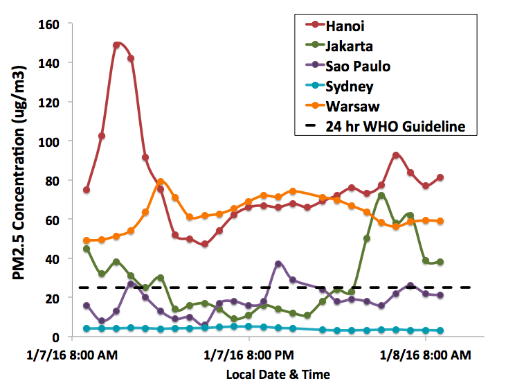
In this vignette I want to draw a graph inspired by https://pbs.twimg.com/media/CYOAGowW8AQs4Fy.png:large.
library("ropenaq")
library("ggplot2")
library("dplyr")
library("viridis")
Graph 1
tbHanoi <- aq_measurements(city = "Hanoi", parameter = "pm25", date_from = as.character(Sys.Date()-1), limit = 1000)

tbJakarta <- aq_measurements(city = "Jakarta", parameter = "pm25", date_from = as.character(Sys.Date()-1), limit = 1000)

tbChennai <- aq_measurements(city = "Chennai", location = "US+Diplomatic+Post%3A+Chennai", parameter = "pm25", date_from = as.character(Sys.Date()-1), limit = 1000)


tbPM <- rbind(tbHanoi,
            tbJakarta,
            tbChennai)
tbPM <- filter(tbPM, value >= 0)

ggplot() + geom_line(data = tbPM,
                     aes(x = dateLocal, y = value, colour = location),
                     size = 1.5) +
  ylab(expression(paste("PM2.5 concentration (", mu, "g/",m^3,")"))) +
  theme(text  =  element_text(size = 15)) +
   theme(axis.text.x = element_text(angle = 45, hjust = 1)) +
  scale_color_viridis(discrete = TRUE)
Graph 2
Another graph, for Delhi.
tbIndia <- aq_measurements(country = "IN", city = "Delhi",
                           location = "US+Diplomatic+Post%3A+New+Delhi",
                           parameter = "pm25",
                           date_from = as.character(Sys.Date()-1), limit = 1000)
tbIndia <- filter(tbIndia, value >= 0)
ggplot() + geom_line(data = tbIndia,
                     aes(x = dateLocal, y = value),
                     size = 1.5) +
  ylab(expression(paste("PM2.5 concentration (", mu, "g/",m^3,")"))) +
  theme(text  =  element_text(size = 15))+
   theme(axis.text.x = element_text(angle = 45, hjust = 1))
ropenscilabs/ropenaq documentation built on May 18, 2022, 8:31 p.m.
R Package Documentation
Browse R Packages
We want your feedback!
Note that we can't provide technical support on individual packages. You should contact the package authors for that.
NOT_CRAN <- identical(tolower(Sys.getenv("NOT_CRAN")), "true") knitr::opts_chunk$set( collapse = TRUE, comment = "#>", purl = NOT_CRAN, eval = NOT_CRAN )
In this vignette I want to draw a graph inspired by https://pbs.twimg.com/media/CYOAGowW8AQs4Fy.png:large.
library("ropenaq") library("ggplot2") library("dplyr") library("viridis")
Graph 1
tbHanoi <- aq_measurements(city = "Hanoi", parameter = "pm25", date_from = as.character(Sys.Date()-1), limit = 1000) tbJakarta <- aq_measurements(city = "Jakarta", parameter = "pm25", date_from = as.character(Sys.Date()-1), limit = 1000) tbChennai <- aq_measurements(city = "Chennai", location = "US+Diplomatic+Post%3A+Chennai", parameter = "pm25", date_from = as.character(Sys.Date()-1), limit = 1000) tbPM <- rbind(tbHanoi, tbJakarta, tbChennai) tbPM <- filter(tbPM, value >= 0) ggplot() + geom_line(data = tbPM, aes(x = dateLocal, y = value, colour = location), size = 1.5) + ylab(expression(paste("PM2.5 concentration (", mu, "g/",m^3,")"))) + theme(text = element_text(size = 15)) + theme(axis.text.x = element_text(angle = 45, hjust = 1)) + scale_color_viridis(discrete = TRUE)
Graph 2
Another graph, for Delhi.
tbIndia <- aq_measurements(country = "IN", city = "Delhi", location = "US+Diplomatic+Post%3A+New+Delhi", parameter = "pm25", date_from = as.character(Sys.Date()-1), limit = 1000) tbIndia <- filter(tbIndia, value >= 0) ggplot() + geom_line(data = tbIndia, aes(x = dateLocal, y = value), size = 1.5) + ylab(expression(paste("PM2.5 concentration (", mu, "g/",m^3,")"))) + theme(text = element_text(size = 15))+ theme(axis.text.x = element_text(angle = 45, hjust = 1))
R Package Documentation
Browse R Packages
We want your feedback!
Note that we can't provide technical support on individual packages. You should contact the package authors for that.
Embedding an R snippet on your website
Add the following code to your website.
For more information on customizing the embed code, read Embedding Snippets.