Nothing
Correlation Plots
In metasnf: Meta Clustering with Similarity Network Fusion
knitr::opts_chunk$set(echo = TRUE)
options(crayon.enabled = FALSE, cli.num_colors = 0)
Download a copy of the vignette to follow along here: correlation_plots.Rmd
In this vignette, we go through how you can visualize associations between the features included in your analyses.
Data set-up
library(metasnf)

# We'll just use the first few columns for this demo
cort_sa_minimal <- cort_sa[, 1:5]

# And one more mock categorical feature for demonstration purposes
city <- fav_colour
city$"city" <- sample(
    c("toronto", "montreal", "vancouver"),
    size = nrow(city),
    replace = TRUE
)
city <- city |> dplyr::select(-"colour")

# Make sure to throw in all the data you're interested in visualizing for this
# data_list, including out-of-model measures and confounding features.
dl <- data_list(
    list(cort_sa_minimal, "cortical_sa", "neuroimaging", "continuous"),
    list(income, "household_income", "demographics", "ordinal"),
    list(pubertal, "pubertal_status", "demographics", "continuous"),
    list(fav_colour, "favourite_colour", "demographics", "categorical"),
    list(city, "city", "demographics", "categorical"),
    list(anxiety, "anxiety", "behaviour", "ordinal"),
    list(depress, "depressed", "behaviour", "ordinal"),
    uid = "unique_id"
)

summary(dl)

# This matrix contains all the pairwise association p-values
assoc_pval_matrix <- calc_assoc_pval_matrix(dl)

assoc_pval_matrix[1:3, 1:3]
Heatmaps
Here's what a basic heatmap looks like:
ap_heatmap <- assoc_pval_heatmap(assoc_pval_matrix)
save_heatmap(
    ap_heatmap,
    "assoc_pval_heatmap.png",
    width = 650,
    height = 500,
    res = 100
)
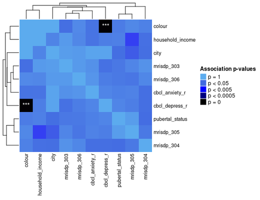
Most of this data was generated randomly, but the "colour" feature is really just a categorical mapping of "cbcl_depress_r".
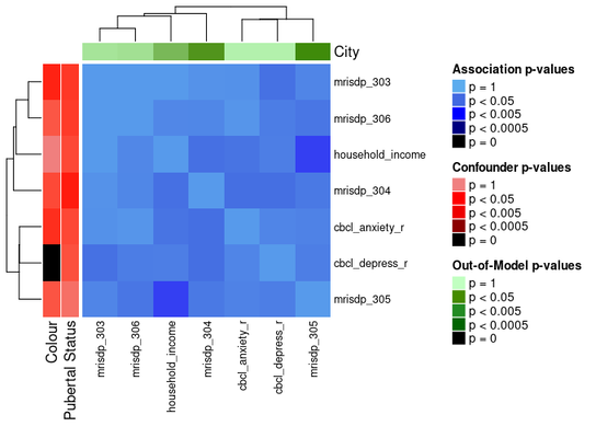
You can draw attention to confounding features and/or any out of model measures by specifying their names as shown below.
ap_heatmap2 <- assoc_pval_heatmap(
    assoc_pval_matrix,
    confounders = list(
        "Colour" = "colour",
        "Pubertal Status" = "pubertal_status"
    ),
    out_of_models = list(
        "City" = "city"
    )
)
save_heatmap(
    ap_heatmap2,
    "assoc_pval_heatmap2.png",
    width = 680,
    height = 500,
    res = 100
)
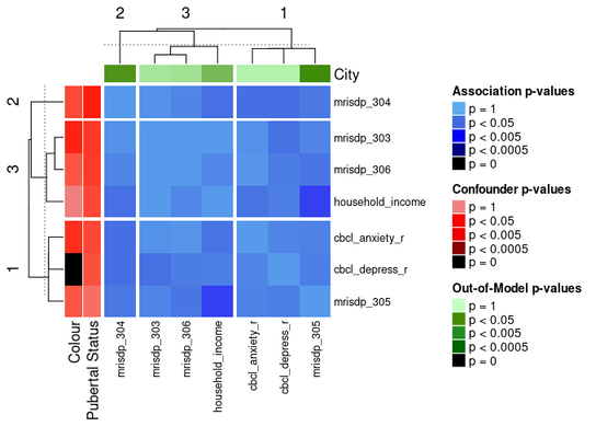
The ComplexHeatmap package offers functionality for splitting heatmaps into slices.
One way to do the slices is by clustering the heatmap with k-means:
ap_heatmap3 <- assoc_pval_heatmap(
    assoc_pval_matrix,
    confounders = list(
        "Colour" = "colour",
        "Pubertal Status" = "pubertal_status"
    ),
    out_of_models = list(
        "City" = "city"
    ),
    row_km = 3,
    column_km = 3
)
save_heatmap(
    ap_heatmap3,
    "assoc_pval_heatmap3.png",
    width = 680,
    height = 500,
    res = 100
)
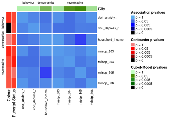
Another way to divide the heatmap is by feature domain.
This can be done by providing a data_list with all the features in the assoc_pval_matrix and setting split_by_domain to TRUE.
ap_heatmap4 <- assoc_pval_heatmap(
    assoc_pval_matrix,
    confounders = list(
        "Colour" = "colour",
        "Pubertal Status" = "pubertal_status"
    ),
    out_of_models = list(
        "City" = "city"
    ),
    dl = data_list,
    split_by_domain = TRUE
)
save_heatmap(
    ap_heatmap4,
    "assoc_pval_heatmap4.png",
    width = 700,
    height = 500,
    res = 100
)
Try the metasnf package in your browser
Any scripts or data that you put into this service are public.
metasnf documentation built on June 8, 2025, 12:47 p.m.
R Package Documentation
Browse R Packages
We want your feedback!
Note that we can't provide technical support on individual packages. You should contact the package authors for that.
knitr::opts_chunk$set(echo = TRUE)
options(crayon.enabled = FALSE, cli.num_colors = 0)
Download a copy of the vignette to follow along here: correlation_plots.Rmd
In this vignette, we go through how you can visualize associations between the features included in your analyses.
Data set-up
library(metasnf) # We'll just use the first few columns for this demo cort_sa_minimal <- cort_sa[, 1:5] # And one more mock categorical feature for demonstration purposes city <- fav_colour city$"city" <- sample( c("toronto", "montreal", "vancouver"), size = nrow(city), replace = TRUE ) city <- city |> dplyr::select(-"colour") # Make sure to throw in all the data you're interested in visualizing for this # data_list, including out-of-model measures and confounding features. dl <- data_list( list(cort_sa_minimal, "cortical_sa", "neuroimaging", "continuous"), list(income, "household_income", "demographics", "ordinal"), list(pubertal, "pubertal_status", "demographics", "continuous"), list(fav_colour, "favourite_colour", "demographics", "categorical"), list(city, "city", "demographics", "categorical"), list(anxiety, "anxiety", "behaviour", "ordinal"), list(depress, "depressed", "behaviour", "ordinal"), uid = "unique_id" ) summary(dl) # This matrix contains all the pairwise association p-values assoc_pval_matrix <- calc_assoc_pval_matrix(dl) assoc_pval_matrix[1:3, 1:3]
Heatmaps
Here's what a basic heatmap looks like:
ap_heatmap <- assoc_pval_heatmap(assoc_pval_matrix)
save_heatmap( ap_heatmap, "assoc_pval_heatmap.png", width = 650, height = 500, res = 100 )
Most of this data was generated randomly, but the "colour" feature is really just a categorical mapping of "cbcl_depress_r".
You can draw attention to confounding features and/or any out of model measures by specifying their names as shown below.
ap_heatmap2 <- assoc_pval_heatmap( assoc_pval_matrix, confounders = list( "Colour" = "colour", "Pubertal Status" = "pubertal_status" ), out_of_models = list( "City" = "city" ) )
save_heatmap( ap_heatmap2, "assoc_pval_heatmap2.png", width = 680, height = 500, res = 100 )
The ComplexHeatmap package offers functionality for splitting heatmaps into slices. One way to do the slices is by clustering the heatmap with k-means:
ap_heatmap3 <- assoc_pval_heatmap( assoc_pval_matrix, confounders = list( "Colour" = "colour", "Pubertal Status" = "pubertal_status" ), out_of_models = list( "City" = "city" ), row_km = 3, column_km = 3 )
save_heatmap( ap_heatmap3, "assoc_pval_heatmap3.png", width = 680, height = 500, res = 100 )
Another way to divide the heatmap is by feature domain.
This can be done by providing a data_list with all the features in the assoc_pval_matrix and setting split_by_domain to TRUE.
ap_heatmap4 <- assoc_pval_heatmap( assoc_pval_matrix, confounders = list( "Colour" = "colour", "Pubertal Status" = "pubertal_status" ), out_of_models = list( "City" = "city" ), dl = data_list, split_by_domain = TRUE )
save_heatmap( ap_heatmap4, "assoc_pval_heatmap4.png", width = 700, height = 500, res = 100 )
Try the metasnf package in your browser
Any scripts or data that you put into this service are public.
R Package Documentation
Browse R Packages
We want your feedback!
Note that we can't provide technical support on individual packages. You should contact the package authors for that.
Embedding an R snippet on your website
Add the following code to your website.
For more information on customizing the embed code, read Embedding Snippets.