inst/examples/appendices/delayed.md
In cboettig/earlywarning: Detection of Early Warning Signals for Catastrophic Bifurcations
Model-based detection of early warning under a delay
What happens when we attempt to fit the linear change model to a signal in which the environment is initially constant and then begins degrading?
First let's simulate some such data
require(populationdynamics)
## Loading required package: populationdynamics
require(earlywarning)
## Loading required package: earlywarning
pars = c(Xo = 500, e = 0.5, a = 180, K = 1000,
    h = 200, i = 0, Da = 0.45, Dt = 50, p = 2)
sn <- saddle_node_ibm(pars, times = seq(0, 100,
    length = 200))
X <- ts(sn$x1, start = sn$time[1], deltat = sn$time[2] -
    sn$time[1])
Observe that this produces timeseries has 200 points in the interval (0,100) with a linear change begining half way through, at Dt=50, where it begins approaching a saddle-node bifurcation. Let's fit both our models:
A <- stability_model(X, "OU")
B <- stability_model(X, "LSN")
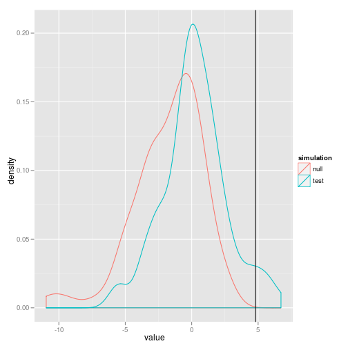
observed <- -2 * (logLik(A) - logLik(B))
observed
## [1] 4.805
... and then use the bootstrapped likelihood ratios to see if this difference is significant:
require(snowfall)
## Loading required package: snowfall
## Loading required package: snow
sfInit(parallel = TRUE, cpu = 16)
## R Version:  R version 2.14.1 (2011-12-22)
##
## snowfall 1.84 initialized (using snow 0.3-8): parallel execution on 16 CPUs.
##
sfLibrary(earlywarning)
## Library earlywarning loaded.
## Library earlywarning loaded in cluster.
##
## Warning message: 'keep.source' is deprecated and will be ignored
sfExportAll()
reps <- sfLapply(1:100, function(i) compare(A,
B))
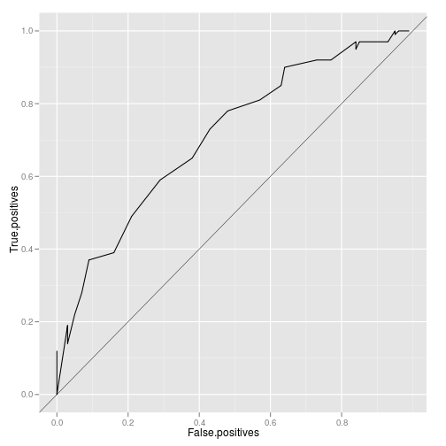
lr <- lik_ratios(reps)
roc <- roc_data(lr)
save(list = ls(), file = "delayed.rda")
Plot the likelihood ratio distribution with a line indicating the observed value. Also plot the ROC curve.
require(ggplot2)
## Loading required package: ggplot2
## Loading required package: reshape
## Loading required package: plyr
##
## Attaching package: 'reshape'
##
## The following object(s) are masked from 'package:plyr':
##
##     rename, round_any
##
## Loading required package: grid
## Loading required package: proto
ggplot(lr) + geom_density(aes(value, color = simulation)) +
    geom_vline(aes(xintercept = observed))
ggplot(roc) + geom_line(aes(False.positives, True.positives)) +
    geom_abline(aes(yintercept = 0, slope = 1), lwd = 0.2)
Is this a concern for the windowed approach? It still complicates the calculation of the correlation statistic used to demonstrate a statistically significant increase. We certainly would not advocate choosing the region "by eye" as it were where the increase appears and then testing the correlation on that segment alone -- that would guarentee bias. In principle this faces the same problem that the starting point needs to be known in advance.
cboettig/earlywarning documentation built on May 13, 2019, 2:07 p.m.
R Package Documentation
Browse R Packages
We want your feedback!
Note that we can't provide technical support on individual packages. You should contact the package authors for that.
Model-based detection of early warning under a delay
What happens when we attempt to fit the linear change model to a signal in which the environment is initially constant and then begins degrading?
First let's simulate some such data
require(populationdynamics)
## Loading required package: populationdynamics
require(earlywarning)
## Loading required package: earlywarning
pars = c(Xo = 500, e = 0.5, a = 180, K = 1000,
h = 200, i = 0, Da = 0.45, Dt = 50, p = 2)
sn <- saddle_node_ibm(pars, times = seq(0, 100,
length = 200))
X <- ts(sn$x1, start = sn$time[1], deltat = sn$time[2] -
sn$time[1])
Observe that this produces timeseries has 200 points in the interval (0,100) with a linear change begining half way through, at Dt=50, where it begins approaching a saddle-node bifurcation. Let's fit both our models:
A <- stability_model(X, "OU")
B <- stability_model(X, "LSN")
observed <- -2 * (logLik(A) - logLik(B))
observed
## [1] 4.805
... and then use the bootstrapped likelihood ratios to see if this difference is significant:
require(snowfall)
## Loading required package: snowfall
## Loading required package: snow
sfInit(parallel = TRUE, cpu = 16)
## R Version: R version 2.14.1 (2011-12-22)
##
## snowfall 1.84 initialized (using snow 0.3-8): parallel execution on 16 CPUs.
##
sfLibrary(earlywarning)
## Library earlywarning loaded.
## Library earlywarning loaded in cluster.
##
## Warning message: 'keep.source' is deprecated and will be ignored
sfExportAll()
reps <- sfLapply(1:100, function(i) compare(A,
B))
lr <- lik_ratios(reps)
roc <- roc_data(lr)
save(list = ls(), file = "delayed.rda")
Plot the likelihood ratio distribution with a line indicating the observed value. Also plot the ROC curve.
require(ggplot2)
## Loading required package: ggplot2
## Loading required package: reshape
## Loading required package: plyr
##
## Attaching package: 'reshape'
##
## The following object(s) are masked from 'package:plyr':
##
## rename, round_any
##
## Loading required package: grid
## Loading required package: proto
ggplot(lr) + geom_density(aes(value, color = simulation)) +
geom_vline(aes(xintercept = observed))
ggplot(roc) + geom_line(aes(False.positives, True.positives)) +
geom_abline(aes(yintercept = 0, slope = 1), lwd = 0.2)
Is this a concern for the windowed approach? It still complicates the calculation of the correlation statistic used to demonstrate a statistically significant increase. We certainly would not advocate choosing the region "by eye" as it were where the increase appears and then testing the correlation on that segment alone -- that would guarentee bias. In principle this faces the same problem that the starting point needs to be known in advance.
R Package Documentation
Browse R Packages
We want your feedback!
Note that we can't provide technical support on individual packages. You should contact the package authors for that.
Embedding an R snippet on your website
Add the following code to your website.
For more information on customizing the embed code, read Embedding Snippets.