data360rUseCases.md
In mrpsonglao/WBdata360R: Wrapper for 'TCdata360' and 'Govdata360' API
Diving in data360r: Package Use Cases in just 3+ lines of R code
This section covers the following use cases, which caters to R users ranging from the beginner to advanced levels:
- Use Case 1: Downloading relevant indicator data for a specific country
- Use Case 2: Comparing and visualizing indicators with ggplot2
- Use Case 3: Running regression on the WEF Global Competitiveness Index dataset
Look out for friendly tips when using the data360r package, which can be found in specially-formatted boxes such as this one:
TIP: If you want to see more use cases that aren’t covered here or provide feedback on the data360r package, feel free to drop us a message at tcdata360@worldbank.org!
Use Case #1: Downloading relevant indicator data for a specific country
For most users, it’s important to quickly find and download data you need for a report. For example, what if we need to download data related to “woman business” for the United States?
Step 1. Search for indicator IDs of indicators related to “woman business”. For simplicity, let’s search for the top 5 indicators related to “woman business”. Note that 7 results are returned since some indicators have two IDs (one for TCdata360, the other for Govdata360).
df_usecase1 <- search_360("woman business", search_type="indicator", limit_results = 5)
TIP: We can easily get the array of indicator IDs of the top 5 related indicators using df_usecase1$id.
TIP: For the user’s convenience, search_360 brings back results in decreasing order of relevance (represented by the “score” column). However, note also that search_360 returns the union of all search results for each individual term. For better search results, try to keep the search string query specific but concise.
Step 2. Search for Country ISO3 for United States. Let’s search for the ISO3 of all countries related to “United States”. We take note of the slug “USA” of the first result (which is a perfect match with score = 1.0) which is the country ISO3 we need.
> search_360("United States", search_type="country")
### Output:
    id  name    slug    type    score   redirect    dataset
1   NA  United States   USA country 1.00000000  FALSE   NA
TIP: For country-type results, the “slug” column provides the Country ISO3 ID.
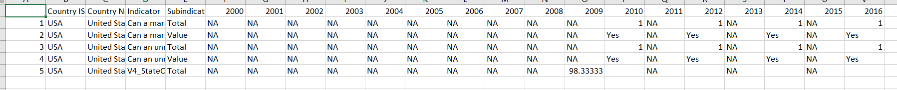
Step 3. Get indicator data related to “woman business” for USA as a dataframe. Putting it altogether, we use the results of previous Steps 1 & 2 to get a wide dataframe containing the data we need.
> df_usecase1_result <- get_data360(indicator_id=df_usecase1$id, country_iso3="USA")
[Optional] Step 4. Export R dataframe as CSV. What if we want to export the dataframe so that we can use it in Excel? We can use the write.csv function (via utils package, which the data360r package already installs for you) to do this.
> write.csv(df_usecase1_result, ‘df_usecase1_result.csv')
Here’s the output using Excel:
Use Case #2: Comparing and visualizing indicators with ggplot2
For intermediate R users who are comfortable with using R for data visualization, dataframes usually need to be in a long format especially when used with the ggplot2 R package. So how do we use data360r together with ggplot2?
Step 1. Search IDs of indicators for comparison. For this example, let’s get the indicator IDs for the “What is the legal age of marriage for boys and for girls?” indicators. We note that these are indicator IDs 204 and 205, respectively.
> search_360("marriage", search_type="indicator")
### Output:
    id  name    slug    type    score   dataset redirect
1   204 What is the legal age of marriage for boys? age.marr.male   indicator   0.1111111   Women, Business and the Law FALSE
2   205 What is the legal age of marriage for girls?    age.marr.fem    indicator   0.1111111   Women, Business and the Law FALSE
TIP: data360r package functions are compatible with the tidyverse R package, so you can use these with together with “pipes” %>%. For example, to remove duplicates you can run: search_360("men", search_type="indicator") %>% distinct(name,.keep_all=TRUE)
Step 2. Get indicator data for all countries for year 2016. How do we get the indicator data in long format using get_data360? Simply add the parameter output_type="long" in the function call, and voila! For simplicity, we limit the indicator data to year 2016 only by adding the parameter timeframes = c(2016).
> df_usecase2_result <- get_data360(indicator_id = c(204, 205), timeframes = c(2016), output_type = 'long')
TIP: The default output_type for getdata_360 is a wide dataframe. For getdata_360 outputs with output_type = ‘long’, the column for the timeframes is always called “Period” whereas the column for the indicator values is always called “Observation”. Knowing this is helpful especially when making reusable code snippets with data360r functions.
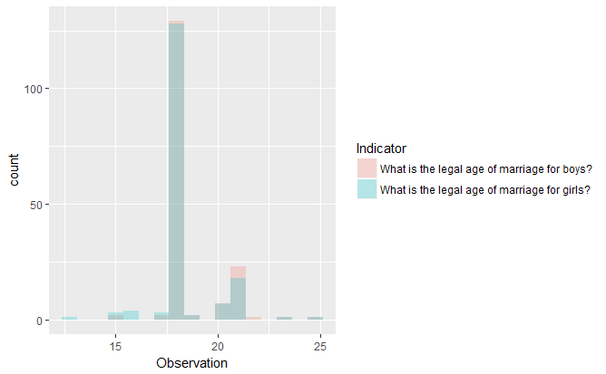
Step 3. Plot indicator data using ggplot2. Since the resulting dataframe from get_data360 is in a long dataframe format, it’s fairly straightforward to generate plots using these. For example, let’s generate overlapping histograms to quickly compare the two indicators.
> library(ggplot2)
> ggplot(df_usecase2_result, aes(x=Observation, cond=Indicator,fill=Indicator)) +
geom_histogram(binwidth=.75, alpha=.25, position="identity")
Here's how the plot looks like:
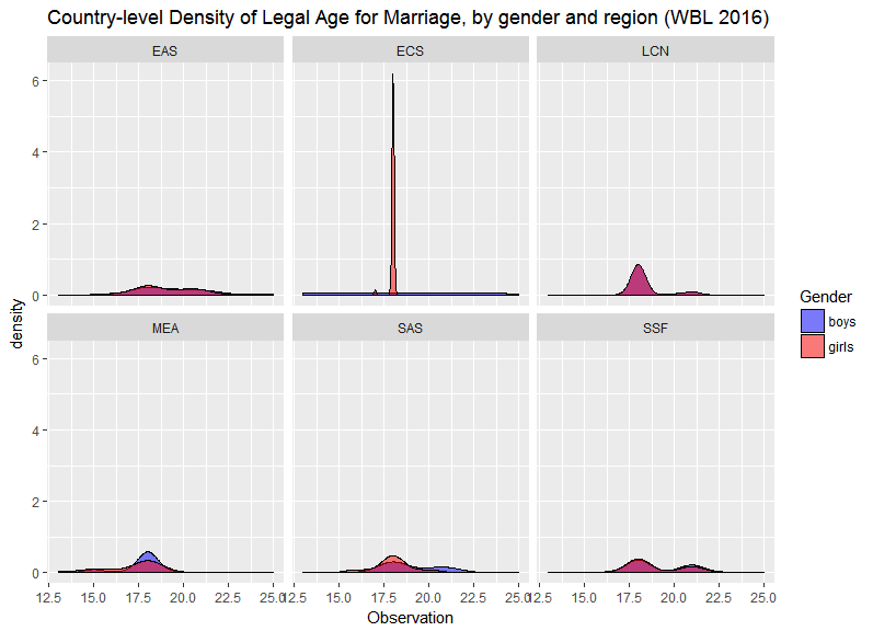
Step 4 [Optional]. Generate a more advanced ggplot2 plot with data360r. To show its versatility, let’s generate a more complex plot with data360r. First, we query the indicator data using getdata_360 and merge this with the countries’ region metadata using get_metadata360. We remove countries under the region “NAC” for simplicity.
> library(tidyverse)
> df_usecase2_result <- get_data360(indicator_id = c(204, 205), output_type = 'long') %>%
    merge(select(get_metadata360(),iso3,region), by.x="Country ISO3", by.y="iso3") %>%
    filter(!(region == "NAC"))
We then use facet_wrap to generate multiple kernel density estimator (KDE) plots comparing the two indicators, by geographic region.
> ggplot(df_usecase2_result, aes(x=Observation, cond=Indicator, fill=Indicator)) +
geom_density(alpha=.5) +
facet_wrap(~region) +
theme(legend.position="right") +
scale_fill_manual(name="Gender",values=c("blue","red"), labels=c("boys","girls")) +
ggtitle("Country-level Density of Legal Age for Marriage, by gender and region (WBL 2016)")
Here's how the resulting plot looks like:
Use Case #3: Running regression on the WEF Global Competitiveness Index dataset
What if we want to focus on a single dataset and conduct a quick regression analysis on this?
Step 1. Get the dataset ID of the desired dataset. Let’s look through the dataset metadata and identify a dataset we want to use. For this use case, let’s focus on the WEF Global Competitiveness Index (GCI) dataset with dataset id == 53.
> df_usecase3_datasets <- get_metadata360(metadata_type = "datasets")
Step 2. Get the indicator data for WEF GCI 2016-2017. For simplicity, we get all WEF GCI data from the timeframe 2016-2017 in a long dataframe format.
> library(tidyverse)
> df_usecase3_result <- get_data360(dataset_id=c(53), output_type = 'long') %>% filter(Period==c("2016-2017"))
Step 3.a. Preprocessing WEF GCI data for linear regression. For simplicity, we only keep all WEF GCI indicators with Subindicator type == ‘Value’. We then reshape the resulting dataframe such that the indicators are the column names using reshape::acast. This makes it easier to fit the indicator data to regression models.
> df2 <- filter(df_usecase3_result, df_usecase3_result$"Subindicator Type" == "Value", !is.na(Observation))
> df3 <- as.data.frame(reshape2::acast(df2, df2$"Country ISO3" ~ df2$Indicator, value.var="Observation"))
Step 3.b. Regression on “Innovation” and “Technological Readiness” indicators. Since the dataframe has been preprocessed appropriately, it’s straightforward to implement regression on WEF GCI 2016-2017 indicators. Before fitting the data to a regression model, let’s first generate a scatterplot for selected WEF GCI indicators. For simplicity, let’s focus on the “Innovation” and “Technological Readiness” indicators.
> qplot(df3$"Innovation", df3$"Technological Readiness", data = df3)
Here's how the scatterplot looks like:
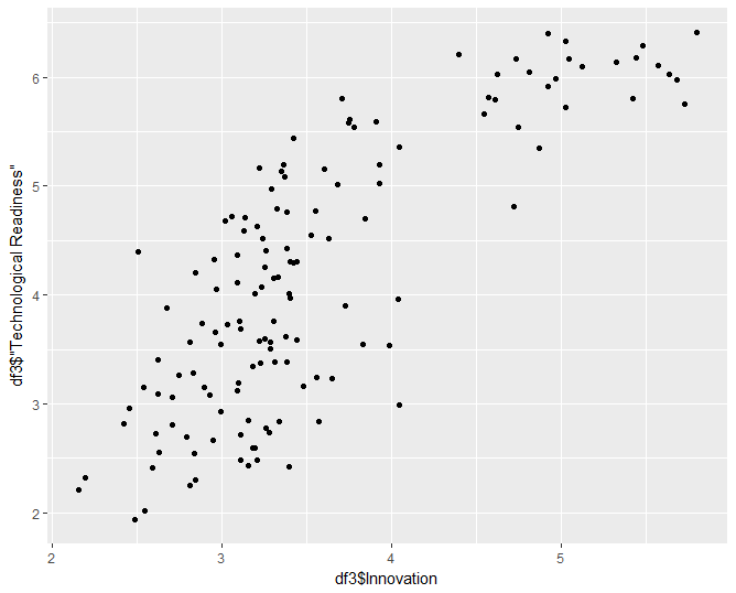
The scatterplot suggests that Innovation increases quadratically with Technological Readiness. Let’s fit a quadratic regression model to these data points. Based on the summary results, the model is a good fit. We also generate the supplementary model plots to see if the results make sense.
> mod_usecase3_quad <- lm(df3$"Innovation" ~ poly(df3$"Technological Readiness", 2))
> summary(mod_usecase3_quad)
Call:
lm(formula = df3$Innovation ~ poly(df3$"Technological Readiness",
2))
Residuals:
Min 1Q Median 3Q Max
-0.89642 -0.32320 -0.00312 0.24694 1.19196
Coefficients:
Estimate Std. Error t value Pr(>|t|)
(Intercept) 3.55455 0.03764 94.441 < 2e-16 ***
poly(df3$"Technological Readiness", 2)1 7.83017 0.44054 17.774 < 2e-16 ***
poly(df3$"Technological Readiness", 2)2 2.99204 0.44054 6.792 3.29e-10 ***
---
Signif. codes: 0 ‘***’ 0.001 ‘**’ 0.01 ‘*’ 0.05 ‘.’ 0.1 ‘ ’ 1
Residual standard error: 0.4405 on 134 degrees of freedom
Multiple R-squared: 0.7299, Adjusted R-squared: 0.7258
F-statistic: 181 on 2 and 134 DF, p-value: < 2.2e-16
> par(mfrow = c(2, 2))
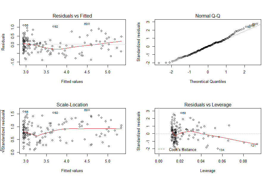
> plot(mod_usecase3_quad)
Here's how the resulting plots looks like:
mrpsonglao/WBdata360R documentation built on June 17, 2022, 4:03 a.m.
R Package Documentation
Browse R Packages
We want your feedback!
Note that we can't provide technical support on individual packages. You should contact the package authors for that.
Diving in data360r: Package Use Cases in just 3+ lines of R code
This section covers the following use cases, which caters to R users ranging from the beginner to advanced levels: - Use Case 1: Downloading relevant indicator data for a specific country - Use Case 2: Comparing and visualizing indicators with ggplot2 - Use Case 3: Running regression on the WEF Global Competitiveness Index dataset
Look out for friendly tips when using the data360r package, which can be found in specially-formatted boxes such as this one:
TIP: If you want to see more use cases that aren’t covered here or provide feedback on the data360r package, feel free to drop us a message at tcdata360@worldbank.org!
Use Case #1: Downloading relevant indicator data for a specific country
For most users, it’s important to quickly find and download data you need for a report. For example, what if we need to download data related to “woman business” for the United States?
Step 1. Search for indicator IDs of indicators related to “woman business”. For simplicity, let’s search for the top 5 indicators related to “woman business”. Note that 7 results are returned since some indicators have two IDs (one for TCdata360, the other for Govdata360).
df_usecase1 <- search_360("woman business", search_type="indicator", limit_results = 5)
TIP: We can easily get the array of indicator IDs of the top 5 related indicators using
df_usecase1$id.TIP: For the user’s convenience,
search_360brings back results in decreasing order of relevance (represented by the“score”column). However, note also thatsearch_360returns the union of all search results for each individual term. For better search results, try to keep the search string query specific but concise.
Step 2. Search for Country ISO3 for United States. Let’s search for the ISO3 of all countries related to “United States”. We take note of the slug “USA” of the first result (which is a perfect match with score = 1.0) which is the country ISO3 we need.
> search_360("United States", search_type="country")
### Output:
id name slug type score redirect dataset
1 NA United States USA country 1.00000000 FALSE NA
TIP: For country-type results, the
“slug”column provides the Country ISO3 ID.
Step 3. Get indicator data related to “woman business” for USA as a dataframe. Putting it altogether, we use the results of previous Steps 1 & 2 to get a wide dataframe containing the data we need.
> df_usecase1_result <- get_data360(indicator_id=df_usecase1$id, country_iso3="USA")
[Optional] Step 4. Export R dataframe as CSV. What if we want to export the dataframe so that we can use it in Excel? We can use the write.csv function (via utils package, which the data360r package already installs for you) to do this.
> write.csv(df_usecase1_result, ‘df_usecase1_result.csv')
Here’s the output using Excel:
Use Case #2: Comparing and visualizing indicators with ggplot2
For intermediate R users who are comfortable with using R for data visualization, dataframes usually need to be in a long format especially when used with the ggplot2 R package. So how do we use data360r together with ggplot2?
Step 1. Search IDs of indicators for comparison. For this example, let’s get the indicator IDs for the “What is the legal age of marriage for boys and for girls?” indicators. We note that these are indicator IDs 204 and 205, respectively.
> search_360("marriage", search_type="indicator")
### Output:
id name slug type score dataset redirect
1 204 What is the legal age of marriage for boys? age.marr.male indicator 0.1111111 Women, Business and the Law FALSE
2 205 What is the legal age of marriage for girls? age.marr.fem indicator 0.1111111 Women, Business and the Law FALSE
TIP:
data360rpackage functions are compatible with the tidyverse R package, so you can use these with together with “pipes”%>%. For example, to remove duplicates you can run:search_360("men", search_type="indicator") %>% distinct(name,.keep_all=TRUE)
Step 2. Get indicator data for all countries for year 2016. How do we get the indicator data in long format using get_data360? Simply add the parameter output_type="long" in the function call, and voila! For simplicity, we limit the indicator data to year 2016 only by adding the parameter timeframes = c(2016).
> df_usecase2_result <- get_data360(indicator_id = c(204, 205), timeframes = c(2016), output_type = 'long')
TIP: The default output_type for
getdata_360is a wide dataframe. Forgetdata_360outputs withoutput_type = ‘long’, the column for the timeframes is always called“Period”whereas the column for the indicator values is always called“Observation”. Knowing this is helpful especially when making reusable code snippets withdata360rfunctions.
Step 3. Plot indicator data using ggplot2. Since the resulting dataframe from get_data360 is in a long dataframe format, it’s fairly straightforward to generate plots using these. For example, let’s generate overlapping histograms to quickly compare the two indicators.
> library(ggplot2)
> ggplot(df_usecase2_result, aes(x=Observation, cond=Indicator,fill=Indicator)) +
geom_histogram(binwidth=.75, alpha=.25, position="identity")
Here's how the plot looks like:
Step 4 [Optional]. Generate a more advanced ggplot2 plot with data360r. To show its versatility, let’s generate a more complex plot with data360r. First, we query the indicator data using getdata_360 and merge this with the countries’ region metadata using get_metadata360. We remove countries under the region “NAC” for simplicity.
> library(tidyverse)
> df_usecase2_result <- get_data360(indicator_id = c(204, 205), output_type = 'long') %>%
merge(select(get_metadata360(),iso3,region), by.x="Country ISO3", by.y="iso3") %>%
filter(!(region == "NAC"))
We then use facet_wrap to generate multiple kernel density estimator (KDE) plots comparing the two indicators, by geographic region.
> ggplot(df_usecase2_result, aes(x=Observation, cond=Indicator, fill=Indicator)) +
geom_density(alpha=.5) +
facet_wrap(~region) +
theme(legend.position="right") +
scale_fill_manual(name="Gender",values=c("blue","red"), labels=c("boys","girls")) +
ggtitle("Country-level Density of Legal Age for Marriage, by gender and region (WBL 2016)")
Here's how the resulting plot looks like:
Use Case #3: Running regression on the WEF Global Competitiveness Index dataset
What if we want to focus on a single dataset and conduct a quick regression analysis on this?
Step 1. Get the dataset ID of the desired dataset. Let’s look through the dataset metadata and identify a dataset we want to use. For this use case, let’s focus on the WEF Global Competitiveness Index (GCI) dataset with dataset id == 53.
> df_usecase3_datasets <- get_metadata360(metadata_type = "datasets")
Step 2. Get the indicator data for WEF GCI 2016-2017. For simplicity, we get all WEF GCI data from the timeframe 2016-2017 in a long dataframe format.
> library(tidyverse)
> df_usecase3_result <- get_data360(dataset_id=c(53), output_type = 'long') %>% filter(Period==c("2016-2017"))
Step 3.a. Preprocessing WEF GCI data for linear regression. For simplicity, we only keep all WEF GCI indicators with Subindicator type == ‘Value’. We then reshape the resulting dataframe such that the indicators are the column names using reshape::acast. This makes it easier to fit the indicator data to regression models.
> df2 <- filter(df_usecase3_result, df_usecase3_result$"Subindicator Type" == "Value", !is.na(Observation))
> df3 <- as.data.frame(reshape2::acast(df2, df2$"Country ISO3" ~ df2$Indicator, value.var="Observation"))
Step 3.b. Regression on “Innovation” and “Technological Readiness” indicators. Since the dataframe has been preprocessed appropriately, it’s straightforward to implement regression on WEF GCI 2016-2017 indicators. Before fitting the data to a regression model, let’s first generate a scatterplot for selected WEF GCI indicators. For simplicity, let’s focus on the “Innovation” and “Technological Readiness” indicators.
> qplot(df3$"Innovation", df3$"Technological Readiness", data = df3)
Here's how the scatterplot looks like:
The scatterplot suggests that Innovation increases quadratically with Technological Readiness. Let’s fit a quadratic regression model to these data points. Based on the summary results, the model is a good fit. We also generate the supplementary model plots to see if the results make sense.
> mod_usecase3_quad <- lm(df3$"Innovation" ~ poly(df3$"Technological Readiness", 2))
> summary(mod_usecase3_quad)
Call:
lm(formula = df3$Innovation ~ poly(df3$"Technological Readiness",
2))
Residuals:
Min 1Q Median 3Q Max
-0.89642 -0.32320 -0.00312 0.24694 1.19196
Coefficients:
Estimate Std. Error t value Pr(>|t|)
(Intercept) 3.55455 0.03764 94.441 < 2e-16 ***
poly(df3$"Technological Readiness", 2)1 7.83017 0.44054 17.774 < 2e-16 ***
poly(df3$"Technological Readiness", 2)2 2.99204 0.44054 6.792 3.29e-10 ***
---
Signif. codes: 0 ‘***’ 0.001 ‘**’ 0.01 ‘*’ 0.05 ‘.’ 0.1 ‘ ’ 1
Residual standard error: 0.4405 on 134 degrees of freedom
Multiple R-squared: 0.7299, Adjusted R-squared: 0.7258
F-statistic: 181 on 2 and 134 DF, p-value: < 2.2e-16
> par(mfrow = c(2, 2))
> plot(mod_usecase3_quad)
Here's how the resulting plots looks like:
R Package Documentation
Browse R Packages
We want your feedback!
Note that we can't provide technical support on individual packages. You should contact the package authors for that.
Embedding an R snippet on your website
Add the following code to your website.
For more information on customizing the embed code, read Embedding Snippets.