In ryanburge/socsci: Some Basic Functions that I Use Frequently
knitr::opts_chunk$set(
  collapse = TRUE,
  comment = "#>",
  fig.path = "README-"
)
options(width = 110)
SocSci: Functions for Analyzing Survey Data
Author
Ryan Burge https://www.ryanburge.net
Pkgdown site is available here: https://ryanburge.github.io/socsci/index.html
Instructor of Political Science, Eastern Illinois University, Charleston IL


Installation
You can install:
-
the latest development version from GitHub with
R
install.packages("devtools")
devtools::install_github("ryanburge/socsci")
There are just a handful of functions to the package right now
Counting Things
I love the functionality of tabyl, but it doesn't take a weight variable. Here's the simple version ct()
library(socsci)
cces <- read_csv("https://raw.githubusercontent.com/ryanburge/blocks/master/cces.csv")

cces %>%
  ct(race)
Note that you are presented with a count column and a pct column.
Let's add weights
cces %>%
  ct(race, commonweight_vv)
Notice that it's pipeable. And if you don't include the weight variable then it won't be calculated with a weight.
I've also added the ability to filter out the NA's before the calculation is made.
cces %>%
  mutate(race2 = frcode(race == 1 ~ "White",
                        race == 2 ~ "Black",
                        race == 3 ~ "Hispanic",
                        race == 4 ~ "Asian")) %>%
  ct(race2, commonweight_vv)

cces %>%
  mutate(race2 = frcode(race == 1 ~ "White",
                        race == 2 ~ "Black",
                        race == 3 ~ "Hispanic",
                        race == 4 ~ "Asian")) %>%
  ct(race2, show_na = FALSE, commonweight_vv)
This behavior is off by default, however.
Getting Confidence Intervals
Oftentimes in social science we like to see what our 95% confidence intervals are, but that's a lot of syntax. It's easy with the mean_ci function. I found the basic syntax on a Stack Overflow post, from the user sboysel.
cces %>%
  mean_ci(gender)
The default is a 95% confidence interval. However that can be changed easily.
cces %>%
  mean_ci(gender, ci = .84)
This can also take weights.
cces %>%
  mean_ci(gender, ci = .84, wt = commonweight_vv)
Simple Mean and Median
I wanted a simple function to calculate the mean and the median. It takes just one variable and computes both statistics.
money1 <- read_csv("https://raw.githubusercontent.com/ryanburge/pls2003_sp17/master/sal_work.csv")

money1

money1  %>%
  mean_med(salary)
Two Value Correlations
Here's a simple function that generates a pearson correlation of two variables with a p-value.
x <- c(1, 2, 3, 7, 5, 777, 6, 411, 8)
y <- c(11, 23, 1, 4, 6, 22455, 34, 22, 22)
z <- c(34, 3, 21, 4555, 75, 2, 3334, 1122, 22312)

test <- data.frame(x,y,z) %>% as.tibble()

test %>%
  filter(z > 10) %>%
  corr(x,y)
Bind Several Dataframes together
Oftentimes I make many little dataframes that I need to bind_rows to put into one large dataframe. As long as those dataframes have the same naming convention that can be done.
dd1 <- data.frame(a = 1, b = 2)
dd2 <- data.frame(a = 3, b = 4)
dd3 <- data.frame(a = 5, b = 6)

bind_df("dd")
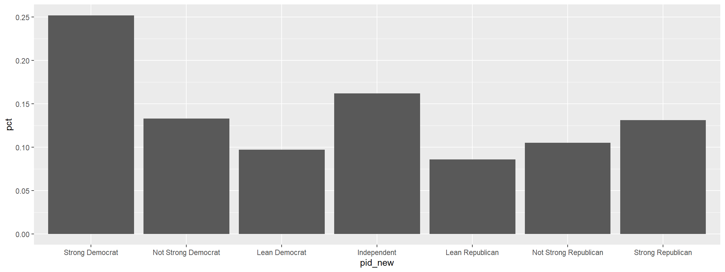
Recode things and keep the factor levels
I recode all the time, but unfortunately when you recode from numeric to character the factor levels are plotted in alphabetical order. There's a way around that now. This uses the case_when function from dplyr but makes sure that the factors level are the same order of how they are specified in the function.
I found this terrific function written by Dennis YL, where he had the same problem that I had.
cces <- read_csv("https://raw.githubusercontent.com/ryanburge/cces/master/CCES%20for%20Methods/small_cces.csv")

graph <- cces %>%
  mutate(pid_new = frcode(pid7 == 1 ~ "Strong Democrat",
                          pid7 == 2 ~ "Not Strong Democrat",
                          pid7 == 3 ~ "Lean Democrat",
                          pid7 == 4 ~ "Independent",
                          pid7 == 5 ~ "Lean Republican",
                          pid7 == 6 ~ "Not Strong Republican",
                          pid7 == 7 ~ "Strong Republican",
                          TRUE ~ "REMOVE")) %>%
  ct(pid_new)


graph %>%
  filter(pid_new != "REMOVE") %>%
  ggplot(., aes(x = pid_new, y = pct)) +
  geom_col()
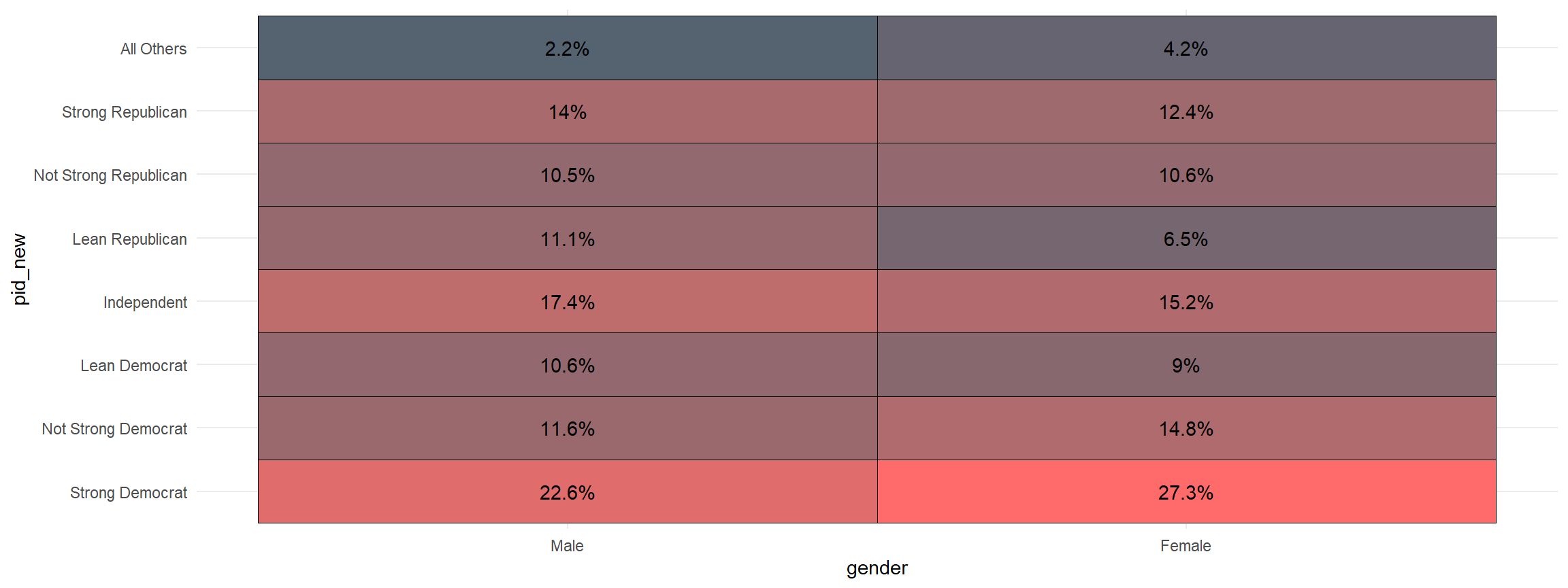
Making A Quick Crosstab Heatmap
Making a crosstab is one of the building blocks of social science statistics. This function visualizes that crosstab. The first variable is the one that is grouped and the second is the one that is counted
cces %>%
  mutate(pid_new = frcode(pid7 == 1 ~ "Strong Democrat",
                          pid7 == 2 ~ "Not Strong Democrat",
                          pid7 == 3 ~ "Lean Democrat",
                          pid7 == 4 ~ "Independent",
                          pid7 == 5 ~ "Lean Republican",
                          pid7 == 6 ~ "Not Strong Republican",
                          pid7 == 7 ~ "Strong Republican",
                          TRUE ~ "All Others")) %>%
  mutate(gender = frcode(gender ==1 ~ "Male",
                         gender ==2 ~ "Female")) %>%
  xheat(gender, pid_new)
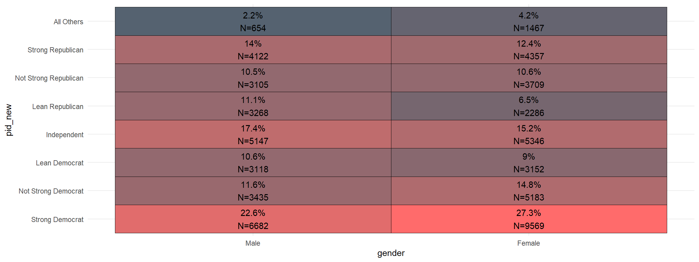
And, you can quickly add the sample size to the graph.
cces %>%
  mutate(pid_new = frcode(pid7 == 1 ~ "Strong Democrat",
                          pid7 == 2 ~ "Not Strong Democrat",
                          pid7 == 3 ~ "Lean Democrat",
                          pid7 == 4 ~ "Independent",
                          pid7 == 5 ~ "Lean Republican",
                          pid7 == 6 ~ "Not Strong Republican",
                          pid7 == 7 ~ "Strong Republican",
                          TRUE ~ "All Others")) %>%
  mutate(gender = frcode(gender ==1 ~ "Male",
                         gender ==2 ~ "Female")) %>%
  xheat(gender, pid_new, count = TRUE)
- let me know what you think on twitter @ryanburge
ryanburge/socsci documentation built on June 6, 2020, 2:37 a.m.
R Package Documentation
Browse R Packages
We want your feedback!
Note that we can't provide technical support on individual packages. You should contact the package authors for that.
knitr::opts_chunk$set( collapse = TRUE, comment = "#>", fig.path = "README-" ) options(width = 110)
SocSci: Functions for Analyzing Survey Data
Author
Ryan Burge https://www.ryanburge.net Pkgdown site is available here: https://ryanburge.github.io/socsci/index.html
Instructor of Political Science, Eastern Illinois University, Charleston IL
![]()
![]()
Installation
You can install:
-
the latest development version from GitHub with
R install.packages("devtools") devtools::install_github("ryanburge/socsci")
There are just a handful of functions to the package right now
Counting Things
I love the functionality of tabyl, but it doesn't take a weight variable. Here's the simple version ct()
library(socsci) cces <- read_csv("https://raw.githubusercontent.com/ryanburge/blocks/master/cces.csv") cces %>% ct(race)
Note that you are presented with a count column and a pct column.
Let's add weights
cces %>% ct(race, commonweight_vv)
Notice that it's pipeable. And if you don't include the weight variable then it won't be calculated with a weight.
I've also added the ability to filter out the NA's before the calculation is made.
cces %>% mutate(race2 = frcode(race == 1 ~ "White", race == 2 ~ "Black", race == 3 ~ "Hispanic", race == 4 ~ "Asian")) %>% ct(race2, commonweight_vv) cces %>% mutate(race2 = frcode(race == 1 ~ "White", race == 2 ~ "Black", race == 3 ~ "Hispanic", race == 4 ~ "Asian")) %>% ct(race2, show_na = FALSE, commonweight_vv)
This behavior is off by default, however.
Getting Confidence Intervals
Oftentimes in social science we like to see what our 95% confidence intervals are, but that's a lot of syntax. It's easy with the mean_ci function. I found the basic syntax on a Stack Overflow post, from the user sboysel.
cces %>% mean_ci(gender)
The default is a 95% confidence interval. However that can be changed easily.
cces %>% mean_ci(gender, ci = .84)
This can also take weights.
cces %>% mean_ci(gender, ci = .84, wt = commonweight_vv)
Simple Mean and Median
I wanted a simple function to calculate the mean and the median. It takes just one variable and computes both statistics.
money1 <- read_csv("https://raw.githubusercontent.com/ryanburge/pls2003_sp17/master/sal_work.csv") money1 money1 %>% mean_med(salary)
Two Value Correlations
Here's a simple function that generates a pearson correlation of two variables with a p-value.
x <- c(1, 2, 3, 7, 5, 777, 6, 411, 8) y <- c(11, 23, 1, 4, 6, 22455, 34, 22, 22) z <- c(34, 3, 21, 4555, 75, 2, 3334, 1122, 22312) test <- data.frame(x,y,z) %>% as.tibble() test %>% filter(z > 10) %>% corr(x,y)
Bind Several Dataframes together
Oftentimes I make many little dataframes that I need to bind_rows to put into one large dataframe. As long as those dataframes have the same naming convention that can be done.
dd1 <- data.frame(a = 1, b = 2) dd2 <- data.frame(a = 3, b = 4) dd3 <- data.frame(a = 5, b = 6) bind_df("dd")
Recode things and keep the factor levels
I recode all the time, but unfortunately when you recode from numeric to character the factor levels are plotted in alphabetical order. There's a way around that now. This uses the case_when function from dplyr but makes sure that the factors level are the same order of how they are specified in the function.
I found this terrific function written by Dennis YL, where he had the same problem that I had.
cces <- read_csv("https://raw.githubusercontent.com/ryanburge/cces/master/CCES%20for%20Methods/small_cces.csv") graph <- cces %>% mutate(pid_new = frcode(pid7 == 1 ~ "Strong Democrat", pid7 == 2 ~ "Not Strong Democrat", pid7 == 3 ~ "Lean Democrat", pid7 == 4 ~ "Independent", pid7 == 5 ~ "Lean Republican", pid7 == 6 ~ "Not Strong Republican", pid7 == 7 ~ "Strong Republican", TRUE ~ "REMOVE")) %>% ct(pid_new) graph %>% filter(pid_new != "REMOVE") %>% ggplot(., aes(x = pid_new, y = pct)) + geom_col()
Making A Quick Crosstab Heatmap
Making a crosstab is one of the building blocks of social science statistics. This function visualizes that crosstab. The first variable is the one that is grouped and the second is the one that is counted
cces %>% mutate(pid_new = frcode(pid7 == 1 ~ "Strong Democrat", pid7 == 2 ~ "Not Strong Democrat", pid7 == 3 ~ "Lean Democrat", pid7 == 4 ~ "Independent", pid7 == 5 ~ "Lean Republican", pid7 == 6 ~ "Not Strong Republican", pid7 == 7 ~ "Strong Republican", TRUE ~ "All Others")) %>% mutate(gender = frcode(gender ==1 ~ "Male", gender ==2 ~ "Female")) %>% xheat(gender, pid_new)
And, you can quickly add the sample size to the graph.
cces %>% mutate(pid_new = frcode(pid7 == 1 ~ "Strong Democrat", pid7 == 2 ~ "Not Strong Democrat", pid7 == 3 ~ "Lean Democrat", pid7 == 4 ~ "Independent", pid7 == 5 ~ "Lean Republican", pid7 == 6 ~ "Not Strong Republican", pid7 == 7 ~ "Strong Republican", TRUE ~ "All Others")) %>% mutate(gender = frcode(gender ==1 ~ "Male", gender ==2 ~ "Female")) %>% xheat(gender, pid_new, count = TRUE)
- let me know what you think on twitter @ryanburge
R Package Documentation
Browse R Packages
We want your feedback!
Note that we can't provide technical support on individual packages. You should contact the package authors for that.
Embedding an R snippet on your website
Add the following code to your website.
For more information on customizing the embed code, read Embedding Snippets.