Nothing
Mapping BLS Data
In blscrapeR: An API Wrapper for the Bureau of Labor Statistics (BLS)
Mapping County Data
County data mapped on a national scale can sometimes be difficult to see. The get_bls_county() and bls_map_county() functions both have arguments that will accommodate data and maps for specific states or groups of states.
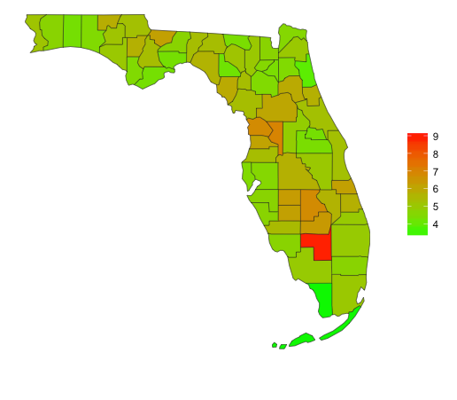
The example below shows the most recent unemployment rates for Florida.
library(blscrapeR)
df <- get_bls_county(stateName = "Florida")

map_bls(map_data=df, fill_rate = "unemployed_rate",
               stateName = "Florida")
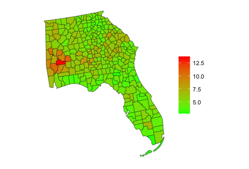
Also, the states can be called together to form larger districts. Below is an example of the most recent unemployment rates for the southeastern states of Florida, Georgia and Alabama.
# Map the unemployment rate for the Southeastern United States.
df <- get_bls_county(stateName = c("Florida", "Georgia", "Alabama"))

map_bls(map_data=df, fill_rate = "unemployed_rate", projection = "lambert",
               stateName = c("Florida", "Georgia", "Alabama"))
Build Your Own Maps
If you don't like any of the pre-fabricated maps, that's alright because blscrapeR provides the fortified map data, which includes longitude, latitude and FIPS codes. This data set is suitable for any kind of ggplot2 map you can think of.
First, call the internal map data and have a look:
library(blscrapeR)
us_map <- county_map_data
head(us_map)
Notice the id column looks a lot like one of the FIPS codes returned by the get_bls_county() function? This is actually a concatenation of the state + county FIPS codes. The first two numbers are the state FIPS and the last four are the county FIPS. These boundaries currently represent 20015/2016 and will be updated accordingly so they always represent the current year.
Next, produce your custom map:
library(blscrapeR)
library(ggplot2)
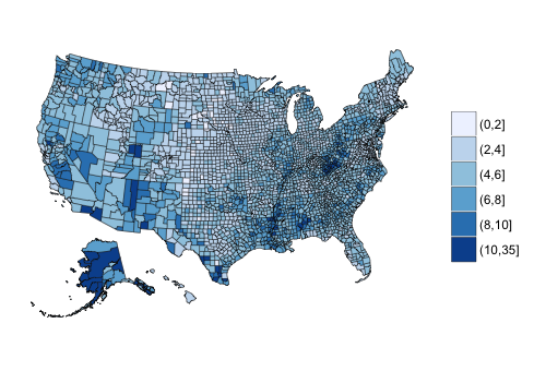
# Get the most recent unemployment rate for each county on a national level.
df <- get_bls_county()
# Get map data
us_map <- county_map_data
# Insert larger breaks in unemployment rates
df$rate_d <- cut(df$unemployed_rate, breaks = c(seq(0, 10, by = 2), 35))
# Plot
ggplot() +
geom_map(data=us_map, map=us_map,
aes(x=long, y=lat, map_id=id, group=group),
fill="#ffffff", color="#0e0e0e", size=0.15) +
geom_map(data=df, map=us_map, aes_string(map_id="fips", fill=df$rate_d),
color="#0e0e0e", size=0.15) +
scale_fill_brewer()+
coord_equal() +
theme(axis.line=element_blank(),
axis.text.x=element_blank(),
axis.text.y=element_blank(),
axis.ticks=element_blank(),
axis.title.x=element_blank(),
axis.title.y=element_blank(),
panel.grid.major = element_blank(),
panel.grid.minor = element_blank(),
panel.border = element_blank(),
panel.background = element_blank(),
legend.title=element_blank())
More Advanced Mapping
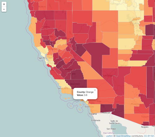
What's R mapping without some interactivity? Below we’re using two additional packages, leaflet, which is popular for creating interactive maps and tigris, which allows us to download the exact shape files we need for these data and includes a few other nice tools.
# Leaflet map
library(blscrapeR)
library(tigris)
library(leaflet)
map.shape <- counties(cb = TRUE, year = 2015)
df <- get_bls_county()

# Slice the df down to only the variables we need and rename "fips" colunm
# so I can get a cleaner merge later.
df <- subset(df, select = c("unemployed_rate", "fips"))
colnames(df) <- c("unemployed_rate", "GEOID")

# Merge df with spatial object.
leafmap <- geo_join(map.shape, df, by="GEOID")

# Format popup data for leaflet map.
popup_dat <- paste0("<strong>County: </strong>",
                    leafmap$NAME,
                    "<br><strong>Value: </strong>",
                    leafmap$unemployed_rate)

pal <- colorQuantile("YlOrRd", NULL, n = 20)
# Render final map in leaflet.
leaflet(data = leafmap) %>% addTiles() %>%
    addPolygons(fillColor = ~pal(unemployed_rate),
                fillOpacity = 0.8,
                color = "#BDBDC3",
                weight = 1,
                popup = popup_dat)
Note: This is just a static image since the full map would not be as portable for the purpose of documentation.
Try the blscrapeR package in your browser
Any scripts or data that you put into this service are public.
blscrapeR documentation built on Sept. 17, 2022, 1:05 a.m.
R Package Documentation
Browse R Packages
We want your feedback!
Note that we can't provide technical support on individual packages. You should contact the package authors for that.
Mapping County Data
County data mapped on a national scale can sometimes be difficult to see. The get_bls_county() and bls_map_county() functions both have arguments that will accommodate data and maps for specific states or groups of states.
The example below shows the most recent unemployment rates for Florida.
library(blscrapeR) df <- get_bls_county(stateName = "Florida") map_bls(map_data=df, fill_rate = "unemployed_rate", stateName = "Florida")
Also, the states can be called together to form larger districts. Below is an example of the most recent unemployment rates for the southeastern states of Florida, Georgia and Alabama.
# Map the unemployment rate for the Southeastern United States. df <- get_bls_county(stateName = c("Florida", "Georgia", "Alabama")) map_bls(map_data=df, fill_rate = "unemployed_rate", projection = "lambert", stateName = c("Florida", "Georgia", "Alabama"))
Build Your Own Maps
If you don't like any of the pre-fabricated maps, that's alright because blscrapeR provides the fortified map data, which includes longitude, latitude and FIPS codes. This data set is suitable for any kind of ggplot2 map you can think of.
First, call the internal map data and have a look:
library(blscrapeR) us_map <- county_map_data head(us_map)
Notice the id column looks a lot like one of the FIPS codes returned by the get_bls_county() function? This is actually a concatenation of the state + county FIPS codes. The first two numbers are the state FIPS and the last four are the county FIPS. These boundaries currently represent 20015/2016 and will be updated accordingly so they always represent the current year.
Next, produce your custom map:
library(blscrapeR) library(ggplot2) # Get the most recent unemployment rate for each county on a national level. df <- get_bls_county() # Get map data us_map <- county_map_data # Insert larger breaks in unemployment rates df$rate_d <- cut(df$unemployed_rate, breaks = c(seq(0, 10, by = 2), 35)) # Plot ggplot() + geom_map(data=us_map, map=us_map, aes(x=long, y=lat, map_id=id, group=group), fill="#ffffff", color="#0e0e0e", size=0.15) + geom_map(data=df, map=us_map, aes_string(map_id="fips", fill=df$rate_d), color="#0e0e0e", size=0.15) + scale_fill_brewer()+ coord_equal() + theme(axis.line=element_blank(), axis.text.x=element_blank(), axis.text.y=element_blank(), axis.ticks=element_blank(), axis.title.x=element_blank(), axis.title.y=element_blank(), panel.grid.major = element_blank(), panel.grid.minor = element_blank(), panel.border = element_blank(), panel.background = element_blank(), legend.title=element_blank())
More Advanced Mapping
What's R mapping without some interactivity? Below we’re using two additional packages, leaflet, which is popular for creating interactive maps and tigris, which allows us to download the exact shape files we need for these data and includes a few other nice tools.
# Leaflet map library(blscrapeR) library(tigris) library(leaflet) map.shape <- counties(cb = TRUE, year = 2015) df <- get_bls_county() # Slice the df down to only the variables we need and rename "fips" colunm # so I can get a cleaner merge later. df <- subset(df, select = c("unemployed_rate", "fips")) colnames(df) <- c("unemployed_rate", "GEOID") # Merge df with spatial object. leafmap <- geo_join(map.shape, df, by="GEOID") # Format popup data for leaflet map. popup_dat <- paste0("<strong>County: </strong>", leafmap$NAME, "<br><strong>Value: </strong>", leafmap$unemployed_rate) pal <- colorQuantile("YlOrRd", NULL, n = 20) # Render final map in leaflet. leaflet(data = leafmap) %>% addTiles() %>% addPolygons(fillColor = ~pal(unemployed_rate), fillOpacity = 0.8, color = "#BDBDC3", weight = 1, popup = popup_dat)
Note: This is just a static image since the full map would not be as portable for the purpose of documentation.
Try the blscrapeR package in your browser
Any scripts or data that you put into this service are public.
R Package Documentation
Browse R Packages
We want your feedback!
Note that we can't provide technical support on individual packages. You should contact the package authors for that.
Embedding an R snippet on your website
Add the following code to your website.
For more information on customizing the embed code, read Embedding Snippets.