Nothing
Visualizing Time Series
In timetk: A Tool Kit for Working with Time Series
knitr::opts_chunk$set(
  message = FALSE,
  warning = FALSE,
  fig.width = 8,
  fig.height = 4.5,
  fig.align = 'center',
  out.width='95%',
  dpi = 100,
  collapse = TRUE,
  comment = "#>"
)
knitr::include_graphics("timetk_version_2.jpg")
This tutorial focuses on, plot_time_series(), a workhorse time-series plotting function that:
- Generates interactive
plotly plots (great for exploring & shiny apps)
- Consolidates 20+ lines of
ggplot2 & plotly code
- Scales well to many time series
- Can be converted from interactive
plotly to static ggplot2 plots
Libraries
Run the following code to setup for this tutorial.
library(dplyr)
library(ggplot2)
library(lubridate)
library(timetk)

# Setup for the plotly charts (# FALSE returns ggplots)
interactive <- FALSE
Plotting Time Series
Let's start with a popular time series, taylor_30_min, which includes energy demand in megawatts at a sampling interval of 30-minutes. This is a single time series.
taylor_30_min
The plot_time_series() function generates an interactive plotly chart by default.
- Simply provide the date variable (time-based column,
.date_var) and the numeric variable (.value) that changes over time as the first 2 arguments
- When
.interactive = TRUE, the .plotly_slider = TRUE adds a date slider to the bottom of the chart.
taylor_30_min %>%
  plot_time_series(date, value,
                   .interactive = interactive,
                   .plotly_slider = TRUE)
Plotting Groups
Next, let's move on to a dataset with time series groups, m4_daily, which is a sample of 4 time series from the M4 competition that are sampled at a daily frequency.
m4_daily %>% group_by(id)
Visualizing grouped data is as simple as grouping the data set with group_by() prior to piping into the plot_time_series() function. Key points:
- Groups can be added in 2 ways: by
group_by() or by using the ... to add groups.
- Groups are then converted to facets.
.facet_ncol = 2 returns a 2-column faceted plot.facet_scales = "free" allows the x and y-axis of each plot to scale independently of the other plots
m4_daily %>%
  group_by(id) %>%
  plot_time_series(date, value,
                   .facet_ncol = 2, .facet_scales = "free",
                   .interactive = interactive)
Visualizing Transformations & Sub-Groups
Let's switch to an hourly dataset with multiple groups. We can showcase:
- Log transformation to the
.value
- Use of
.color_var to highlight sub-groups.
m4_hourly %>% group_by(id)
The intent is to showcase the groups in faceted plots, but to highlight weekly windows (sub-groups) within the data while simultaneously doing a log() transformation to the value. This is simple to do:
.value = log(value) Applies the Log Transformation.color_var = week(date) The date column is transformed to a lubridate::week() number. The color is applied to each of the week numbers.
m4_hourly %>%
  group_by(id) %>%
  plot_time_series(date, log(value),             # Apply a Log Transformation
                   .color_var = week(date),      # Color applied to Week transformation
                   # Facet formatting
                   .facet_ncol = 2,
                   .facet_scales = "free",
                   .interactive = interactive)
Static ggplot2 Visualizations & Customizations
All of the visualizations can be converted from interactive plotly (great for exploring and shiny apps) to static ggplot2 visualizations (great for reports).
taylor_30_min %>%
  plot_time_series(date, value,
                   .color_var = month(date, label = TRUE),

                   # Returns static ggplot
                   .interactive = FALSE,

                   # Customization
                   .title = "Taylor's MegaWatt Data",
                   .x_lab = "Date (30-min intervals)",
                   .y_lab = "Energy Demand (MW)",
                   .color_lab = "Month") +
  scale_y_continuous(labels = scales::label_comma())
Box Plots (Time Series)
The plot_time_series_boxplot() function can be used to make box plots.
- Box plots use an aggregation, which is a key parameter defined by the
.period argument.
m4_monthly %>%
    group_by(id) %>%
    plot_time_series_boxplot(
        date, value,
        .period      = "1 year",
        .facet_ncol  = 2,
        .interactive = FALSE)
Regression Plots (Time Series)
A time series regression plot, plot_time_series_regression(), can be useful to quickly assess key features that are correlated to a time series.
- Internally the function passes a
formula to the stats::lm() function.
- A linear regression summary can be output by toggling
show_summary = TRUE.
m4_monthly %>%
    group_by(id) %>%
    plot_time_series_regression(
        .date_var     = date,
        .formula      = log(value) ~ as.numeric(date) + month(date, label = TRUE),
        .facet_ncol   = 2,
        .interactive  = FALSE,
        .show_summary = FALSE
    )
Summary
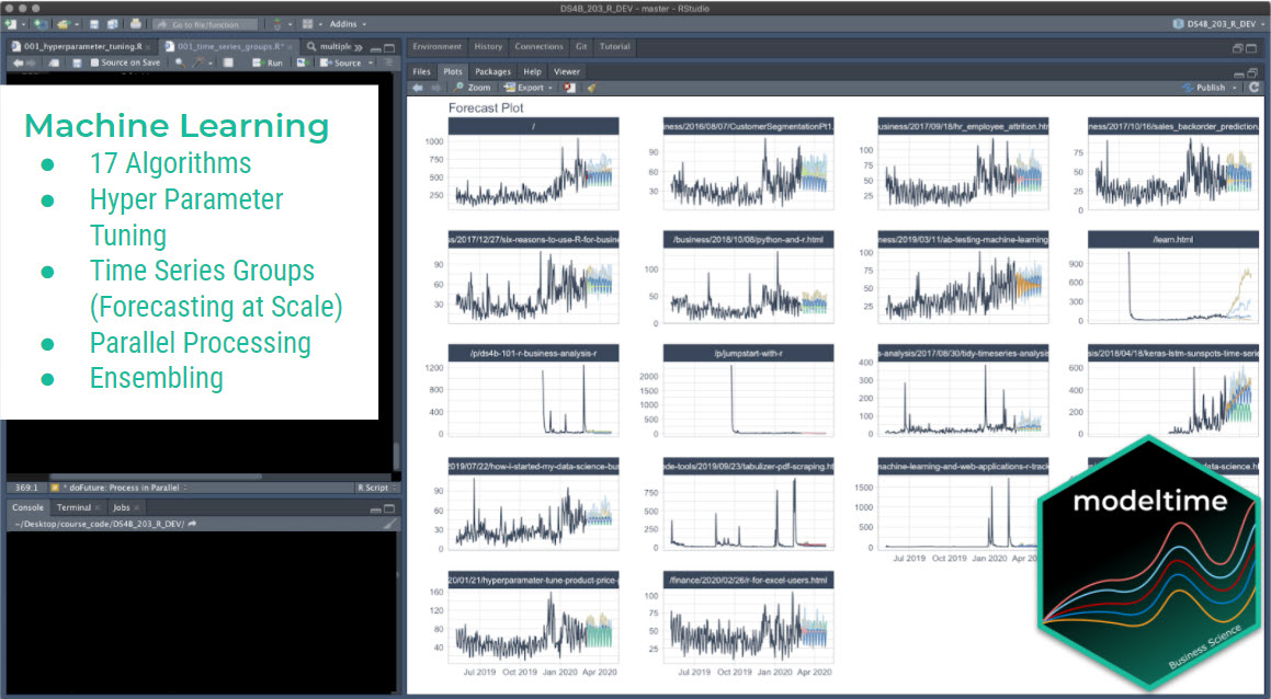
Timetk is part of the amazing Modeltime Ecosystem for time series forecasting. But it can take a long time to learn:
- Many algorithms
- Ensembling and Resampling
- Machine Learning
- Deep Learning
- Scalable Modeling: 10,000+ time series
Your probably thinking how am I ever going to learn time series forecasting. Here's the solution that will save you years of struggling.
Take the High-Performance Forecasting Course
Become the forecasting expert for your organization
High-Performance Time Series Course
Time Series is Changing
Time series is changing. Businesses now need 10,000+ time series forecasts every day. This is what I call a High-Performance Time Series Forecasting System (HPTSF) - Accurate, Robust, and Scalable Forecasting.
High-Performance Forecasting Systems will save companies by improving accuracy and scalability. Imagine what will happen to your career if you can provide your organization a "High-Performance Time Series Forecasting System" (HPTSF System).
How to Learn High-Performance Time Series Forecasting
I teach how to build a HPTFS System in my High-Performance Time Series Forecasting Course. You will learn:
- Time Series Machine Learning (cutting-edge) with
Modeltime - 30+ Models (Prophet, ARIMA, XGBoost, Random Forest, & many more)
- Deep Learning with
GluonTS (Competition Winners)
- Time Series Preprocessing, Noise Reduction, & Anomaly Detection
- Feature engineering using lagged variables & external regressors
- Hyperparameter Tuning
- Time series cross-validation
- Ensembling Multiple Machine Learning & Univariate Modeling Techniques (Competition Winner)
- Scalable Forecasting - Forecast 1000+ time series in parallel
- and more.
Become the Time Series Expert for your organization.
Take the High-Performance Time Series Forecasting Course
Try the timetk package in your browser
Any scripts or data that you put into this service are public.
timetk documentation built on Nov. 2, 2023, 6:18 p.m.
R Package Documentation
Browse R Packages
We want your feedback!
Note that we can't provide technical support on individual packages. You should contact the package authors for that.
knitr::opts_chunk$set( message = FALSE, warning = FALSE, fig.width = 8, fig.height = 4.5, fig.align = 'center', out.width='95%', dpi = 100, collapse = TRUE, comment = "#>" )
knitr::include_graphics("timetk_version_2.jpg")
This tutorial focuses on, plot_time_series(), a workhorse time-series plotting function that:
- Generates interactive
plotlyplots (great for exploring & shiny apps) - Consolidates 20+ lines of
ggplot2&plotlycode - Scales well to many time series
- Can be converted from interactive
plotlyto staticggplot2plots
Libraries
Run the following code to setup for this tutorial.
library(dplyr) library(ggplot2) library(lubridate) library(timetk) # Setup for the plotly charts (# FALSE returns ggplots) interactive <- FALSE
Plotting Time Series
Let's start with a popular time series, taylor_30_min, which includes energy demand in megawatts at a sampling interval of 30-minutes. This is a single time series.
taylor_30_min
The plot_time_series() function generates an interactive plotly chart by default.
- Simply provide the date variable (time-based column,
.date_var) and the numeric variable (.value) that changes over time as the first 2 arguments - When
.interactive = TRUE, the.plotly_slider = TRUEadds a date slider to the bottom of the chart.
taylor_30_min %>% plot_time_series(date, value, .interactive = interactive, .plotly_slider = TRUE)
Plotting Groups
Next, let's move on to a dataset with time series groups, m4_daily, which is a sample of 4 time series from the M4 competition that are sampled at a daily frequency.
m4_daily %>% group_by(id)
Visualizing grouped data is as simple as grouping the data set with group_by() prior to piping into the plot_time_series() function. Key points:
- Groups can be added in 2 ways: by
group_by()or by using the...to add groups. - Groups are then converted to facets.
.facet_ncol = 2returns a 2-column faceted plot.facet_scales = "free"allows the x and y-axis of each plot to scale independently of the other plots
m4_daily %>% group_by(id) %>% plot_time_series(date, value, .facet_ncol = 2, .facet_scales = "free", .interactive = interactive)
Visualizing Transformations & Sub-Groups
Let's switch to an hourly dataset with multiple groups. We can showcase:
- Log transformation to the
.value - Use of
.color_varto highlight sub-groups.
m4_hourly %>% group_by(id)
The intent is to showcase the groups in faceted plots, but to highlight weekly windows (sub-groups) within the data while simultaneously doing a log() transformation to the value. This is simple to do:
.value = log(value)Applies the Log Transformation.color_var = week(date)The date column is transformed to alubridate::week()number. The color is applied to each of the week numbers.
m4_hourly %>% group_by(id) %>% plot_time_series(date, log(value), # Apply a Log Transformation .color_var = week(date), # Color applied to Week transformation # Facet formatting .facet_ncol = 2, .facet_scales = "free", .interactive = interactive)
Static ggplot2 Visualizations & Customizations
All of the visualizations can be converted from interactive plotly (great for exploring and shiny apps) to static ggplot2 visualizations (great for reports).
taylor_30_min %>% plot_time_series(date, value, .color_var = month(date, label = TRUE), # Returns static ggplot .interactive = FALSE, # Customization .title = "Taylor's MegaWatt Data", .x_lab = "Date (30-min intervals)", .y_lab = "Energy Demand (MW)", .color_lab = "Month") + scale_y_continuous(labels = scales::label_comma())
Box Plots (Time Series)
The plot_time_series_boxplot() function can be used to make box plots.
- Box plots use an aggregation, which is a key parameter defined by the
.periodargument.
m4_monthly %>% group_by(id) %>% plot_time_series_boxplot( date, value, .period = "1 year", .facet_ncol = 2, .interactive = FALSE)
Regression Plots (Time Series)
A time series regression plot, plot_time_series_regression(), can be useful to quickly assess key features that are correlated to a time series.
- Internally the function passes a
formulato thestats::lm()function. - A linear regression summary can be output by toggling
show_summary = TRUE.
m4_monthly %>% group_by(id) %>% plot_time_series_regression( .date_var = date, .formula = log(value) ~ as.numeric(date) + month(date, label = TRUE), .facet_ncol = 2, .interactive = FALSE, .show_summary = FALSE )
Summary
Timetk is part of the amazing Modeltime Ecosystem for time series forecasting. But it can take a long time to learn:
- Many algorithms
- Ensembling and Resampling
- Machine Learning
- Deep Learning
- Scalable Modeling: 10,000+ time series
Your probably thinking how am I ever going to learn time series forecasting. Here's the solution that will save you years of struggling.
Take the High-Performance Forecasting Course
Become the forecasting expert for your organization
High-Performance Time Series Course
Time Series is Changing
Time series is changing. Businesses now need 10,000+ time series forecasts every day. This is what I call a High-Performance Time Series Forecasting System (HPTSF) - Accurate, Robust, and Scalable Forecasting.
High-Performance Forecasting Systems will save companies by improving accuracy and scalability. Imagine what will happen to your career if you can provide your organization a "High-Performance Time Series Forecasting System" (HPTSF System).
How to Learn High-Performance Time Series Forecasting
I teach how to build a HPTFS System in my High-Performance Time Series Forecasting Course. You will learn:
- Time Series Machine Learning (cutting-edge) with
Modeltime- 30+ Models (Prophet, ARIMA, XGBoost, Random Forest, & many more) - Deep Learning with
GluonTS(Competition Winners) - Time Series Preprocessing, Noise Reduction, & Anomaly Detection
- Feature engineering using lagged variables & external regressors
- Hyperparameter Tuning
- Time series cross-validation
- Ensembling Multiple Machine Learning & Univariate Modeling Techniques (Competition Winner)
- Scalable Forecasting - Forecast 1000+ time series in parallel
- and more.
Become the Time Series Expert for your organization.
Take the High-Performance Time Series Forecasting Course
Try the timetk package in your browser
Any scripts or data that you put into this service are public.
R Package Documentation
Browse R Packages
We want your feedback!
Note that we can't provide technical support on individual packages. You should contact the package authors for that.
Embedding an R snippet on your website
Add the following code to your website.
For more information on customizing the embed code, read Embedding Snippets.